

What Typographic Hierarchy Actually Means
Typographic hierarchy is the visual organization of content by relative importance. That sounds straightforward, but the execution is where things get complicated. Typography behaves like a chain reaction: every adjustment a designer makes affects everything else. This is why a client's "small change" is never small and never linear. Typography is symbiotic — each element contributes to the others, even subtly.
The phrase itself combines two distinct ideas. Typographic concerns typography itself: type choice, sizes, weights, letter spacing, and the like. Hierarchy concerns priority — what comes first, second, and third. Together, they mean arranging content in levels of importance so the reader knows where to look and what matters most.
Neither term is intuitive to outsiders, and even in art and design, fellow artists don't necessarily grasp typographic hierarchy. This is partly because of how we learn design. Before becoming a designer, I earned a BA in Art Education and understood color, composition, contrast, drawing, and sketching. When I returned to school to study graphic design, I was lost. I struggled to see letters as anything beyond semantic symbols. Questions flooded my mind: "What do you mean the letters have a grid? What do you mean I am doing too much? How is this too big?"
Two influential explanations changed my perspective. An instructor framed typography as auditioning for a part in a play — enunciation, emphasis, and voice. That resonated: typography became the spoken language in visual form, with the page as the stage and letters as performers. Another instructor likened typographic hierarchy to a ballet company, where one prima ballerina leads and everything else bows to her. These analogies helped me understand that typography is a visual language that communicates through relative emphasis.
Six Variables to Establish Hierarchy
Every typographic composition you see — a poster, brochure, or web page — is an application of six basic variables, applied together. We rarely dissect composition this way, but retraining your brain to see content as a relationship of shapes in space is foundational.
These variables come from two books by Rob Carter, professor at Virginia Commonwealth University: Typographic Design: Form and Communication and the out-of-print Experimental Typography. Together, they isolate:
- Proximity or space
- Weight
- Size
- Size and weight
- Color
- Visual punctuation
Selecting typefaces and arranging elements on a page evokes responses from readers. When elements compete, readers feel confusion — think of a printed note with jarring type or a website where the typography is all jumbled up. Yet mastery is elusive. It requires constant practice and honing visual acumen.
These variables also behave differently across media. Typographic proportions don't look the same online as they do in print; the relationship between reader and screen is different from reader and printed matter, whether hand-held or seen at a distance.
A note on these exercises: they are university studies intended to expose students to compositional parameters while building a skill set for innovation. Use your discernment and consider your project's needs when applying — or knowingly breaking — these principles.
Space and the Grid
Before looking at how space creates hierarchy, we need a basic understanding of the grid, the underlying structure that organizes elements in any context — a page, an app, a poster, or a building. A grid breaks space into smaller modules, like puzzle pieces that form a larger picture. Grids are applied in two broad ways: predetermined or improvisational.
Predetermined Grids
A predetermined grid divides space into a set number of columns, starting with a one-column manuscript grid commonly seen in wedding invitations or the opening page of a magazine article. From there, we can use two, three, four, five, or more columns. Software such as Adobe InDesign and Affinity Publisher makes it easy to define the grid before placing content. On the web, the underlying column structure — two, three, or four columns — is often easy to spot by looking at the page layout.
Modernist and Swiss Typography schools of thought offer some of the clearest examples of predetermined grids. Postmodern typography later responded to this rigidity by rejecting the idea that certain forms can perform objective functions such as neutrality or legibility. As the NYUAD Types of Art blog puts it:
“Postmodern typography would be born out of the rejection of the modernist idea that certain forms, due to their inherent characteristics, are able to perform certain objective functions such as neutrality or legibility.”
This led to a more organic, playful treatment of the grid.
Improvisational Grids
An improvisational grid takes the opposite approach: you place one element, often at a very large size, and extend its lines to organize the elements around it. Visual alignments are emphasized by following invisible lines emanating from that anchor element. In the Evince Diagnostics banner example, the logo and a pattern at the top — not traditional vertical and horizontal columns — determine how the type is arranged.
Improvisational grids are one of the most playful ways to build hierarchy because they yield unexpected results. But they demand attention to detail and sensitivity to the whole composition. The effect is often achieved with a large letter, though images or graphics can serve the same role.
Proximity as a Hierarchical Tool
Proximity refers to the relative distance between elements. Think of friends, close friends, and strangers: the closer the relationship, the smaller the distance. For the purposes of this exercise, think of proximity simply as space — space between letters, words, titles, paragraphs, and margins, and where we place elements on the page.
To isolate space as a variable, set the following limits:
- All type is 8–12 point, depending on the typeface.
- Everything is one size, including titles.
- No color is used.
- A grid of two to five columns is used, or an improvisational grid — note that an improvisational grid can also be built on space and alignments even when all elements are the same size.
In the instructional example How to Fold a Crane by Chrissy Pk, the columns of text are arranged diagonally, creating a sense of movement and energy. The title is repeated to frame the page and anchor the eye, preventing it from wandering off the composition. All type is the same size; hierarchy is achieved through uppercase letters and through space — not numbers or bullets — set between the steps.
An analysis of the layout shows a four-column grid underneath the diagonal arrangement. The takeaways from this piece:
- Use diagonal columns instead of vertical ones.
- Use uppercase to signal hierarchy.
- Use added space between sequential items instead of numbers or bullets.
- Repeat one element if it serves the purpose and keeps the eye and mind focused.
The key is to see paragraphs, sentences, columns, and pages as shapes. The page itself — whether rectangular, circular, or shaped like the guitar in the 1995 first edition of MTV Unplugged — is the starting shape, and the text can follow its curve as shown in that book's spread. If you consider the whole format as a shape, the rest becomes a matter of subdividing that space in interesting ways.
Even a simple two-column grid can be treated with care. And as we move into the next variables, note that space is never abandoned — it continues to be part of the experiment.
Weight
Weight refers to changes in the typeface, such as bold, regular, italic, heavy, or medium. When exploring weight as a variable, keep all sizes even — do not change size at all. A typeface without multiple weight options, or a heavily ornamental one, will not be much help here. Display typefaces are fine for a poster, but a hierarchy benefits from a family with well-proportioned shapes and several weights.
In the first "Fold" example, the layout is traditional: left-aligned text in a two-column grid. The word Fold is bolded in the title and every time it appears in the content. This consistent repetition establishes both a visual hierarchy and a conceptual connection to the subject — folding a crane.
A second example takes a less conventional route with a circular grid; the text is arranged like a clock face, requiring the reader to rotate the page. Here the bold weight is more delicate, matching the more delicate typeface. Additional lessons from these examples:
- Use organic shapes to subdivide the format.
- Follow a consistent logical system — for instance, bold a key word and keep it bolded throughout the text.
Size
Size is straightforward: how large or small the font is displayed. For this exercise, limit yourself to three size categories:
- Body copy: anywhere from 8 to 12 points, depending on the typeface's x-height, never over 12.
- Titles: you can push the contrast with very large display sizes — anything over 14 points technically counts as display but is often still too small to make an impact.
- Subheaders or accents: a size between the title and body copy.
These parameters are not purely mathematical. How a type size looks once printed matters just as much as the number itself. Titles are best treated as a tight group: the spaces between each word affect how the title is read — do the words go together, and should there be a gap between them?
In one design, the title is set along a column pointing upward toward the beginning of the text, using size to emphasize the word CRANE and lead the reader in. The body follows a straightforward sequence of bullet points with space between steps.
Another example uses three sizes in the expected pattern — title, numbers, and text. But the numbers are set slightly larger than the body copy, sitting between title and text in size to signal reading order. Summary additions from the size exploration:
- Set one word of the title much larger than the rest.
- Direct the reader with an upward-oriented title pointing to the content.
- Set numbers slightly larger than the text to indicate sequence.
With space, weight, and size each explored on their own, the next step is to see how they work in combination.
Size And Weight
Combining size and weight changes builds on the proximity work, still keeping to roughly three size steps. Weight is a useful tool for giving emphasis to secondary elements without pulling attention from the title. As you experiment, watch the page balance: a heavy element on one side can make the other side feel vacant.
This pairing is also a natural entry point into an improvisational grid. A very large letter or word can establish visual alignments that anchor the rest of the layout.
A calendar page is a fine playground for this. In one example, the month number is the largest and boldest element, while the month name beneath it is set very light — a sharp but comfortable contrast. The year is small and bold, matching the weight of the number above. Though the three pieces differ, they read as a cohesive typographic unit at the focal point of the page. Notably, the month name and year are tucked under the vertical line of the number, aligned within its serifs. This reinforces the implied vertical lines and strengthens the visual grouping.
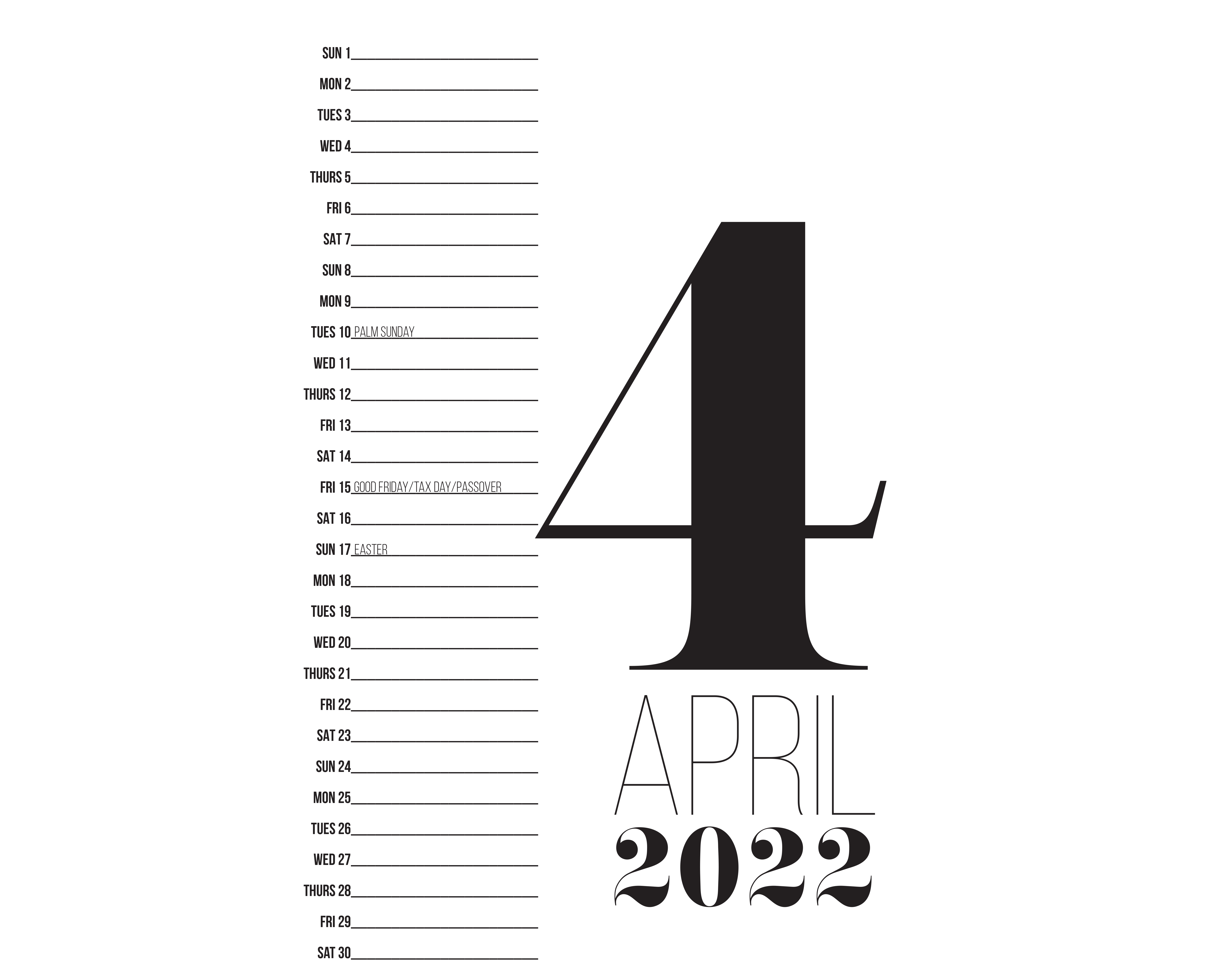
Adding to the running list of techniques:
- Make a word very large on the page. If you go big, go big.
- Bold the largest element. Not always required, but it can produce a rich, confident hierarchy.
- Create units or groupings by containing type within an imaginary box.
- Use visual alignments or improvised grids to support the typographic grouping.
Color
Color deserves its own article; indeed, Cameron Chapman has written several for Smashing Magazine covering color theory in depth.
- “Color Theory For Designers, Part 1: The Meaning of Color”
- “Color Theory For Designers, Part 2: Understanding Concepts And Color Terminology”
- “Color Theory for Designers, Part 3: How To Create Your Own Color Schemes”
Here, though, the focus is narrower: how color directs the eye, draws attention to specific type, and keeps the viewer engaged with the composition. For that purpose it helps to restrict the palette to two or three colors. With the restraint in place, the role of each color becomes easy to trace.
Reading The Content First
Color choices should never be arbitrary. The content itself should steer the palette: a children’s birthday invitation calls for vibrant hues, while instructional material for hospital patients might benefit from softer, calmer tones. Three factors shape practical color decisions:
- Content,
- Audience,
- Context.
The audience informs the writing, the typefaces, the sizes and the weight. Context determines distance: a poster is read from afar, a book or mobile screen from close range. Since color changes how content is perceived, the only reliable path is reading the copy before choosing colors.
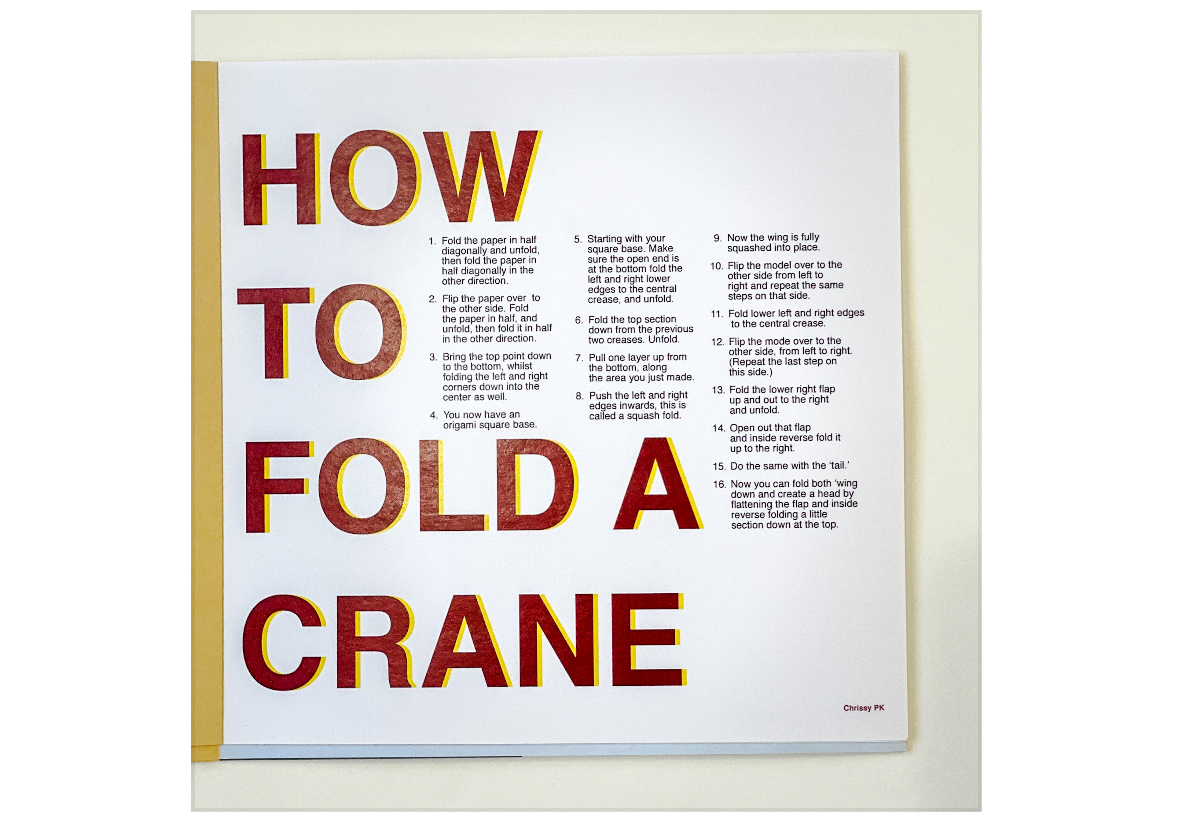
In one example, all the color is on the title and the author’s name; the body copy remains uncolored. The title is large, establishing a pocket of white space where the instructions sit comfortably. With no color competing on the body text, the eye naturally lands there anyway.
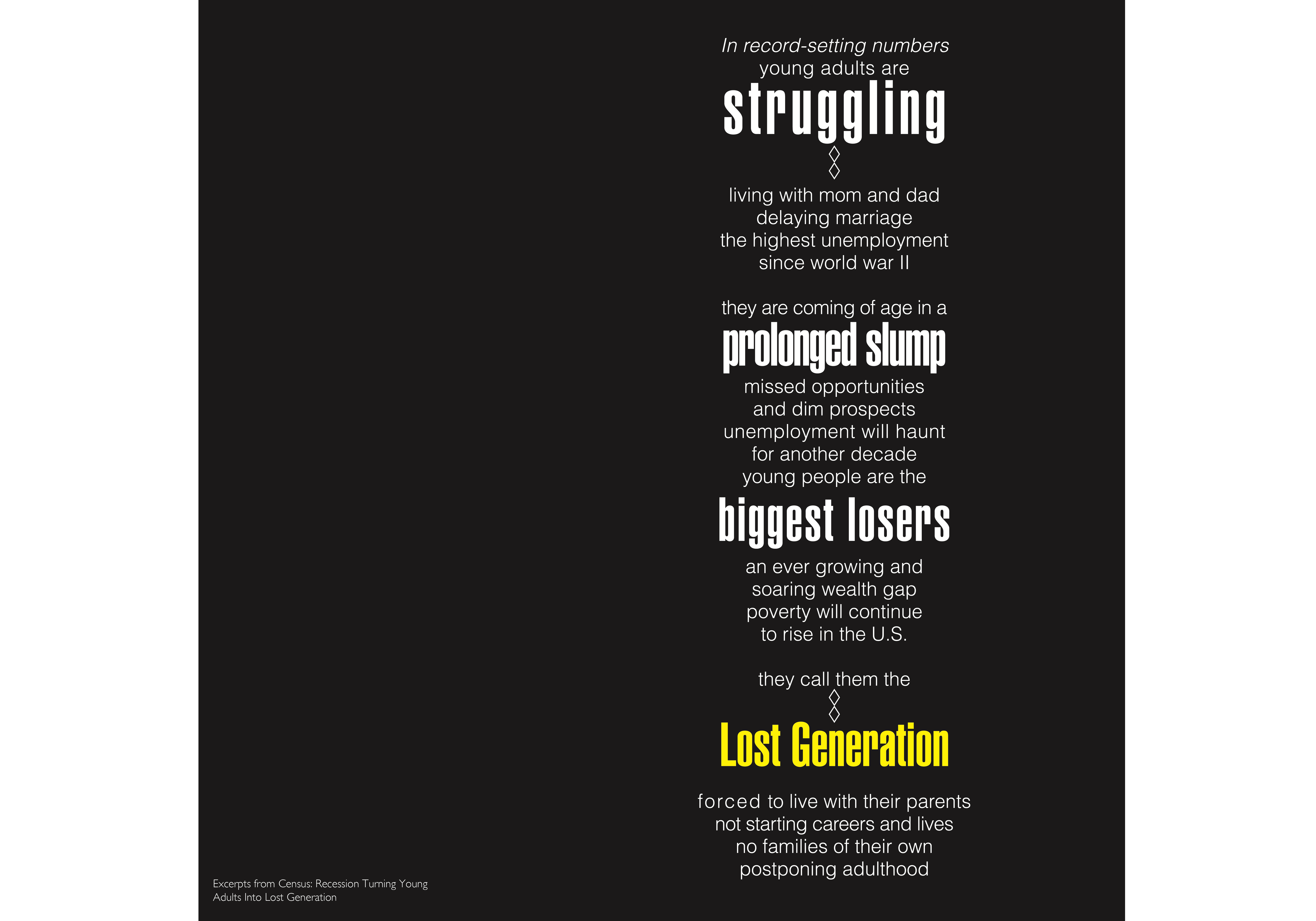
Another example inverts the scheme with a black background. The piece reads as pessimistic and somber, which justifies the lack of cheerful colors. The column of text is jammed to the right of the page; the resulting asymmetry creates a visual instability that mirrors the message.
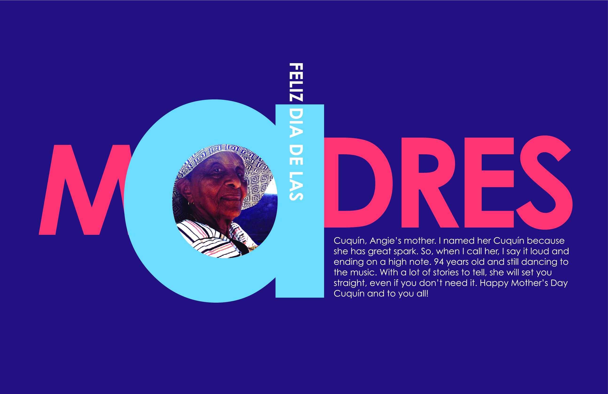
A Mother’s Day card demonstrates a slightly different approach. The lowercase a is the largest element; its bowl provides a space for a photograph that completes the letter. Remaining letters are capitalized, but this single lowercase a still anchors the piece. The designer used four distinct sizes, breaking the “three sizes” constraint, yet it works because nothing competes with the focal point. The vibrant palette reflects the personality of the honoree.
Color adds three more techniques to our toolkit:
- Use color to convey personality and tone.
- Break a rule if the system stays coherent and the focal point holds.
- Create spaces within letters or words to tuck in text, patterns or pictures.
Visual Punctuation
“What is visual punctuation?” is a common student question. Visual punctuation is the use of lines, shapes, symbols and geometric elements to enhance a hierarchy. These elements work as guides, moving the view across the composition.
A piece for a paper crane uses a drawn crane as a visual cue pointing to the title. White type at the beginning of the instructions echoes the white in the crane, establishing a compositional link. The word FOLD pulls attention back up. Each bolded instruction step directs the reader sequentially through the text without numbered markers.

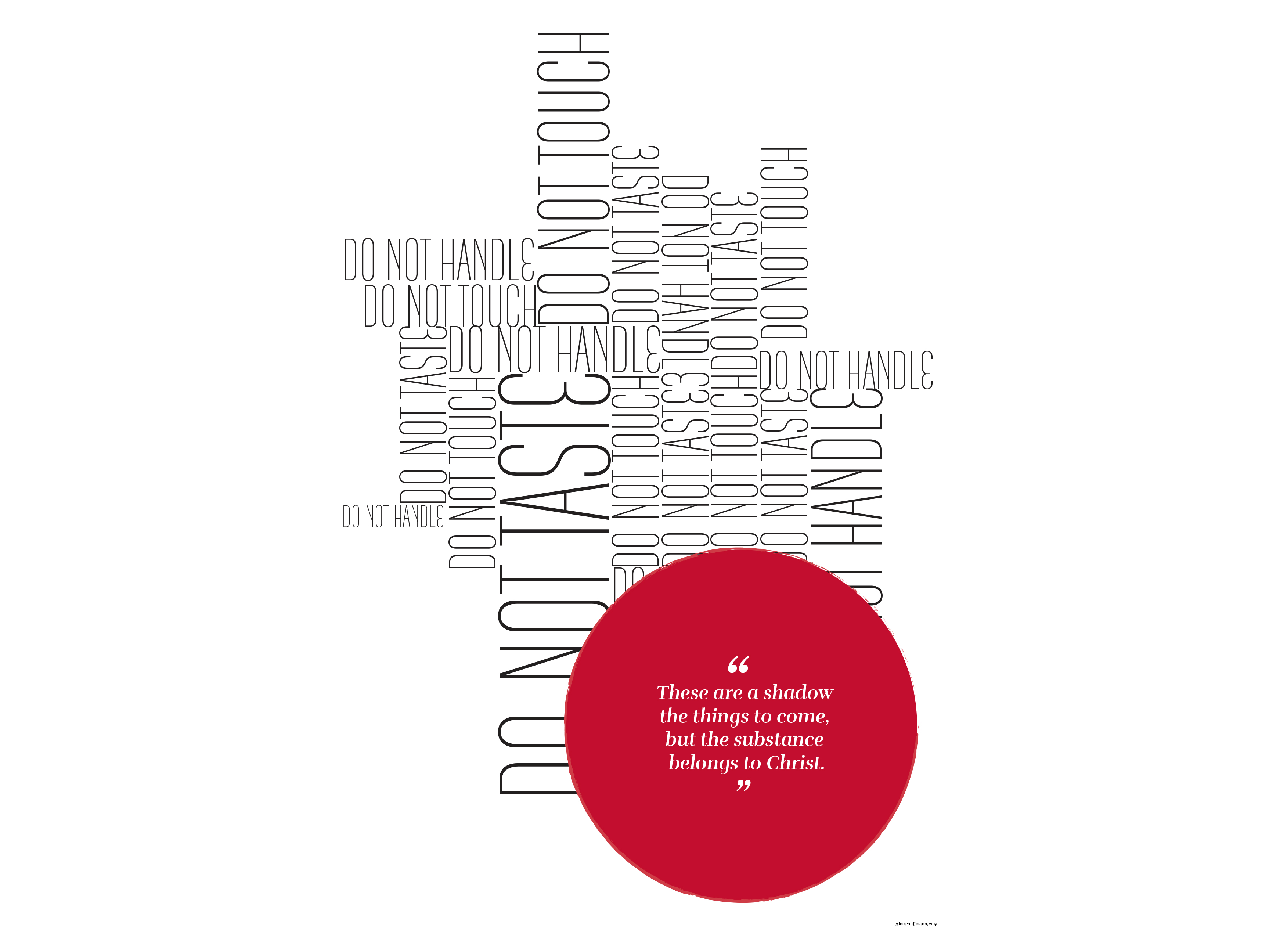
A layout designed to push back against rigid religious regulations carries a visual point that supports the conceptual one.
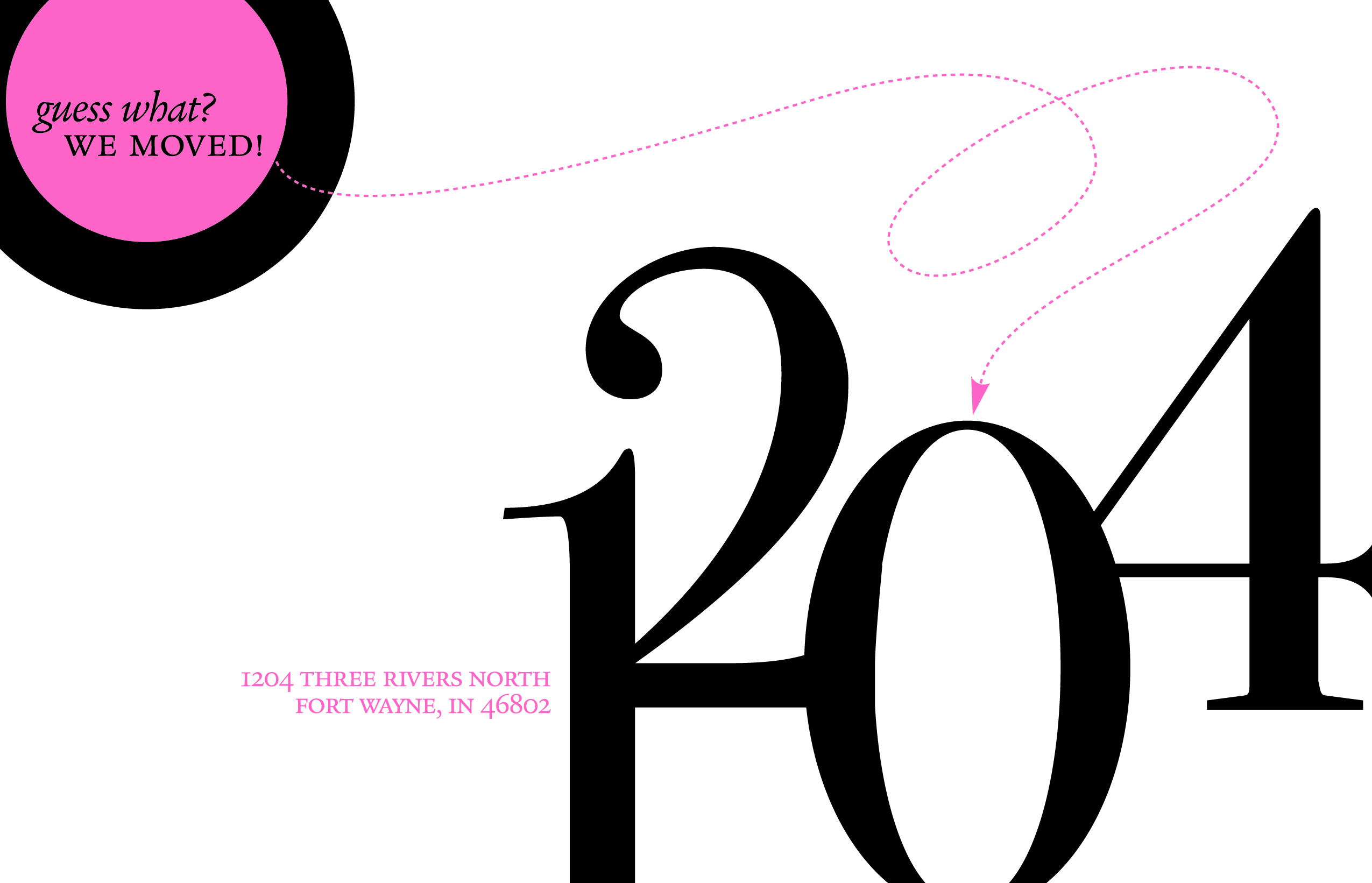
Circles, in turn, are efficient attention-getters. A card example uses a dotted line — matching the color of a circle in the upper left — pointing to a new house number. The number’s baseline establishes an imaginary line on which the address sits. A triangular eye-path runs from the upper left to the mid-right and down to the bottom left. The numbers are the dominant elements, and the size relationship with the upper-left circle is deliberate.
With visual punctuation covered:
- Use visual punctuation to enhance the meaning, concept or message.
- You can use only one color and one shape.
- Or you can use more than one color to build a hierarchy.
All Variables, Together
Proximity, weight, size, size-weight pairings, color and visual punctuation rarely appear in isolation. Once you know them individually, the challenge is spotting them in the wild.
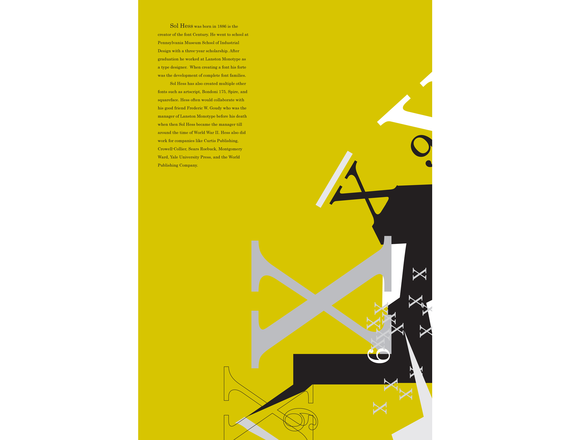
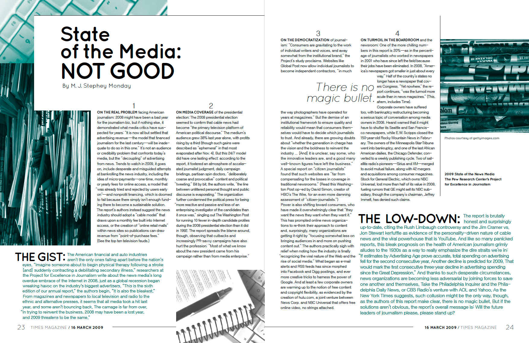

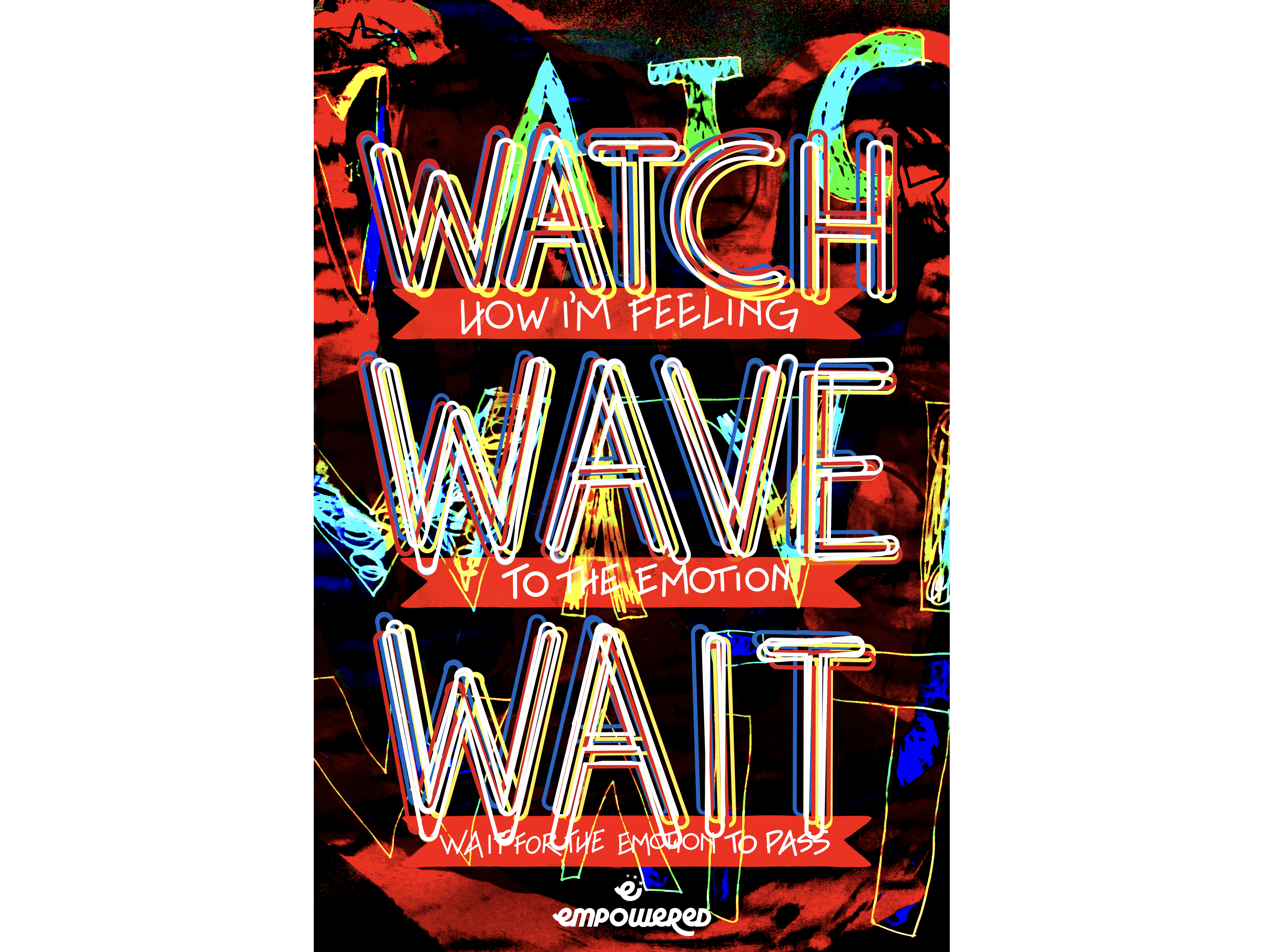
The technique is to isolate first, then combine. This is true of any discipline: learn each component well, then start mixing. A poster for the Empowered youth program shows this in action. The project, led by Dr. Krista Mehari, aimed at helping marginalized teens make productive decisions. For the Watch, Wave, and Wait poster, outlines of repeated words create a pattern that mimics the internal calming loop one uses when upset. It holds to the three-sizes guidance while breaking other formal expectations.
Putting It Into Practice
If you want to try it, a few practical notes on process:
- Pick content that isn’t overly long. A set of ten-step instructions or a short essay excerpt works well; a full two-page editorial is too much.
- Work smaller than a letter-size page. An eight-by-eight-inch format is ideal. The same applies to your sketches.
- Always sketch first. Sketching outside the computer is the best way to think without grid constraints. Generate multiple options for each variable.
- Choose the strongest two or three sketches from each variable and build them digitally.
- Print your digital drafts to judge proportion correctly. Include crop marks for clean cutting.
- Tape the printed pages upside down on a wall. Viewing them from a distance and inverted sharpens your read of proportions, space and hierarchy.
- Revise, reprint, re-tape. Repeat the loop until you are confident of the hierarchy.
- Assemble the final pieces into a booklet. One former student bound her How to Fold a Crane project this way; a virtual flipbook is another outlet.
Once the process feels natural, there is nothing stopping you from applying it to a poster or that two-page editorial you had in mind.
The Variables in Practice
Typographic hierarchy is rarely the product of a single adjustment. More often, it emerges from combining several of the six variables discussed here—size, weight, color, space, and the others—in deliberate ways. A shift in only one variable can add a subtle accent; stacking two or three creates a clear, readable structure. The key is to treat each variable not as a toggle but as a tuneable component of the whole composition.
For example, increasing only the font size of a heading can make it compete with the body text rather than complement it. But pairing a size increase with a weight change and a reduction in surrounding whitespace can create a proper visual anchor. Similarly, adding color to a single phrase within a paragraph can act as a quiet callout, while using color alongside a heavier weight and a slight size increase gives that phrase the status of a subheading. The interplay is what matters, not the isolated effect of any one knob.
Repetition Builds Sensitivity
Designers often speak of having a “good eye,” but that eye is trained, not innate. Repeated exposure to well-structured layouts—and the deliberate deconstruction of poor ones—sharpens one’s ability to see hierarchy as a set of levers. Every project is a practice opportunity. Even something as modest as a business card can become a study in spacing and contrast if you approach it with the variables in mind.
Eventually, this analysis becomes second nature. You start noticing that a cramped line of text, an oversized pull quote, or an overused accent color disrupts flow—not because of a rule, but because you’ve internalized what the balance of these variables should feel like. The goal isn’t to memorize a formula; it’s to build enough familiarity that the right adjustment suggests itself.
Further Exploration
To continue refining this skill, studying historical and contemporary examples is invaluable. The sources below offer a range of perspectives, from practical web typography guides to archival poster collections.
- I Love Typography — font news and resources
- A Pinterest board curated with typographic examples
- Typotheque’s blog
- Carnegie Mellon Swiss Posters Collection
- “The Elements of Typographic Style Applied to the Web”
- Web Design Experiments by Jen Simmons
- Typography 101
- “How to Structure an Effective Typographic Hierarchy” by Cameron Chapman
- “Typographic Hierarchy” by Ilene Strizver



