
Why canvas text effects are worth understanding
Since Firefox 2.0 brought <canvas> into the mainstream in 2006, the API has matured into a tool that gives JavaScript developers direct control over color, vectors, and pixels. Most attention has gone to drawing and image manipulation — but text effects are an equally rich area, and the same techniques apply to any vector object, making them useful for games and interactive apps alike.
This article walks through several classes of canvas text effects:
- CSS-style shadows with clipping paths and font metrics.
- Photoshop-like neon and gradient treatments using
globalCompositeOperation. - A little-known trick to produce inner shadows via path winding.
- A generative, animated effect driven by
requestAnimationFrameand HSL color cycling.
Shadow basics: CSS vs. canvas
CSS distinguishes box-shadow (for block elements) from text-shadow (for inline text). Canvas has a single shadow model applied to every vector primitive — lines, curves, arcs, rects, fillText, and strokeText alike. Four properties control it:
ctx.shadowColor— accepts RGB, RGBA, HSL, HEX, or named colors.ctx.shadowOffsetX— horizontal offset in pixels.ctx.shadowOffsetY— vertical offset in pixels.ctx.shadowBlur— blur radius; larger values produce softer shadows.
These closely mirror CSS text-shadow, which simplifies porting effects. Two subtle differences matter when you do. First, CSS text-shadow includes a blur radius; if it's zero, plain fillText produces an identical result and no shadow rendering is necessary. Second, CSS supports relative units like em, but canvas does not. You can convert em to pixels by creating a DOM element with the same font properties and measuring its offsetHeight at height: 1em — that value is the pixel-per-em ratio.
Emulating CSS text shadows
Anaglyph 3D text (the red/cyan effect seen through 3D glasses) shows how a minimal CSS rule can become a canvas equivalent. Because the CSS rule specifies no blur, rendering two offset copies of the text — one in red, one in cyan — gives the same depth illusion without touching the shadow API.
More elaborate CSS effects, like neon glows, require multiple stacked shadows. Canvas allows only one shadow per draw call, so you must draw the text multiple times on top of itself, varying shadowOffsetX, shadowOffsetY, and shadowBlur each pass. This raises an alpha-multiplication problem: each pass darkens overlapping regions, creating jagged artifacts. Setting fillStyle to fully transparent doesn't help — the shadow's opacity is always derived from the fill's alpha channel.
The workaround is to draw the shadow offset far enough from the text that the two don't overlap, keep the text itself off-screen, then restore the context's transform to place the shadow where the text would have been.
Clipping to confine shadows
That trick leaves the original text visible unless you clip it away. To build a correct clip region, you need the text's width and height. Width comes from ctx.measureText().width, but ctx.measureText().height doesn't exist. The reliable fallback is to measure a DOM span with identical font settings; its offsetHeight gives the em-box height. With both dimensions known, you can construct a rectangular clipping path that includes the shadow but excludes the dummy fill text.
Once that's in place, your canvas code can parse CSS-style shadow declarations — including multiple shadows — and reproduce the full visual effect.
A tangent on pixel manipulation
The same period that produced these shadow techniques also produced an interesting side experiment: a true anaglyph 3D effect from two still images. By extracting the red channel from a left-eye image and the cyan channel from a right-eye image, then combining them per-pixel via getImageData and putImageData, you can synthesize a 3D view. With two phones recording simultaneously, the same method could generate live 3D video in the browser.
Chaining effects with compositing modes
Canvas exposes 12 globalCompositeOperation modes. darker and lighter behave like layer blend modes — they mix pixel values mathematically. The other ten act more like alpha masks, where one drawing operation erases or reveals the previous content. Understanding these is the key to chaining multiple effects without drawing to intermediate offscreen canvases.
The "lighter" mode is especially useful for glow-style effects: overlapping colors add like light, so red plus green yields yellow, and full red, green, and blue produce white. Lowering globalAlpha while using "lighter" yields smooth gradient-like falloffs.
Neon-rainbow jitter
Building a neon glow with a rainbow gradient plus a jittered outline requires three compositing modes in sequence:
- Draw the base text with "source-in" to isolate the gradient inside the glyph shapes.
- Apply "lighter" to add bloom from multiple offset copies with increasing
shadowBlur. - Use "darker" to overlay fine dark jitter lines that create a hand-drawn outline effect.
By keeping the shadow draw separate from the visible text — as in the earlier clipping technique — each pass can contribute its glow without touching the fill color.
Zebra reflection
Inspired by CSS gradient-text tutorials, this effect goes a step further, producing an iTunes-style reflection. It demonstrates that canvas lets you stack different fill types onto the same text object: a solid color, a repeating pattern via createPattern, and a linear gradient for the glossy "shine" that gives the text depth. Combined with a flipped, alpha-faded copy below the baseline, the result looks like text resting on a reflective surface.
Inner shadows with path winding
Outer shadows are straightforward; inner shadows — where the shadow appears inside the glyph, as if carved into the surface — require a less documented feature. Canvas uses the even-odd or nonzero winding rule to determine which areas of a path are filled. If you construct a path that encloses a region in one direction (say clockwise) and then trace the text outlines in the opposite direction, the inner area of the glyphs becomes unfilled, while the region between the outer box and the glyphs is filled.
That inverted fill can carry a shadow offset, producing a soft dark cast along the inner edges of the letterforms — a convincing inner shadow entirely within the standard shadow API.
Generative motion with HSL cycling
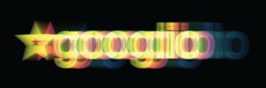
Canvas text effects need not be static. By driving shadowColor or fillStyle with an HSL color whose hue advances per frame, and scheduling redraws through window.requestAnimationFrame, you can create a "space-age" chroma effect where each frame recolors the text and its halo. Because the hue changes only slightly each frame, the text appears to drift through the color spectrum smoothly rather than flashing.
The technique uses the full high-resolution timer loop: update the HSL value, clear the canvas, redraw the text layers, and wait for the next frame. The result produces a continuous shimmering effect with no additional assets.
Inset shadows with winding rules
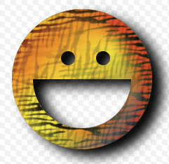
The canvas specification doesn't define "inner" versus "outer" shadows, which can make inset shadows seem unsupported at first. However, you can create them by exploiting clockwise versus anti-clockwise winding rules. Draw a container rectangle, then draw a cutout shape using the opposite winding direction—this effectively inverts the shape.
The example below applies both fillStyle and an inner shadow, each stylized with color, gradient, or pattern. Pattern rotation is set independently; note the zebra stripes are perpendicular to each other. A clipping mask sized to the bounding box removes the need for an oversized container around the cutout shape, improving performance by skipping shadow processing for unnecessary areas.
function innerShadow() {

function drawShape() { // draw anti-clockwise
ctx.arc(0, 0, 100, 0, Math.PI * 2, true); // Outer circle
ctx.moveTo(70, 0);
ctx.arc(0, 0, 70, 0, Math.PI, false); // Mouth
ctx.moveTo(-20, -20);
ctx.arc(30, -30, 10, 0, Math.PI * 2, false); // Left eye
ctx.moveTo(140, 70);
ctx.arc(-20, -30, 10, 0, Math.PI * 2, false); // Right eye
};

var width = 200;
var offset = width + 50;
var innerColor = "rgba(0,0,0,1)";
var outerColor = "rgba(0,0,0,1)";

ctx.translate(150, 170);

// apply inner-shadow
ctx.save();
ctx.fillStyle = "#000";
ctx.shadowColor = innerColor;
ctx.shadowBlur = getBlurValue(120);
ctx.shadowOffsetX = -15;
ctx.shadowOffsetY = 15;

// create clipping path (around blur + shape, preventing outer-rect blurring)
ctx.beginPath();
ctx.rect(-offset/2, -offset/2, offset, offset);
ctx.clip();

// apply inner-shadow (w/ clockwise vs. anti-clockwise cutout)
ctx.beginPath();
ctx.rect(-offset/2, -offset/2, offset, offset);
drawShape();
ctx.fill();
ctx.restore();

// cutout temporary rectangle used to create inner-shadow
ctx.globalCompositeOperation = "destination-out";
ctx.fill();

// prepare vector paths
ctx.beginPath();
drawShape();

// apply fill-gradient to inner-shadow
ctx.save();
ctx.globalCompositeOperation = "source-in";
var gradient = ctx.createLinearGradient(-offset/2, 0, offset/2, 0);
gradient.addColorStop(0.3, '#ff0');
gradient.addColorStop(0.7, '#f00');
ctx.fillStyle = gradient;
ctx.fill();

// apply fill-pattern to inner-shadow
ctx.globalCompositeOperation = "source-atop";
ctx.globalAlpha = 1;
ctx.rotate(0.9);
ctx.fillStyle = ctx.createPattern(image, 'repeat');
ctx.fill();
ctx.restore();

// apply fill-gradient
ctx.save();
ctx.globalCompositeOperation = "destination-over";
var gradient = ctx.createLinearGradient(-offset/2, -offset/2, offset/2, offset/2);
gradient.addColorStop(0.1, '#f00');
gradient.addColorStop(0.5, 'rgba(255,255,0,1)');
gradient.addColorStop(1.0, '#00f');
ctx.fillStyle = gradient
ctx.fill();

// apply fill-pattern
ctx.globalCompositeOperation = "source-atop";
ctx.globalAlpha = 0.2;
ctx.rotate(-0.4);
ctx.fillStyle = ctx.createPattern(image, 'repeat');
ctx.fill();
ctx.restore();

// apply outer-shadow (color-only without temporary layer)
ctx.globalCompositeOperation = "destination-over";
ctx.shadowColor = outerColor;
ctx.shadowBlur = 40;
ctx.shadowOffsetX = 15;
ctx.shadowOffsetY = 10;
ctx.fillStyle = "#fff";
ctx.fill();
};
These techniques show how globalCompositeOperation lets you chain effects together, combining masking and blending for richer visual output.
Generative drawing effects
Starting with the Unicode character 0x2708:
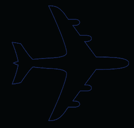
…it can be transformed into a shaded version:
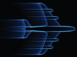
…by making repeated ctx.strokeText() calls with a thin lineWidth (0.25), while gradually decreasing the x-offset and alpha. This gives vector elements a sense of motion.
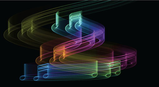
Mapping element positions to sine/cosine waves and cycling colors with HSL can yield more complex results, like the "biohazard" example:

Understanding HSL
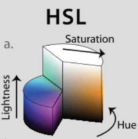
HSL (Hue, Saturation, Lightness) is a newer addition to the CSS3 specs. Whereas HEX was built with computers in mind, HSL is designed for human readability.
To cycle through the color spectrum with HSL, simply increment the hue value from 360; the hue is mapped to the spectrum in a cylindrical manner. Lightness determines how dark or light the color is—0% is black, 100% is white. Saturation controls vividness: 0% produces grays, while 100% yields fully saturated colors.
Because HSL is relatively new, you may want legacy browser support. That's possible via color-space conversion. The code below takes an HSL object like { H: 360, S: 100, L: 100} and returns an RGB object { R: 255, G: 255, B: 255 }, which you can use to build an rgb or rgba string. For more background, see Wikipedia's entry on HSL.
// HSL (1978) = H: Hue / S: Saturation / L: Lightness
HSL_RGB = function (o) { // { H: 0-360, S: 0-100, L: 0-100 }
var H = o.H / 360,
    S = o.S / 100,
    L = o.L / 100,
    R, G, B, _1, _2;

function Hue_2_RGB(v1, v2, vH) {
if (vH < 0) vH += 1;
if (vH > 1) vH -= 1;
if ((6 * vH) < 1) return v1 + (v2 - v1) * 6 * vH;
if ((2 * vH) < 1) return v2;
if ((3 * vH) < 2) return v1 + (v2 - v1) * ((2 / 3) - vH) * 6;
return v1;
}

if (S == 0) { // HSL from 0 to 1
R = L * 255;
G = L * 255;
B = L * 255;
} else {
if (L < 0.5) {
    _2 = L * (1 + S);
} else {
    _2 = (L + S) - (S * L);
}
_1 = 2 * L - _2;

R = 255 * Hue_2_RGB(_1, _2, H + (1 / 3));
G = 255 * Hue_2_RGB(_1, _2, H);
B = 255 * Hue_2_RGB(_1, _2, H - (1 / 3));
}

return {
R: R,
G: G,
B: B
};
};
Animating with requestAnimationFrame
Historically, JavaScript animations relied on two options: setTimeout and setInterval.
window.requestAnimationFrame is the modern standard that replaces both. It conserves resources by letting the browser throttle animations based on available capacity. Key benefits include:
- Animations can slow or stop when the user leaves the frame, avoiding unnecessary resource consumption.
- A frame-rate cap at 60FPS; this is well above the threshold where most humans perceive motion as fluid (around 30FPS).
At the time of writing, vendor-prefixed versions are still needed. Paul Irish published a shim providing cross-vendor support in requestAnimationFrame for smart animating:
// shim layer with setTimeout fallback
window.requestAnimFrame = (function(){
return  window.requestAnimationFrame       ||
        window.webkitRequestAnimationFrame ||
        window.mozRequestAnimationFrame    ||
        window.oRequestAnimationFrame      ||
        window.msRequestAnimationFrame     ||
        function(/* function */ callback, /* DOMElement */ element){
        window.setTimeout(callback, 1000 / 60);
        };
})();
For broader legacy support, you can combine this with a polyfill like requestAnimationFrame.js (with some features still to be worked out), while easing into the new standard.
(function animate() {
var i = 50;
while(i--) {
    if (n > endpos) return;

    n += definition;
    ctx.globalAlpha = (0.5 - (n + startpos) / endpos) * alpha;
    if (doColorCycle) {
        hue = n + color;
        ctx.strokeStyle = "hsl(" + (hue % 360) + ",99%,50%)"; // iterate hue
    }
    var x = cos(n / cosdiv) * n * cosmult; // cosine
    var y = sin(n / sindiv) * n * sinmult; // sin
    ctx.strokeText(text, x + xoffset, y + yoffset); // draw rainbow text
}
timeout = window.requestAnimationFrame(animate, 0);
})();
Source code
With support across the browser vendor sphere, the future of <canvas> is secure. It can also be ported to iPhone, Android, or desktop executables via PhoneGap, or


