

Building tooltip triangles in CSS
Tooltips have no single prescribed implementation, so developers assemble them from their own recipes. This covers one step of that recipe: the small triangle, or tail, that connects the tooltip to its anchor. The tail receives little attention, yet several techniques exist for creating it, ranging from simple to fairly involved.
The ideal starting point is a single-element tooltip, avoiding extra markup just for the triangle:
<span class="tooltip">I am a tooltip</span>The border trick
The most widespread way to draw a triangle is the border trick, documented on Stack Overflow since 2010 and on CSS-Tricks by Chris Coyier in 2016. Borders meet each other at 45° angles, so an element with a border but no width and height renders four perfect triangles. Setting three border colors to transparent leaves only one triangle visible. An animated demonstration exists in a CodePen by Chris Coyier.
In practice the triangle is a pseudo-element of the tooltip. Its dimensions are already 0px by default on ::before and ::after, so only one border needs a solid color. Widening the other borders increases the triangle's base; enlarging the visible border increases its height.
.tooltip {
  &::before {
    content: "";

    border-width: var(--triangle-base);
    border-style: solid;
    border-color: transparent;

    border-top: var(--triangle-height) solid red;
  }
}
Attaching the triangle means setting the triangle's position to absolute and .tooltip to relative, then using inset properties to place it. The triangle must also be translated by its own width — -50% when positioned via left, 50% when using right.
.tooltip {
  position: relative;

  &::before {
    /* ... */
    position: absolute;
    top: var(--triangle-top);
    left: var(--triangle-left);

    transform: translateX(-50%);
  }
}
The newer Anchor Positioning properties can also handle the placement.
Rotating a square instead
The border method occupies the border property, which then can't be used for anything else. An older alternative is to rotate a square by 45° and hide half of it behind the tooltip body so only its corner shows as a triangle. The square comes from a pseudo-element:
.tooltip {
  &::before {
    content: "";

    display: block;
    height: var(--triangle-size);
    width: var(--triangle-size);

    background-color: red;
  }
}
It is then positioned behind the tooltip body so that one half remains visible. Because the square is rotated, the transformation applies on both axes.
.tooltip {
  position: relative;

  &::before {
    /* ... */
    position: absolute;
    top: 75%;
    left: 50%;
    z-index: -1; /* So it's behind the tooltip's body */

    transform: translateX(-50%);
    transform: rotate(45deg) translateY(25%) translateX(-50%);
  }
}
This method pairs better with Anchor Positioning: the triangle's styles don't need to change when it moves around, whereas with the border approach the visible border changes with direction.
Refining the square with clip-path
The rotated square has two flaws. It isn't a true triangle, so a short tooltip can let it peek out at the top, and moving the false triangle to the sides exposes its square shape. The clip-path property fixes both by selecting the region of an element to display and clipping the rest. Since a triangle is needed, the polygon() function fits: it takes points expressed as percentages from the origin (top-left corner) and connects them with straight lines. The three points here are 0% 0% (top-left), 100% 0% (top-right) and 50% 100% (bottom-center).
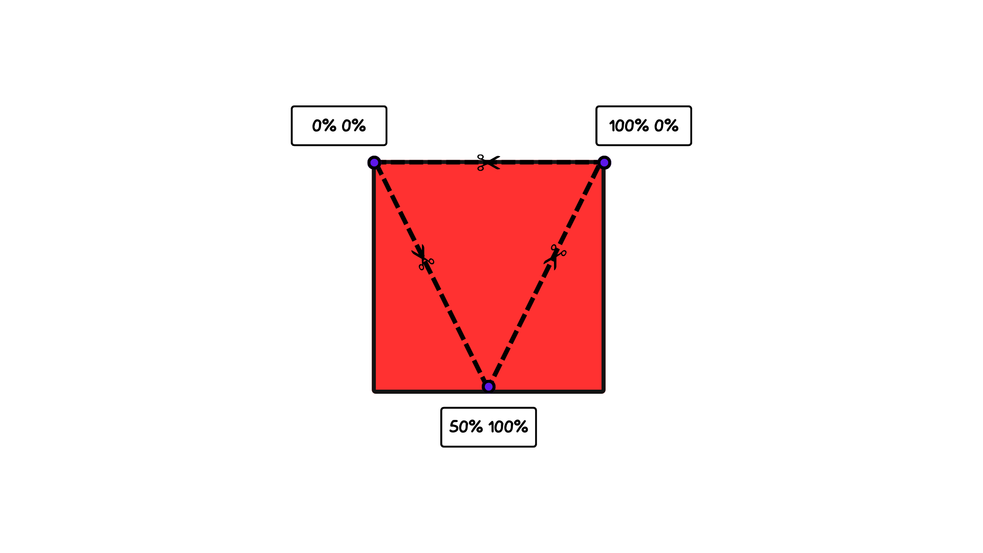
Written as a comma-separated list inside polygon(), the clip-path value looks like this:
.tooltip {
  &::before {
    content: "";

    width: var(--triangle-base);
    height: var(--triangle-height);

    clip-path: polygon(0% 0%, 100% 0%, 50% 100%);
    transform: translate(-50%);

    background-color: red;
  }
}
Its top and left properties are set through CSS variables, which become useful shortly.
.tooltip {
  position: relative;

  &::before {
    /* ... */
    position: absolute;
    top: var(--triangle-top); /* 100% */
    left: var(--triangle-left); /* 50% */

    transform: translate(-50%);
  }
}
At this point the tooltip has a genuine triangle. However, pushing the triangle to the far end of any side still lets it slip outside the tooltip body. clip-path gives enough control to adjust the triangle based on its horizontal position: near the top-left corner its x-axis value should approach 50% as the tooltip's position approaches 0%, and near the top-right corner it should approach 50% as the position approaches 100%.
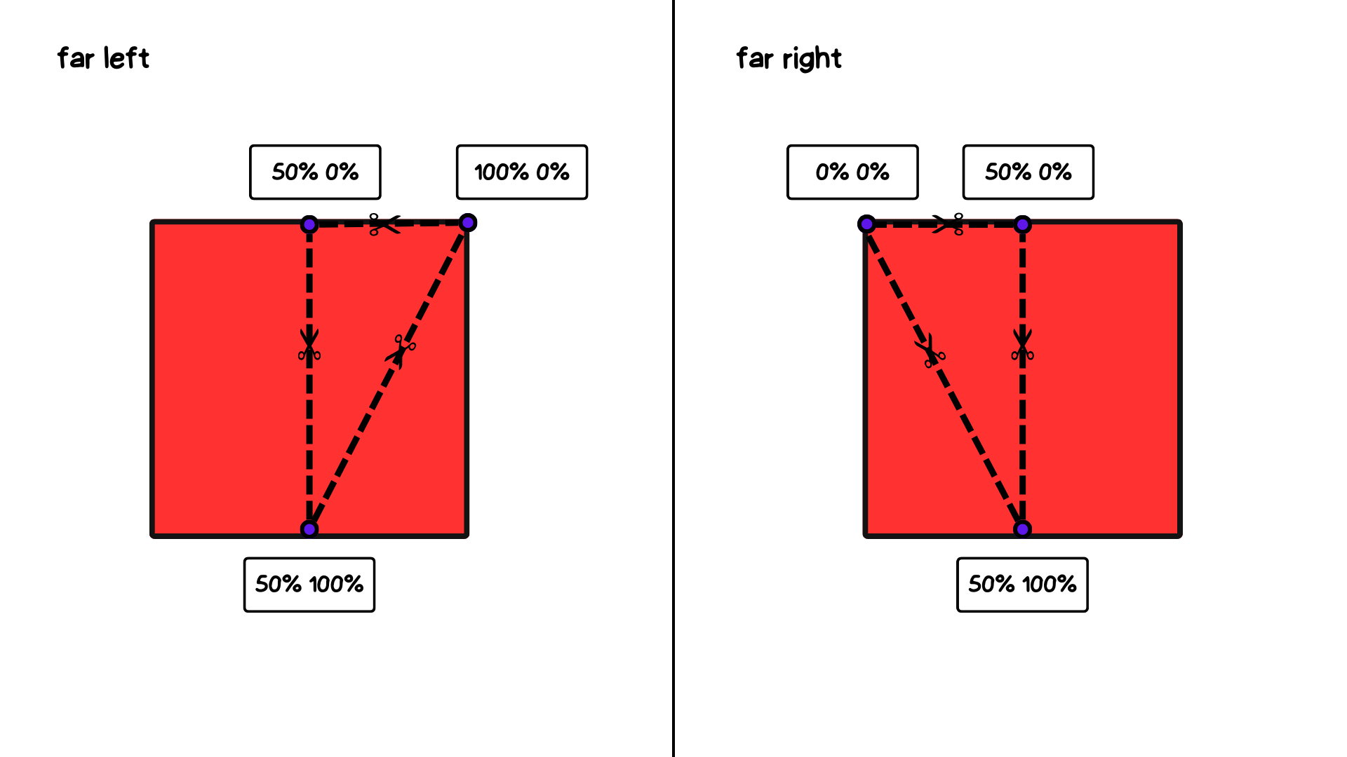
A min() + max() combination accomplishes this:
.tooltip {
  clip-path: polygon(
    max(50% - var(--triangle-left), 0%) 0,
    min(150% - var(--triangle-left), 100%) 0%,
    50% 100%
  );
}
Inside math functions like min() and max(), calc() isn't needed. Moving the tooltip horizontally demonstrates how the shape adapts.
A tail with no pseudo-elements
A case remains where both pseudo-elements are already in use and none can be spared for the triangle, or where a cleaner solution without pseudo-elements is preferred. That takes two properties: clip-path, seen above, and border-image.
clip-path can trim the whole tooltip shape, tail included, directly from the element. The obstacle is that the element's background isn't large enough to cover the tail. border-image supplies an overgrown background: it uses an image or CSS gradient as an element's border — here, a solid-color border as wide as the triangle's height. The syntax is complex; Temani Afif's full dive into border-image is a recommended reference.
.tooltip {
  border-image: fill 0 // var(--triangle-height) conic-gradient(red 0 0);
}
The trim is more elaborate this time because the tail is trimmed too, requiring seven points:
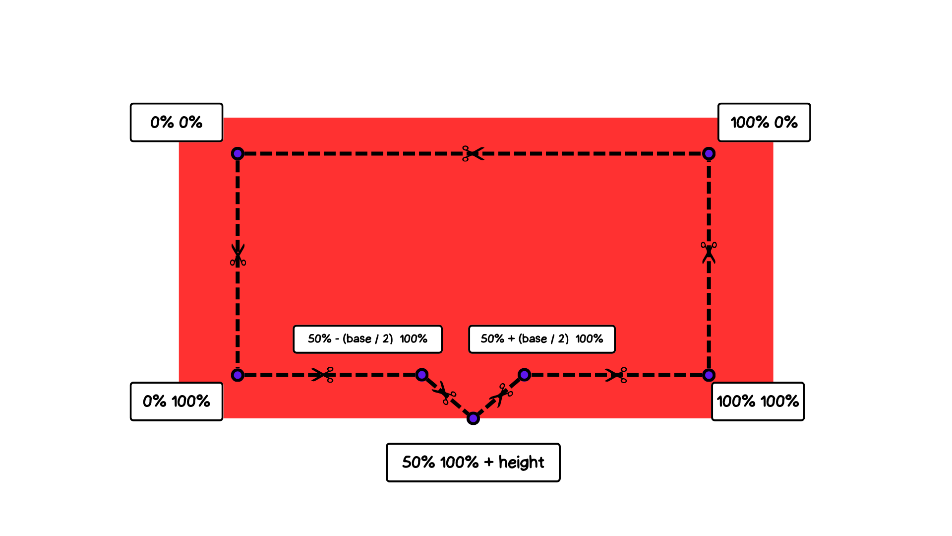
Translated to CSS, the clip-path value is:
.tooltip {
  /* ... */
  clip-path: polygon(
    0% 100%,
    0% 0%,
    100% 0%,
    100% 100%,
    calc(50% + var(--triangle-base) / 2) 100%,
    50% calc(100% + var(--triangle-height)),
    calc(50% - var(--triangle-base) / 2) 100%
  );
}
The triangle's bottom point can be capped whenever it passes beyond either side of the tooltip:
.tooltip {
  /* ... */
  clip-path: polygon(
    0% 100%,
    0% 0%,
    100% 0%,
    100% 100%,
    min(var(--triangle-left) + var(--triangle-base) / 2, 100%) 100%,
    var(--triangle-left) calc(100% + var(--triangle-height)),
    max(var(--triangle-left) - var(--triangle-base) / 2, 0%) 100%
  ;
}
The result is a functioning tail that belongs to the main body and uses only one element.
Further reading
- "The Complex But Awesome CSS
border-imageProperty" by Temani Afif - "Transforming Borders into Cool CSS Triangles" by Optimistic Web



