Why animation needs easing
Objects in the physical world rarely move at a perfectly constant speed. They accelerate, decelerate, or do both. Human perception is tuned to expect this kind of motion, so UI animations that mirror it tend to feel more comfortable and natural. Animations that ignore this principle come across as robotic, which can make an interface feel jarring.
In animation terminology, motion that starts slowly and speeds up is called "ease in" (historically, "slow in"). Motion that starts quickly and slows down is called "ease out" (or "slow out"). Combining both is known as "ease in out." Easing, in essence, is the process of softening the extremes of an animation so its motion feels less abrupt.
Choosing an easing keyword
CSS transitions and animations support several easing (or timing) keywords that control how an animation progresses. The most useful ones for natural-feeling motion are:
linearease-inease-outease-in-out
There is also a steps keyword for discrete, stepped transitions, but the keywords above are typically what you need to produce natural motion. For more control, you can also define custom easing curves in code.
Linear: steady but stiff
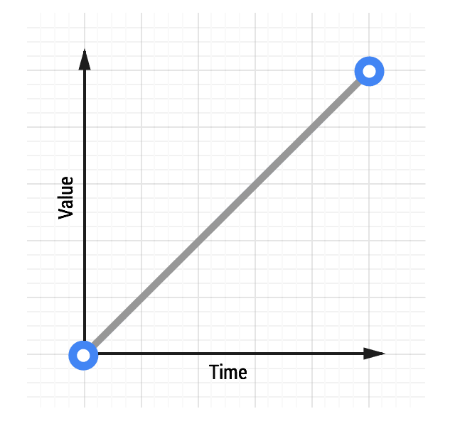
With linear easing, the value of the animated property changes by equal amounts over equal time intervals. The motion has no acceleration or deceleration, which tends to feel mechanical and unnatural. Users generally find this noticeable and unpleasant, so you should avoid linear motion in most UI contexts. Both CSS and JavaScript animation options include a linear timing function.
transition: transform 500ms linear;
Ease-out: responsive with a natural stop
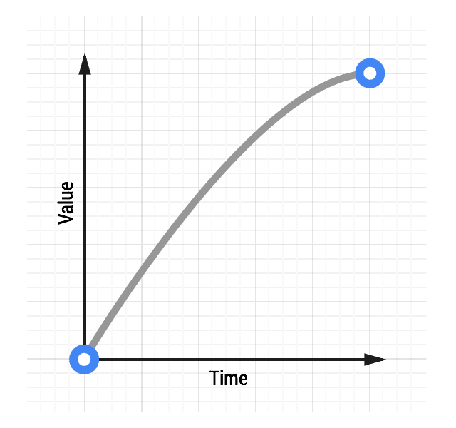
Ease-out animations start quickly and then decelerate toward the end. The fast start makes the animation feel responsive, while the smooth slowdown mimics how real objects come to rest.
For most UI work, ease-out is the recommended choice. It balances the user's need for immediate feedback with a natural endpoint. In CSS, the ease-out keyword gives you this behavior directly:
transition: transform 500ms ease-out;
Ease-in: a slow start that ends abruptly
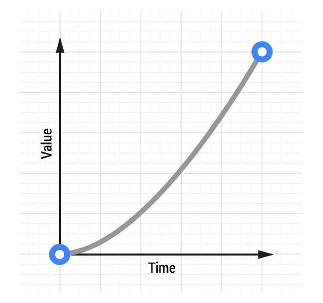
Ease-in animations start slowly and accelerate toward the end. This can be a fitting effect for motion that mimics gravity, such as a heavy object falling and striking the ground with a sudden stop.
However, ease-in works poorly for most interfaces. The slow start makes the animation feel unresponsive, and the abrupt ending conflicts with how objects in the real world behave. Use ease-in sparingly, and only if you can keep the animation very short to limit the perceived sluggishness. The CSS keyword is ease-in:
transition: transform 500ms ease-in;
Ease-in-out: dramatic contrast, with caveats
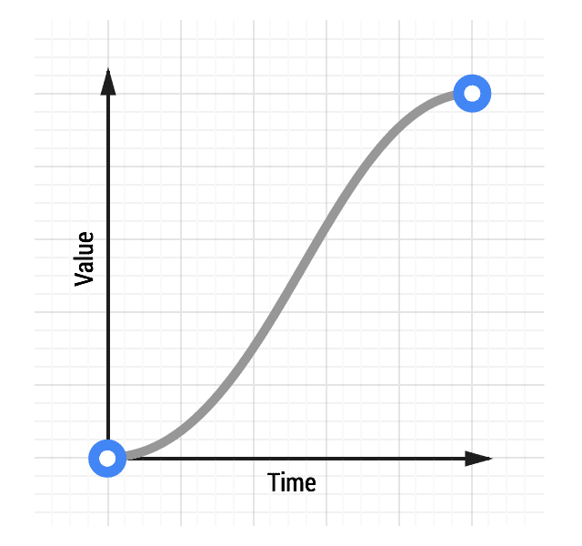
Ease-in-out combines both behaviors: motion that begins gently, accelerates through the middle, then decelerates to a stop. It resembles a car accelerating and braking smoothly, and the shifted pacing can create a more noticeable, dramatic effect than ease-out alone.
Because of the slow start, an ease-in-out animation needs to be kept reasonably short to avoid feeling labored. Durations in the 300–500ms range generally work, though the right value depends on your project's overall feel. The increased contrast between slow and fast phases can be satisfying when tuned well. Use the ease-in-out keyword in CSS to apply it:
transition: transform 500ms ease-in-out;


