

The long-standing decoration overshoot problem
Text decorations such as underlines run past the first and last characters—specifically to the edges of the content box—which throws off vertical alignment. Whether that bothers you is a matter of taste; for many designers it is a persistent annoyance.
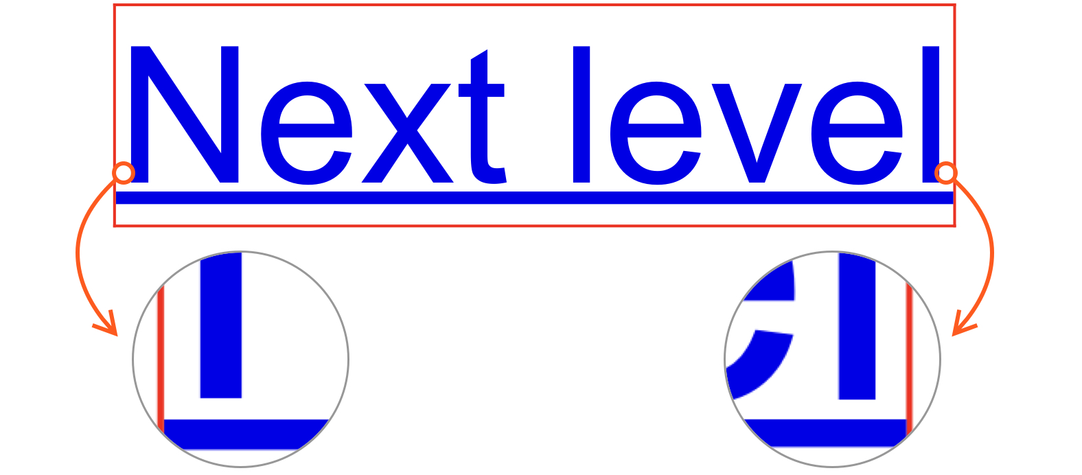
The usual workaround is text-decoration: none plus an ::after pseudo-element with a custom background. It is fiddly, and it costs you the native decoration features: text-decoration-thickness, text-underline-position (which sets the underline's position relative to the font's internal metrics, such as the baseline), and text-underline-offset (which sets the offset from that position). Most people live with the misalignment because the trade isn't worth it.
How text-decoration-inset works
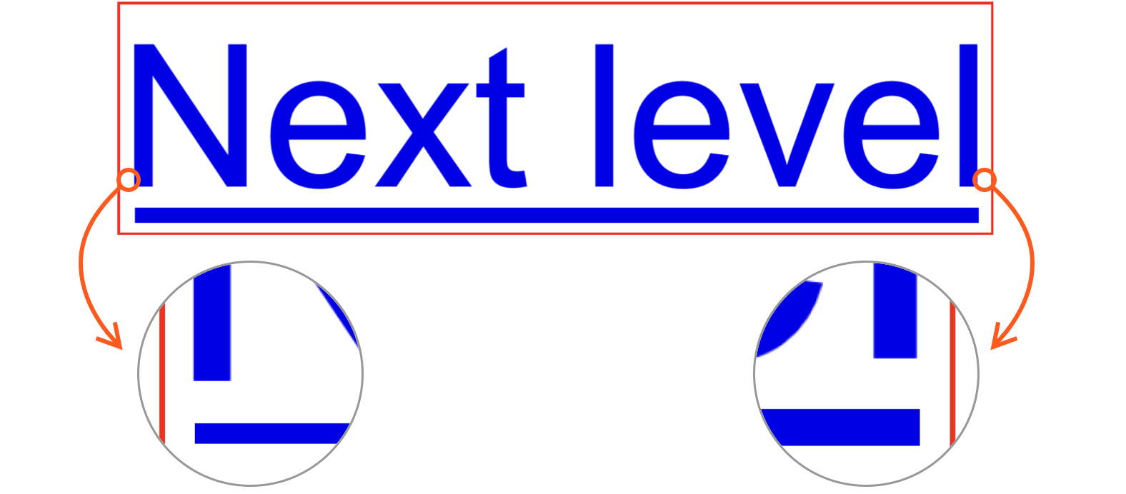
The property, formerly named text-decoration-trim, clips the ends of the computed text-decoration-line. Its syntax:
text-decoration-inset: <left-inset> <right-inset>;Left and right insets are independent. The values must be <length>s, but relative units work, and em ties them to the computed font-size so insets scale with text size. In the demo above, a left inset of 0.076em—7.6% of the computed font-size—lines the underline up with the left stem of the letter "N" and other left stems. That value was found by trial and error, and needs to be derived only once per font.
The approach is not exact: a first letter like "W" will not align. It suits cases where the content is known in advance. A fully accurate, automatic way to align decorations and multiple lines of text may come from the W3C eventually; until then, this produces effects such as an overline and underline combination built on a generous helping of text-decoration-thickness.
Transitions and animation
The native alternative to animated ::after underlines is what makes this property interesting. A simple example multiplies the insets by ten on :hover. Remember that only <length> values are allowed, so prefer em units or test across font sizes.
a {
  transition: 300ms;
  text-decoration-inset: 0.046em 0.009em;

  &:hover {
    text-decoration-inset: calc(0.046em * 10);
  }
}
A more ambitious demo uses a CSS @keyframes animation for a shooting-star underline: the left inset is pushed all the way to the right side. Because 100% is not available here, the element width was measured as 4.5em and used as the value instead—precision improves the animation.
a {
  /*
    The value at the start and end of the
    animation, as well as the default value
  */
  text-decoration-inset: 0.046em 0.009em;

  &:hover {
    animation: 1s next-level;
  }
}

@keyframes next-level {
  /* By half-way through the animation... */
  50% {
    /*
      ...the left inset has shifted 4.5em,
      which is the full width of the element
    */
    text-decoration-inset: 4.5em 0.009em;

    /* It’s faded out as well */
    text-decoration-color: transparent;
  }

  /* Immediately after that... */
  50.999% {
    /* ...both insets are set to the left */
    text-decoration-inset: 0.046em 4.5em;
  }

  /* Then it animates back to the default value */
}
Assessment
The property is a welcome native tool for refining two details at once: aligning text decorations relative to the text, and transitioning or animating them. It has flaws, but so does every feature.



