

Design trends rarely announce themselves. They surface through repetition — a shape or treatment that keeps appearing across unrelated sites until it reads as a pattern. The blobby shape is the current example: walls of screenshots collected over a single week of ordinary browsing, with no deliberate hunt for instances, turned up more than a dozen sites using it.
Why the shape works
A blob is a low-cost flourish. Against an otherwise flat design it delivers a spot of color or a focal point that pulls the eye from one region of the page to the next. Some of the strongest examples are simply gorgeous, and the appeal is easy to understand given how many teams draw on the same UI frameworks and take cues from sites they admire.
These examples are collected as observations, not as criticism:






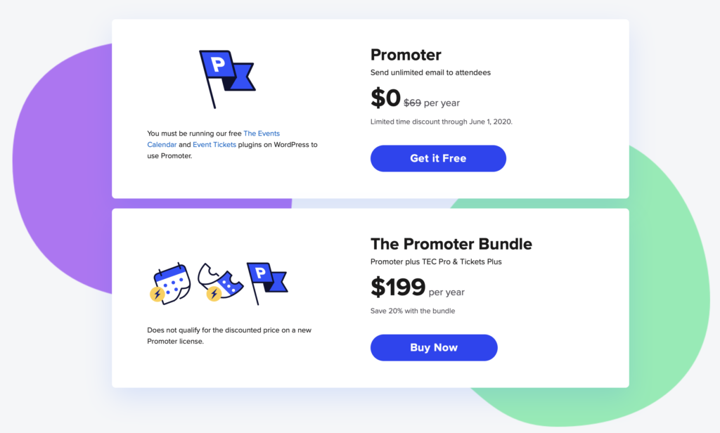









Contrast and color discipline
Repeated exposure to the pattern also exposes its failure modes. The first is legibility: when a dark blob sits on a white document background and text runs across it, finding a font color that satisfies WCAG’s 2.1 AA standard for legibility becomes difficult.
The second is restraint in palette. A single hot pink blob behind a card component is harmless. Add yellow, orange, and other bright tones alongside it and the design begins to compete with the content it is meant to support. A vibrant rainbow of blobs can also raise accessibility concerns. A flourish should stay subtle while still landing with impact.
Beyond backgrounds
Blobs are not limited to filling space with color. Some of the more interesting implementations use them to crop images into irregular shapes — an image can be embedded directly in SVG and then masked with a path. Nor are blobs confined to page backgrounds: Topcoder’s site uses the shape for tabs, an unusual and effective application.
Trends have a shelf life
Watching a style spread invites a longer view of how today’s work will read to the developers who follow. Roughly 15 years ago, many sites adopted Apple’s reflective imagery; replicating that effect in Photoshop enough times leaves muscle memory behind.

Skeuomorphism, bevels, animated GIF backgrounds, long shadows, heroes, gradients, bokeh backgrounds — each visual treatment has had its season. Blobs may eventually join that list, and may return later. The more useful exercise is to look back at three decades of shared inspiration and consider how the choices being made now will appear through that same long lens.



