Why SVG beats bitmaps for responsive graphics
When you need rich visuals without eating a user's data plan, SVG is worth a serious look. Unlike canvas, which many developers reach for when mixing vectors and rasters, SVG is a declarative part of HTML5. Because it's resolution-independent, a single asset scales cleanly to whatever screen it lands on — no need to generate multiple bitmaps for different viewport sizes.
That independence also makes SVG ideal for responsive layouts. Line art and vector drawing are where SVG shines; bitmaps still make more sense for continuous-tone images like photos. Authoring tools including the Drawing app in Google Drive, Inkscape, Illustrator, and Corel Draw all export SVG, so content creation is straightforward.
Consider the file-size payoff. The HTML5 logo as SVG is just 1,427 bytes. Compressed with GZIP and renamed to .svgz, it drops to 663 bytes — a size most browsers handle natively. That results in roughly a 60x advantage over JPEG and over 80x compared to PNG. JPEG is lossy and shows visible color artifacts along sharp edges; PNG introduces no such distortion but is far heavier. The SVG remains visually identical to the PNG while beating both formats on size.

Building a full-screen vector background
A fixed-position CSS rule will stretch an SVG across any viewport:
<style>
#bg {
  position:fixed;
  top:0;
  left:0;
  width:100%;
  z-index: -1;
}
</style>
<img src="HTML5-logo.svgz" id="bg" alt="HTML5 logo"></pre>
Content layered over that background needs contrast:

At full saturation, the underlying graphic obscures text. One quick "fix" is setting CSS opacity:
#bg {
  opacity: 0.2;
}

But opacity comes at a cost on mobile: most mobile browsers paint semi-transparent objects slower than opaque ones. A better approach is to lighten the colors inside the SVG file itself. Editing the source gradient eliminates transparency from the paint path entirely, giving an identical visual result with faster rendering and less battery drain.

Optimizing gradient direction
Gradients add texture to UI elements like buttons. Building one starts with a rounded rectangle and a linear gradient:
<svg xmlns="http://www.w3.org/2000/svg">
  <defs>
    <linearGradient id="blueshiny">
      <stop stop-color="#a0caf6" offset="0"/>
      <stop stop-color="#1579df" offset="0.5" />
      <stop stop-color="#1675d6" offset="0.5"/>
      <stop stop-color="#115ca9" offset="1"/>
    </linearGradient>
  </defs>
  <g id="button" onclick="alert('ouch!');">
    <rect fill="url(#blueshiny)" width="198" height="83" x="3" y="4" rx="15" />
    <text x="100" y="55" fill="white" font-size="18pt" text-anchor="middle">Press me</text>
  </g>
</svg>

That renders with the SVG default gradient angle — left to right. Adjust the direction via the x1, y1, x2, and y2 attributes. Changing only y2 makes the gradient run diagonally:
<linearGradient id="blueshiny" y2="1">

A vertical, top-to-bottom gradient needs just y2 set to full height:
<linearGradient id="blueshiny" x2="0" y2="1">

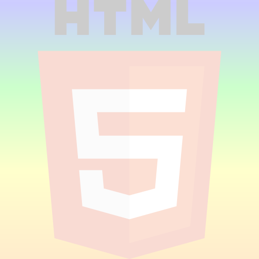
That last orientation is the one to choose when speed matters. Hardware paints scanlines per horizontal row, and when the color value doesn't change across a row, the engine takes a fast path. Vertical gradients render nearly as quickly as a solid fill on most devices. The same optimization applies to CSS gradients. Even a subtle vertical gradient backdrop for the HTML5 logo comes with almost no drawing penalty:
<defs>
<linearGradient id="grad1" x2="0" y2="1">
    <stop stop-color="#FBE6FB" offset="0" />
    <stop stop-color="#CCCCFF" offset="0.2" />
    <stop stop-color="#CCFFCC" offset="0.4" />
    <stop stop-color="#FFFFCC" offset="0.6" />
    <stop stop-color="#FFEDCC" offset="0.8" />
    <stop stop-color="#FFCCCC" offset="1" />
</linearGradient>
</defs>
<rect x="-200" y="-160" width="910" height="830" fill="url(#grad1)"/></pre>
Animating gradients without JavaScript
An SVG gradient element lives in the DOM, which gives you animation capability built right into the format. There's no need for script to cycle through colors. For example, defining multiple color stops with an animation duration:
<linearGradient id="grad1" x2="0" y2="1">
    <stop stop-color="#FBE6FB" offset="0">
    <animate attributeName="stop-color"
        values="#FBE6FB;#CCCCFF;#CCFFCC;#FFFFCC;#FFEDCC;#FFCCCC;#FBE6FB"
        begin="0s" dur="20s" repeatCount="indefinite"/>
    </stop>
    <stop stop-color="#CCCCFF" offset="0.2">
    <animate attributeName="stop-color"
        values="#CCCCFF;#CCFFCC;#FFFFCC;#FFEDCC;#FFCCCC;#FBE6FB;#CCCCFF"
        begin="0s" dur="20s" repeatCount="indefinite"/>
    </stop>
    <stop stop-color="#CCFFCC" offset="0.4">
    <animate attributeName="stop-color"
        values="#CCFFCC;#FFFFCC;#FFEDCC;#FFCCCC;#FBE6FB;#CCCCFF;#CCFFCC"
        begin="0s" dur="20s" repeatCount="indefinite"/>
    </stop>
    <stop stop-color="#FFFFCC" offset="0.6">
    <animate attributeName="stop-color"
        values="#FFFFCC;#FFEDCC;#FFCCCC;#FBE6FB;#CCCCFF;#CCFFCC;#FFFFCC"
        begin="0s" dur="20s" repeatCount="indefinite"/>
    </stop>
    <stop stop-color="#FFEDCC" offset="0.8">
    <animate attributeName="stop-color"
        values="#FFEDCC;#FFCCCC;#FBE6FB;#CCCCFF;#CCFFCC;#FFFFCC;#FFEDCC"
        begin="0s" dur="20s" repeatCount="indefinite"/>
    </stop>
    <stop stop-color="#FFCCCC" offset="1">
    <animate attributeName="stop-color"
        values="#FFCCCC;#FBE6FB;#CCCCFF;#CCFFCC;#FFFFCC;#FFEDCC;#FFCCCC"
        begin="0s" dur="20s" repeatCount="indefinite"/>
    </stop>
</linearGradient>
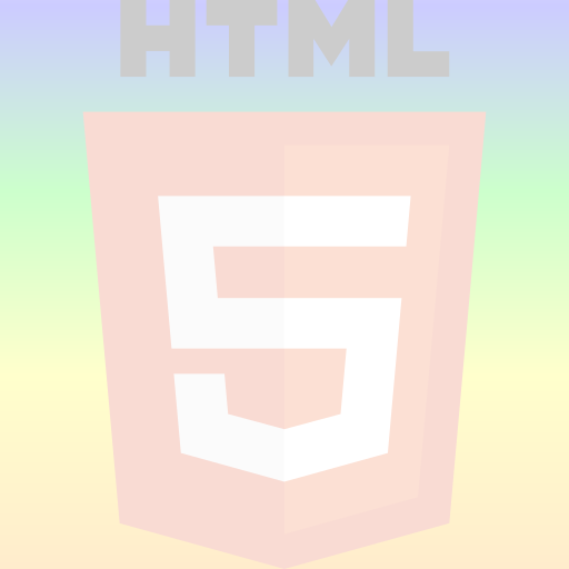
Here, the browser cycles the gradient stop colors continuously through the spectrum over 20 seconds, producing the look of light sweeping up the page, forever, without a line of JavaScript. Favoring native SVG animation keeps CPU usage lower than script-driven approaches because the rendering engine exploits its own knowledge of the paint path.
One caveat: not all browsers execute this kind of inline animation. In those cases the gradient renders held at its starting color. A requestAnimationFrame script could replace the effect, though that goes beyond this article's scope. The whole animated file stays a tiny 2,922 bytes — a full-screen dynamic visual for a fraction of the download weight of any raster equivalent.
When not to use SVG
SVG is the optimal tool for line art and other drawn content. It's a poor fit for photography, video, and body text — HTML and CSS manage text layout more gracefully and with better accessibility. But for lightweight, full-bleed graphics on an arbitrary screen, the format's combination of small payload, infinite resolution, and native animation is hard to beat.
More resources
- Inkscape — open source drawing application that uses SVG as its native format.
- Open Clip Art — thousands of public-domain SVG images.
- W3C SVG Page — specifications and official links.
- Raphaël — JavaScript library for drawing and animating SVG with graceful fallbacks.
- SVG Resources from Slippery Rock University, including the SVG Primer.


