

Faking a cube with one element
A convincing cube normally needs six faces. Showing only the three visible sides gets close enough for a loader, and a single HTML element can cover it. The trick combines a conic gradient, CSS clip-path, pseudo-elements, and negative margins.
Two pseudo-elements — the element's ::before and ::after — each stand in for half of the cube. A conic gradient provides the shading across the visible faces, clip-path cuts each half into a triangular cube shape, and a negative margin pulls both halves together so they overlap and read as one solid cube. The bulk of the work after that is animation.

Building the split cube
The geometry comes from a small set of variables and a clip-path equation; a supporting figure lays out how the clip points and the negative margin are derived from them.
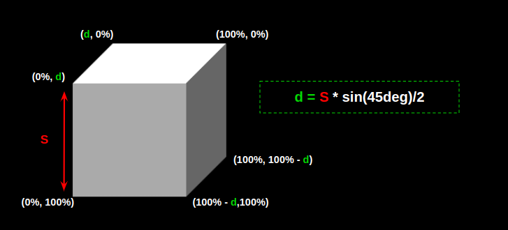
Start with the main .loader element: a 150px square set up as a flexible container.
.loader {
  --s: 150px; /* control the size */
  --_d: calc(0.353 * var(--s)); /* 0.353 = sin(45deg)/2 */

  width: calc(var(--s) + var(--_d));
  aspect-ratio: 1;
  display: flex;
}
Now establish the two pseudos, which serve as the two halves inside the container:
.loader::before,
.loader::after {
  content: "";
  flex: 1;
}
They need painting, which is the job of the conic gradient:
.loader::before,
.loader::after {
  content: "";
  flex: 1;
  background:
    conic-gradient(from -90deg at calc(100% - var(--_d)) var(--_d),
    #fff 135deg, #666 0 270deg, #aaa 0);
}
Unclipped, the gradient looks wrong. Clipping it to the element fixes that:
.loader::before,
.loader::after {
  content: "";
  flex: 1;
  background:
    conic-gradient(from -90deg at calc(100% - var(--_d)) var(--_d),
    #fff 135deg, #666 0 270deg, #aaa 0);
  clip-path:
    polygon(var(--_d) 0, 100% 0, 100% calc(100% - var(--_d)), calc(100% - var(--_d)) 100%, 0 100%, 0 var(--_d));
}
Then overlap the two halves with a negative margin:
.loader::before {
  margin-right: calc(var(--_d) / -2);
}

.loader::after {
  margin-left: calc(var(--_d) / -2);
}
With the cube assembled, animate the halves:
.loader::before,
.loader::after {
  /* same as before */
  animation: load 1.5s infinite cubic-bezier(0, .5, .5, 1.8) alternate;
}

.loader::after {
  /* same as before */
  animation-delay: -.75s
}

@keyframes load{
  0%, 40%   { transform: translateY(calc(var(--s) / -4)) }
  60%, 100% { transform: translateY(calc(var(--s) / 4)) }
}
A cube as a progress indicator
The same cube simulation powers a 3D progress loader, also built on a single element. The only structural change is the loader's height and aspect ratio. The animation updates the width of the left side while the right side absorbs the remaining space through flex-grow: 1.
First, make the right side translucent with opacity so one half of the cube reads as filled and the other as empty. Then update the left side's color, either by changing the three color stops inside the conic gradient or by adding a background color and a background-blend-mode.
.loader::before {
  background-color: #CC333F; /* control the color here */
  background-blend-mode: multiply;
}
The blend approach allows only one color update. The right side blends with the three white shades of the conic gradient, producing three new shades from a single color value.
Animating the left side's width is the next step, and starting at 0% looks wrong: the animation appears to begin outside the cube. Because of the clip-path and negative margin, the animation must start instead from the --_d variable used to define both the clip-path points and the negative margin.
@keyframes load {
  0%,
  5% {width: var(--_d); }
  95%,
  100% {width: 100%; }
}
One detail is still missing. A side-by-side screenshot of the intended result and the current state makes it visible:

It is the bottom face of the cube. The transparent second element means the bottom face of that rectangle must remain visible. The fix is a gradient on the main element, clipped the same way as the pseudos:
background: linear-gradient(#fff1 0 0) bottom / 100% var(--_d) no-repeat;The complete code, with everything assembled:
.loader {
  --s: 100px; /* control the size */
  --_d: calc(0.353*var(--s)); /* 0.353 = sin(45deg) / 2 */

  height: var(--s);
  aspect-ratio: 3;
  display: flex;
  background: linear-gradient(#fff1 0 0) bottom / 100% var(--_d) no-repeat;
  clip-path: polygon(var(--_d) 0, 100% 0, 100% calc(100% - var(--_d)), calc(100% - var(--_d)) 100%, 0 100%, 0 var(--_d));
}
.loader::before,
.loader::after {
  content: "";
  clip-path: inherit;
  background:
    conic-gradient(from -90deg at calc(100% - var(--_d)) var(--_d),
     #fff 135deg, #666 0 270deg, #aaa 0);
}
.loader::before {
  background-color: #CC333F; /* control the color here */
  background-blend-mode: multiply;
  margin-right: calc(var(--_d) / -2);
  animation: load 2.5s infinite linear;
}
.loader:after {
  flex: 1;
  margin-left: calc(var(--_d) / -2);
  opacity: 0.4;
}

@keyframes load {
  0%,
  5% { width: var(--_d); }
  95%,
  100% { width: 100%; }
}
Repeating cube patterns
Beyond two halves, a single element — no pseudo-elements at all — can simulate an infinite number of cubes in a grid. These demos were unsupported in Safari at the time of writing.
The math involves very specific numbers; a figure shows how the construction is derived rather than spelling each step out.
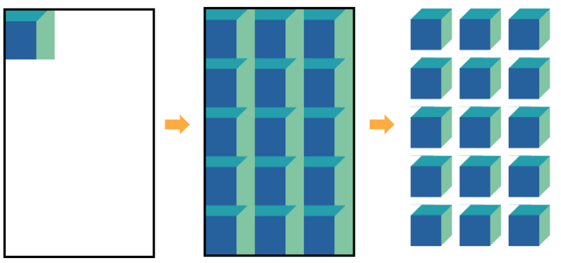
A conic-gradient creates the repeating cube pattern. Three variables govern the repetition:
--size— the size of each cube.--m— the number of columns.--n— the number of rows.--gap— the distance between cubes.
.cube {
  --size: 40px;
  --m: 4;
  --n: 5;
  --gap :10px;

  aspect-ratio: var(--m) / var(--n);
  width: calc(var(--m) * (1.353 * var(--size) + var(--gap)));
  background:
    conic-gradient(from -90deg at var(--size) calc(0.353 * var(--size)),
      #249FAB 135deg, #81C5A3 0 270deg, #26609D 0) /* update the colors here */
    0 0 / calc(100% / var(--m)) calc(100% / var(--n));
}
A mask layer, built from a pattern of the same size, handles the rest. This is the trickiest part: a linear-gradient and a conic-gradient together cut away parts of the element so only the cube shapes show.
.cube {
  /* etc. */
  mask:
    linear-gradient(to bottom right,
       #0000 calc(0.25 * var(--size)),
       #000 0 calc(100% - calc(0.25 * var(--size)) - 1.414 * var(--gap)),
       #0000 0),
    conic-gradient(from -90deg at right var(--gap) bottom var(--gap), #000 90deg, #0000 0);
  mask-size: calc(100% / var(--m)) calc(100% / var(--n));
  mask-composite: intersect;
}
The code looks complex, but CSS variables reduce control to a few edits. For a 10⨉10 grid, set --m and --n to 10. For wider spacing, change --gap. The color values are used once each, so a new color palette is a matter of updating them.
Sliding and blinking variations
With the pattern technique in place, animations produce variations. One loader slides a row of cubes endlessly from left to right.
Four cubes occupy a single row, so --n equals 4 and --m equals 1 — those variables are no longer needed. Instead, the grid container works with the --size and --gap variables:
.loader {
  --size: 70px;
  --gap: 15px;

  width: calc(3 * (1.353 * var(--size) + var(--gap)));
  display: grid;
  aspect-ratio: 3;
}
The container holds four cubes but shows only three at a time, so one always slides in as another slides out. The width is therefore calculated by a factor of 3, with the aspect ratio also set to 3.
The cube pattern must span four cubes wide, which happens on the container's ::before pseudo-element:
.loader::before {
  content: "";
  width: calc(4 * 100% / 3);
  /*
     Code to create four cubes
  */
}
Four cubes in a three-cube container can then be justified to the end of the grid container so it overflows and shows only the last three:
.loader {
  /* same as before */
  justify-content: end;
}
At this stage a red outline marks the bounds of the grid container. Moving the pseudo-element to the right with an animation completes the motion:
@keyframes load {
  to { transform: translate(calc(100% / 4)); }
}
The finishing touch hides the overflowing pattern and adds masking that fades the start and end edges:
.loader {
  --size: 70px;
  --gap: 15px;

  width: calc(3*(1.353*var(--s) + var(--g)));
  display: grid;
  justify-items: end;
  aspect-ratio: 3;
  overflow: hidden;
  mask: linear-gradient(90deg, #0000, #000 30px calc(100% - 30px), #0000);
}
Making the count flexible is straightforward: introduce a --n variable for how many cubes are displayed at once, and express the total number of cubes in the pattern as calc(var(--n) + 1) since it should be one more than --n.
A second variation changes the cubes' color in succession rather than sliding them. Here the driver is an animated background combined with background-blend-mode:
.loader {
  /* ... */
  background:
    linear-gradient(#ff1818 0 0) 0% / calc(100% / 3) 100% no-repeat,
    /* ... */;
  background-blend-mode: multiply;
  /* ... */
  animation: load steps(3) 1.5s infinite;
}
@keyframes load {
  to { background-position: 150%; }
}
This version keeps the same layout as the sliding example — three cubes instead of four — and adds a gradient of a specific color that blends with the conic gradient, the same approach used in the progress loader. Animating the background gradient's background-position with a three-step animation makes the cubes blink color one at a time.
Wiring the cube count into a variable for this version is left as an exercise: a solution exists, but working it out from the previous example is the point.



