

A Scale That Says Less Than It Should
Star ratings are meant to summarize a product’s quality at a glance, but in practice they often obscure more than they reveal. The glyphs have no universal meaning, so users import whatever interpretation they have built from years of encounters with the same five icons on different sites. A book rated three stars might mean “not my genre, though beautifully written” to one reviewer and “solidly average” to another. The same rating can carry opposite intentions, and without a written companion, there is no way to recover the intended message.
This is not a new complaint. Industry observers have long criticized the five-star model for its ambiguity, yet it remains the default for everything from novels to household goods. The odd consequence is that the scale’s lack of specificity is also its main advantage: it can be dropped onto any product category without adjustment. But that generality means it has not been optimized for any particular use case, and no company can realistically expect users to relearn the meaning of a familiar icon each time they land on a new site.
The result is a trail of small inconsistencies that accumulate into a noisy dataset. Scanning reviews on a platform like Goodreads, for instance, shows one-star reviews spanning from “did not finish” to active extortion attempts, two-star reviews covering everything from “this author lost me” to “fine, but nothing more,” and three-star reviews including books people would actively recommend to friends. When the only way to understand a rating is to read its accompanying review, the rating itself stops doing its job. And in practice, most users who rate never write that review: analysis of review activity across 100 popular books on Goodreads, split between modern bestsellers and classics, found that fewer than 5% of people assigning stars also wrote a review. The remaining 95% of ratings are, effectively, guesses.
Goodreads frames its own mission as helping readers “find and share books that they can fall in love with.” A scale that invites individualized, unreported interpretations makes that collaborative goal harder, because users cannot assume they and their peers are speaking the same language about the same books.
Even a Perfect Scale Would Miss the Point
Imagine, though, that every user of a social literature platform accepted a single, shared definition of one through five stars. Even then, a rating communicates nothing about what a reader specifically liked or disliked. A numeric score primarily functions as an eligibility filter — people can set a threshold above which they will consider a book — but the books above that threshold still need to be differentiated by something other than a number. On a site built around social reading, that differentiation is supposed to come from other people’s insights.
One counterargument is that recommendation algorithms can absorb everyone’s individual rating interpretations and derive meaning from them automatically. Setting aside questionable output from recommendation engines — such as a superhero novel leading to suggestions for a speech about compassion or a biography about The Who’s bassist — machine-based discovery has a real cost. Users may trust algorithms for more tasks these days, but delegating book discovery to software also gives people fewer reasons to talk to one another. For a platform whose purpose is social connection around literature, over-reliance on the algorithm is counterproductive. Human interaction is not incidental to the service; it is increasingly the point, especially in an era when remote work and isolation are commonplace. Research has consistently shown that social connection ranks closer to a basic need than a luxury, and any redesign of a review system should be undertaken with that in mind.
One Alternative: Structured Prompts Instead of a Five-Point Scale
The following design, sketched for a social literature app but adaptable elsewhere, rests on three principles: building trust, respecting time, and creating clarity. Rather than asking users to map their reaction onto a universal five-point scale, the system drives them through a series of lightweight, structured interactions.
Gate Reviews Behind a “Read” Shelving Action
Trust starts with a simple gate: users must shelve a book as “Read” before they can write a review.
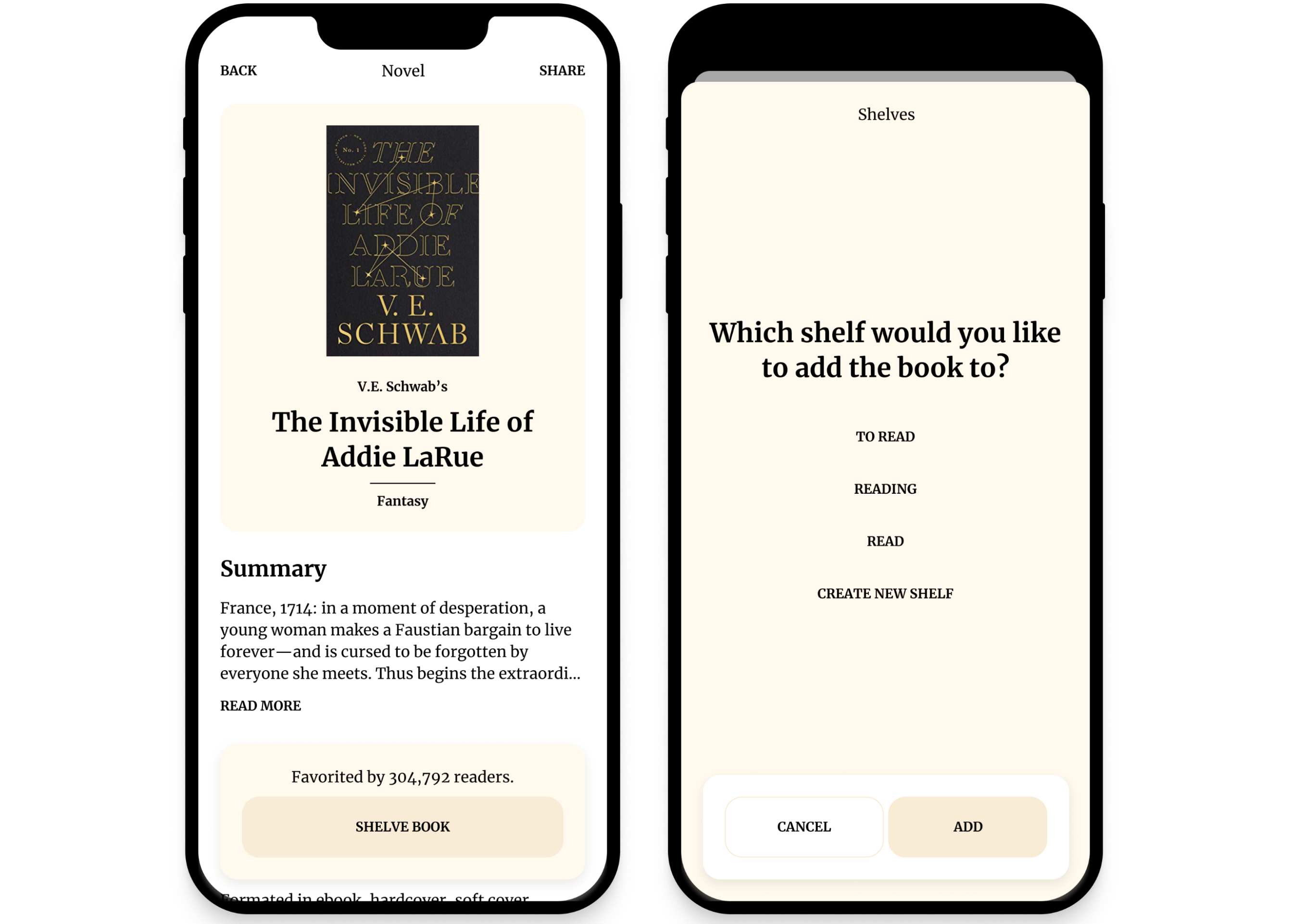
This does not make deception impossible, but it raises the cost of a dishonest review. A user who lies gains little on an app built for discovering and discussing literature; if their goal is to draw attention to a book, the subsequent conversation can expose them quickly.
Favorites and Qualities Replace Star Ambiguity
Once a book is shelved as “Read,” the user can mark it as a “Favorite.” This is a low-effort binary action that avoids the confusion of interpreting what another person meant by three stars versus four.
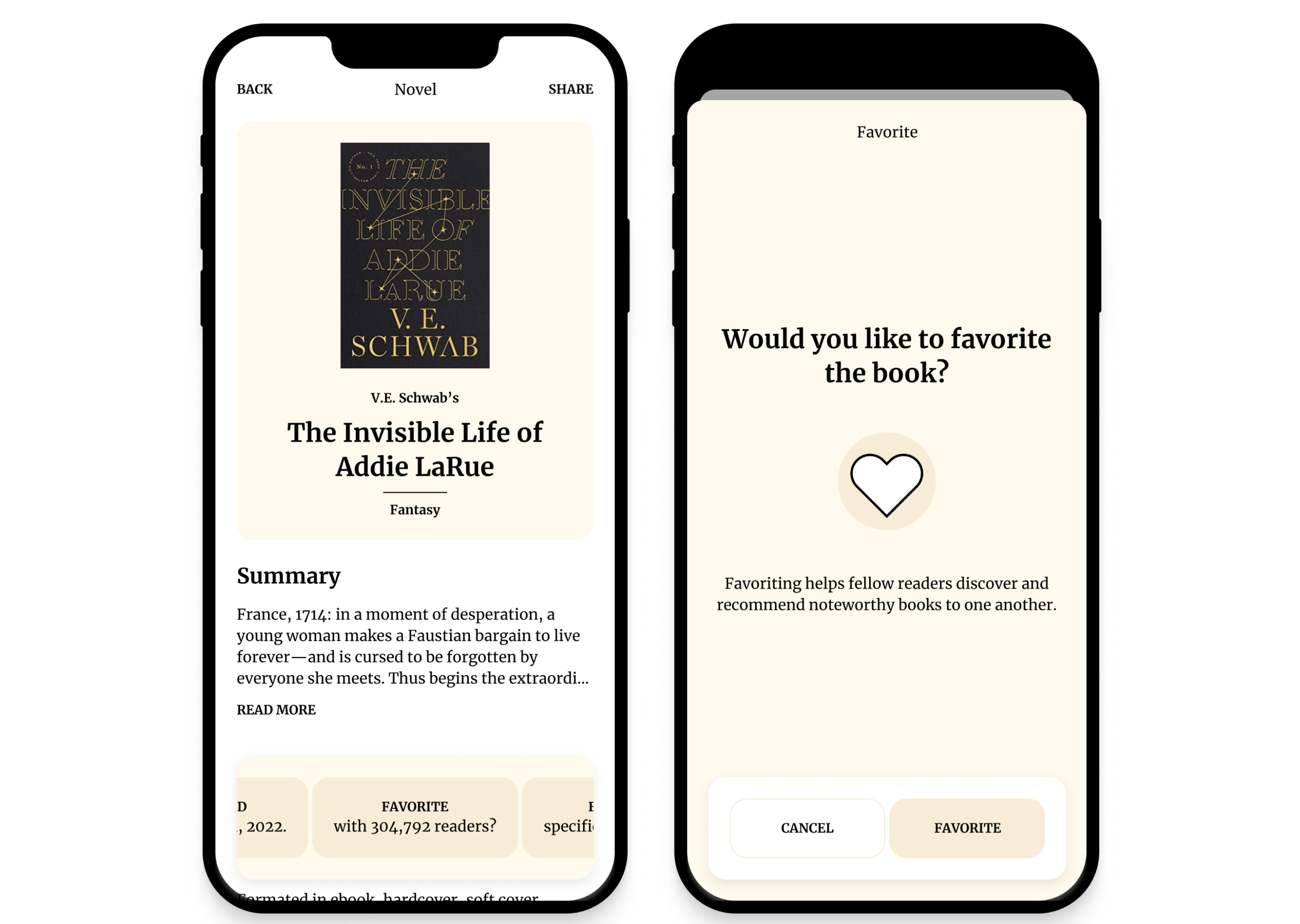
Not favoriting a book carries no negative connotation. The Favorite count simply highlights books that resonated with readers and can feed into ranking lists, inviting others to dig into the reasons behind the choice.
On the same shelving action, users are prompted to name what they enjoyed about the book.
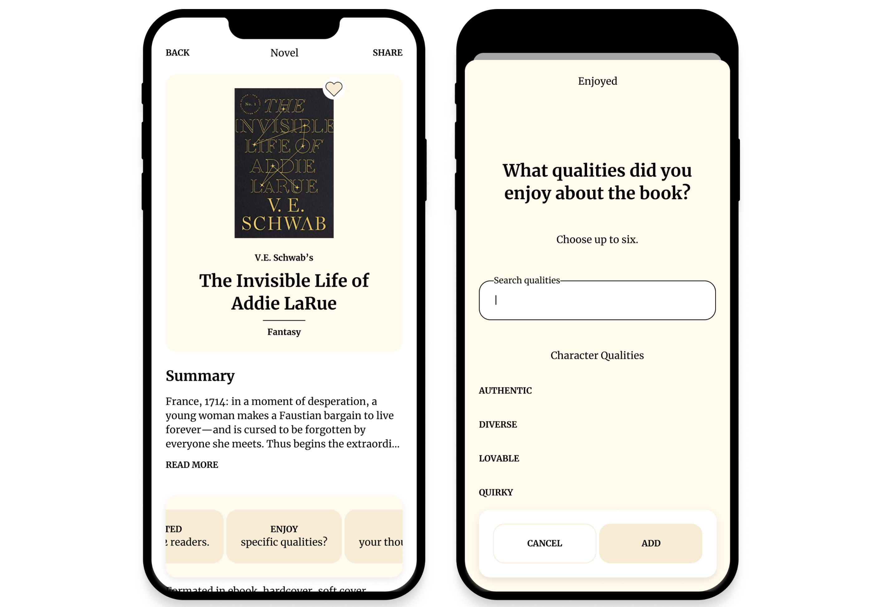
Instead of a blank field, the app offers a predetermined list of literary qualities — “Fast-paced plot,” “Lyrical language,” “Quirky characters,” and many more.
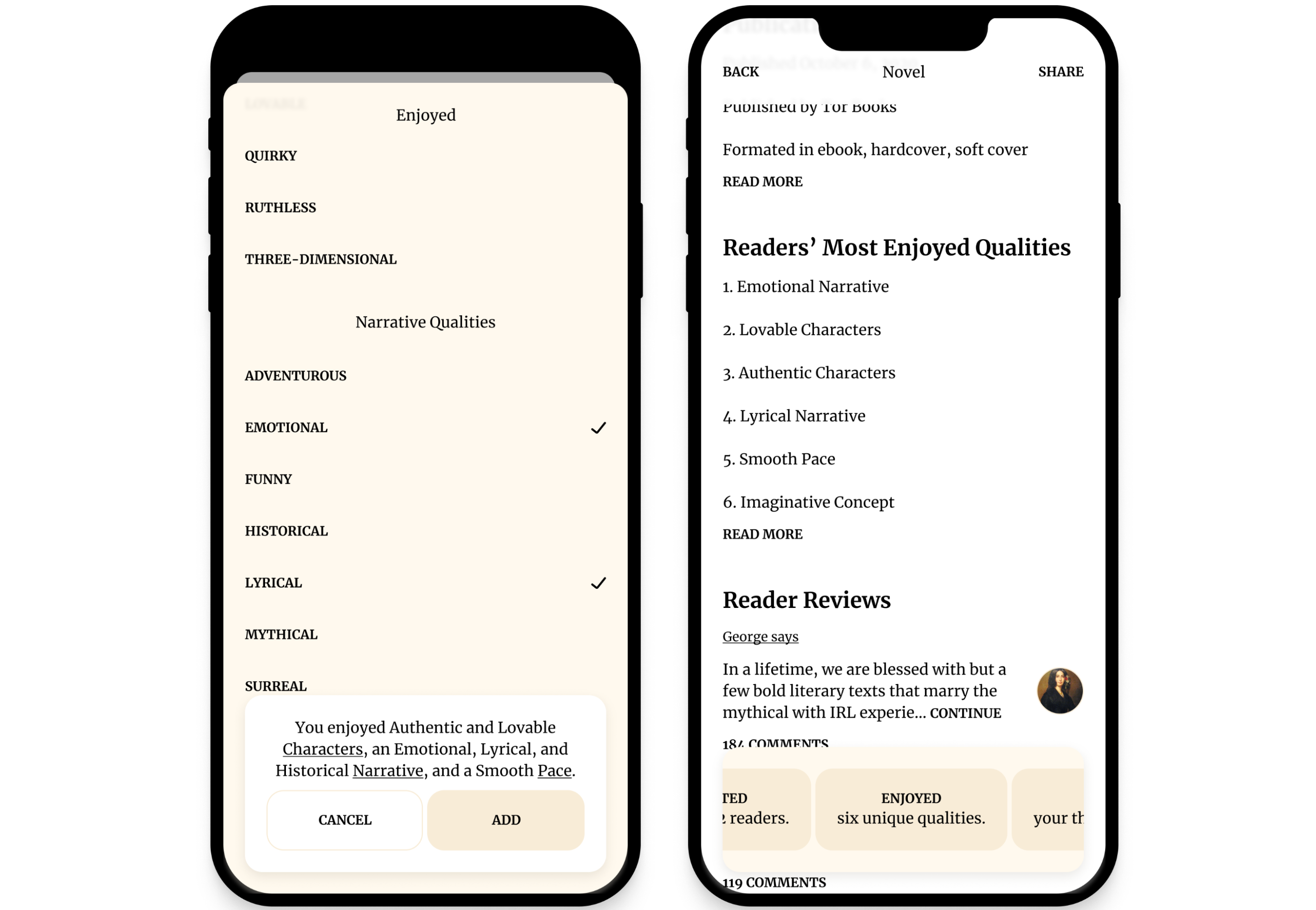
Each selection adds to the aggregate traits shown on the book’s page, ranked by how often other readers chose them. This gives a prospective reader a concrete sense of what the book offers. Limiting the number of selectable qualities forces genuine reflection and prevents the list from being noise. A parallel “Wished” list could capture what readers felt was missing, following the same structure to inform someone’s reading decision.
Guided Written Reviews Capture the “Why”
Structured input alone cannot capture a reader’s full experience. Written reviews still matter — but the barrier is real. Fewer than 5% of Goodreads raters write reviews, partly because constructive criticism is a learned skill and partly because writing well takes time. Prompting users along the way lowers that barrier.
Rather than presenting an empty text box, the app offers dynamic prompts based on earlier choices. If the user favorited the book, the prompt might ask why. If they selected “Well-developed characters,” it might ask how the author achieved that. The prompt can even suggest browsing other reviews for inspiration.
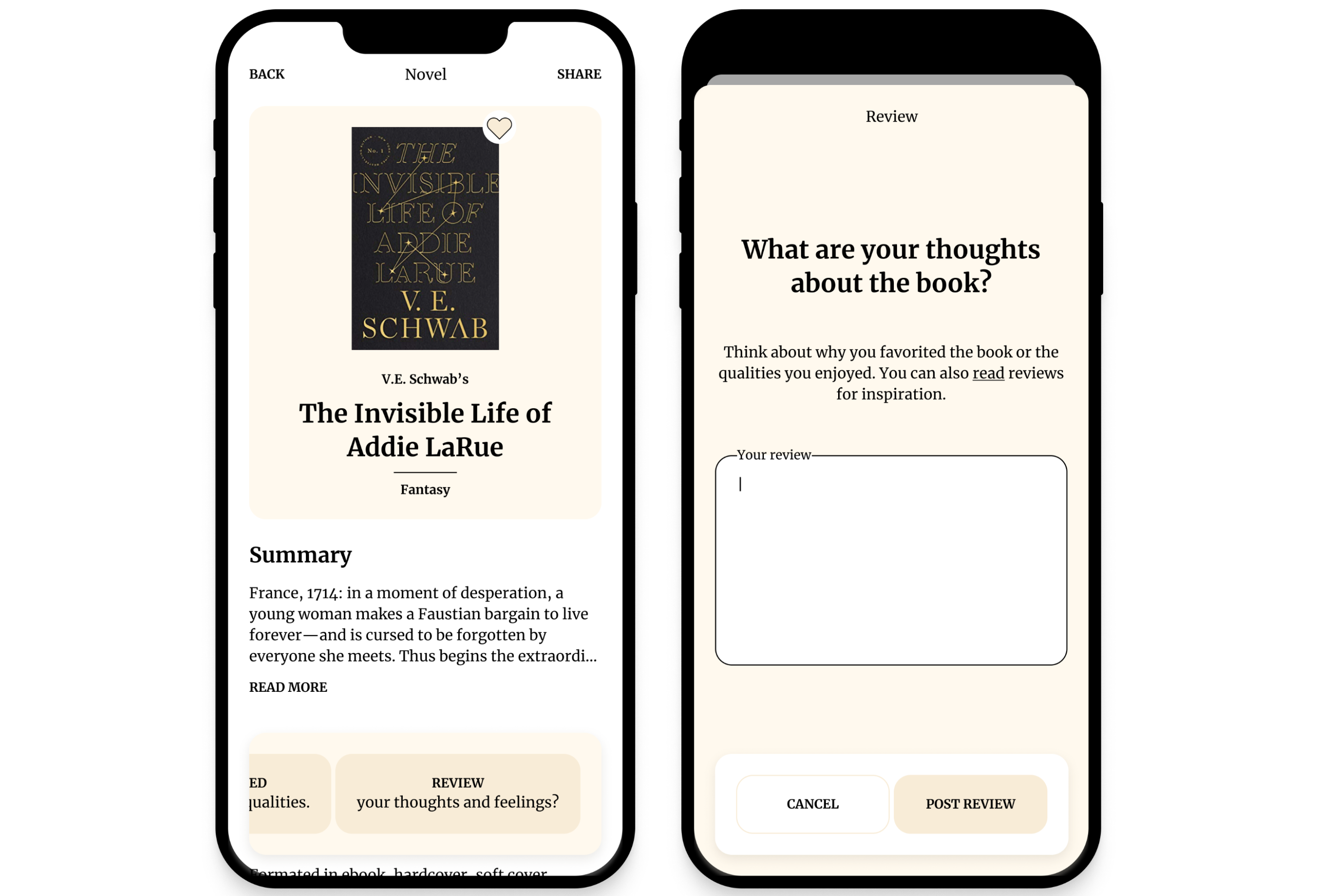
Dynamic prompting matters most for difficult books. For The Diary of a Young Girl, only 1% of Goodreads raters left a review; commenting on pacing feels dissonant for a work rooted in historical tragedy. Yet avoiding conversation about hard literature misses an opportunity — discussing art can reduce prejudice and build empathy. For such books, prompts might ask what a passage meant to the reader, how the book made them feel, or invite close reading of a significant section.
Any of these features only work with regular community use. Commenting is the backbone of that, but “Like” buttons undercut it: bots farm them for attention, users chase them for validation, and people reach for a one-click reaction instead of words. The platform should protect its comment section from those dynamics, as even a former Twitter CEO acknowledged the Like button compromises dialogue.
Practical Steps for Today’s Reviewer
Platforms change slowly, and individuals can adopt a more considerate review process without waiting for an interface redesign.
- Leave a star rating. Algorithms and readers both use these; skipping it means fewer people will find the book.
- Write a short review. Focus on elements that communicate your experience:
- State why you gave the rating you did.
- List a few qualities you enjoyed, ideally with one sentence of context for each.
- Reference a passage that mattered to you.
- Flag spoilers explicitly.
- Link to other reviews that capture your perspective well.
- Share the review. Doing so helps others discover literature and sets an example that encourages them to write as well.
The same process applies to other products. The goal is to replace an ambiguous symbol with a small amount of context — enough to turn an isolated judgment into a shared understanding.


