
Web Fonts and Layout Stability
Web fonts are a core part of branding and user experience, but they come with a tradeoff. While a page loads, the browser is still fetching the font file, and that can produce a brief moment where text is either invisible or rendered with the wrong typeface. These flashes of invisible text (FOIT) and unstyled text (FOUT) are caused by the font not being available at render time.

The font-display CSS property is the primary tool for controlling this behavior. It accepts five values: block, swap, fallback, optional, and auto.
For visual consistency above all, block keeps text invisible for a short period. If the custom font hasn't loaded within that window, a fallback font appears until the custom font becomes available.

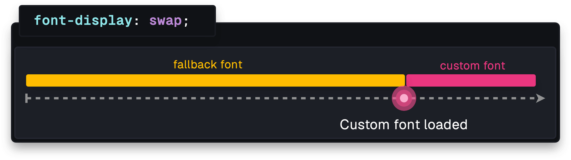
To show content as quickly as possible, swap renders the fallback font immediately and switches to the custom font once it finishes loading.
fallback sits between the two. It briefly renders invisible text before using the fallback font. If the web font still isn't loaded after three seconds, the fallback stays in place, even if the custom font loads later. On subsequent navigations, the custom font is used.

With optional, the browser decides whether to use the web font at all, based on factors such as network conditions. If the font is cached and can load within 100 ms, it will be displayed. Otherwise, the fallback remains in use.

auto leaves the choice to the browser, which typically defaults to swap.
Matching the Fallback to the Web Font
Choosing a fallback is only half the battle. If the fallback and the web font have different metrics, you can still see layout shift even when the font-size is identical. Fonts take up varying amounts of horizontal and vertical space, and that difference is what causes text and surrounding elements to move when the font swap occurs.

One way to mitigate this is with the size-adjust @font-face descriptor. It scales all metrics of a font by a specified percentage. Adjusting it so the fallback's text size nearly matches the web font keeps the layout stable before and after the swap.

For finer-grained control, CSS also provides ascent-override, descent-override, and line-gap-override to define those specific metrics precisely.
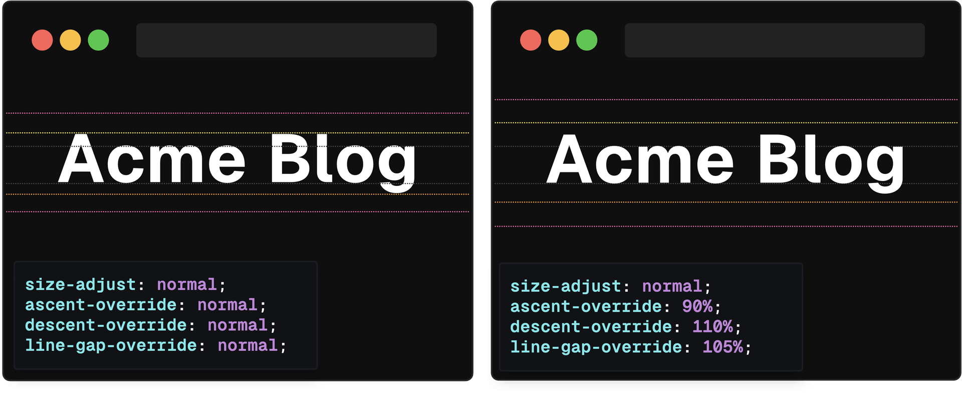
A carefully chosen fallback, combined with these overrides, minimizes the layout shift users experience when the real web font loads.
Speeding Up Font Delivery
Browsers can also be guided to fetch fonts more efficiently. The preconnect resource hint tells the browser to establish a connection to the font server as soon as the page begins loading, reducing the latency involved in that request.

The preload hint goes further, instructing the browser to start fetching the font file early in the loading process. This often happens before rendering begins, which prevents late font swaps and the layout issues that come with them.

Automated Optimization with next/font
Manually handling preconnect and @font-face descriptors works, but it is fiddly and easy to get wrong. For Next.js applications, the next/font module handles these optimizations automatically for both local and Google fonts.
At build time, the module downloads the font stylesheet and all font files so they are served locally, eliminating the need for external requests. This has several effects that remove most manual font-work:
- Fonts are downloaded at build time and served from the local site.
- A fallback font that closely resembles the web font is added for you.
- Fonts are preloaded automatically.
The module also calculates all necessary measurements, including size-adjust, ascent-override, descent-override, and line-gap-override, at build time. When a subset is defined, the font is preloaded, so it is downloaded as early as possible.
The result is a version of web font handling where users rarely encounter layout shift, and no extra work is expected from the developer.


