
Pitching with purpose: content first
Abigail Africa, a student at USC’s Iovine & Young Academy and one of Figma’s inaugural Student Fellows, has spent her college career presenting to a wide range of audiences—toy designers, vehicle inventors, and entertainment executives. Her core lesson from those experiences: what you say matters more than how you say it. Visuals and delivery are tools, but they serve the story you’re telling.
Before drafting any presentation, Africa runs through a quick audience inventory. Trust is the foundation of persuasion, and audiences need to see that you understand their context before they’ll shift how they think, feel, or act. She prepares by asking: What do they care about? Why are they listening? What do they have to gain? And how do they communicate—is there industry-specific language to incorporate?
Once she knows the audience, Africa builds her talk around a narrative arc: establish empathy, articulate a problem, then present the solution. To frame the problem statement, her design strategy professor recommends completing a specific sentence: "A [stakeholder] who feels [feeling] about [a task] needs to [act] but [faces an obstacle]." This phrasing ensures the problem is concrete and audience-centric. When introducing the solution, she reinforces how it resolves the stated problem, often recycling language or recalling earlier characters and examples for cohesion. She closes with a clear call-to-action—whether that’s approving the project, funding the work, offering mentorship, or simply changing how the audience thinks.
Delivery tactics that land
Word choice only goes so far. Tone, demeanor, and physical presence transform slides into a persuasive pitch. Africa discovered through recording herself that her natural vocal inflection is flatter than most, even when she’s genuinely excited. To compensate in-person, she energizes herself beforehand—coffee, posture-improving shoes, a quick limb shake-out—and uses gesture, movement, and forward leans to punctuate key moments.
Audiences mirror emotion, so visible enthusiasm is contagious. But Africa also watches for real-time feedback. If listeners seem to zone out, she changes tactics: moving around the room, speaking louder, or making direct eye contact with a few individuals.
Remote presentations introduce their own constraints. Technical hiccups are one issue, but the bigger problem is that typical intonation and gestures often don’t translate on video calls, and the audience’s immediate emotional feedback is muffled—especially when cameras are off. Africa recommends a simple calibration exercise: record yourself reading aloud for five minutes and listen back to hear what the audience actually perceives. For Zoom specifically, she adapts with a few practical moves:
- Stand while presenting (stacking books under your computer works)
- Pin your own video and watch your performance to stay animated
- Place sticky notes on your screen reminding you to smile and raise your eyebrows
Repetition, motifs, and comfort
Reinforcement is another key tool. Africa’s father, a sales professional, repeats crucial points three times. In presentations, she pairs that verbal repetition with visual motifs—subtle variations on a repeated diagram, recurring images, or repeated on-screen words—to make the message cohesive and memorable.
She also dresses for movement. Clothing should be flexible enough to permit natural gestures without worry. Wearing a go-to outfit that makes you feel confident and stand taller helps, as long as you can stay comfortable in it.
Africa notes that storytelling is not an innate gift reserved for dinner parties—it’s a learnable professional skill. Refining what you say, how you deliver it, and the visuals you craft to support it all improve with practice, and those pieces are most effective when aligned around a single narrative purpose.
Slides as reinforcement, not replacement

Your slides exist to support the words you say, not to carry them. The most effective visuals illustrate an argument, anchor attention, or provide evidence for the points in your talk track. Building decks in Figma is efficient because components, set colors, and styles let you replicate design elements across slides instantly — a particular advantage when collaborating with others on the same deck.
Keep it simple
The guiding principle here is visual economy: useful simplicity that removes anything distracting from the essential message. Your slides don't need to be artistic or complex to be effective. When a recent presentation on writing required a dense talk track, the accompanying slide was deliberately plain and relevant.

Simple doesn't necessarily mean few. If a slide contains more than two separate pieces of information, it's usually worth decluttering — even if that means splitting it into multiple slides. A recent six-minute presentation used 54 slides to keep each one focused.
Some reliable slide-making rules:
- Align related information laterally rather than stacking it as bullet points.
- Use one-word or wordless slides to drive home a key point, a technique popularized by TED talks.
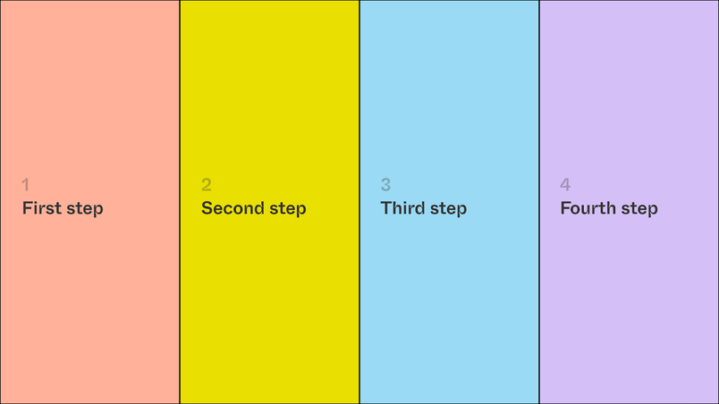

Alignment and spacing matter
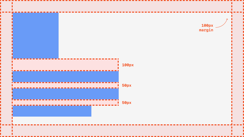
Careful alignment and spacing make slides significantly easier to read and understand. Repeated elements like page numbers or subtitles must sit in the exact same position on every slide — a few pixels of drift distracts the audience and makes the presentation feel unfinished. One way to enforce consistency is building a slide template with a rectangular clipping mask that crops margins automatically, keeping all content in bounds.
Typography basics
Strong typography is often what separates a polished deck from a merely adequate one. A few fundamentals:
- Readability comes before character. A distinctive typeface adds personality, but accessibility checks should come before final type decisions.
- Free web fonts can elevate a deck from generic to refined. An classic trick is pairing two typefaces — Typewolf is a helpful resource for finding good pairs.
- For deeper study, free type courses and Medium publications cover the field comprehensively.
- Inter, by Rasmus Andersson, is an excellent free sans-serif already built into Figma and Google Docs via OpenType.
- Figma's Marcin Wichary wrote a detailed ode to OpenType covering ligatures, alternative letterforms, and digit styling — a worthwhile starting point for exploring font features.
Designing for accessibility
Accessibility in presentation design is well documented. Practical starting points:
- In classrooms, increase text contrast and underexpose images.
- Sunny rooms wash out projections and add glare to LED displays; what looked like strong contrast in a dark room will look gray and diluted in daylight.
- For large rooms where screens are hard to see, share a link to the deck at the start so attendees can follow on their own devices.
Virtual presentations offer more flexibility because viewers can adjust their own experience and read from a close distance. Still, always confirm at the start that everyone can hear and see properly.
Choosing imagery wisely
Photography, illustrations, icons, and videos help tell a story, but each piece must contribute to the narrative. Icons are a common trap — they work in UI, but nobody clicks anything in a pitch deck. Imagery should add meaning, not decoration.
Free-use photography is plentiful (Unsplash has a Figma plugin), but always credit sources through captions, links, or a dedicated citation slide at the end. Edgier imagery like memes or pop culture references can work with the right audience, but relevance matters more than risk-taking; don't alienate listeners for the sake of a joke.
Color and data
Accent colors, used sparingly, add polish. You can highlight specific words or data points, or use color more subtly: background colors that shift gradually across a presentation can track an evolving concept; distinct accent or background colors help separate topics. While some decks call for vibrant, full-color palettes, color should never interfere with readability.
For data, prioritize figures you can represent visually — growth over time works well. Context matters more than raw statistics, and data journalism from outlets like The Pudding, Our World in Data, and The New York Times offers strong models for clear, story-driven data presentation.
Developing your voice as a storyteller
Storytelling is a skill that improves with deliberate practice. Building it into everyday life doesn't require formal presentations. Three habits make a significant difference:
Practice in ordinary conversation
- Treat every conversation as a pitch of some idea and pay attention to which storytelling structures work.
- Watch your conversational partner's reactions closely — over time, you'll learn to read your audience and adapt your approach.
- Choose your words with precision, even when it means pausing mid-sentence to find the right phrase.
Consume great storytelling regularly
Podcasts like The Memory Palace and Modern Love showcase intimate narrative pacing, while publications like The Atlantic and The New York Times model how to distill complex ideas into clear prose. Learning from professional storytellers refines your own pacing, intonation, and structure.
Maintain a library of excellence
Collect standout sentences and phrases in a dedicated document for inspiration when you're stuck. Do the same for visual communication: save screenshots of exceptional slides and templates, like the decks from Yuhki Yamashita, VP of Product at Figma.
Becoming a better storyteller isn't just about technique; it's about finding a style that feels authentic. With practice, you'll develop a voice that works for you — and that's what audiences respond to most.


