
Where mailto: and tel: links break down
mailto: links usually behave predictably when a default mail client is configured; right-clicking also exposes a browser option to copy the address. Adam Silver and Amy Hupe recently catalogued the failure modes that make the pattern less reliable than it looks:
Firstly, mailto links make it hard to copy the address, for example if you want to share the email address with someone else.
Secondly, some users use more than one mail app, and the link just uses whichever has been setup as the default, without giving them the option to use the other.
And finally, many users don’t have an email application set up, which means the link can take them to a dead end or down a rabbit hole.
Their UI work settled on a mailto: link whose visible text is the full email address, making the destination obvious, paired with a Copy button for convenience.

Why tel: is harder
tel: links are stranger still: many devices that render them have no calling capability at all. Where calling exists, the same ambiguity as email applies—several apps (WhatsApp, FaceTime, the default phone app) may be able to handle the action.
Giving users a choice
The core UX difficulty is letting people decide what a special link type should do. mailgo is a small JavaScript library aimed at exactly that, presenting UI when such a link is clicked.

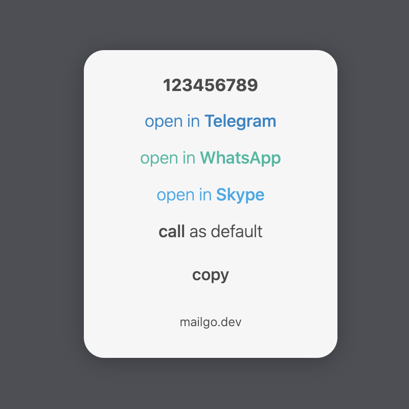
The interface includes an “open default” option for users who simply want the link to behave the way it always has, which covers the problems these link types tend to create.



