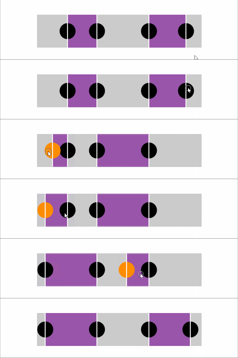
Two thumbs, one wrapper
The idea of a multi-range slider traces back to an article by Lea Verou, though multi-range sliders have since been dropped from the spec. This build covers the two-thumb case: both thumbs can pass each other into any order, and the fill between them adjusts accordingly, with only a small amount of JavaScript involved.
Structure and markup
The component is two range inputs inside a wrapper. Both inputs must share the same minimum and maximum — otherwise nothing works correctly. Those bounds live as custom properties on the wrapper (--min and --max), as do the current values (--a and --b).
- let min = -50, max = 50
- let a = -30, b = 20;

.wrap(style=`--a: ${a}; --b: ${b}; --min: ${min}; --max: ${max}`)
  input#a(type='range' min=min value=a max=max)
  input#b(type='range' min=min value=b max=max)
That produces the following markup:
<div class='wrap' style='--a: -30; --b: 20; --min: -50; --max: 50'>
  <input id='a' type='range' min='-50' value='-30' max='50'/>
  <input id='b' type='range' min='-50' value='20' max='50'/>
</div>
Accessibility without a fieldset
Two range inputs would normally each need a <label>, but the slider as a whole needs only one label. One option is making the wrapper a <fieldset>, describing the whole control with its <legend>, and giving each input a screen-reader-only <label>.
A flex or grid layout on the wrapper is usually desirable — the alternative is absolute positioning with its own problems — but Chromium has an issue where <fieldset> cannot act as a flex or grid container. The workaround is the equivalent ARIA pattern:
- let min = -50, max = 50
- let a = -30, b = 20;

.wrap(role='group' aria-labelledby='multi-lbl' style=`--a: ${a}; --b: ${b}; --min: ${min}; --max: ${max}`)
  #multi-lbl Multi thumb slider:
  label.sr-only(for='a') Value A:
  input#a(type='range' min=min value=a max=max)
  label.sr-only(for='b') Value B:
  input#b(type='range' min=min value=b max=max)
The generated markup becomes:
<div class='wrap' role='group' aria-labelledby='multi-lbl' style='--a: -30; --b: 20; --min: -50; --max: 50'>
  <div id='multi-lbl'>Multi thumb slider:</div>
  <label class='sr-only' for='a'>Value A:</label>
  <input id='a' type='range' min='-50' value='-30' max='50'/>
  <label class='sr-only' for='b'>Value B:</label>
  <input id='b' type='range' min='-50' value='20' max='50'/>
</div>
An element carrying an aria-label or aria-labelledby attribute also needs a role.
Laying out and styling the inputs
The wrapper is a middle-aligned grid with one column and two rows. The bottom cell takes the slider's dimensions; the top row matches the slider's width but sizes its height to the group label's content.
$w: 20em;
$h: 1em;

.wrap {
  display: grid;
  grid-template-rows: max-content $h;
  margin: 1em auto;
  width: $w;
}
The <label> elements are hidden by absolutely positioning them and clipping them to nothing:
.wrap {
  // same as before
  overflow: hidden; // in case <label> elements overflow
  position: relative;
}

.sr-only {
  position: absolute;
  clip-path: inset(50%);
}
Using clip-path here drops pre-Chromium Edge and Internet Explorer, but that is acceptable — for the reason explained below.
Both sliders sit in the bottom grid cell, stacked:
input[type='range'] {
  grid-column: 1;
  grid-row: 2;
}
Even at this stage a problem is visible: the top slider's track renders above the bottom slider's thumb, and the top input swallows mouse and touch interaction meant for the bottom one.
The fix is to strip track backgrounds and borders, paint the track area via a background on the wrapper instead, set pointer-events: none on the <input> elements, and restore auto on their thumbs.
@mixin track() {
  background: none; /* get rid of Firefox track background */
  height: 100%;
  width: 100%;
}

@mixin thumb() {
  background: currentcolor;
  border: none; /* get rid of Firefox thumb border */
  border-radius: 0; /* get rid of Firefox corner rounding */
  pointer-events: auto; /* catch clicks */
  width: $h; height: $h;
}

.wrap {
  /* same as before */
  background: /* emulate track with wrapper background */
    linear-gradient(0deg, #ccc $h, transparent 0);
}

input[type='range'] {
  &::-webkit-slider-runnable-track,
  &::-webkit-slider-thumb, & { -webkit-appearance: none; }

  /* same as before */
  background: none; /* get rid of white Chrome background */
  color: #000;
  font: inherit; /* fix too small font-size in both Chrome & Firefox */
  margin: 0;
  pointer-events: none; /* let clicks pass through */

  &::-webkit-slider-runnable-track { @include track; }
  &::-moz-range-track { @include track; }

  &::-webkit-slider-thumb { @include thumb; }
  &::-moz-range-thumb { @include thumb; }
}
Additional styles on the input, track and thumb keep the look consistent across browsers that allow clicks to pass through the input and track while keeping them on the thumbs. Since pre-Chromium Edge and IE are excluded by that behavior, no -ms- prefix is included — styling something non-functional in those browsers serves no purpose — which is also why clip-path is safe for hiding the labels.
Keeping values in sync
The script only has to update the wrapper's custom properties. In real use they would be set higher in the DOM so that any other element whose styles depend on them inherits them.
addEventListener('input', e => {
  let _t = e.target;
  _t.parentNode.style.setProperty(`--${_t.id}`, +_t.value)
}, false);
Without DevTools open, nothing visibly changes, so each input gets its own output element:
- let min = -50, max = 50
- let a = -30, b = 20;

.wrap(role='group' aria-labelledby='multi-lbl' style=`--a: ${a}; --b: ${b}; --min: ${min}; --max: ${max}`)
  #multi-lbl Multi thumb slider:
  label.sr-only(for='a') Value A:
  input#a(type='range' min=min value=a max=max)
  output(for='a' style='--c: var(--a)')
  label.sr-only(for='b') Value B:
  input#b(type='range' min=min value=b max=max)
  output(for='b' style='--c: var(--b)')
Resulting HTML:
<div class='wrap' role='group' aria-labelledby='multi-lbl' style='--a: -30; --b: 20; --min: -50; --max: 50'>
  <div id='multi-lbl'>Multi thumb slider:</div>
  <label class='sr-only' for='a'>Value A:</label>
  <input id='a' type='range' min='-50' value='-30' max='50'/>
  <output for='a' style='--c: var(--a)'></output>
  <label class='sr-only' for='b'>Value B:</label>
  <input id='b' type='range' min='-50' value='20' max='50'/>
  <output for='b' style='--c: var(--b)'></output>
</div>
A counter trick renders the values in an ::after pseudo-element:
output {
  &::after {
    counter-reset: c var(--c);
    content: counter(c);
  }
}
The values now visibly track the drag, but the output is ugly and knocks the wrapper's background out of alignment. Squeezing the <output> elements into a row between the group label and the sliders fixes it — absolute positioning would be another option.
.wrap {
  // same as before
  grid-template: repeat(2, max-content) #{$h}/ 1fr 1fr;
}

[id='multi-lbl'] { grid-column: 1/ span 2 }

input[type='range'] {
  // same as before
  grid-column: 1/ span 2;
  grid-row: 3;
}

output {
  grid-row: 2;

  &:last-child { text-align: right; }

  &::after {
    content: '--' attr(for) ': ' counter(c) ';'
    counter-reset: c var(--c);
  }
}
Distinct :focus styles show which value is currently being edited:
input[type='range'] {
  /* same as before */
  z-index: 1;

  &:focus {
    z-index: 2;
    outline: dotted 1px currentcolor;

    &, & + output { color: darkorange }
  }
}
Drawing the fill
An ::after pseudo-element on the wrapper, placed in the bottom grid row alongside the inputs, draws the fill. It comes after the inputs in the source, but positive z-index values keep them on top; this works without changing their position because they are grid children.
The pseudo-element's width must reflect the difference between the larger and smaller input value — but the thumbs cross, so there is no way to know which is larger.
First attempt: width plus min-width
The initial idea pairs width with min-width to yield the absolute difference of two percentage values --a and --b. Set width to --b minus --a and min-width to --a minus --b:
<div style='--a: 30%; --b: 50%'><!-- first example, --b is bigger --></div>
<div style='--a: 60%; --b: 10%'><!-- second example, --a is bigger --></div>
div {
background: #f90;
height: 4em;
min-width: calc(var(--a) - var(--b));
width: calc(var(--b) - var(--a));
}When --b is larger, width is positive (valid) and min-width is negative (invalid), so the computed value comes from width: with --b at 70% and --a at 50%, width computes to 70% - 50% = 20% and min-width to 50% - 70% = -20%. When --a is larger, the roles reverse: with --a at 80% and --b at 30%, width computes to 30% - 80% = -50% and min-width to 80% - 30% = 50%, so min-width wins.
Expressed as percentages for the slider, each difference is divided by --dif (the maximum minus the minimum) and multiplied by 100%:
.wrap {
  /* same as before */
  --dif: calc(var(--max) - var(--min));

  &::after {
    content: '';
    background: #95a;
    grid-column: 1/ span 2;
    grid-row: 3;
    min-width: calc((var(--a) - var(--b))/var(--dif)*100%);
    width: calc((var(--b) - var(--a))/var(--dif)*100%);
  }
}
The ::after now always gets the right computed width, but it also has to be offset from the track's minimum by the smaller value, and the same trick doesn't extend to margin-left — there is no min-margin-left. Using left would require explicitly setting position: relative on the pseudo-element, which felt unappealing. The min() function in the CSS spec would help, but at the time of writing it was implemented only by Safari, and Safari-only support was untestable on the available hardware.
Second attempt: one pseudo-element per ordering
Both wrapper pseudo-elements are used instead. One gets its margin-left and width set as if --b were larger; the other as if --a were larger. If --b is larger, the ::before width is positive while the ::after one is negative — invalid, so it falls back to 0 and is hidden. If --a is larger, the opposite happens.
The ::before margin-left comes from --a, since that pseudo-element assumes --b is the larger value and --a therefore marks the left end. On ::after, margin-left comes from --b, since --a is assumed larger and --b marks the left end.
<div style='--a: 30%; --b: 50%'></div>
<div style='--a: 60%; --b: 10%'></div>
div {
&::before, &::after {
content: '';
height: 5em;
}
&::before {
margin-left: var(--a);
width: calc(var(--b) - var(--a));
}
&::after {
margin-left: var(--b);
width: calc(var(--a) - var(--b));
}
}Applied to the slider:
.wrap {
  /* same as before */
  --dif: calc(var(--max) - var(--min));

  &::before, &::after {
    grid-column: 1/ span 2;
    grid-row: 3;
    height: 100%;
    background: #95a;
    content: ''
  }

  &::before {
    margin-left: calc((var(--a) - var(--min))/var(--dif)*100%);
    width: calc((var(--b) - var(--a))/var(--dif)*100%)
  }

  &::after {
    margin-left: calc((var(--b) - var(--min))/var(--dif)*100%);
    width: calc((var(--a) - var(--b))/var(--dif)*100%)
  }
}
Correcting the fill edges
The margin-left and width values aren't quite right, though the demo's thumb styling — its shape, its dimensions relative to the track, and full opacity — hides the error. Give the thumb a round, smaller-than-track form and it shows: the fill's endlines don't line up with the thumbs' vertical midlines.
The cause is how the thumb travels. In Chrome, the thumb's border-box moves within the track's content-box; in Firefox, within the slider's content-box. Chrome also always derives the track's width from the parent slider, ignoring any width set on the track itself — not so in Firefox, where the track can be wider or narrower than its parent <input>, making it even clearer that the thumb's range of motion depends solely on the slider width there.
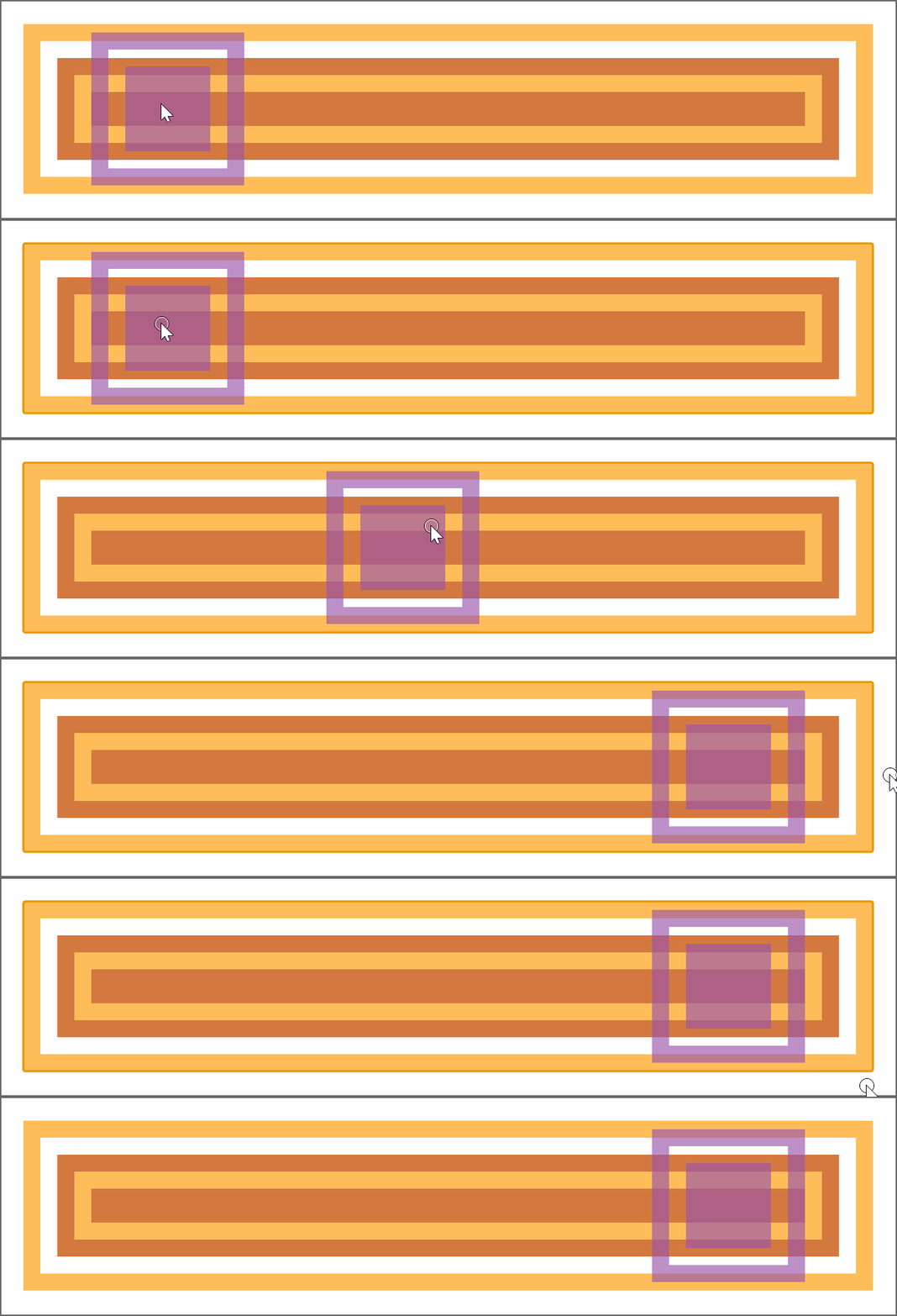
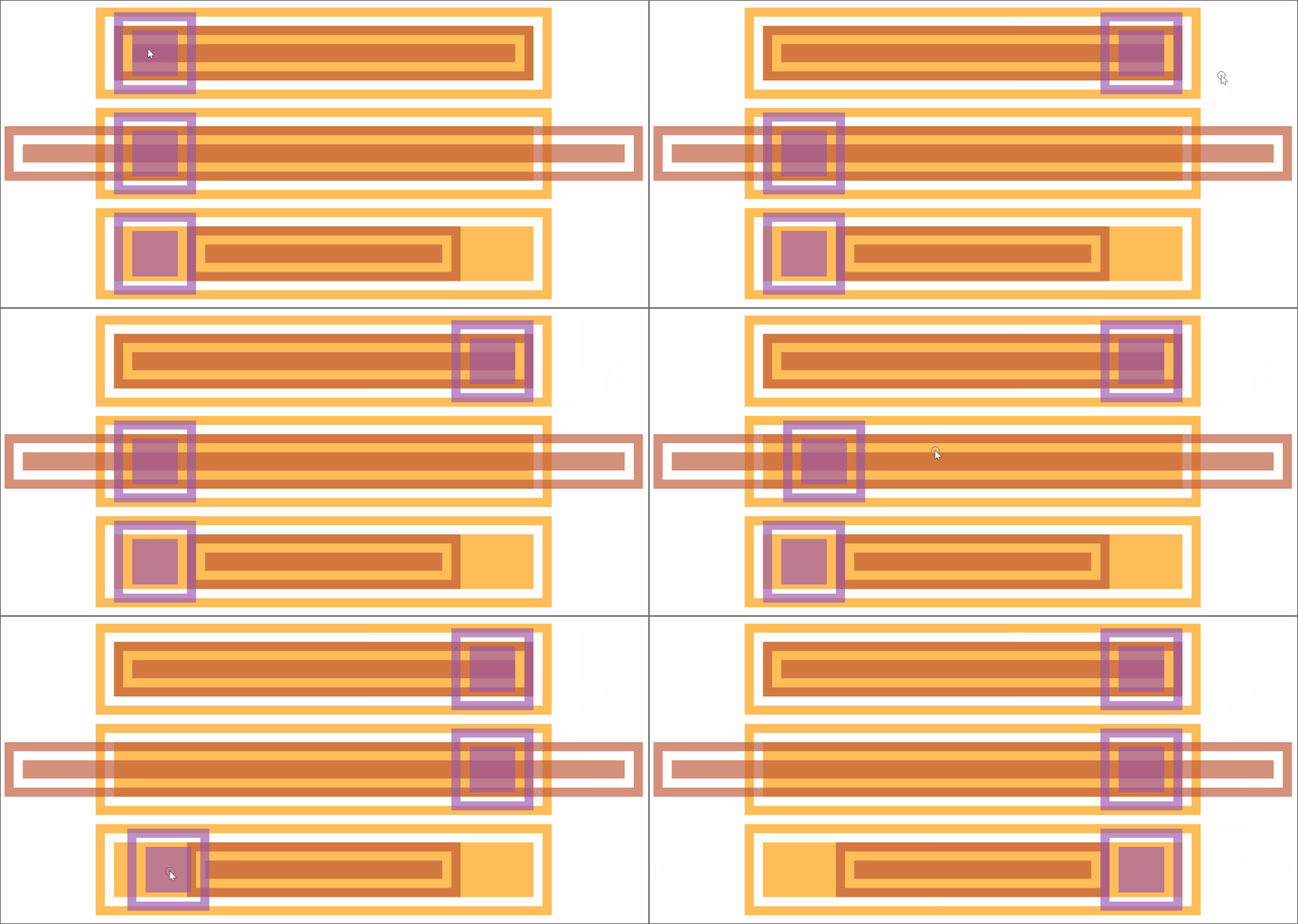
border-box of the track perfectly fits the content-box of the slider horizontally. It’s longer and it’s shorter).For this case, dropping any margin, border and padding on the track makes its content-box coincide with the input's, removing the cross-browser inconsistency.
What remains: the thumbs' vertical midlines travel from half a thumb width (a radius, for a circular thumb) past the track start to half a thumb width before the track end — an interval equal to the track width minus the thumb width, or the thumb diameter when circular. The fill's width and margin-left must therefore be relative to the track width minus the thumb width rather than to 100%, and margin-left starts at half a thumb width, not 0.
$d: .5*$h; // thumb diameter
$r: .5*$d; // thumb radius
$uw: $w - $d; // useful width

.wrap {
  /* same as before */
  --dif: calc(var(--max) - var(--min));

  &::before {
    margin-left: calc(#{$r} + (var(--a) - var(--min))/var(--dif)*#{$uw});
    width: calc((var(--b) - var(--a))/var(--dif)*#{$uw});
  }

  &::after {
    margin-left: calc(#{$r} + (var(--b) - var(--min))/var(--dif)*#{$uw});
    width: calc((var(--a) - var(--b))/var(--dif)*#{$uw});
  }
}
With that, the fill begins and ends exactly on the thumbs' midlines. The remaining, bigger problem is more thumbs — four, say — all able to pass each other into an unknowable order. With only two pseudo-elements available, the technique cannot be reused, and the CSS-only answer requires scrapping this approach entirely for a more clever one.