

The first installment of this series built a two-thumb slider. This follow-up generalizes to any number of thumbs and introduces a different, more flexible way of painting the fills between thumbs, then walks through styling for a realistic 3D look and a flat one.
Layered gradients as fill primitives
Instead of drawing fills per gap, we stack left-to-right linear-gradient() layers on a wrapper pseudo-element that covers the same area as the range inputs, one layer per thumb. Each layer is fully opaque (alpha 1) from the track minimum up to the thumb's mid-line, then fully transparent (alpha 0). The RGB values are irrelevant — only alpha matters — so the code uses the red and transparent keywords to save characters.
The stop positions always fall between a thumb radius from the left edge and a thumb radius from the right edge, i.e. within the useful width (track width minus thumb diameter). The computation adds a thumb radius, then computes progress as the difference between the current thumb position and the minimum, divided by the difference (--dif) between maximum and minimum — a value in [0, 1], 0 at the slider minimum and 1 at the maximum. Multiplying progress by the useful width locates the point within that interval; the final stop is the sum of the thumb radius and that distance.
An interactive demo shows the layers stacked in 2D and the range inputs plus parent pseudo-element gradients layered in 3D; dragging the thumbs updates the corresponding fill.
XOR-compositing the masks
Simply stacking gradient layers does not produce the desired fills. The gradients must instead become mask layers that are XOR-ed — in CSS mask terms, their alphas are XOR-ed. XOR yields 1 when the inputs differ and 0 when they are identical.
| Inputs | Output | |
|---|---|---|
| A | B | |
| 0 | 0 | 0 |
| 0 | 1 | 1 |
| 1 | 0 | 1 |
| 1 | 1 | 0 |
With multiple layers, XOR-ing works from the bottom up: the first two are XOR-ed, the third is XOR-ed with that result, and so on. Where the two bottom layers both have alpha 1, the result is 0; where they differ, the result is 1; where both are 0, the result is 0. The same procedure continues with each higher layer.

In CSS, this means mask-composite: exclude for the standard property and -webkit-mask-composite: xor for the non-standard one.
Building it in code
To keep the component fully flexible, the Pug code is reworked so thumbs are entries in an array of objects, each with a value and a label (for screen readers); adding or removing an item updates everything else.
- let min = -50, max = 50;
- let thumbs = [
-   { val: -15, lbl: 'Value A' },
-   { val: 20, lbl: 'Value B' },
-   { val: -35, lbl: 'Value C' },
-   { val: 45, lbl: 'Value D' }
- ];
- let nv = thumbs.length;

.wrap(role='group' aria-labelledby='multi-lbl'
      style=`${thumbs.map((c, i) => `--v${i}: ${c.val}`).join('; ')};
             --min: ${min}; --max: ${max}`)
  #multi-lbl Multi thumb slider:
    - for(let i = 0; i < nv; i++)
      label.sr-only(for=`v${i}`) #{thumbs[i].lbl}
      input(type='range' id=`v${i}` min=min value=thumbs[i].val max=max)
      output(for=`v${i}` style=`--c: var(--v${i})`)
<div class='wrap' role='group' aria-labelledby='multi-lbl'
style='--v0: -15; --v1: 20; --v2: -35; --v3: 45; --min: -50; --max: 50'>
<div id='multi-lbl'>Multi thumb slider:</div>
<label class='sr-only' for='v0'>Value A</label>
<input type='range' id='v0' min='-50' value='-15' max='50'/>
<output for='v0' style='--c: var(--v0)'></output>
<label class='sr-only' for='v1'>Value B</label>
<input type='range' id='v1' min='-50' value='20' max='50'/>
<output for='v1' style='--c: var(--v1)'></output>
<label class='sr-only' for='v2'>Value C</label>
<input type='range' id='v2' min='-50' value='-35' max='50'/>
<output for='v2' style='--c: var(--v2)'></output>
<label class='sr-only' for='v3'>Value D</label>
<input type='range' id='v3' min='-50' value='45' max='50'/>
<output for='v3' style='--c: var(--v3)'></output>
</div>No CSS or JavaScript changes are needed for a functional slider whose <output> values update on drag. With four <output> elements against a two-column grid, however, the layout breaks, so the output row is dropped, the outputs are absolutely positioned, and they are shown only when the corresponding <input> is focused. Remnants of the earlier two-pseudo-element solution are removed.
.wrap {
  /* same as before */
  grid-template-rows: max-content #{$h}; /* only 2 rows now */

  &::after {
    background: #95a;
    // content: ''; // don't display for now
    grid-column: 1/ span 2;
    grid-row: 3;
  }
}

input[type='range'] {
  /* same as before */
  grid-row: 2; /* last row is second row now */
}

output {
  color: transparent;
  position: absolute;
  right: 0;

  &::after {
    content: counter(c);
    counter-reset: c var(--c);
  }
}
The fills are then produced by generating the mask layers in Pug and storing them in a --fill custom property on the wrapper.
//- same as before
- let layers = thumbs.map((c, i) => `linear-gradient(90deg, red calc(var(--r) + (var(--v${i}) - var(--min))/var(--dif)*var(--uw)), transparent 0)`);

.wrap(role='group' aria-labelledby='multi-lbl'
  style=`${thumbs.map((c, i) => `--v${i}: ${c.val}`).join('; ')};
    --min: ${min}; --max: ${max};
    --fill: ${layers.join(', ')}`)
  // - same as before
<div class='wrap' role='group' aria-labelledby='multi-lbl'
style='--v0: -15; --v1: 20; --v2: -35; --v3: 45;
--min: -50; --max: 50;
--fill:
linear-gradient(90deg,
red calc(var(--r) + (var(--v0) - var(--min))/var(--dif)*var(--uw)),
transparent 0),
linear-gradient(90deg,
red calc(var(--r) + (var(--v1) - var(--min))/var(--dif)*var(--uw)),
transparent 0),
linear-gradient(90deg,
red calc(var(--r) + (var(--v2) - var(--min))/var(--dif)*var(--uw)),
transparent 0),
linear-gradient(90deg,
red calc(var(--r) + (var(--v3) - var(--min))/var(--dif)*var(--uw)),
transparent 0)'>
<div id='multi-lbl'>Multi thumb slider:</div>
<label class='sr-only' for='v0'>Value A</label>
<input type='range' id='v0' min='-50' value='-15' max='50'/>
<output for='v0' style='--c: var(--v0)'></output>
<label class='sr-only' for='v1'>Value B</label>
<input type='range' id='v1' min='-50' value='20' max='50'/>
<output for='v1' style='--c: var(--v1)'></output>
<label class='sr-only' for='v2'>Value C</label>
<input type='range' id='v2' min='-50' value='-35' max='50'/>
<output for='v2' style='--c: var(--v2)'></output>
<label class='sr-only' for='v3'>Value D</label>
<input type='range' id='v3' min='-50' value='45' max='50'/>
<output for='v3' style='--c: var(--v3)'></output>
</div>This requires turning Sass dimension variables into CSS variables and substituting them in the properties that use them.
.wrap {
  /* same as before */
  --w: 20em;
  --h: 4em;
  --d: calc(.5*var(--h));
  --r: calc(.5*var(--d));
  --uw: calc(var(--w) - var(--d));
  background: linear-gradient(0deg, #ccc var(--h), transparent 0);
  grid-template: max-content var(--h)/ var(--w);
  width: var(--w);
}
.wrap {
/* same as before */
&::after {
content: '';
background: #95a;
grid-column: 1/ span 2;
grid-row: 2;
/* non-standard WebKit version */
-webkit-mask: var(--fill);
-webkit-mask-composite: xor;
/* standard version, supported in Firefox */
mask: var(--fill);
mask-composite: exclude;
}
}At this point, all it takes to change the thumb count is adding or removing objects in the thumbs array — nothing else.
Toward a realistic look
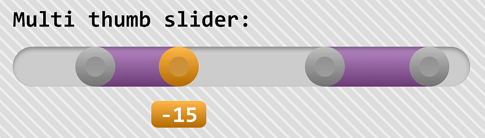
First, make the track the same height as the thumb and round its ends. Until now the track was emulated via a background on .wrap; layered linear and radial gradients could do rounded ends, but the free ::before pseudo-element makes a better solution available.
.wrap {
  /* same as before */
  --h: 2em;
  --d: var(--h);

  &::before, &::after {
    border-radius: var(--r);
    background: #ccc;
    content: '';
    grid-column: 1/ span 2;
    grid-row: 2;
  }

  &::after {
    background: #95a;

    /* non-standard WebKit version */
    -webkit-mask: var(--fill);
    -webkit-mask-composite: xor;

    /* standard version, supported in Firefox */
    mask: var(--fill);
    mask-composite: exclude;
  }
}
Emulating the track with ::before also opens the door to a slightly 3D appearance; the values are tweakable.
<pre rel="SCSS"><code class="language-scss">.wrap {
  /* same as before */

  &::before, &::after {
    /* same as before */
    box-shadow: inset 0 2px 3px rgba(#000, .3);
  }

  &::after {
    /* same as before */
    background:
      linear-gradient(rgba(#fff, .3), rgba(#000, .3))
      #95a;
  }
}
The thumb is then restyled by layering multiple backgrounds with different background-clip (and background-origin) values.
@mixin thumb() {
  border: solid calc(.5*var(--r)) transparent;
  border-radius: 50%; /* make circular */
  box-sizing: border-box; /* different between Chrome & Firefox */
  /* box-sizing needed now that we have a non-zero border */
  background:
    linear-gradient(rgba(#000, .15), rgba(#fff, .2)) content-box,
    linear-gradient(rgba(#fff, .3), rgba(#000, .3)) border-box,
    currentcolor;
  pointer-events: auto;
  width: var(--d); height: var(--d);
}
Those rules accomplish little while currentcolor is black (#000), so the color is changed and the thumb cursor is set to something more fitting.
input[type='range'] {
  /* same as before */
  color: #eee;
  cursor: grab;

  &:active { cursor: grabbing; }
}
A grid-gap on the wrapper moves the label text away from the slider.
.wrap {
  /* same as before */
  grid-gap: .625em;
}
The remaining eyesore is the absolutely positioned outputs in the top-right corner; the fix is a third grid row for them, moved along with the thumbs. Their position is computed much like the sharp gradient stops: the output's left edge starts on the vertical line one thumb radius --r from the slider's left edge, and the output is translated back (negative direction, hence the minus sign) by half its width — 50%, since percentages in translate() refer to the transformed element's own dimensions. To follow a thumb, subtract the minimum (--min) from the current value (--c), divide by --dif, and multiply the resulting [0, 1] progress by the useful width (--uw).
.wrap {
  /* same as before */
  grid-template-rows: max-content var(--h) max-content;
}

output {
  background: currentcolor;
  border-radius: 5px;
  color: transparent;
  grid-column: 1;
  grid-row: 3;
  margin-left: var(--r);
  padding: 0 .375em;
  transform: translate(calc((var(--c) - var(--min))/var(--dif)*var(--uw) - 50%));
  width: max-content;

  &::after {
    color: #fff;
    content: counter(c);
    counter-reset: c var(--c);
  }
}
Overflow, overlaps, and state switching
overflow: hidden clips part of an <output> at the track end, because it cuts everything outside the element's padding-box. A large enough lateral padding on .wrap is a quick fix; where spacing is tight, a matching negative lateral margin inverts it. Since the wrapper is relatively positioned, the outputs land above overlapping static-content elements; otherwise adjust the z-index on .wrap.
padding: 0 2em;Worse are the odd-looking <output> overlaps that appear while dragging. Raising the z-index of the focused <input>'s corresponding <output> fixes the overlap symptom but not the underlying problem — visible once the body gets an image background and the text can no longer hide in it.
input[type='range'] {
  &:focus {
    outline: solid 0 transparent;

    &, & + output {
      color: darkorange;
      z-index: 2;
    }
  }
}
Hiding and revealing therefore needs rethinking, without bloating the CSS. A highlight custom property --hl is 0 in the normal state and 1 in a highlight state such as :focus, with its negation computed as --nothl; every property that differs between states then depends on --hl and, where needed, --nothl.
* {
  --hl: 0;
  --nothl: calc(1 - var(--hl));
  margin: 0;
  font: inherit
}
$hlc: #f90;
@mixin thumb() {
/* same as before */
background-color: $hlc;
}
input[type='range'] {
/* same as before */
filter: grayScale(var(--nothl));
z-index: calc(1 + var(--hl));
&:focus {
outline: solid 0 transparent;
&, & + output { --hl: 1; }
}
}
output {
/* same grid placement */
margin-left: var(--r);
max-width: max-content;
transform: translate(calc((var(--c) - var(--min))/var(--dif)*var(--uw)));
&::after {
/* same as before */
background:
linear-gradient(rgba(#fff, .3), rgba(#000, .3))
$hlc;
border-radius: 5px;
display: block;
padding: 0 .375em;
transform: translate(-50%) scale(var(--hl));
}
}Transitions can be added on state change.
$t: .3s;

input[type='range'] {
  /* same as before */
  transition: filter $t ease-out;
}

output::after {
  /* same as before */
  transition: transform $t ease-out;
}
Finally, the fill can be grayscale()-ed when no thumb is focused, using :focus-within on the wrapper.
.wrap {
  &::after {
    /* same as before */
    filter: Grayscale(var(--nothl));
    transition: filter $t ease-out;
  }

  &:focus-within { --hl: 1; }
}
A flat variant
For a flat design, drop the box shadows and gradients that created the 3D look and give the track background a repeating gradient.
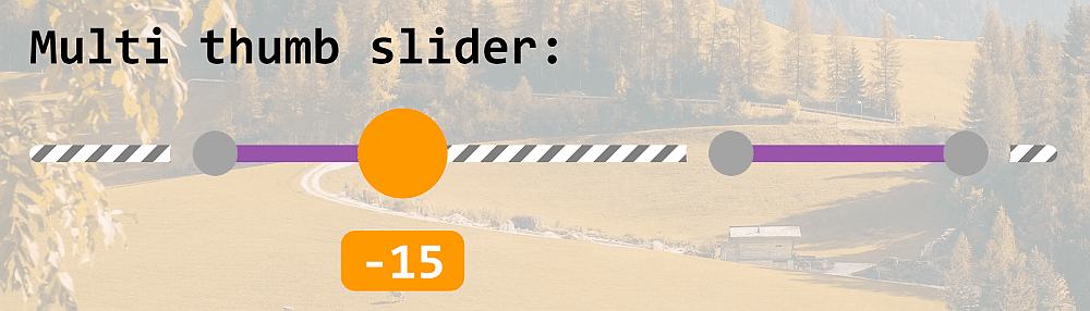
The thumb's size change on :focus becomes a scaling transform whose factor depends on --hl.
@mixin thumb() {
  /* same as before */
  transform: scale(calc(1 - .5*var(--nothl)));
  transition: transform $t ease-out;
}
The holes around the thumbs also exploit mask compositing: radial gradients create a disc at each thumb position, and the result is inverted (composited with a fully opaque layer) to turn the discs into holes. The Pug code is adjusted to generate the list of per-thumb radial gradients, inverted in CSS.

//- same as before
- let tpos = thumbs.map((c, i) => `calc(var(--r) + (var(--v${i}) - var(--min))/var(--dif)*var(--uw))`);
- let fill = tpos.map(c => `linear-gradient(90deg, red ${c}, transparent 0)`);
- let hole = tpos.map(c => `radial-gradient(circle at ${c}, red var(--r), transparent 0)`)

.wrap(role='group' aria-labelledby='multi-lbl'
  style=`${thumbs.map((c, i) => `--v${i}: ${c.val}`).join('; ')};
    --min: ${min}; --max: ${max};
    --fill: ${fill.join(', ')};
    --hole: ${hole.join(', ')}`)
  // -same wrapper content as before
<div class='wrap' role='group' aria-labelledby='multi-lbl'
style='--v0: -15; --v1: 20; --v2: -35; --v3: 45;
--min: -50; --max: 50;
--fill:
linear-gradient(90deg,
red calc(var(--r) + (var(--v0) - var(--min))/var(--dif)*var(--uw)),
transparent 0),
linear-gradient(90deg,
red calc(var(--r) + (var(--v1) - var(--min))/var(--dif)*var(--uw)),
transparent 0),
linear-gradient(90deg,
red calc(var(--r) + (var(--v2) - var(--min))/var(--dif)*var(--uw)),
transparent 0),
linear-gradient(90deg,
red calc(var(--r) + (var(--v3) - var(--min))/var(--dif)*var(--uw)),
transparent 0);
--hole:
radial-gradient(circle
at calc(var(--r) + (var(--v0) - var(--min))/var(--dif)*var(--uw)),
red var(--r), transparent 0),
radial-gradient(circle
at calc(var(--r) + (var(--v1) - var(--min))/var(--dif)*var(--uw)),
red var(--r), transparent 0),
radial-gradient(circle
at calc(var(--r) + (var(--v2) - var(--min))/var(--dif)*var(--uw)),
red var(--r), transparent 0),
radial-gradient(circle
at calc(var(--r) + (var(--v3) - var(--min))/var(--dif)*var(--uw)),
red var(--r), transparent 0)'>
<!-- same content as before -->
</div>Both pseudo-elements get a mask and their layers are XOR-ed. On ::before, the mask is the list of radial-gradient() discs XOR-ed with a fully opaque layer that inverts the discs into circular holes; on ::after, it is the list of fill linear-gradient() layers.
.wrap {
  /* same as before */

  &::before, &::after {
    content: '';
    /* same as before */

    --mask: linear-gradient(red, red), var(--hole);

    /* non-standard WebKit version */
    -webkit-mask: var(--mask);
    -webkit-mask-composite: xor;

    /* standard version, supported in Firefox */
    mask: var(--mask);
    mask-composite: exclude;
  }

  &::after {
    background: #95a;
    --mask: var(--fill);
  }
}
The last step adjusts the track and fill height and vertically centers them (with the thumbs) inside their grid cell.
.wrap {
  /* same as before */

  &::before, &::after {
    /* same as before */
    align-self: center;
    height: 6px;
  }
}


