
The Gray Dead Zone in CSS Gradients
Take a simple CSS linear gradient from pure yellow to pure blue. Chances are the middle looks washed out, even muddy. Erik Kennedy coined a name for this phenomenon: the “gray dead zone.” The fix isn't picking better colors—it's changing how the browser interpolates between them.
Why RGB interpolation goes gray
When CSS calculates a linear gradient, it averages the Red, Green, and Blue channels for every pixel along the way. Pure yellow is rgb(255, 255, 0); pure blue is rgb(0, 0, 255). At the midpoint, each channel converges toward 127.5, producing a flat gray.
The math is straightforward but produces a counterintuitive outcome. Two fully saturated colors mix into a completely desaturated middle. The issue is fundamental to the RGB color space: whenever all three channels are equal, the result is grayscale.
HSL interpolation keeps the vibrancy
HSL represents color as three different components: hue (where the color falls on the wheel), saturation (vibrancy), and lightness (how light or dark). If a gradient from yellow to blue averages HSL values instead of RGB, the saturation and lightness stay constant—only the hue changes. The result walks the color wheel directly from one pigment to the other, with no dead zone.
HSL isn't perfect for every case, though. It models raw physics rather than human perception. Two colors can share the same HSL lightness value yet appear very different: yellow looks much lighter than blue to most people. For perceptually-uniform gradients, color spaces like HCL model human vision more closely.
Native CSS interpolation modes
Modern CSS includes a way to select the interpolation color space. The syntax adds an optional color mode parameter inside the gradient function:
<style> body { /* Fallback for older browsers: */ background: linear-gradient(to right, yellow, blue); /* Fancy new value: */ background: linear-gradient(to right in oklch, yellow, blue); }</style>
On supporting browsers, this yields a smooth yellow-to-blue transition without the gray middle. Browser support for gradient interpolation was around 91% as of late 2025. Older browsers ignore the parameter and fall back to RGB interpolation.
A polyfill approach for any color space
For full browser coverage—or to use color spaces CSS doesn't support natively—there's a workaround. CSS gradients accept more than two color stops. The trick is to pre-calculate many intermediate colors using a JavaScript library like chroma.js in whatever color space you prefer, then pass them all to the gradient function:
.box {
  background-image: linear-gradient(
    to right,
    #ffff00,
    #f8ea47,
    #f0d465,
    #f0d465,
    #e7bf7c,
    #ddaa8f,
    #d095a1,
    #c280b2,
    #b26cc2,
    #9d56d2,
    #8440e1,
    #6028f0,
    #0000ff
  )
}
The concern is that the CSS engine still interpolates between each provided stop in RGB. That's true, but with enough stops—the closer the consecutive colors, the less interpolation matters. When two colors are nearly identical, any interpolation method produces approximately the same result. Passing a few dozen carefully computed midpoints renders a smooth curve that stays vivid throughout.
This approach works for linear, radial, and conic gradients alike.
The Gradient Generator tool
Applying these principles by hand is tedious, so there's a dedicated tool for it. The Gradient Generator lets you pick two colors, choose a color space, and control the distribution of intermediate colors with an easing curve. The cleanest implementation uses a plugin named shine.js, which the creator wrote after exploring different design solutions. The resulting CSS output is appropriate for responsive layouts, like the one deployed at prepfast.
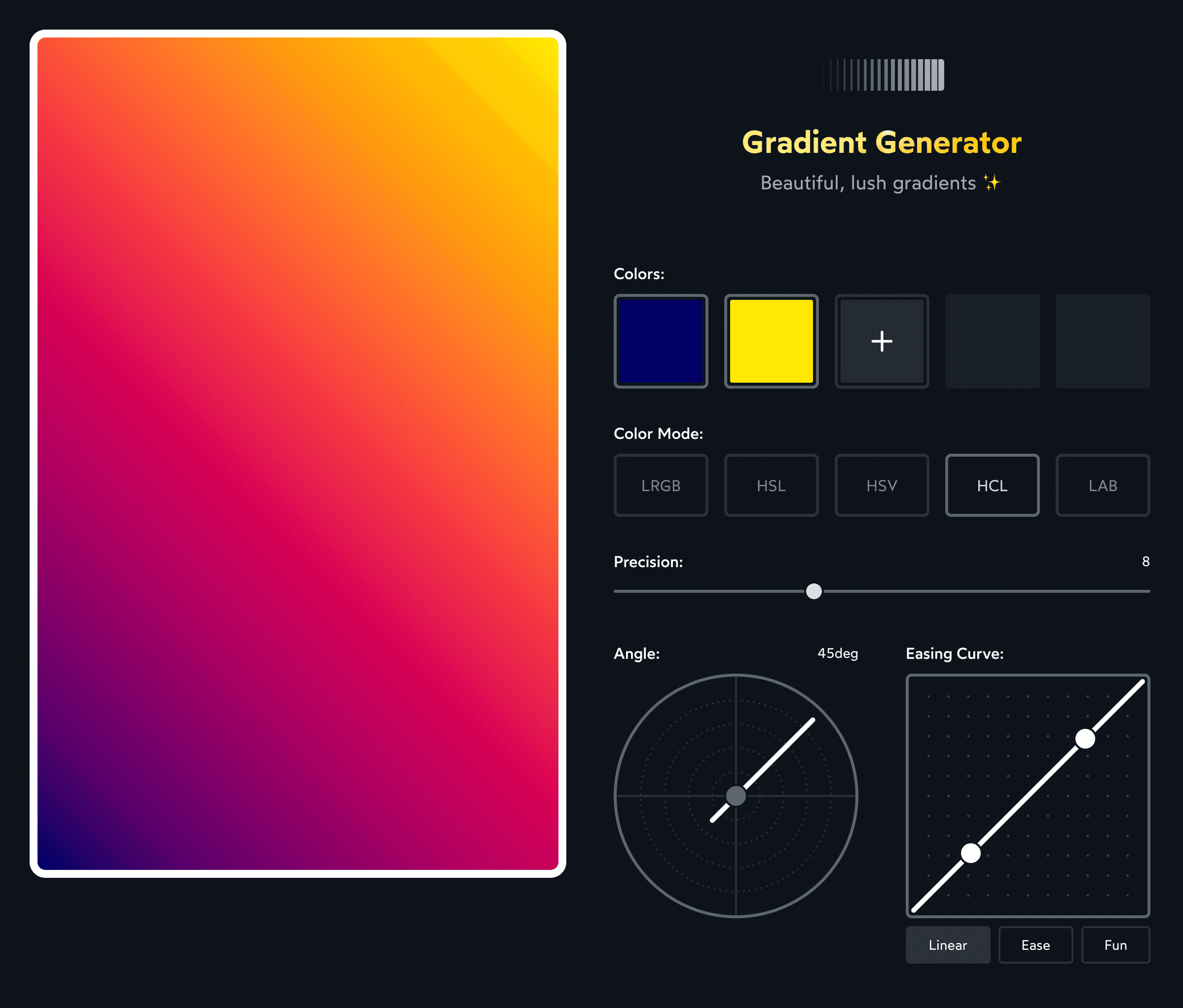
The tool generates linear gradients, but the exported color list can be pasted into radial or conic gradient functions directly. Controls let you adjust start and end colors, midpoint count, and color mode.
Two projects served as direct inspiration for this generator: Erik Kennedy's Vivid Gradient Generator Tool and Polychroma by @stormwarning.
The core lesson remains: choose your interpolation space deliberately. The gray dead zone isn't inevitable—it's an artifact of averaging RGB channels. Interpolate by hue and saturation, monitor chroma levels for human-vision accuracy, and you get gradients that hold their color across the entire spectrum.


