Direction-relative styling, not screen-relative
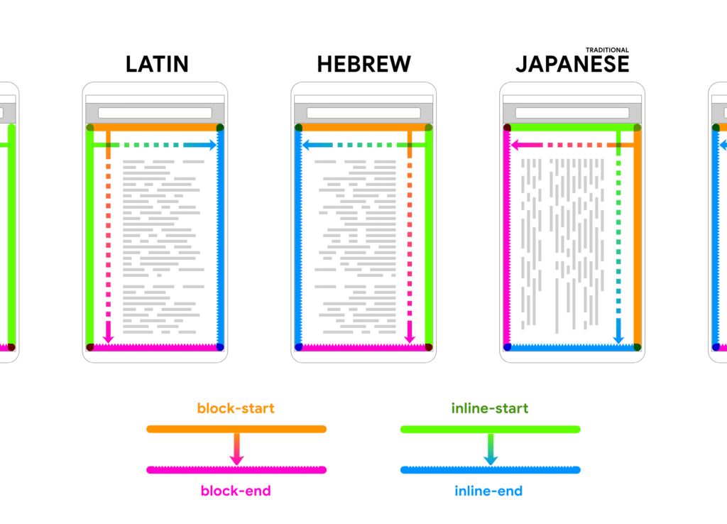
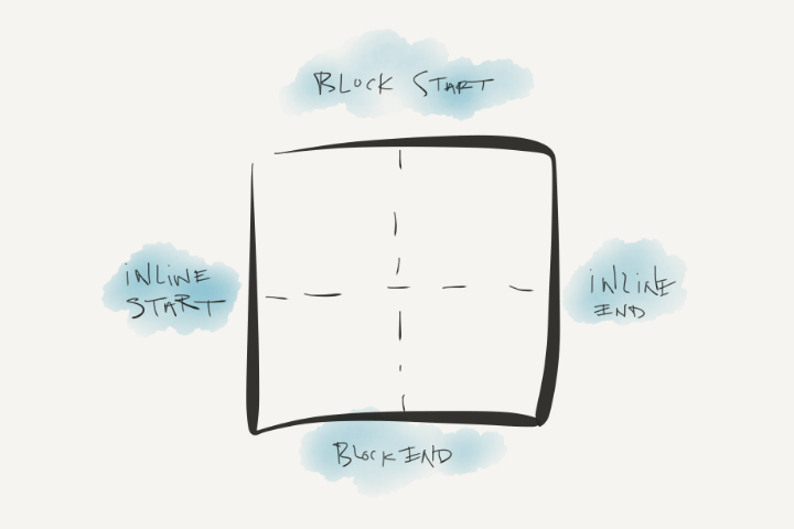
A logical property describes a side, corner or axis of the box model in the context of the writing direction in force, rather than in absolute terms. The usual analogy: referring to someone's strong arm instead of assuming it is their right arm. "Right" is a physical reference; "strong" is a logical one, and it depends on the person. 2020 delivered another round of logical property features to major browsers, and adopting them has paid off in less code that covers more of the world.
p {
  /* 🚫 */ text-align: left;
  /* 👍 */ text-align: start;

  /* 🚫 */ margin-top: 1rem;
  /* 👍 */ margin-block-start: 1rem;
}
Other fields arrived here first
Once the updated syntax clicked, it became clear that other disciplines had already solved their orientation problems the same way. The web was simply late to the vocabulary.
Ships: port and starboard
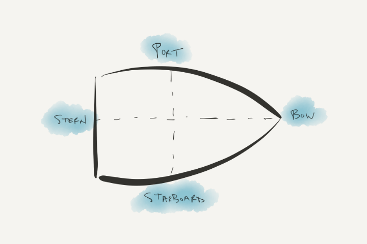
Port and starboard are logical sides of a vessel, defined relative to it. Wikipedia puts the point plainly:
… nautical terms of orientation deal unambiguously with the structure of vessels, referring respectively to the left and right sides of the vessel, seen by an observer aboard the vessel looking forward."
Those are vessel-centric logical properties: working with ships means using ship language.
Slopes and soundstages
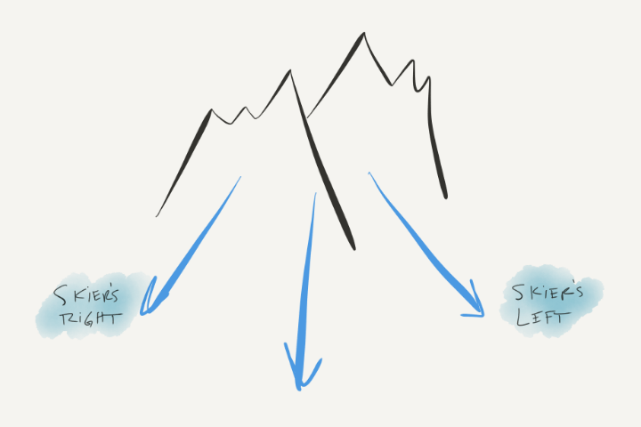
"Skier's left" is a logical direction anchored to a skier facing downhill. Without it, skiers muddled left and right, because the answer depended on where someone stood when they named the direction — on a chair lift heading up the mountain, left and right invert as soon as you start skiing down. The community's fix, "Skier's Right" and "Skier's Left", amounts to contextual logical properties. Film studios do the same with "Stage One" and "Camera Two": orientation keyed to a shared reference instead of a relative one.
What this buys the web
Physical-focused styles break down for us as an industry. Padding on the left and right of a button only fits some languages — as if the padding had been written while facing the wrong way on the ship. inline-start and inline-end fit every language, and it stops mattering which way you are facing. Give the demo Pen a try and watch the browser do substantial work to keep the content readable worldwide.
button {
  padding-block: 1ch;
  padding-inline: 2ch;
  border-inline: 5px solid var(--brand-1);
}
The aim is to describe a side once, in terms that remain meaningful to the author and become meaningful to everyone else. Think less, deliver more.
p {
  max-inline-size: 50ch;
  margin-block: 1rem;
}
The people-first angle matters: logical properties respect the individual's language direction, so a reader's diversity, complexity and unpredictability can be brought to the table and left to browser engines to lay out correctly. Stop reasoning in "top" and "left"; start reasoning in "block" and "start". Working with web boxes means using web box language.
hr {
  max-inline-size: 30ch;
  margin-inline: auto;
  border-block-start: 1px solid hsl(2rad 20% 20% / 20%);
}
Flexbox has been training you in logical properties all along.



