Two Mega Menus, One Clear Difference
Two large navigation menus crossed my path today, each of them an enormous grid of links that seems to say: we have so much stuff, let's just lay it all out.
The first comes from the footer of an older U.S. Government website:

The second is the AWS Console's menu of AWS services:
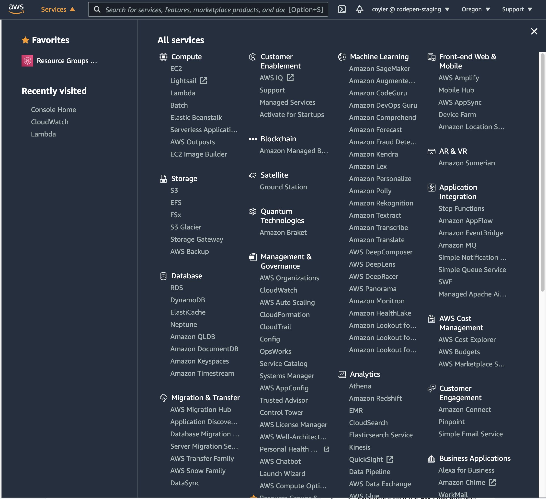
What then sets them apart? The AWS Console version puts a search bar at the top, and that bar exists chiefly to locate items inside the menu — though it also searches the wider site:

That pattern — searching a list of things that are already on the page — is exactly what the classic jQuery contains selector does, and it deserves a demonstration: