
How global style variations work
Global styles variations arrived in Gutenberg 12.5 as a way for theme authors to ship alternate looks — color, fonts, typography, spacing — for a single block theme. Technically, each variation is a separate theme.json stored in a /styles folder; the editor exposes them so users can swap appearances without changing themes.
The initial concept, shown by Twenty Twenty-Two lead Kjell Reigstad in GitHub ticket #292 and a related tweet, started as alternate color and font combinations but extends to simple child themes. Automattic's theme team has since used the pattern for variable child themes that differ only in color and fonts, such as geologist (blue, cream, slate, yellow) and quadrat (black, green, red, white, yellow). The switcher UI was still evolving at publication; its progress is tracked in GitHub ticket #35619.
Matias Ventura put the feature on the WordPress 6.0 roadmap:
Embrace style alternates driven by
Matias Ventura, "Preliminary Roadmap to 6.0"jsonvariations. This was teased in various videos around the new default theme and should be fully unveiled and presented in 6.0. One of the parallel goals is to create a few distinct variations of TT2 made just with styles. (35619)
The iteration that ships in WordPress 6.0 is available via the Gutenberg 13.0 plugin. Anne McCarthy's Exploring WordPress 6.0 video walks through it alongside the Webfonts API (from 5:18).
Variations versus child themes
The line between an alternate theme.json and a child theme has become thin. The alante-dark child theme differs from its parent only by an alternate.json that overrides global theme styles:

Similarly, the Framboise and Richmond child themes of Alara differ only in a single theme.json.
Building a variation set: setup
Prerequisites are a working knowledge of block themes and the Full Site Editor (FSE); the block theme introduction on CSS-Tricks, the site editor documentation, and Full Site Editing cover the basics. The features below need Gutenberg 13.0 activated or WordPress 6.0.
- Set up WordPress. A fresh install with Twenty Twenty-Two active and some dummy content — for example, Gutenberg test data. For this demo the TT2 child theme also centers content and gives header and footer a color distinct from the body:

- Create the styles folder. Inside the child theme's root, add
/stylesholding the variation files (blue.json,maroon.json,pink.jsonin this demo):
__ style.css
__ theme.json
__ functions.php
__ index.php
__ templates
__ ...
__ parts
__ ...
__ styles
__ blue.json
__ maroon.json
__ pink.json- Write each variation. Each JSON file carries the palette you want. Here is
maroon.json;blue.jsonandpink.jsonuse the same structure with their own hex values for theforeground/background-bodyandforeground-dark/primarycolor properties.
{
  "version": 2,
  "title": "Maroon",
  "settings": {
    "color": {
      "palette": [
        { "slug": "foreground", "color": "#7C290F", "name": "Foreground" },
        { "slug": "background", "color": "#ffffff", "name": "Background" },
        { "slug": "foreground-dark", "color": "#000000", "name": "Foreground Dark" },
        { "slug": "background-body", "color": "#ffd8be", "name": "Background Body" },
        { "slug": "primary", "color": "#000000", "name": "Primary" },
        { "slug": "secondary", "color": "#ffe2c7", "name": "Secondary" },
        { "slug": "tertiary", "color": "#55ACEE", "name": "Tertiary" }
      ]
  },
  "typography": {}
},
"styles": {
  "color":
      {
        "background": "var(--wp--preset--color--background-body)",
        "text": "var(--wp--preset--color--foreground-dark)"
      },
  "elements": {
      "link": {
        "color": { "text": "var(--wp--preset--color--primary)" }
      }
    }
  }
}
After saving, open Appearance → Editor, click the styles icon, and press the Other Styles button — since renamed Browser styles — to see the blue, maroon and pink options alongside the theme's original styles. Pick one and save from the top-right; the choice is reflected on the front end. Labels for each variation and the filename with a hover effect on the thumbnail landed in Gutenberg 13.0.
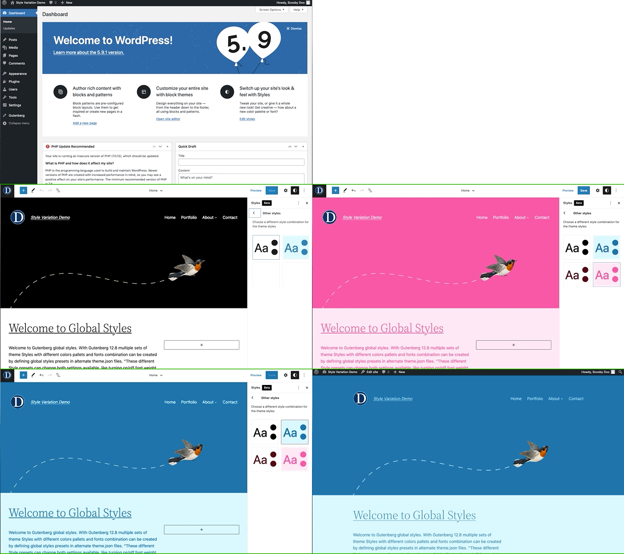
The full demo result:

Case study: a dark mode without plugins
Dark mode is a personal preference, and implementing a toggle by hand is real work for most developers — there is a complete guide to dark mode and coverage of dark mode typography on CSS-Tricks. In WordPress, the WP Dark Mode plugin is one route; WP Engine, WPBeginner and a WPExplorer roundup cover plugin options.
Doing it inside a block theme without a plugin has historically taken JavaScript for assets such as a toggler, customization and editor-mode support, dark CSS variables and an expanded functions.php — see Ari Stathopoulos's dark mode support for TT1 Blocks. Global style variations reduce that to dropping JSON into the /styles folder, as Anne McCarthy shows in this short video using Kjell Reigstad's gist of JSON snippets.
TT2 Gopher Blocks and its three modes
TT2 Gopher Blocks is a demo sibling of a work-in-progress block theme, built on Twenty Twenty-Two and combining style variations with the Webfonts API introduced in Gutenberg 12.8. It has centered single-column content, a distinct header and footer, and friendlier archive and search pages. A GitHub repository is available for forking.

- Light mode — white header, smoky body background in the footer, Open Sans as primary font.
- Dark mode — black header and footer with lighter dark body backgrounds, Source Serif Pro as primary font.
- Maroon mode — dark maroon header and footer over a lighter yellowish body background, Work Sans as primary font.
Registering bundled fonts
The Webfonts API lets authors load local (bundled) fonts "in a performance-friendly, privacy-friendly, and future-proof manner." It works only with fonts bundled in the theme and, for privacy reasons, does not support Google-hosted fonts; current status is tracked in this make WordPress core post and this WP Tavern article. There are two implementation paths: PHP and theme.json.
Twenty Twenty-Two keeps Source Serif Pro files in assets/fonts and registers them in PHP in functions.php:
function twentytwentytwo_get_font_face_styles() {
  return "
  @font-face{
    font-family: 'Source Serif Pro';
    font-weight: 200 900;
    font-style: normal;
    font-stretch: normal;
    font-display: swap;
    src: url('" . get_theme_file_uri( 'assets/fonts/SourceSerif4Variable-Roman.ttf.woff2' ) . "') format('woff2');
  }
  @font-face{
    font-family: 'Source Serif Pro';
    font-weight: 200 900;
    font-style: italic;
    font-stretch: normal;
    font-display: swap;
    src: url('" . get_theme_file_uri( 'assets/fonts/SourceSerif4Variable-Italic.ttf.woff2' ) . "') format('woff2');
  }
  ";
}
Gutenberg 12.8 added registration of local fonts from theme.json. In the TT2 Gopher theme, the maroon variation registers Work Sans like this:
"typography": {
  "fontFamilies": [
    {
      "fontFamily": "'Work Sans', -apple-system, BlinkMacSystemFont, 'Helvetica Neue', 'Helvetica', sans-serif",
      "slug": "work-sans",
      "name": "Work Sans",
      "fontFace": [
        { "fontFamily": "Work Sans", "fontDisplay": "block", "fontWeight": "400", "fontStyle": "normal", "fontStretch": "normal", "src": [ "file:./assets/fonts/work-sans/WorkSans-VariableFont_wght.ttf" ] },
        { "fontFamily": "Work Sans", "fontDisplay": "block", "fontWeight": "700", "fontStyle": "normal", "fontStretch": "normal", "src": [ "file:./assets/fonts/work-sans/WorkSans-VariableFont_wght.ttf" ] },
        { "fontFamily": "Work Sans", "fontDisplay": "block", "fontWeight": "400", "fontStyle": "italic", "fontStretch": "normal", "src": [ "file:./assets/fonts/work-sans/WorkSans-Italic-VariableFont_wght.ttf" ] },
        { "fontFamily": "Work Sans", "fontDisplay": "block", "fontWeight": "700", "fontStyle": "italic", "fontStretch": "normal", "src": [ "file:./assets/fonts/work-sans/WorkSans-Italic-VariableFont_wght.ttf" ] }
      ]
    }
  ]
}
Composing the variations
Using the same steps as above, the demo adds white.json and black.json to the child theme's /styles folder, each combining a different palette with a different font. The feature requires theme.json version 2. Since Gutenberg 12.5, a title set in theme.json supplies the label in the site editor; otherwise the file name without its extension is shown.
{
  "version": 2,
  "title": "White",
  "settings": {
    "color": {
      "palette": [
        { "slug": "foreground", "color": "#000000", "name": "Foreground" },
        { "slug": "background", "color": "#f2f2f2", "name": "Background" },
        { "slug": "background-header", "color": "#ffffff", "name": "Background header" },
        { "slug": "primary", "color": "#0d0d0d", "name": "Primary" },
        { "slug": "secondary", "color": "#F0EAE6", "name": "Secondary" },
        { "slug": "tertiary", "color": "#eb3425", "name": "Tertiary" },
        { "slug": "quaternary", "color": "#7c7e83", "name": "Quaternary" }
      ]
    },
    "typography": {
      "fontFamilies": [
        {
        "fontFamily": "\"Public Sans\", sans-serif",
        "name": "Public Sans",
        "slug": "public-sans",
        "fontFace": [
          { "fontFamily": "Public Sans", "fontDisplay": "block", "fontStyle": "normal", "fontStretch": "normal", "src": [ "file:.assets/fonts/publicSans/PublicSans-VariableFont_wght.ttf.woff2" ] },
          { "fontFamily": "Public Sans", "fontDisplay": "block", "fontStyle": "italic", "fontStretch": "normal", "src": [ "file:./assets/fonts/publicSans/PublicSans-Italic-VariableFont_wght.ttf.woff2" ] }
        ]
      }
    ]
  }
},
"styles": {
  "blocks": {
    "core/image": {
      "filter": { "duotone": "var(--wp--preset--duotone--default-filter)" }
    },
    "core/post-title": {
      "typography": { "fontFamily": "var(--wp--preset--font-family--public-sans)", "fontWeight": "700", "fontSize": "var(--wp--custom--typography--font-size--gigantic)" }
    },
    "core/query-title": {
      "typography": { "fontFamily": "var(--wp--preset--font-family--public-sans)", "fontWeight": "300", "fontSize": "var(--wp--custom--typography--font-size--gigantic)" }
    },
    "core/post-featured-image": {
      "filter": { "duotone": "var(--wp--preset--duotone--default-filter)" }
    },
    "core/site-logo": {
      "filter": { "duotone": "var(--wp--preset--duotone--default-filter)" }
    },
    "core/site-title": {
      "typography": { "fontFamily": "var(--wp--preset--font-family--public-sans)", "fontSize": "var(--wp--preset--font-size--normal)", "fontWeight": "normal" }
    }
    },
    "color": { "background": "var(--wp--preset--color--background)", "text": "var(--wp--preset--color--foreground)" },
    "elements": {
      "h1": {
        "typography": { "fontFamily": "var(--wp--preset--font-family--public-sans)", "fontWeight": "600", "fontSize": "var(--wp--custom--typography--font-size--colossal)" }
      },
      "h2": {
        "typography": { "fontFamily": "var(--wp--preset--font-family--public-sans)", "fontWeight": "600", "fontSize": "var(--wp--custom--typography--font-size--gigantic)" }
      },
      "h3": {
        "typography": { "fontFamily": "var(--wp--preset--font-family--public-sans)", "fontWeight": "300", "fontSize": "var(--wp--custom--typography--font-size--huge)" }
      },
      "h4": {
        "typography": { "fontFamily": "var(--wp--preset--font-family--public-sans)", "fontWeight": "300", "fontSize": "var(--wp--preset--font-size--x-large)" }
      },
      "h5": {
        "typography": { "fontFamily": "var(--wp--preset--font-family--public-sans)", "fontWeight": "700", "textTransform": "uppercase", "fontSize": "var(--wp--preset--font-size--medium)" }
      },
      "h6": {
        "typography": { "fontFamily": "var(--wp--preset--font-family--public-sans)", "fontWeight": "400", "textTransform": "uppercase", "fontSize": "var(--wp--preset--font-size--medium)" }
      },
      "link": {
        "color": { "text": "var(--wp--custom--color--foreground)" }
      }
    },
    "typography": { "fontFamily": "var(--wp--preset--font-family--public-sans)", "fontSize": "var(--wp--preset--font-size--normal)" }
  }
}
white.json swaps the theme.json palettes and also registers the local Public Sans files. The black.json follows the same pattern but uses Source Serif Pro, registered in functions.php:

Themes shipping style variations
- Twenty Twenty-Two — the first default theme with style variations; its 1.2 release bundled with WordPress 6.0 adds three variations: "Blue", "Pink" and "Swiss".
- Frost — an experimental block theme with a dark variation.
- Alara — over 100 active installs, 7 variations.
- Wabi — 3 variants, 300+ active installs, powers Rich Tabor's site.
- Brisky — 600+ installs, one dark variation.
- Pendant — Automattic theme team work in progress with 3 variations.
Justin's WP Tavern article speculates that authors could tie variations to a visitor's settings, while users might pick seasonal or event-based designs. Wide adoption is a matter of time.
Takeaways
Style variations make it straightforward to give a block theme several typography and color combinations without plugins. The technique blurs the case for child themes and for numerous near-identical block themes: a few well-designed bases — Automattic's in-progress block-canvas and blockbase are examples — could be customized through variations alone.



