
The Case for Customer-Centric Web Design
Most businesses understand that product-market fit requires deep research into customer needs before a launch. They build value propositions, study competitors, and run focus groups to reduce the risk of failure. The connection between what customers want and what a company offers is obvious enough to guide major product decisions.
Yet the same logic often evaporates when those businesses design their websites and landing pages. A company’s web presence is frequently treated as a channel for pushing corporate messages rather than a tool for serving the visitor. That misses the point entirely: visitors have needs in this context, too, and addressing them is what turns a casual click into a conversion.
These aren’t the needs that the product itself satisfies. These are meta-needs — the ones that make a visitor’s interaction with a landing page smooth, credible, and compelling enough to put them in a receptive state of mind.
Matching the Message From Ad to Landing Page
A simple starting point is consistency between your ad copy and your landing page content. When a user clicks a sponsored result, they’ve already told you something vital: your ad resonated with their problem and they believe the promise it makes. They are willing to start a journey with you.
This concept is known as “Ad Scent,” and ignoring it on your landing page wastes the momentum your ad team built. MarketingSherpa reports that just under 50% of digital marketers create a unique landing page for each ad campaign, understanding the importance of this thread. The overhead sounds manageable when you frame it correctly: if you promise something in the ad, expand on that specific promise on the page. Don’t just rephrase the ad copy — the core message is already across. Now provide information and prompts that connect that promise to the action you want the visitor to take.
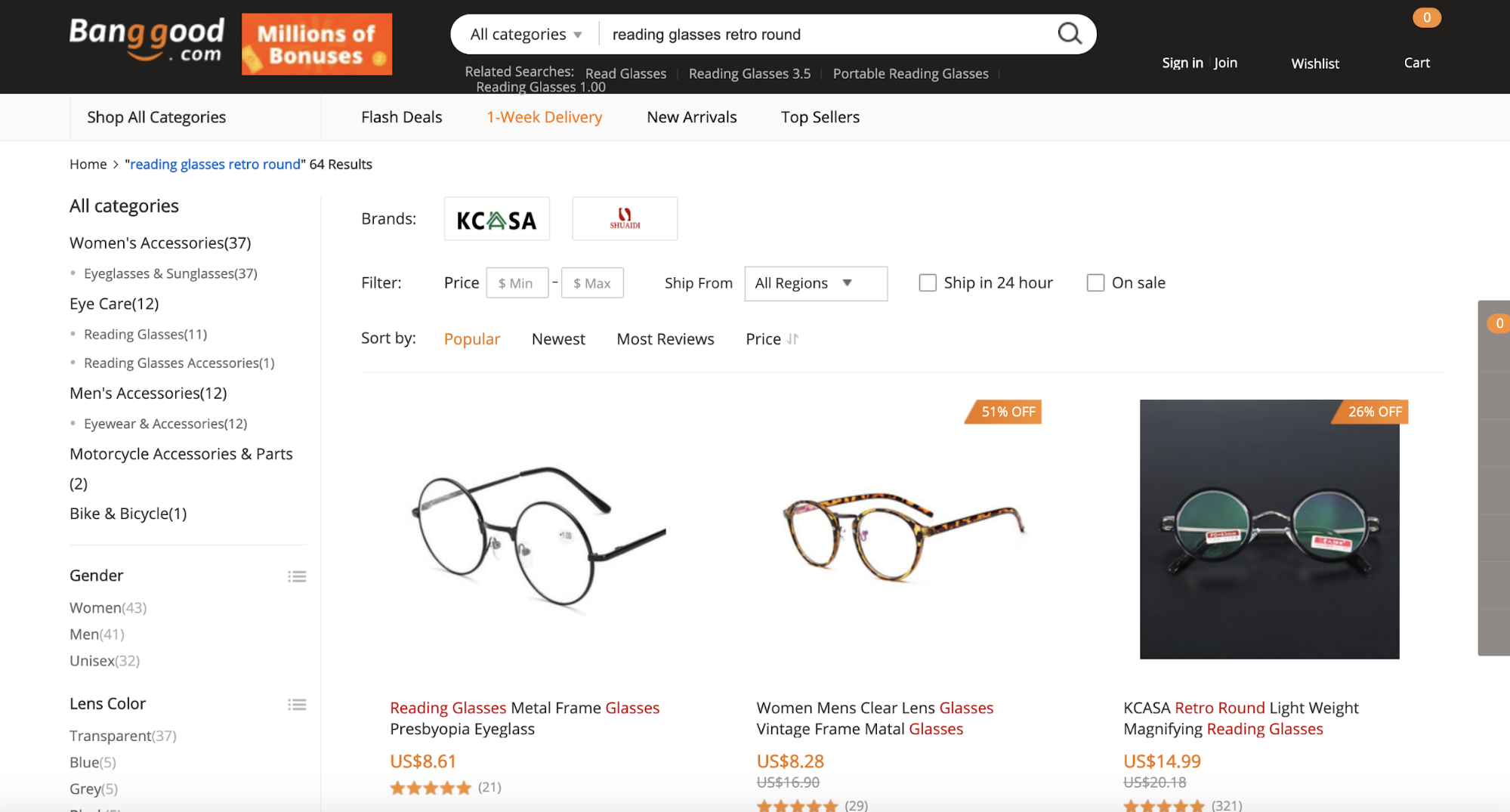
Online retailer BangGood demonstrates this well. A search for “Cheap retro reading glasses” returns a sponsored ad promising low prices and a coupon for new users. Clicking through leads directly to a product catalog pre-filtered by that exact search term. No clicking through categories or hunting for the right style. Visible discount labels immediately show potential savings.
Building Urgency Without Alienating Visitors
Online shoppers can compare multiple retailers within seconds, so grabbing the attention of a semi-motivated customer requires more than a good price. A visible countdown timer showing how much time remains on a “hot deal” taps into real psychology that drives action.
Zoma executes this well on their sales page. A clearly visible but non-intrusive element makes visitors aware that time is running out on a significant discount.
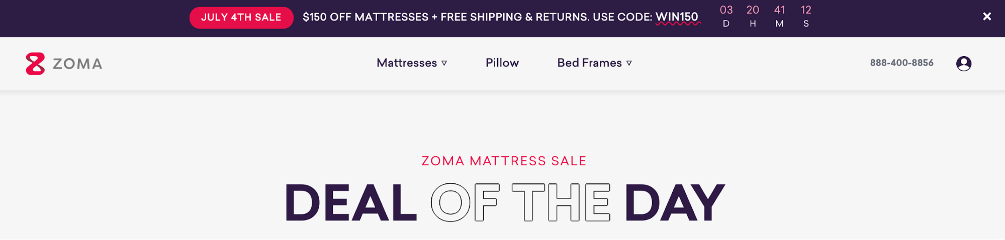
Shoppers might still browse elsewhere, but the offer lingers in their minds. This is customer-centric design at its best: highlighting the feeling that they are among the few lucky enough to seize a great deal is one of the most effective ways to hurry a decision along.
Making Social Proof Visible and Actionable
The same Zoma page demonstrates another principle: giving visitors proof that other shoppers were satisfied. Social proof is a well-established marketing tenet, but its value depends on visibility and credibility within the landing page itself.
On Zoma’s sports mattress page, a 4.7 star-rating appears with an attractive sample size. Nearly 300 reviews is reassuring. Critically, the review element is clickable but doesn’t navigate the user away — it scrolls to an anchor on the same page.
What visitors find there is simple copy that answers the question they were already asking: “See why active people love Zoma.” Below that sits an uncluttered list of credible reviews, all displayed above a floating CTA prompting the visitor to add the product to their cart.
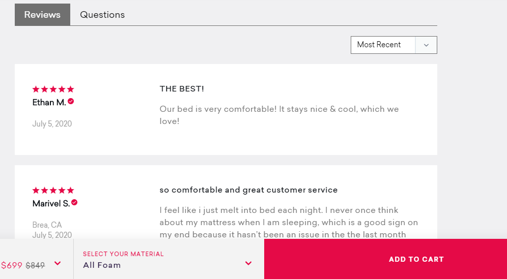
Within a single click, several customer needs are addressed:
- The need for their consideration to be validated by peers;
- Reassurance that the reviews are legitimate;
- The convenience of taking action immediately, without scrolling back to a purchase area.
None of these needs concern the product itself. They leverage needs intrinsic to the online shopping experience.
Prioritizing Information Visitors Actually Need
Customer-centric landing pages give visitors the information they need, not the information the company feels like sharing. A visitor who has clicked through from an ad wants to know what’s in it for them, within seconds of reading the copy. They don’t want a wall of text about company history, corporate values, or staff integrity.
Marketers need to anticipate the specific pain points a customer wants addressed and make that information readily available. That requires solid customer profiling and a clear understanding of the value proposition. The challenge is conveying that value — how the product fulfills the customer’s needs — in a way that is both engaging and immediately understandable.
Engagement Through Simplicity
What does “engaging” mean in this context? There is no paint-by-numbers formula, but some general principles apply. Minimize visual clutter. Show only imagery and text that relate directly to why a person might be interested in the product. Visitors don’t care about your development process or strategic roadmap at first glance. They care about one question:
“How is spending their money on your product going to solve a problem they have?”
Elemental Labs demonstrates this super-simplified approach on their landing page for LMNT.
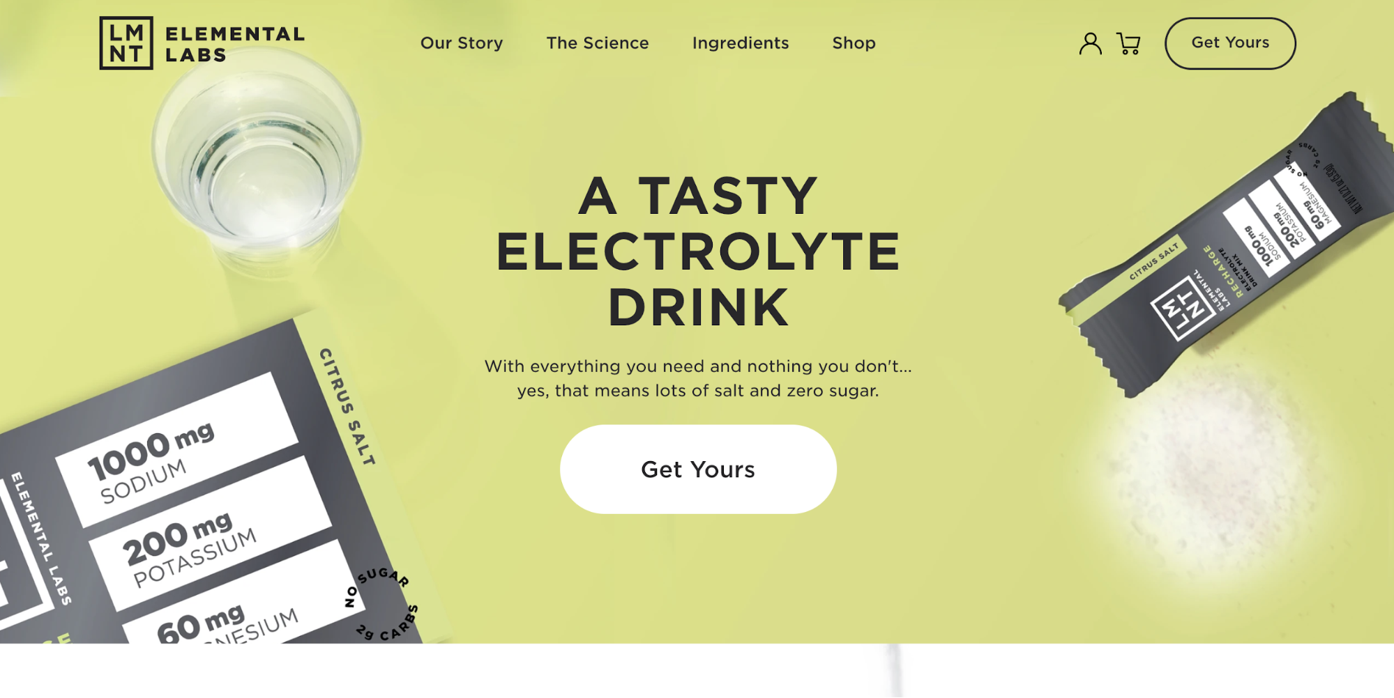
Apart from navigation and peripheral elements, just over twenty words are visible. In those two sentences, the product and its value are spelled out within seconds. The page leads with simple, high-quality product visuals that show the packaging and the product in use, aligned with design principles that promote maximum engagement.
This tells a simple visual story that connects the customer to a mental impression of actually using the product. There is no need for a complex image sequence showing every step of preparation. The essential message lands instantly, with no clutter to dilute it.
Customer Needs Don't Stop at the Product
Customer-centricity shouldn't be confined to interactions with the product or service itself. Businesses that focus only on the moment of use miss where many customer needs actually live. Those needs extend into every phase of the journey: before the click, during research, and after conversion.
Your customers are asking you to respect their time. Their attention is limited, and the moment a page feels cluttered or confusing, you start losing them to the noise you created. If every marketing professional started a campaign by asking what the product can do to make a customer's life easier, the rest would fall into place.
The point is to be deliberate about what you place in front of customers and why. When you filter every element through the lens of customer value, you eliminate distractions by default.
That approach works because it shifts the conversation from what your business wants to say to what the customer actually needs to hear. Communicate value intelligently, avoid the visual clutter, and you make a far stronger case than any dense or decorative design could.
Where to Take It From Here
If you want to dig into topics related to pricing, sustainable design, authentication, or accessibility, the following resources are good starting points:
- Pricing Projects As A Freelancer Or Agency Owner
- When Friction Is A Good Thing: Designing Sustainable E-Commerce Experiences
- Rethinking Authentication UX
- A Designer’s Accessibility Advocacy Toolkit



