Home/Engineering/High DPI images for variable pixel densities
Engineering
High DPI images for variable pixel densities
Understand how to serve the best quality images as efficiently as possible.
W
web.devweb.dev
·
Choosing the Right Image Resolution
Modern displays pack far more pixels per inch (ppi) than the roughly 96dpi baseline that early web design assumed. A fixed-resolution image that looks acceptable on a desktop monitor can appear visibly blurry on a phone held at arm's length, where the pixel density is much higher. To keep images sharp without wasting bandwidth, you need to understand how browsers map CSS pixels to physical device pixels and how to exploit that mapping.
The CSS Pixel and Device Pixel Ratio
The device pixel ratio (DPR) is the key concept. Per the HTML specification, a reference pixel is defined so that at a typical viewing distance of 28 inches, an ideal display has 96 physical pixels per CSS pixel. Manufacturers use this reference to derive a device-specific value. The DPR is simply the ratio of the device's physical pixel density to the ideal pixel density for its typical viewing distance:
Estimate the viewing distance (e.g., ~18 inches for phones vs. 28 for desktops).
Compute the ideal density: idealPixelDensity = distanceRatio * 96.
Divide the device's actual ppi by that ideal density: devicePixelRatio = physicalPixelDensity / idealPixelDensity.
One reference angular pixel, to
illustrate how the device pixel ratio is calculated.
For a phone with a 180ppi screen held at 18 inches, the ideal density is about 150ppi, giving a DPR of 1.2. Browsers use this ratio to determine how many physical pixels correspond to one CSS pixel:
Historically, vendors often reported a whole-number DPR — an iPhone reports 1, its Retina sibling reports 2. The CSS specification recommends picking the whole number that best approximates the reference pixel, partly because round numbers can reduce sub-pixel rendering artifacts. However, the actual device ecosystem is less tidy: many Android handsets report 1.5, and the Nexus 7's DPR is approximately 1.33. You should never assume every client has an integer DPR, so an image strategy that presumes clean 1x or 2x values will break on those devices.
Let CSS and SVG Cover the Odd Cases
Not every visual asset needs to be a raster image. Text, SVG, and CSS vector effects scale automatically and cleanly at any DPR because the browser's pixel scaling handles them. For charts, icons, or simple illustrations that can be produced as SVG or CSS shapes, that's the most efficient approach — zero added bytes for high-density screens.
The problem is that raster "whole pixel" choices you make in code matter, and this scaling trick does not apply to bitmap formats like PNG or JPEG. If the asset is a photograph or otherwise can't be reasonably redrawn as vectors, you must serve multiple resolutions, which is the core challenge.
Bandwidth and Battery Constraints
Serving a high-resolution image to every device is wasteful. It consumes extra bandwidth (and battery life) on low-density phones, yet yields the same visual result as a smaller file. Conversely, serving one low-resolution image degrades the experience on high-DPR screens, where crispness is the norm users take for granted.
In the past, you would not notice the difference between a 1x and a 2x version side-by-side. On a high-density display, the 1x image is upscaled with obvious pixelation, while the 2x equivalent is sharp. That gap is the entire reason this problem requires dedicated handling, and it only grows as high-DPR screens become more common.
Approaches for serving the right image
Techniques for handling high-DPI imagery fall into two broad camps: optimizing a single image, or optimizing the selection between multiple images. Single-image approaches force a tradeoff—serving high-resolution assets to everyone means lower-DPI devices pay a bandwidth penalty for pixels they can't use. Multiple-image approaches shift the cost to development, requiring multiple asset versions and a decision strategy.
Compressing one image for all
The least infrastructure-heavy option is to serve one heavily compressed high-DPI image to every client. Since images already account for roughly 60% of average page weight, this raises the obvious question of how much more bandwidth we can justify.
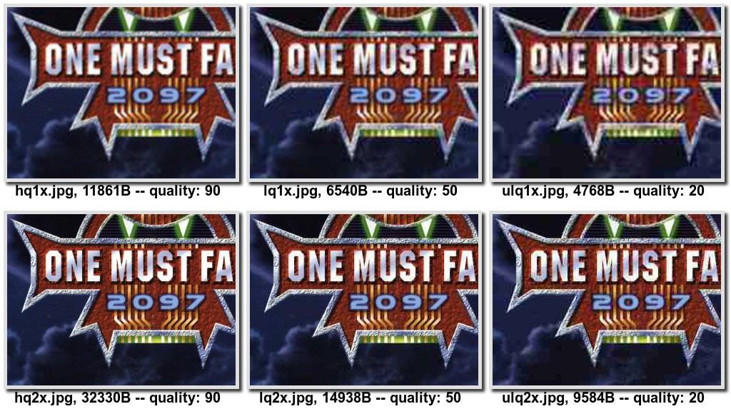
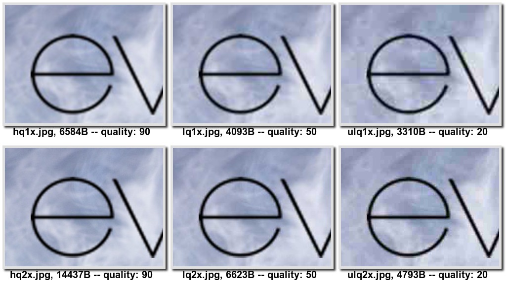
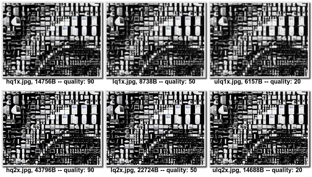
Informal comparisons of 1x and 2x JPEG fragments at quality levels 90, 50, and 20 suggest that heavy compression of large images offers a strong quality-to-size ratio—highly compressed 2x imagery often looks better than uncompressed 1x. The caveat is that serving low-quality 2x images to 2x devices means visibly reduced crispness and increased graininess at quality: 20. For photo-centric apps or projects unwilling to compromise on quality, that tradeoff is rarely acceptable.
Newer and progressive formats
WebP compresses significantly better than JPEG at equivalent fidelity—roughly 30% smaller in official gallery comparisons—and support can be detected in JavaScript via Modernizr.webp. A more direct CSS route uses the image() function to declare format fallbacks:
That approach has two problems: image() is barely implemented anywhere, and WebP's gains, while real, are incremental rather than a full solution to the high-DPI problem.
Progressive formats (JPEG 2000, Progressive JPEG, Progressive PNG) offer the attractive idea of letting the browser stop fetching once additional data no longer improves visible quality. There is conflicting evidence on their size overhead—estimates range from about 20% for PNG and 10% for JPEG up to claims that progressive encoding is more efficient for large files. The larger practical obstacle is connection management: terminating an image request early is cheap, but restarting a connection is expensive. The HTTP Range header would let a browser request just the needed bytes, but server support for it remains poor. And since progressive formats only vary fidelity of one image, they don't address art direction.
Client- and server-side selection
JavaScript gives complete control: window.devicePixelRatio exposes the pixel ratio, and libraries like foresight.js attempt network-connection sniffing. However, this approach forfeits look-ahead parsing—images don't begin downloading until after pageload events fire. A large ecosystem of JavaScript image-loading libraries exists, but none stand out as particularly robust.
Server-side selection, via custom request handlers that inspect the User-Agent and serve assets from a naming convention, suffers a worse flaw: the User-Agent alone doesn't reliably indicate how many pixels the client can use, and using it to make style decisions is generally inadvisable.
Media queries for responsive backgrounds
CSS media queries bring back look-ahead parsing and allow you to define breakpoints for low, mid, and high DPI images. Matching on devicePixelRatio uses the device-pixel-ratio query with min/max variants:
#my-image { background: (low.png); }

@media only screen and (min-device-pixel-ratio: 1.5) {
  #my-image { background: (high.png); }
}
Vendor prefixes complicate things, especially because the placement of min and max differs across browsers:
@media only screen and (min--moz-device-pixel-ratio: 1.5),
    (-o-min-device-pixel-ratio: 3/2),
    (-webkit-min-device-pixel-ratio: 1.5),
    (min-device-pixel-ratio: 1.5) {

  #my-image {
    background:url(high.png);
  }
}
This approach has real drawbacks: it produces verbose, preprocessor-dependent CSS; it can only style background images, so <img src> is out of reach; and matching solely on pixel ratio means a high-DPI phone on a slow EDGE connection can still be served a massive 2x asset. Because image-set() is a CSS function, it does not help <img> elements—which is where srcset comes in.
Choosing a High DPI Strategy
None of the approaches for serving high DPI images is perfect. The best option depends on your specific needs, but with broad browser support for image-set and srcset, these are now the most reliable solutions to build on.
These two mechanisms serve similar purposes but operate in different contexts. image-set() is a CSS function used for background images, while srcset is an attribute for <img> elements. The syntax is similar, but srcset adds the ability to base image selection on viewport size as well as pixel density.
Applying image-set() for Backgrounds
The image-set() function takes one or more comma-separated image declarations. Each declaration pairs a URL string or url() function with a resolution qualifier:
image-set(
  url("image1.jpg") 1x,
  url("image2.jpg") 2x
);

/* You can also include image-set without `url()` */
image-set(
  "image1.jpg" 1x,
  "image2.jpg" 2x
);
This tells the browser two images are available: one optimized for 1x displays and one for 2x displays. The browser chooses which to download based on factors it knows best, which may include connection speed in smarter implementations. It also handles scaling automatically—a 2x image is assumed to be twice the dimensions of its 1x counterpart and is displayed at half its intrinsic size, so it fits the same layout space.
Beyond the standard 1x, 1.5x, or Nx multipliers, you can specify an explicit device pixel density in DPI.
For browsers lacking image-set() support, include a fallback declaration. A plain background-image line placed before the image-set() rule ensures some asset is still rendered:
This pattern serves the 2x asset to supporting browsers, while older ones get the 1x fallback.
You might wonder why a JavaScript polyfill isn't a viable path for image-set(). Efficient polyfilling of CSS functions is notoriously difficult; a www-style discussion details the technical hurdles.
Gaining More Control with srcset
The srcset attribute extends the same idea with viewport-based conditions. In addition to density descriptors, it accepts width and height values tied to the viewport size, letting the browser pick the most relevant file:
<img alt="my awesome image"
  src="banner.jpeg"
 >
This example selects banner-phone.jpeg for viewports under 640px wide, banner-phone-HD.jpeg for small screens on high DPI devices, banner-HD.jpeg for high DPI screens larger than 640px, and banner.jpeg as the default.
Reconsidering the img Swap
Replacing <img> elements with styled <div>s to leverage image-set() is possible, but it carries a cost. The <img> tag has established semantic significance for accessibility and web crawlers that a generic container lacks.
One alternative is the content CSS property, which lets the browser scale the image according to devicePixelRatio:
A key advantage of srcset over image-set() is its graceful degradation. Browsers that don't recognize the attribute will simply fall back to the standard src attribute. And because it's a plain HTML attribute, it's amenable to JavaScript-based polyfills.
The referenced polyfill includes unit tests to ensure behavior tracks the specification closely. It also features built-in checks to prevent execution when native support is present.
Principles to Follow
SVG and CSS remain the ideal solution for visual assets wherever feasible, but they aren't always practical—particularly for image-heavy websites. The various JavaScript, CSS, and server-side techniques each have trade-offs. For most cases, the best path forward is to adopt image-set and srcset.
For background images, use image-set with fallbacks for unsupported browsers.
For content images, use a srcset polyfill, or fall back to the image-set technique.
When you can accept some loss in quality, consider serving heavily compressed 2x images to reduce bandwidth.
One of the most wonderful aspects of math is how deep we can get by studying seemingly trivial questions. Consider the roots of unity, where "unity" simply means the number 1. Basics: roots of unity for real numbers Studying the roots of unity usually begins in middle school: what is …
Cloudflare Gateway and Data Loss Prevention have inherited the flexibility and power of Cloudflare Workers through our full-stack integration with the Cloudflare Developer platform.