
Beyond the inline rectangle
Most long-form articles place images as inline rectangles floating between paragraphs of text. That works, but the result often reads as flat: layouts can start to feel formulaic, and images can seem bolted on rather than woven into the story. Images can do more than illustrate. They influence how readers navigate, feel, and interpret an article.
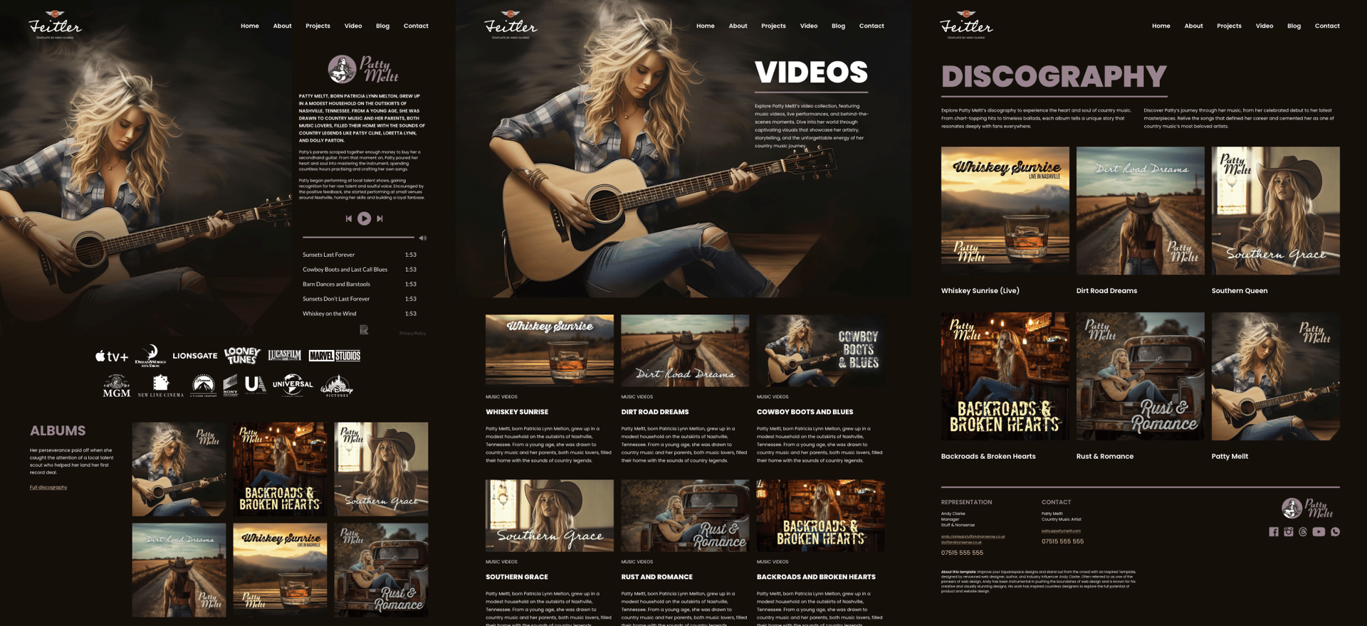
Andy Clarke of Stuff & Nonsense uses a fictional country artist, Patty Meltt, as a stand-in brief: an up-and-coming musician who wants a distinctive, memorable site for a new album and tour. Fictional or not, the design problems are real ones.
Breaking the grid on purpose
Grids give readers a comfortable, structured flow, keeping complex information aligned and manageable. Their predictability is exactly what makes them a useful baseline.
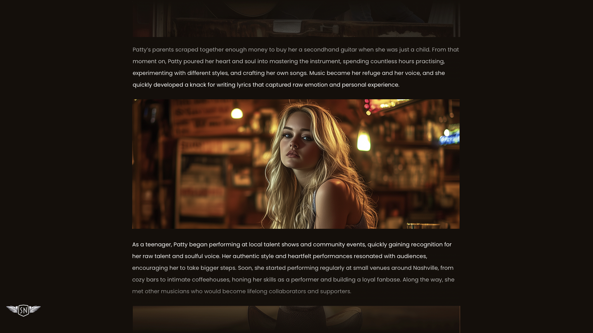
Once a grid exists, however, breaking it selectively draws the eye, adds personality, and stops the layout from flattening out.
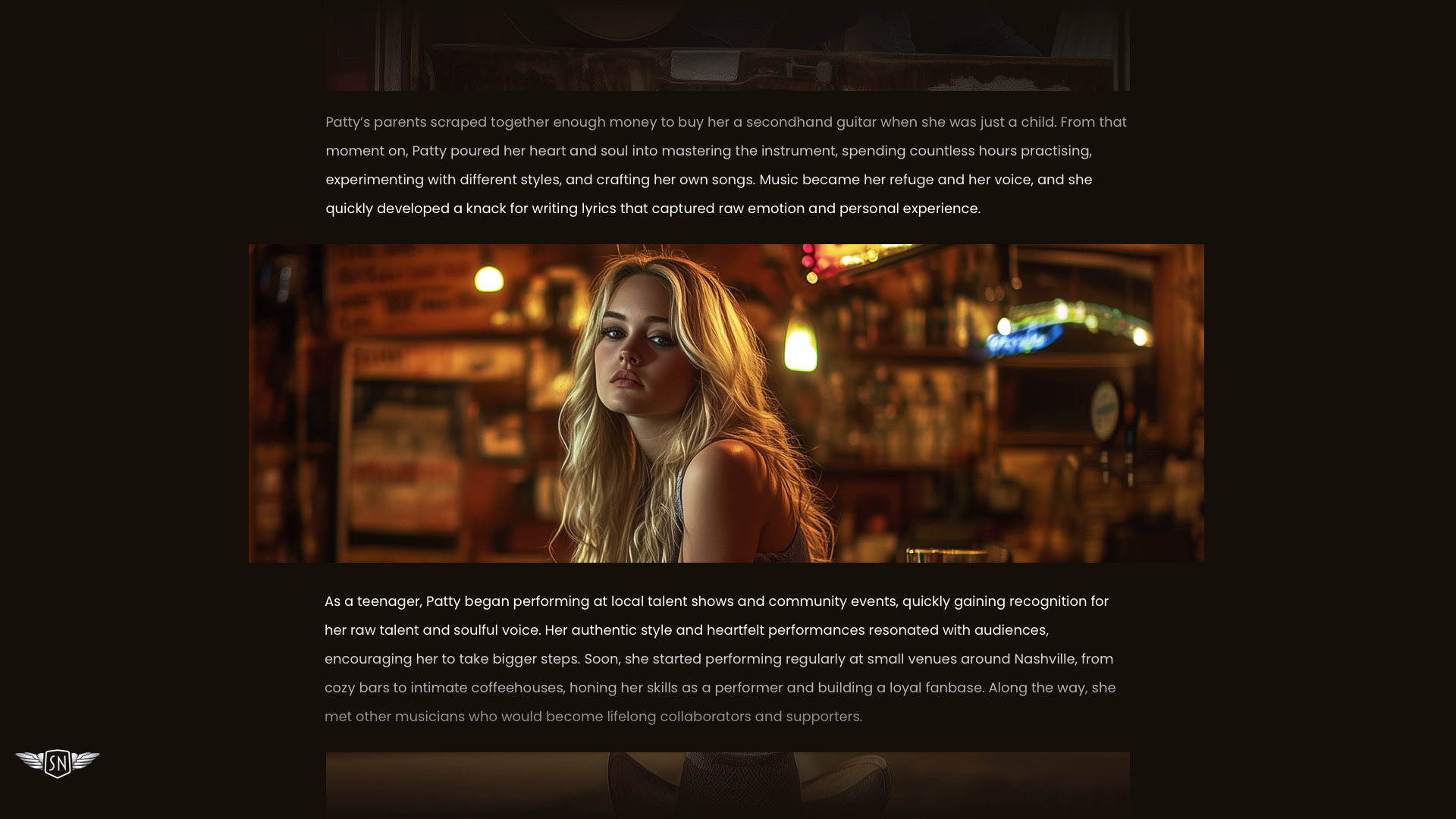
For instance, nudging images into the margins or out of alignment can make a page feel more casual and energetic. You can expand an image past its column with negative margins:
figure {
  inline-size: 120%;
  margin-inline-start: -10%;
  margin-inline-end: -10%;
}
Applied sparingly, these breaks work as punctuation, directing the reader's eye through the text.
Inline width versus full bleed
Once images are treated as design decisions, a basic question arises: how wide should they be?
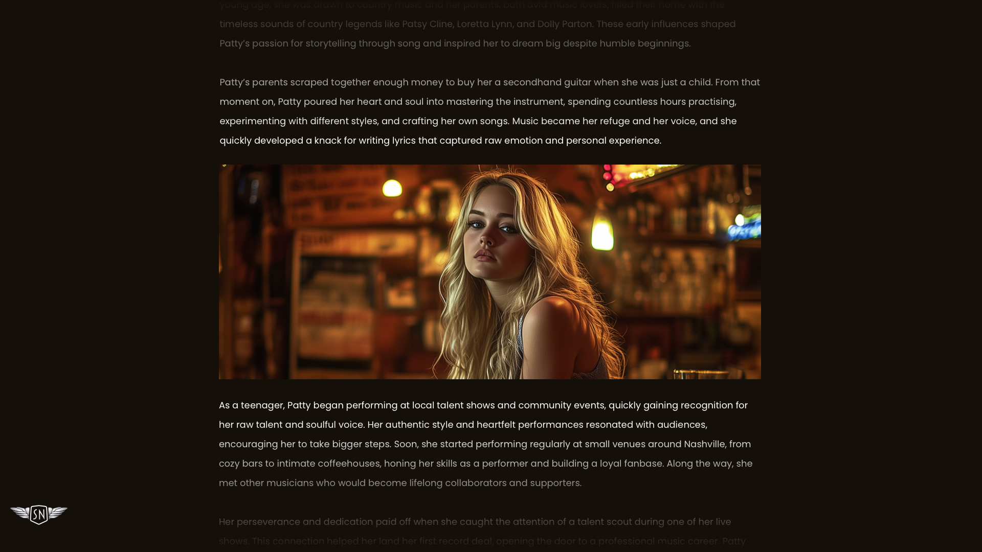
Should an image sit flush with the text column?
img {
  inline-size: 100%;
  max-inline-size: 100%;
}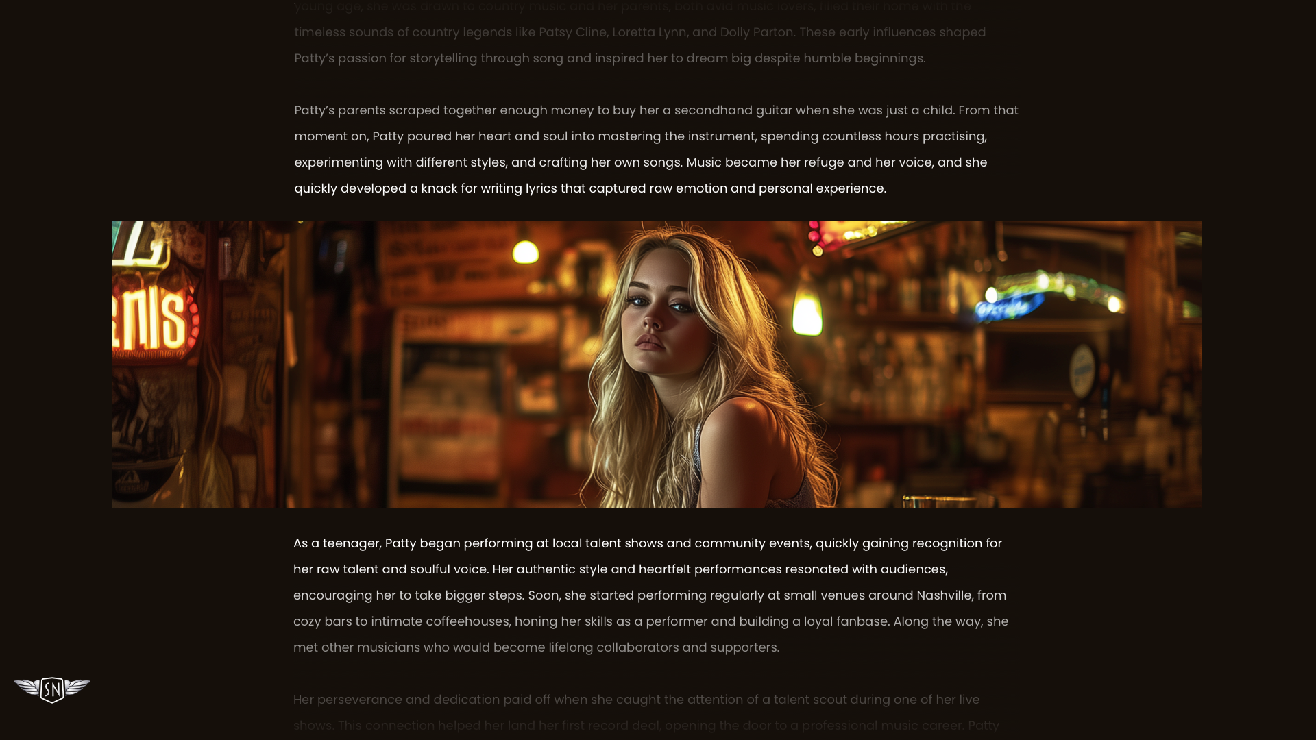
Or span the entire page width?
figure {
  inline-size: 100vw;
  margin-inline-start: 50%;
  transform: translateX(-50%);
}
Neither approach is inherently better — they serve different purposes. Books and newspapers largely keep images inside the column, reinforcing the flow of words; magazines regularly break out with full-bleed imagery for drama.
In articles, news stories, and reports, images within the column move with the copy, creating order and rhythm. That suits charts, diagrams, and infographics where clarity matters. In the wrong context it can feel predictable and low on energy. Full-width imagery produces instant impact, acting as a dramatic pause that shifts attention from words to visuals. But it has to earn its place: overused, it turns into filler and loses its effect.
Arranging groups of images
A single image in the flow of text is not the only case. A sequence of related images raises the question of arrangement — how to compose it.
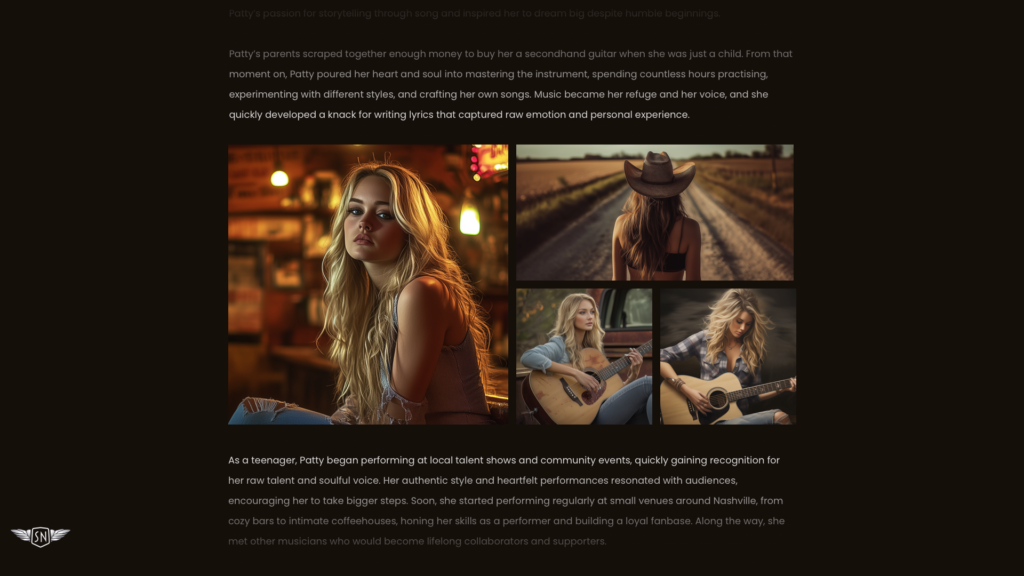
Rather than stacking vertically, a modular grid builds a cohesive arrangement with precise control over placement and scale. It's a structure of repeated units — usually squares or rectangles — arranged horizontally and vertically to bring order to varied content. Images can occupy a single module or span several for a bigger zone of emphasis.
figure {
  display: grid;
  grid-template-columns: repeat(4, 1fr);
  gap: 15px;
}

figure > *:nth-child(1) {
  grid-column: 1 / -1;
}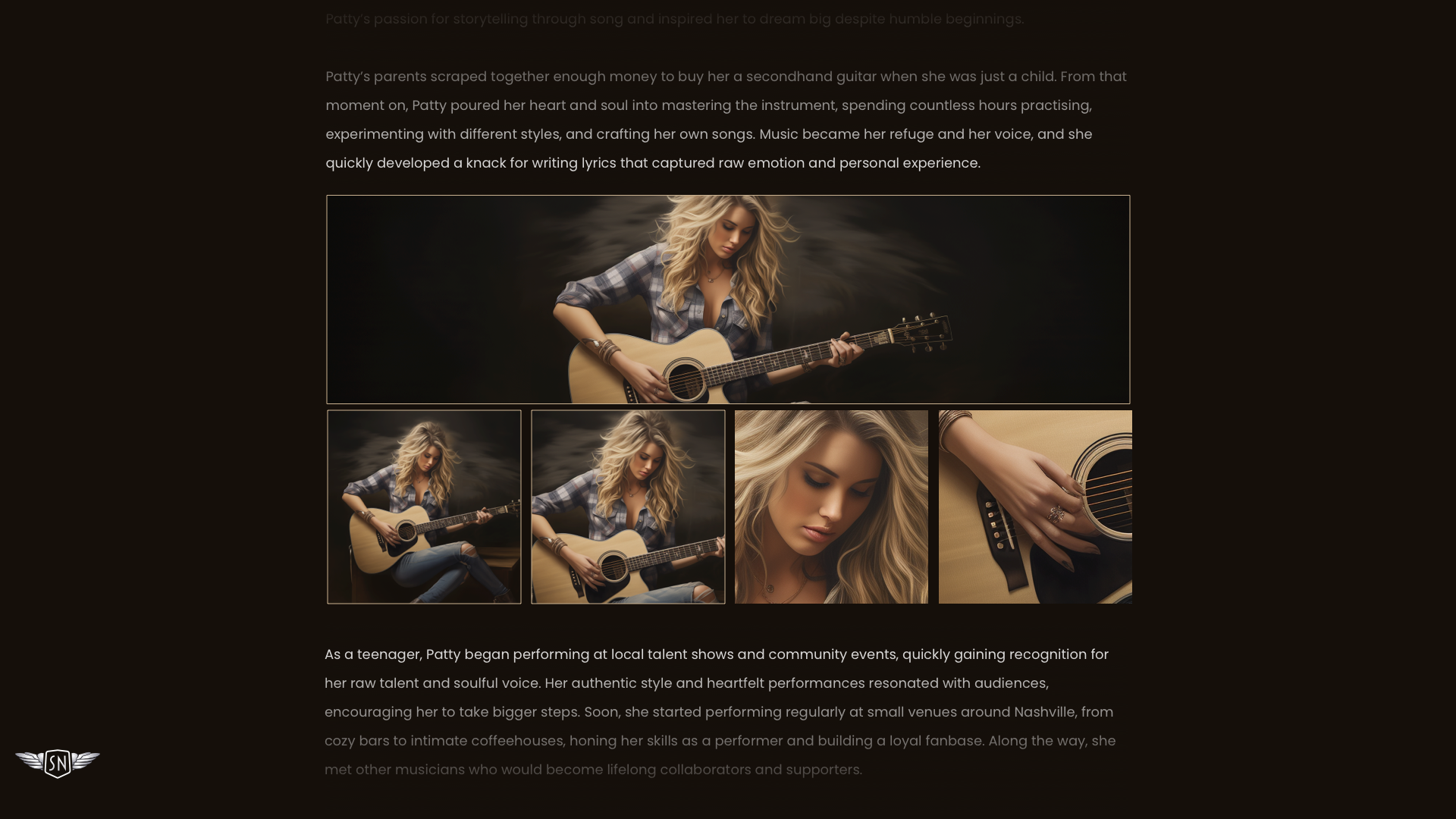
Modular grids also break free of conventional column layouts, adding variety without relying on full-bleed imagery every time. They let landscape and portrait images share the same space, allow scale variation (larger for emphasis, smaller in support), and group related visuals so their relationship is reinforced for the reader.
CSS Shapes for expressive text wraps
Every image sits inside a box. By default, text flows above or below that box, and a floated image forces adjacent text to wrap around its rectangle regardless of content. When the subject fills the box edge to edge, that wrap looks natural.
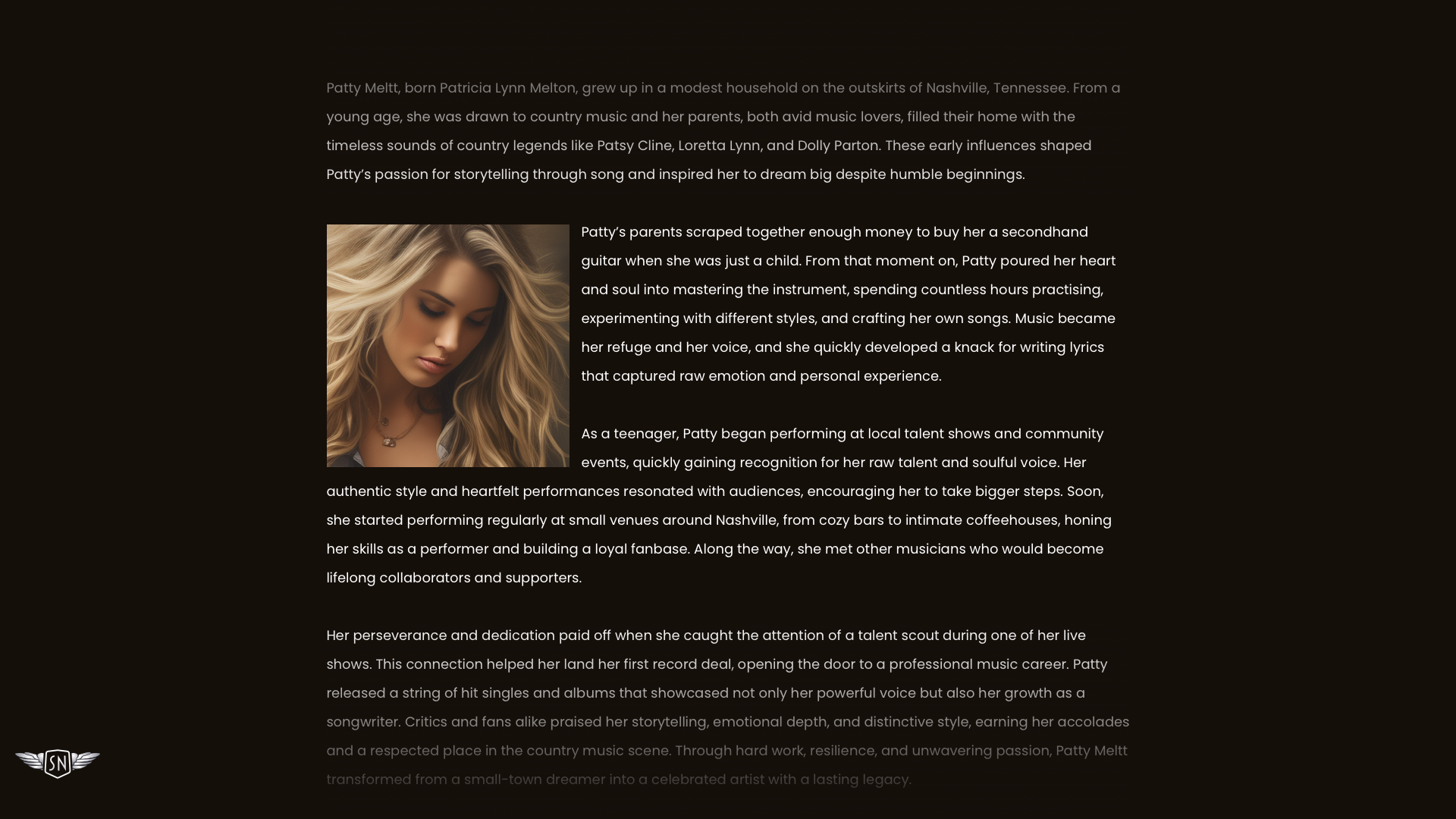
With a cut-out subject or an irregular outline, the rectangular wrap looks awkward.
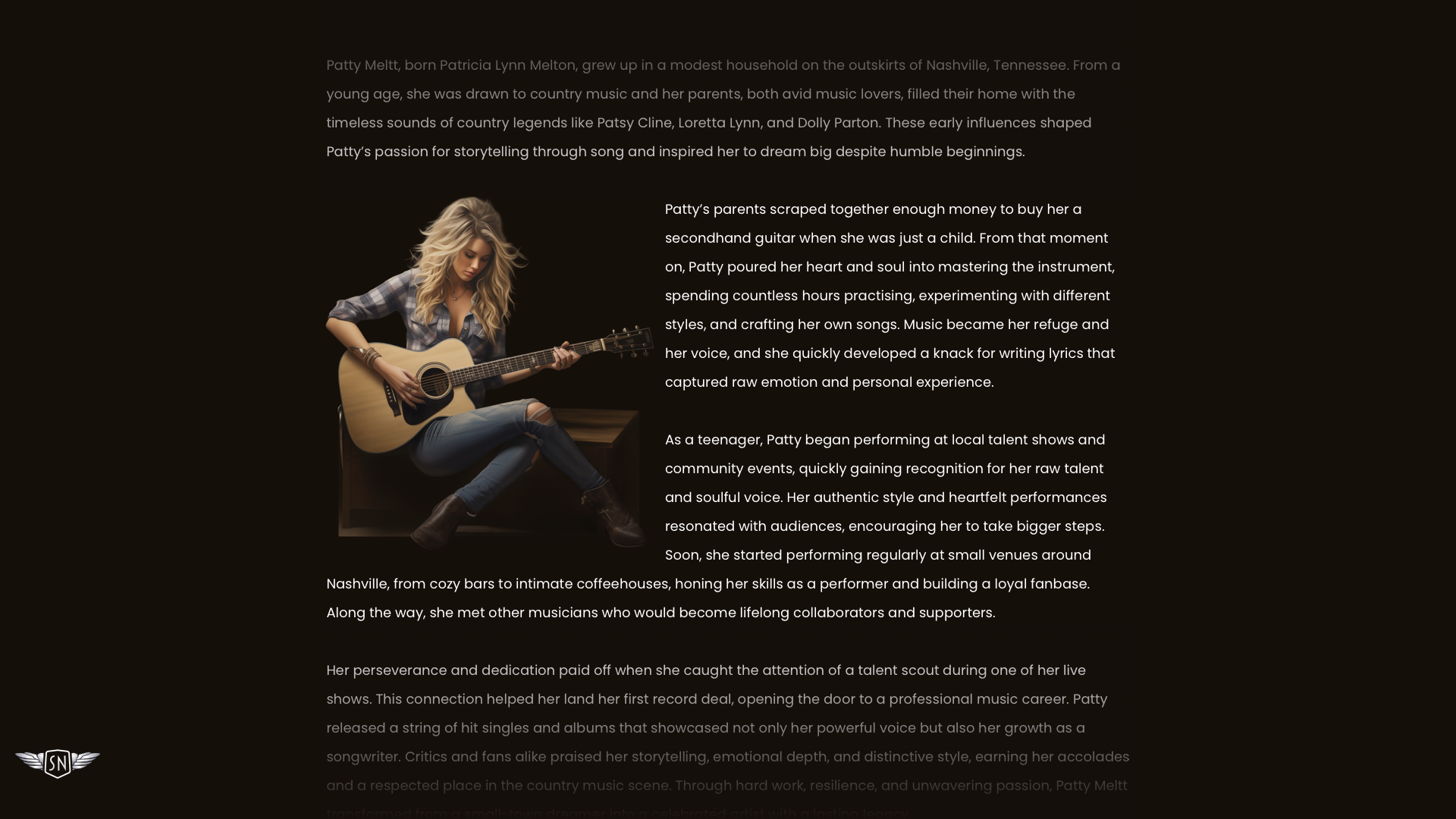
CSS Shapes fixes this by letting text wrap around any custom shape you define. The effect is more than decorative: it livens up the page. shape-outside changes the reading experience — it briefly slows readers down, creates rhythm, and contrasts with regular blocks of text. It also ties text and image together into a single shared composition.
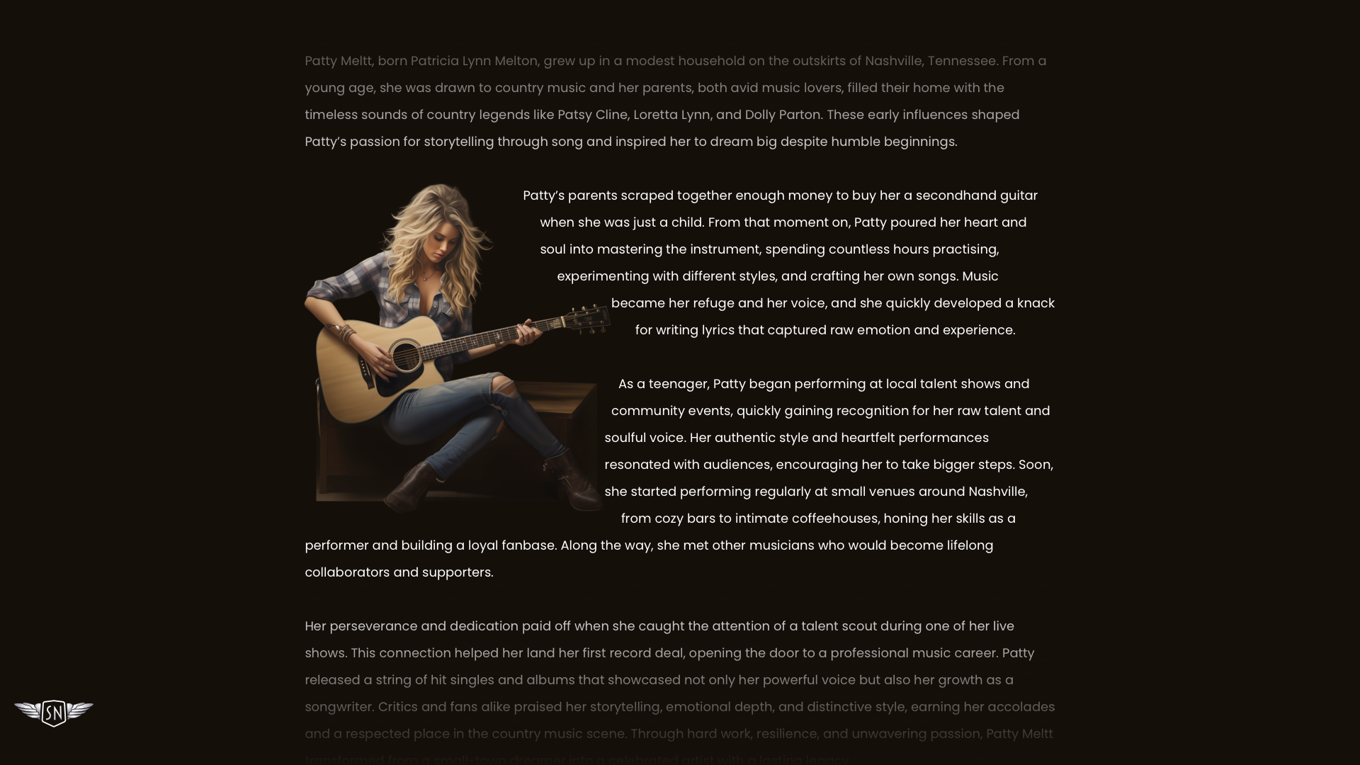
Many explanations of shape-outside open with circles and ellipses, but Clarke argues for starting with something more expressive: flowing text around an image's alpha channel.
img {
  float: left;
  width: 300px;
  height: auto;
  shape-outside: url('patty.webp');
  shape-image-threshold: .5;
  shape-margin: 1rem;
}
No clipping paths, no polygons — just the natural silhouette of the image shaping the text. It's a small touch that makes the design feel crafted and human.
Captions as design elements
Captions don't have to be small grey text tucked beneath a picture.
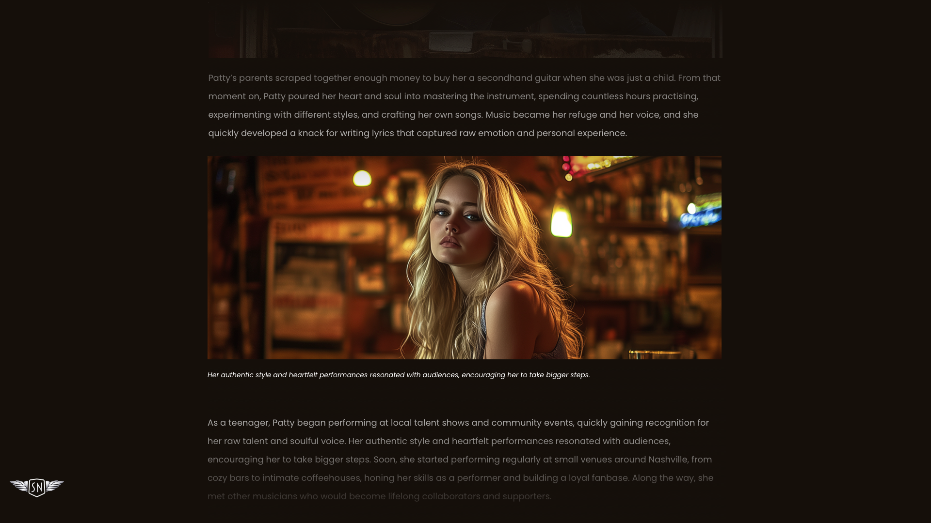
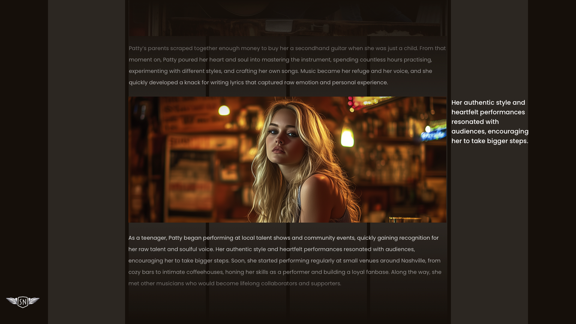
Giving thought to their position and styling turns them into active parts of the design that direct attention and add personality. No rule says a caption must sit below its image. Placing it to the side is one option.
figure {
  display: grid;
  grid-template-columns: repeat(6, 1fr);
  gap: 1rem;
}

figure img {
  grid-column: 1 / 6;
}

figcaption {
  grid-column: 6;
}
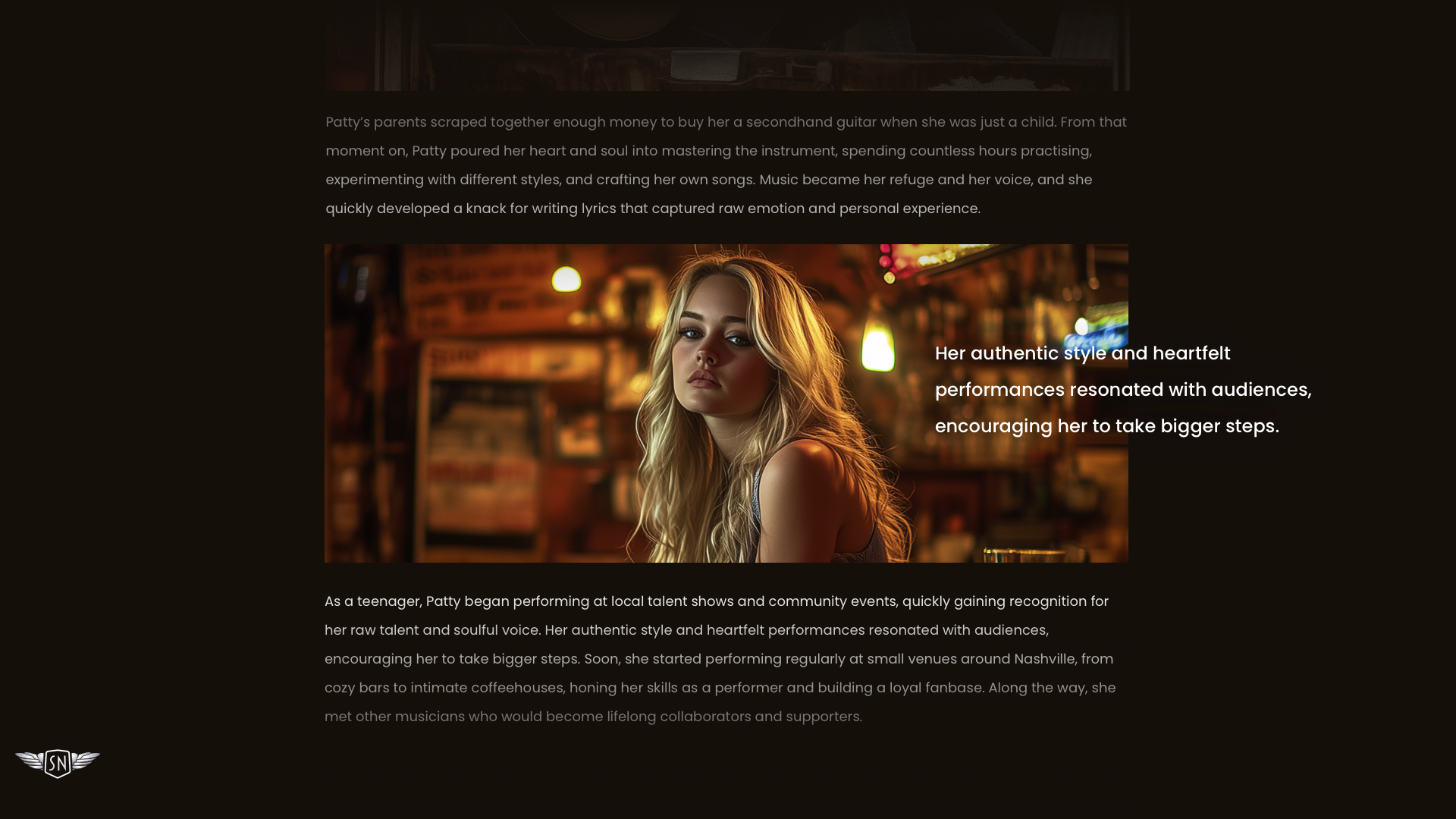
Overlapping part of the picture is another:
figure {
  display: grid;
  grid-template-columns: repeat(6, 1fr);
  gap: 1rem;
}

figure img {
  grid-column: 1 / 6;
  grid-row: 1;
}

figcaption {
  grid-column: 5 / -1;
  grid-row: 1;
}
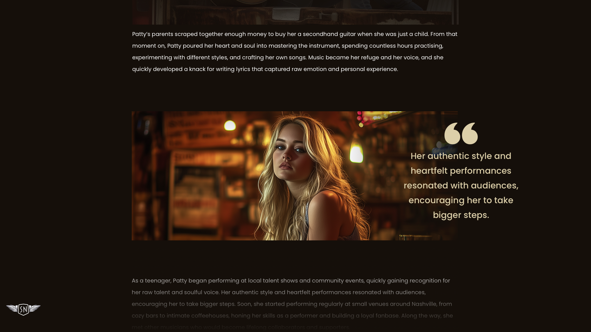
Captions bridge image and text; done well, they can elevate as much as explain. They needn't look conventional — they can be styled like pull quotes or side notes.
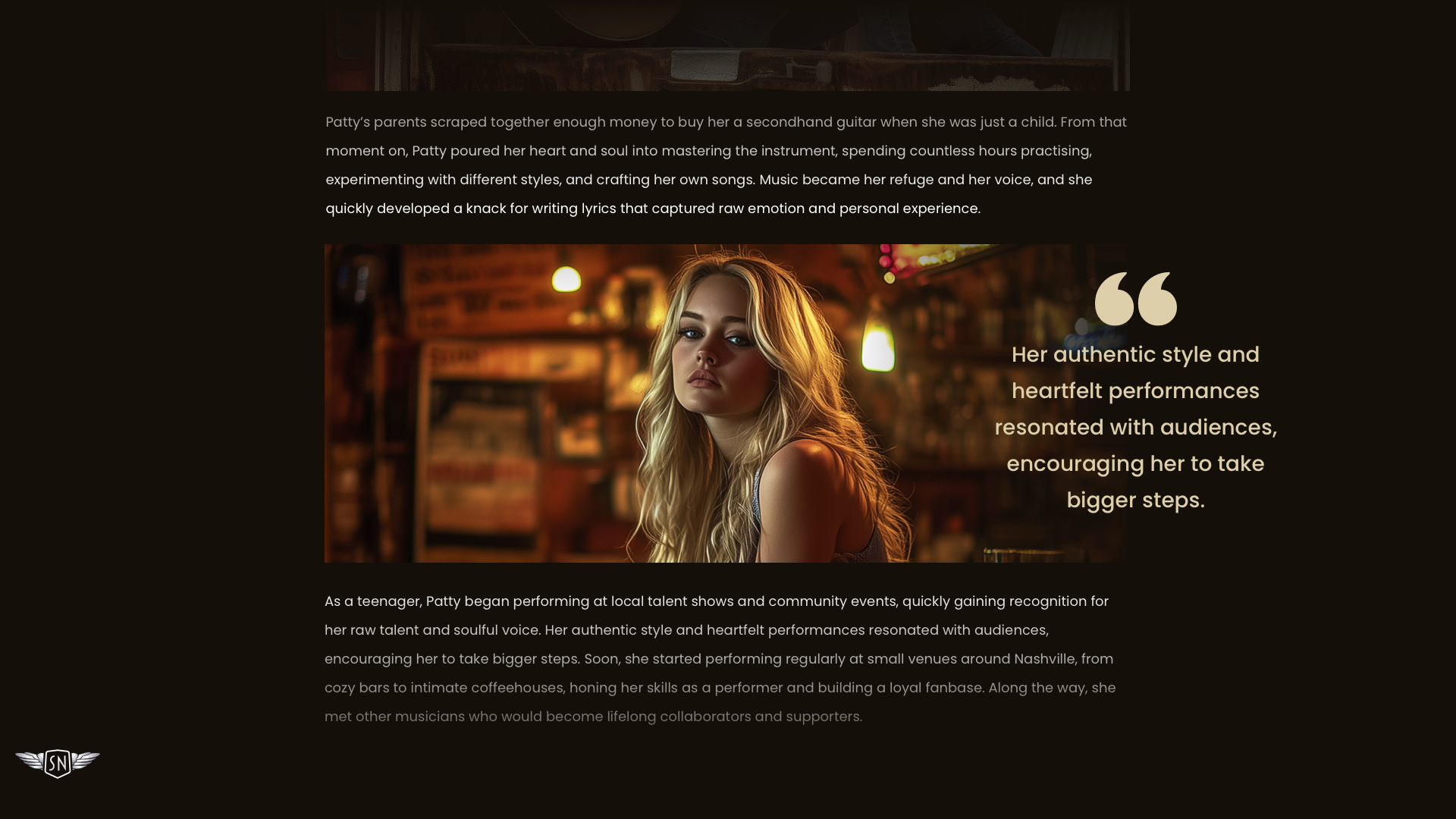
A caption echoing a pull quote, or paired with graphic elements, feels less like a label and more like part of the story.
Whitespace around the image
The space surrounding an image matters as much as the image itself. Margins, padding, and negative space influence how much attention an image draws and how naturally it sits on the page.
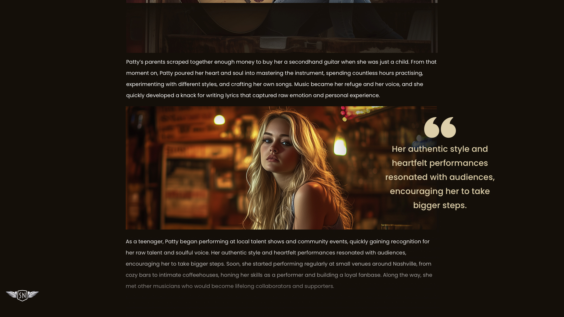
Tighter spacing works for grouping images, but it also introduces tension; generous margins give the image room to breathe.
figure {
  margin-block: 3rem;
}
Like a line break in a poem, whitespace slows the pace and offers natural pauses for the reader.
The design should be deliberate
Images shape how readers move through long-form content, how it feels, and what stays with them. Pushing past the default rectangle — breaking the grid, choosing full-bleed over inline, wrapping text with CSS Shapes, reworking captions — is a matter of intent. The question when laying out an article is less "Where can I put an image?" than "How can this image help shape someone's experience?"


