

Structure and sizing
The layout uses a wrapper with display: flex, relying on the default stretch alignment so a percentage height can be resolved later. The inner .box acts as the flex item and defines the wrapper's height while being stretched to it. That gives a reference height usable by child elements.
The specification describes the mechanism:
If the flex item has
align-self: stretch, redo layout for its contents, treating this used size as its definite cross size so that percentage-sized children can be resolved.
The word definite is what makes a percentage height inside the box safe to use.
<div class="wrapper">
  <div class="box">
    <div class="float"><img></div>
    Lorem ipsum dolor ...
  </div>
</div>
.wrapper {
display: flex;
}
.float {
float: right;
height: 100%;
display: flex;
align-items: flex-end;
shape-outside: inset(calc(100% - 100px) 0 0);
}The floated element and shape-outside
The .float element takes the full height beside the text content, following the same height calculation. The image inside is pushed to the bottom with flexbox alignment. Then shape-outside controls how inline content wraps around the element. Per MDN:
The shape-outside CSS property defines a shape—which may be non-rectangular—around which adjacent inline content should wrap. By default, inline content wraps around its margin box;
shape-outsideprovides a way to customize this wrapping, making it possible to wrap text around complex objects rather than simple boxes.
One accepted value is the inset() function, which, again per MDN:
Defines an inset rectangle. When all of the first four arguments are supplied they represent the top, right, bottom and left offsets from the reference box inward that define the positions of the edges of the inset rectangle.
Writing shape-outside: inset(calc(100% - X) 0 0) creates an inset rectangle starting right at the image's top edge, where the top offset is 100% - X, X is the image height, and 100% is the height of .float. The wrapping text then uses the free space above the image. The result is responsive, and left/right placement can be swapped by changing float.
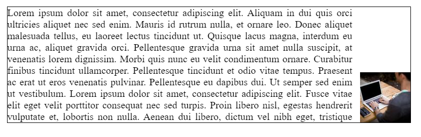
The main caveat: the image height must be known.
Dropping the extra wrapper
Markup can be slimmed down by removing the wrapper around the image:
<div class="wrapper">
  <div class="box">
    <img class="float">
    Lorem ipsum dolor ...
  </div>
</div>
The CSS then becomes:
.wrapper {
  display: flex;
}

.float {
  float: right;
  height: 100%;
  width: 100px;
  shape-outside: inset(calc(100% - 100px /*height */) 0 0);
  object-fit: contain;
  object-position: bottom;
}
Without that wrapper, the image is positioned with object-fit and object-position, which requires an explicit image width. This version needs both the image width and its height, whereas the earlier one needed only the height.
Variations
- Floating right with
justify-content: centerpins the image to the vertical middle; changing the shape toinset(calc(50% - X/2) 0 0)places the inset rectangle at the center. Two images can sit in opposite bottom corners by reusing the same float once right and once left. - Placing images at all four corners uses the same idea plus standard floats for the top images. This is where the approach begins to break down, producing unwanted overflow depending on the containing box size; raising the height of
.floatabove 100% and applying somewhat "magic numbers" via image padding and margin smooths it out. shape-outsidealso acceptsradial-gradient(), producing rounded image wrapping. The gradient's transparent part is the free space for text. Becauseshape-outsideonly affects.float, a matchingborder-radiusmust be applied to the image. This combines with the centering technique above.- A
linear-gradient()gives a triangular wrapping area. Hereclip-pathcuts the image instead ofborder-radius. Aconic-gradient()version defines the same triangle withclip-pathreproducing it on the image, positioned at the vertical center viajustify-content: center.
Decorative images
When the image is decorative (not in the HTML for SEO), the .float element can be replaced with a pseudo-element carrying the image as a background. Then mask reveals only the needed portion of the image—and it takes the same value as shape-outside, so only one shape definition is required.
The overall pattern stays the same for any shape at any position: adjust shape-outside to define the shape, then style the image to follow it, or apply the same value to mask in the pseudo-element version. It holds its place in responsive designs.



