
A fixed card height looks like a guarantee of order: every card in the grid lines up, titles are short, excerpts fit, and the mockup ships without argument. The guarantee only holds for the content the mockup happened to contain.
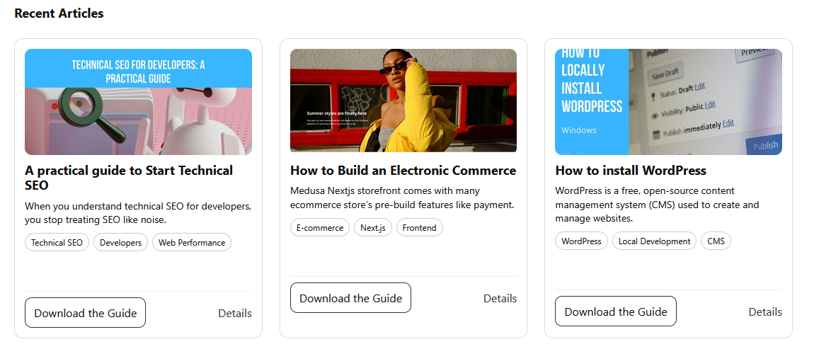
This is the failure mode of a "Recent Articles" section built for a blog. The design assumed short English titles, and the cards fit comfortably inside their fixed boxes:
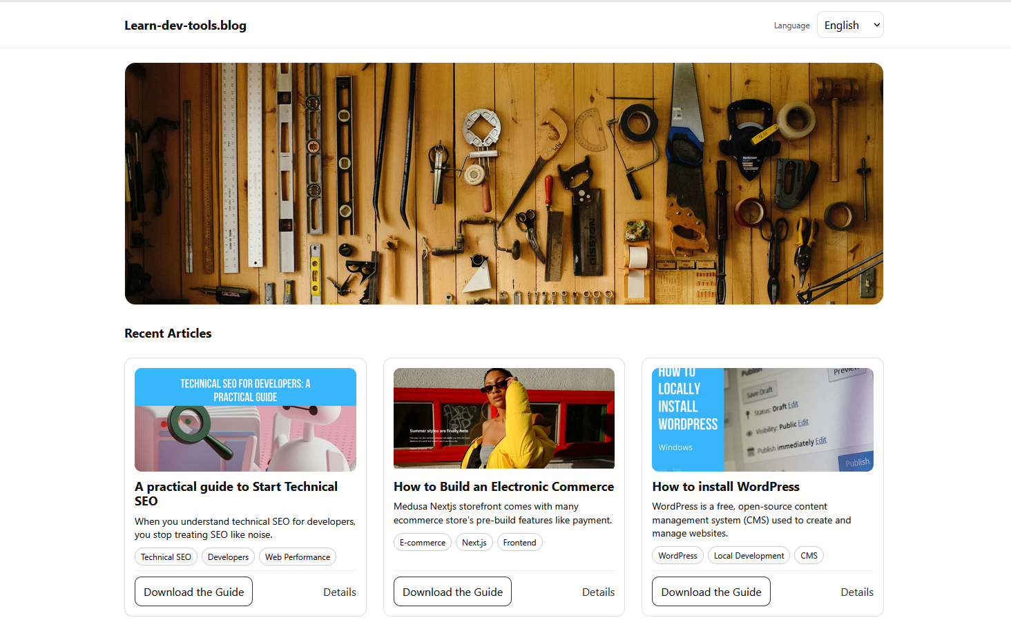
Then the copy changed and editors updated the text:
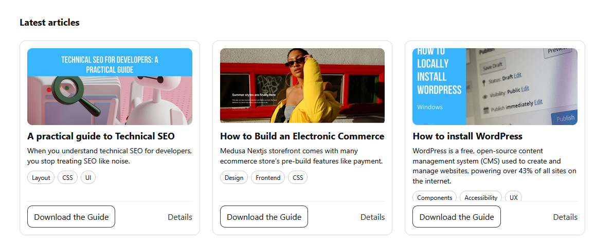
French translations made it worse, and German ones pushed the layout further still:
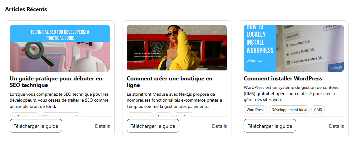
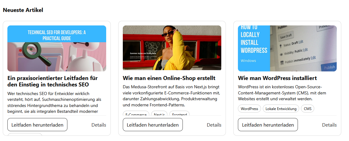
The component had been stable only because of an unstated assumption: content stays within a fixed height. That assumption was encoded in exact pixel dimensions — cards of equal size and vertical rhythm read as order, which is why the design trusted them.
.card__title {
  margin: 0 0 8px;
  font-size: 18px;
  line-height: 1.2;
  display: -webkit-box;
  -webkit-line-clamp: 2;
  -webkit-box-orient: vertical;
  overflow: hidden;
}

.card__excerpt {
  margin: 0 0 10px;
  font-size: 14px;
  line-height: 1.4;
  display: -webkit-box;
  -webkit-line-clamp: 3;
  -webkit-box-orient: vertical;
  overflow: hidden;
}
The relationship broke as soon as the browser's default text size changed, a common adjustment for readers with low vision or digital eye strain. Block elements normally grow with their content; declaring a height severs that link. The browser doesn't flag the conflict — it resolves it by overflowing or clipping.
In the original, overflow: hidden hid the symptoms. Removing it makes the failure visible: excerpts sit on top of the tags and content spills out.
.card__title {
  display: -webkit-box;
  font-size: 18px;
  line-height: 1.2;
  margin: 0 0 8px;
  -webkit-line-clamp: 2;
  -webkit-box-orient: vertical;
  /* overflow: hidden; */
}

.card__excerpt {
  display: -webkit-box;
  font-size: 14px;
  line-height: 1.4;
  margin: 0 0 10px;
  -webkit-line-clamp: 3;
  -webkit-box-orient: vertical;
}
overflow: hidden reveals the structural tension instead of masking it.The browser has no way to reconcile competing instructions except to let the elements collide.
The Fixed Height Is Not Alone
Lifting the fixed height exposes other contributors: absolute positioning and grid alignment were all trying to control the same thing. The card's actions were absolutely positioned, which keeps them pinned to the bottom regardless of content length:
.card__actions {
  position: absolute;
  inset: 0 14px 14px;
}
Absolutely positioned elements are still rendered, but they aren't in flow and don't contribute to the parent's intrinsic height. Visually they belong to the card; structurally the layout ignores them.
The compensation was manual reserved space:
.card__body {
  padding-block-end: 14px;
}
That padding is an estimate. When the font size rises, buttons wrap, or translations lengthen, the estimate fails. Letting the browser calculate the space instead requires dropping absolute positioning — a small change with a noticeable effect. Even with the fixed height still present, the internal tension shrinks because the layout stops fighting itself.

Clamping Masks the Problem
Fixed heights act like ceilings; line clamping acts like a mute button. The original component clamped both title and excerpt:
.card__title {
  display: -webkit-box;
  overflow: hidden;
  -webkit-line-clamp: 2;
  -webkit-box-orient: vertical;
}

.card__excerpt {
  display: -webkit-box;
  overflow: hidden;
  -webkit-line-clamp: 4;
  -webkit-box-orient: vertical;
}
Clamping limits drift and keeps cards visually aligned, which is reassuring, but it inverts the relationship: readability is sacrificed to protect the layout. Remove clamping from .card__title and .card__excerpt while keeping everything else, including the overflow, and the tension becomes obvious — the German card grows taller and the excerpt wraps naturally:

A layout that only works because content is suppressed is fragile. In this case, nearly every failure traces back to one line:
.card {
  height: 375px;
}
That line overrides the browser's default sizing behavior. Remove the height while keeping the rest — clamping included, for comparison — and intrinsic sizing is restored; the remaining alignment question becomes a grid concern.
Grid and Flexbox Take Over
Equal heights don't require manually fixed heights; the grid can align items without hard boundaries on each component. Dropping align-items: start lets grid items stretch, and a more flexible column definition helps across screen sizes:
.card-grid {
  grid-template-columns: repeat(auto-fit, minmax(280px, 1fr));
}
To pin the button without positioning or reserved padding:
.card {
  padding: 14px;
  position: relative;
}
the card becomes a vertical flex layout:
.card {
  display: flex;
  flex-direction: column;
  padding: 14px;
}
flex-direction: column stacks everything from top to bottom. The artificial padding holding room for the actions can then be dropped:
.card__body {
  padding-block-end: 56px;
  padding-block-start: 10px;
}
and the body allowed to expand:
.card__body {
  display: flex;
  flex-direction: column;
  flex: 1;
  padding-block-start: 10px;
}
flex: 1 hands the body whatever space remains after the image and actions take what they need. A simple margin gives the tags breathing room:
.card__tags {
  margin-block-end: 10px;
}
For the titles, clamp() provides fluid typography:
.card__title {
  font-size: clamp(1rem, 2vw, 1.25rem);
}
clamp(1rem, 2vw, 1.25rem) lets the font scale with the viewport while never dropping below 1rem or exceeding 1.25rem.
Testing for the Conditions Nobody Designed For
None of these failures appeared during the build. They appeared when conditions changed: an image failed to load and shifted the card's vertical balance, or the viewport narrowed and text had to wrap more aggressively. To check whether a component survives real content, apply stress deliberately:
- Raise the browser's default font size.
- Use text-only zoom rather than page zoom.
- Replace a title with one unbroken string, or use longer translated words.
- Simulate a missing image.
- Shrink the viewport until text wraps aggressively.
On the intrinsic-height version, a toggle can simulate these cases. Add a button inside .demo-toolbar:
<button type="button" id="toggleStress">
  Toggle stress test
</button>
and the script:
const stressBtn = document.querySelector("#toggleStress");

stressBtn.addEventListener("click", () => {
  document.body.classList.toggle("stress");
});
The script toggles a stress class on <body> on click, acting as a switch for the stress styles:
body.stress .card:nth-child(1) .card__title::after {
  content: "ExtremelyLongUnbrokenStringWithoutAnySpacesToTestOverflowBehavior";
}

body.stress .card:nth-child(2) .card__excerpt {
  font-size: 1.1rem;
}

body.stress .card__media img {
  display: none;
}
The styles give the first card an unbroken string, the second a larger text size to mimic default font settings, and hide .card__media img to simulate a failed image. The stability under these conditions comes from the structural changes, not from the defensive rules: with fixed heights and out-of-flow positioning gone, the component adapts to whatever content it receives.
Assumptions, Not Measurements
The original card failed because it depended on assumptions that were never stated. Titles would fit in two lines, excerpts in four, buttons on one line; translations would stay about the same length, and users would keep default text settings. None of this was enforced — it was guessed, and the guesses made their way into the CSS.
The rebuild removed those hidden dependencies: no pixel ceiling, no padding buffer to constantly retune, no truncation keeping the layout from breaking. Truncation can be a deliberate design choice, but not a method for preventing collapse — when it is used that way, the component is already under strain. The final demo loads stressed content by default: longer translated text, wrapped tags, a missing image. Each card grows as needed, and the grid keeps the alignment without hiding overflow or adding defensive spacing.
Fixed heights still have uses, and clamping is still right when truncation is intentional. The warning sign is finding yourself controlling how content flows inside a component. Letting the browser handle sizing usually produces the more resilient result.



