

Websites That Argue Their Case
The most compelling websites lately share a trait that has nothing to do with layouts, frameworks, or animation libraries. They read like essays. They don't shout at you with a carousel or a hero section begging for attention. Instead, they build a case, paragraph by paragraph, and let the design reinforce the argument rather than replace it.
This framing shifts the designer's job from assembling familiar components to answering harder questions: What is the introduction here? Where is the evidence? How does this conclude? Structuring a site as a piece of persuasive writing pushes back against the pattern-driven thinking that produces yet another template with a new coat of paint. It also gives a site room to develop a genuine voice — one that sounds like a person wrote it, not a marketing team ticking boxes.
Products Argued, Not Announced
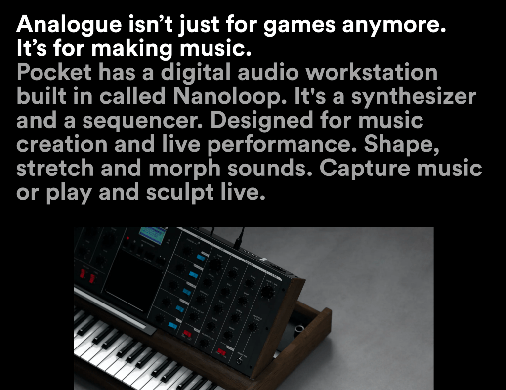
Several high-profile product sites are already taking this approach. The Analogue Pocket page opens not with a feature grid but with real paragraphs making the case for the device. The writing has to carry the reader through the pitch.
Hey, the email service, goes even further. Its site is nearly all text — no screenshots, no dense spec sheets. The copy reads with the force of a manifesto, insisting on its position with an almost confrontational clarity.

Apple has long practiced this form. The iPad Pro section on the LiDAR Scanner, for instance, barely feels like product marketing. It argues for the technology itself, structuring its case around the fundamental questions of any good essay: who benefits, what it does, why it matters, and how it works.

Stripe's redesign makes the same move. Beneath its animated gradients and polished visuals lies a sustained argument — what Stripe is, how trust is established, how simple the setup really is. The aesthetics draw you in, but the writing closes the deal.

The Skimming Problem, Reconsidered
Conventional wisdom insists that users do not read. They glance, they scan, and if a page does not hit them with something flashy in a fraction of a second, they are gone. Keep paragraphs short. Strip out the words. The assumption underneath this advice is that the audience is too impatient — too dumb, really — to handle complexity.
That view misses the actual condition of the web. Users have seen the same tired designs for years: the same stock photography, the same hollow copywriting, the same animation tricks. They are not bored because they cannot focus. They are bored because the sites they visit do not respect their attention. The design might be polished, but it is making a bad argument — one with no charm, no personality, and no reason to care.
Framing a website as an essay is a way out of that cycle. It trades the billboard mentality for something closer to persuasion. The goal shifts from capturing attention to earning it, one well-made point at a time.


