
Typography as the primary interface
A long-form article is not really an interface problem. Unlike a homepage, where the goal is to move people along, an article succeeds or fails on text set for relaxed, sustained reading — the "time on page" measure that tells you someone actually finished the narrative.
Three cheap legibility wins
- Font size.
16pxis the default and is often fine, but a larger size signals that the reader can lean back instead of pressing forward toward the screen. - Characters per line. Don't spend the full viewport width. Narrower measure and larger type combine to put fewer characters on each line; a common recommendation is 45–75 characters. The
chunit gives predictable results, and there is a bookmarklet for counting characters. - Line height. Defaults feel cramped. More spacing between lines (to a point) means less work for the eye, which seems to pull against the short-measure advice but doesn't.
1.2to1.5is a typical range for long-form content.
Pierrick Calvez's "five-minute" typography guide collects more low-hanging fixes of this kind.
Give the page room to stretch
Above the fold is beachfront property: hero banners, calls to action, whatever sells the thing — a dense downtown of high traffic and high-rises. Articles have acreage to spare, so a less-is-more approach applies, and small choices carry outsized weight. Link underlines that sit below the descenders are one example: subtle, but visibly easier to read, and easy to enable sitewide.
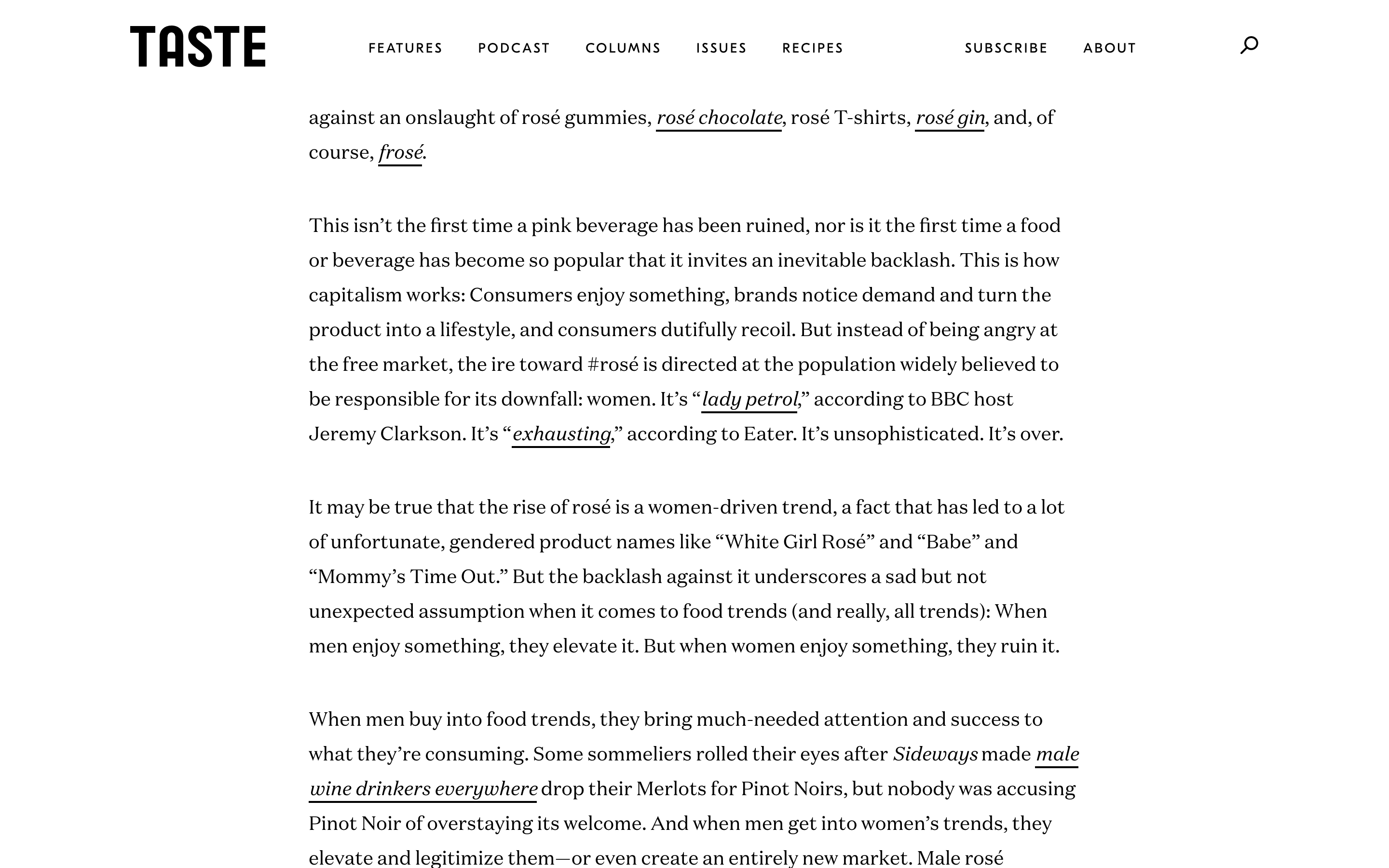
The rule behind it is text-underline-position: under;, together with a text-decoration value other than none. text-decoration-thickness can then match line weight to a font's size or weight:
a {
  text-decoration: underline;
  text-decoration-thickness: 2px;

  /* or */
  text-decoration: underline 2px;
  text-underline-position: under;
}
Before reaching for the text-decoration shorthand, review Šime Vidas's notes on when to avoid it.
Leading the reader in: drop caps
Drop caps — stylized initial letters at the start of a document or section — go back to Latin texts but are mostly decorative today.

They can hinder readability, but they do lead the eye into the main content, and using the ::first-letter pseudo-element avoids serious accessibility problems. Older techniques involving more HTML, CSS and ARIA attributes also exist.
/* select the first letter of the first paragraph */
article > p:first-child::first-letter {
  color: #903;
  float: left;
  font-family: Georgia;
  font-size: 75px;
  line-height: 60px;
  padding-top: 4px;
  padding-right: 8px;
  padding-left: 3px;
}
The initial-letter property would compute the font-size and line-height math for us, but it has essentially no support at the time of writing. CodePen ran a drop-cap challenge years ago, and the results are collected for reference.
Skip links for keyboard users
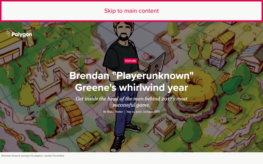
Screen readers can jump to main content when it is wrapped in <main>; people who navigate by tabbing cannot. They need an anchor link that is customarily hidden and revealed on first tab, i.e., shown on focus.
<!-- anchor -->
<a id="skip-link" href="#main">Skip to main content</a>

<!-- target -->
<main class="main">
  <!-- main content -->
</main>
#skip-link {
position: absolute; /* remove it from the flow */
transform: translateX(-100%); /* move it off-screen so that it appears hidden but remains focusable */
}
#skip-link:focus {
position: unset; /* insert it back into the flow */
transform: unset; /* move it back onto the screen */
}
.main {
scroll-margin: 1rem; /* adds breathing room above the scroll target */
}Alternatives abound — see the deeper dives on creating skip links for other implementations.
Illustrations that don't compete
Illustrations that sit lightly on the page introduce moments of delight without demanding cognitive attention, implying that the article itself has something more important to say. Transparency does most of that work: rectangular images capture more negative space and therefore pull harder, which is fine when the images are central to the story.
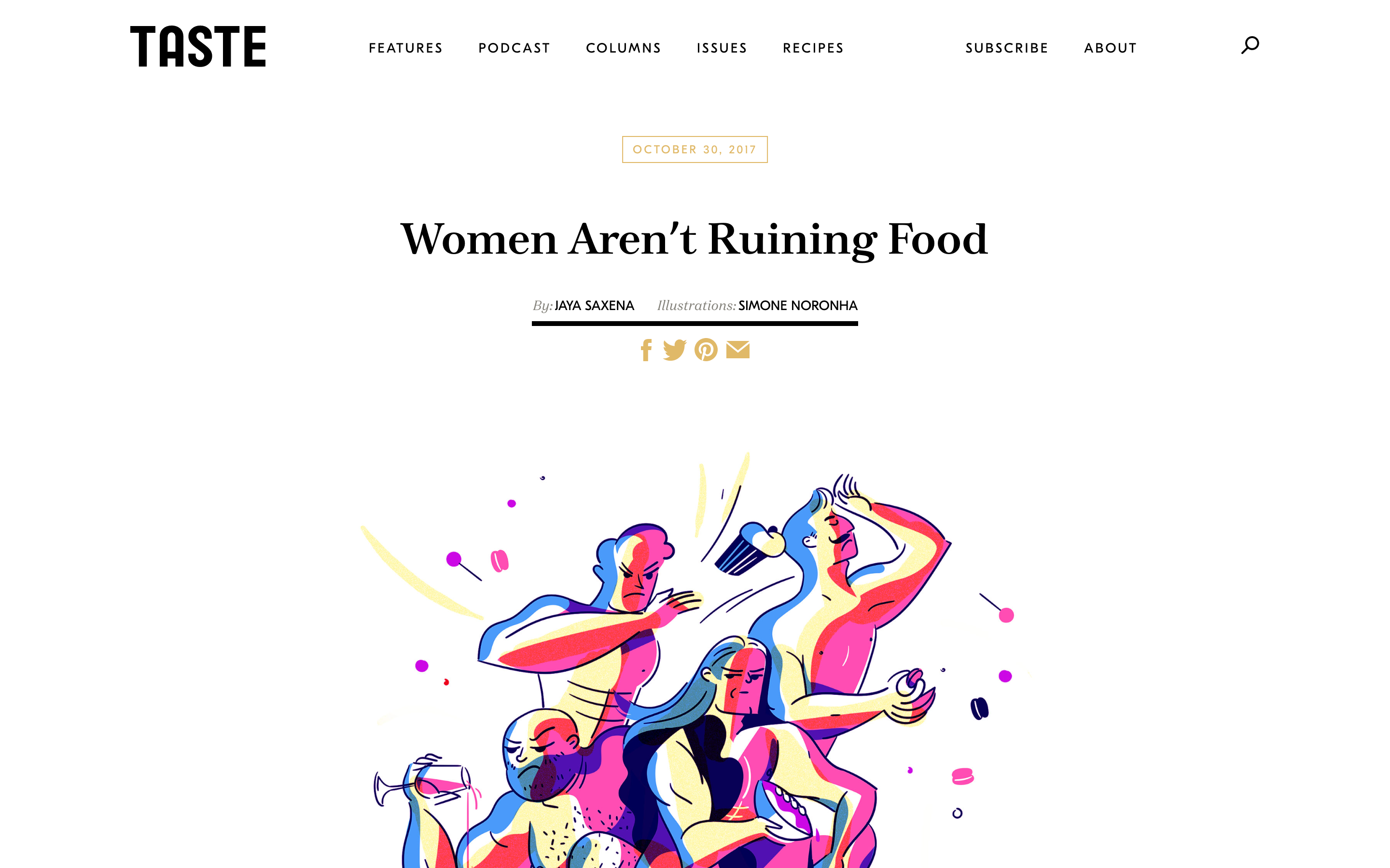
Those images aren't actually transparent. They are ordinary JPEGs painted the same color as the content background — presumably to keep file size below what transparent PNGs would cost.
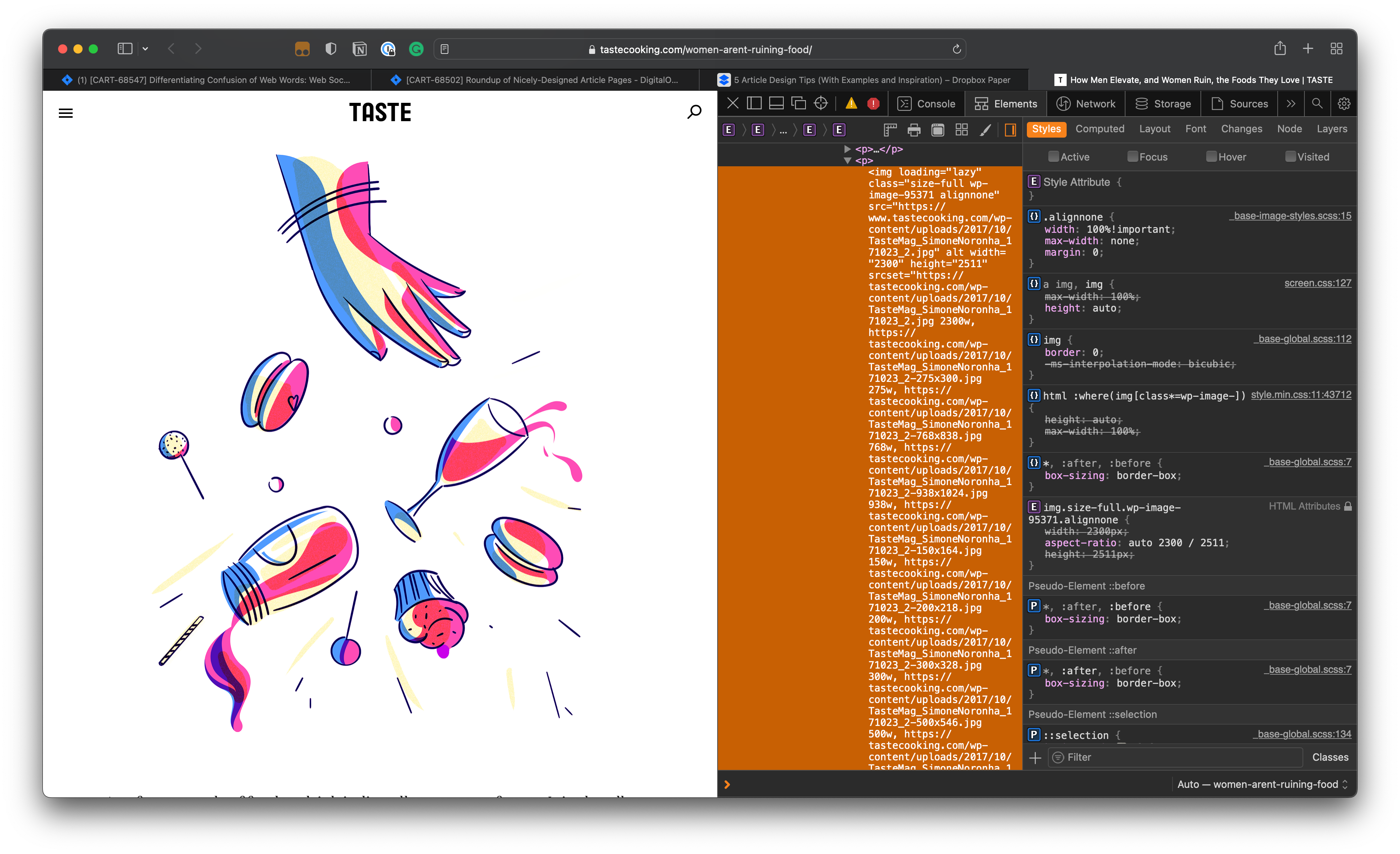
The trade-off is that faking transparency needs extra trickery and maintenance to survive a dark mode UI. Flat, simple illustrations are better served by SVG, which is small, scalable, and blends into any background. If raster images are a given and PNG transparency is preferred, look into responsive images and the loading="lazy" attribute for faster loads.
You don't control where it's read
Content arrives by RSS, email, a colleague's paste, a scraped site — or gets flattened by the Reader Mode button to the designer's dismay. That's acceptable: discoverability matters as much as design, and readers have their own preferences. Safari's Reader Mode and Brave SpeedReader use machine learning to detect articles, then fetch and execute no CSS, JavaScript or non-article images, which boosts performance and blocks ads and tracking.
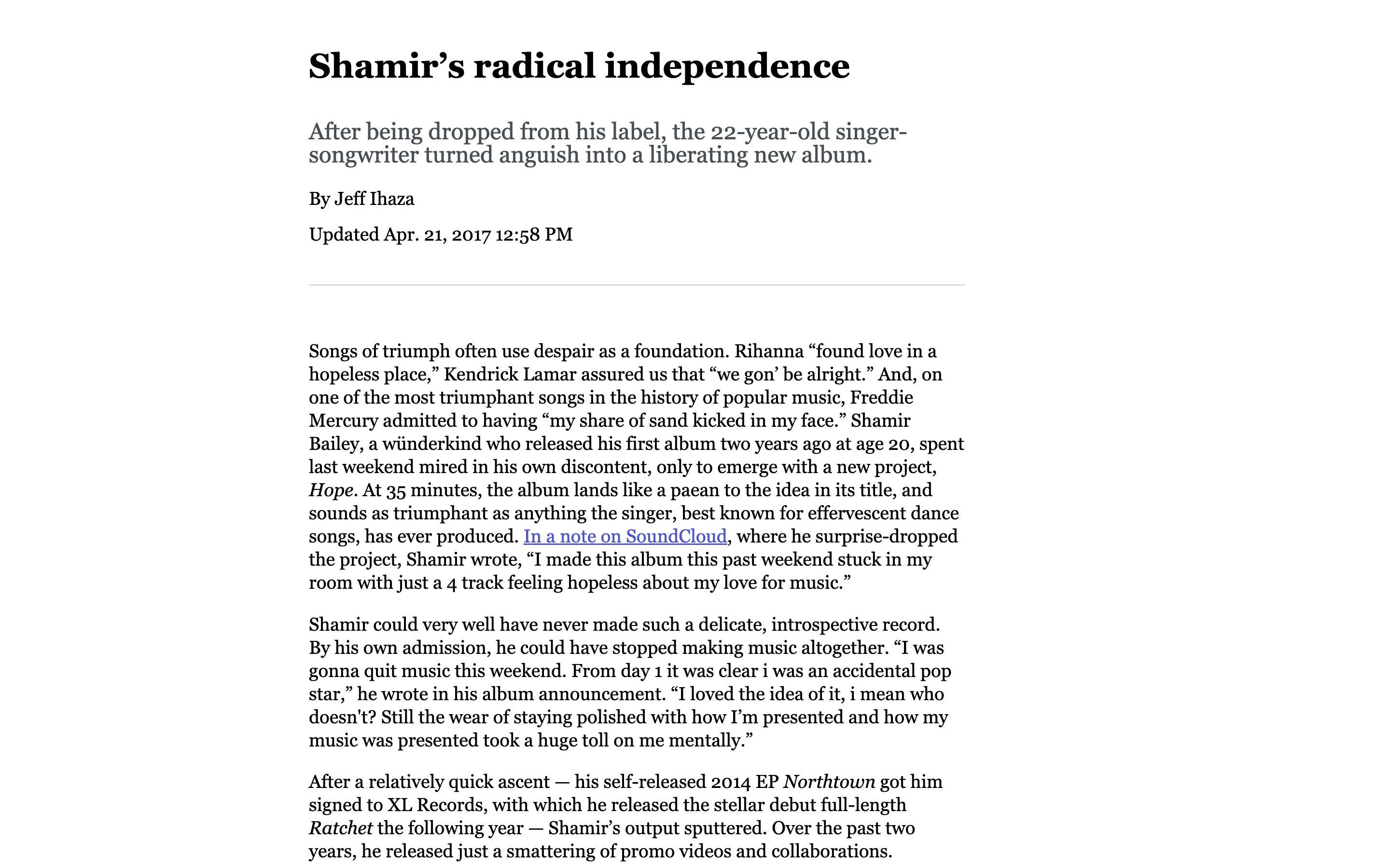
This brute minimalism puts content ahead of styles, so it can be worth embracing a browser's opinionated reading styles on purpose. The lever isn't CSS but HTML: Reader modes work best with simple, semantic, article-related markup, and wrapping everything in <article> tags is not enough. A minimal design that favors legibility over slickness may be a sound strategy in its own right; Robin Rendle's note on the "smallest CSS" for a solid reading experience is strongly recommended.
Examples worth studying
A roundup of pages that put the above into practice:
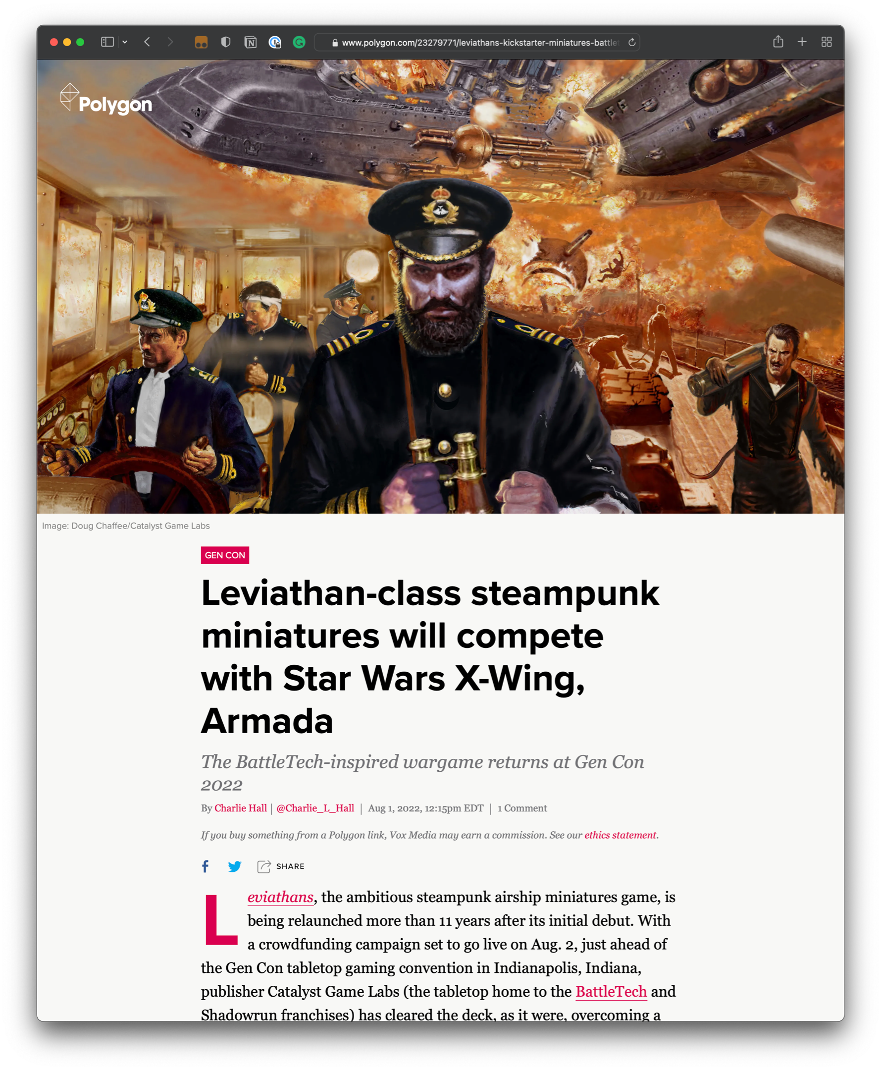
Polygon uses a strong, provacative visual to hook readers into the ain content. Notice how the drop cap, larger font size, and increased line height make this feel like a page you can sit back with and relax. 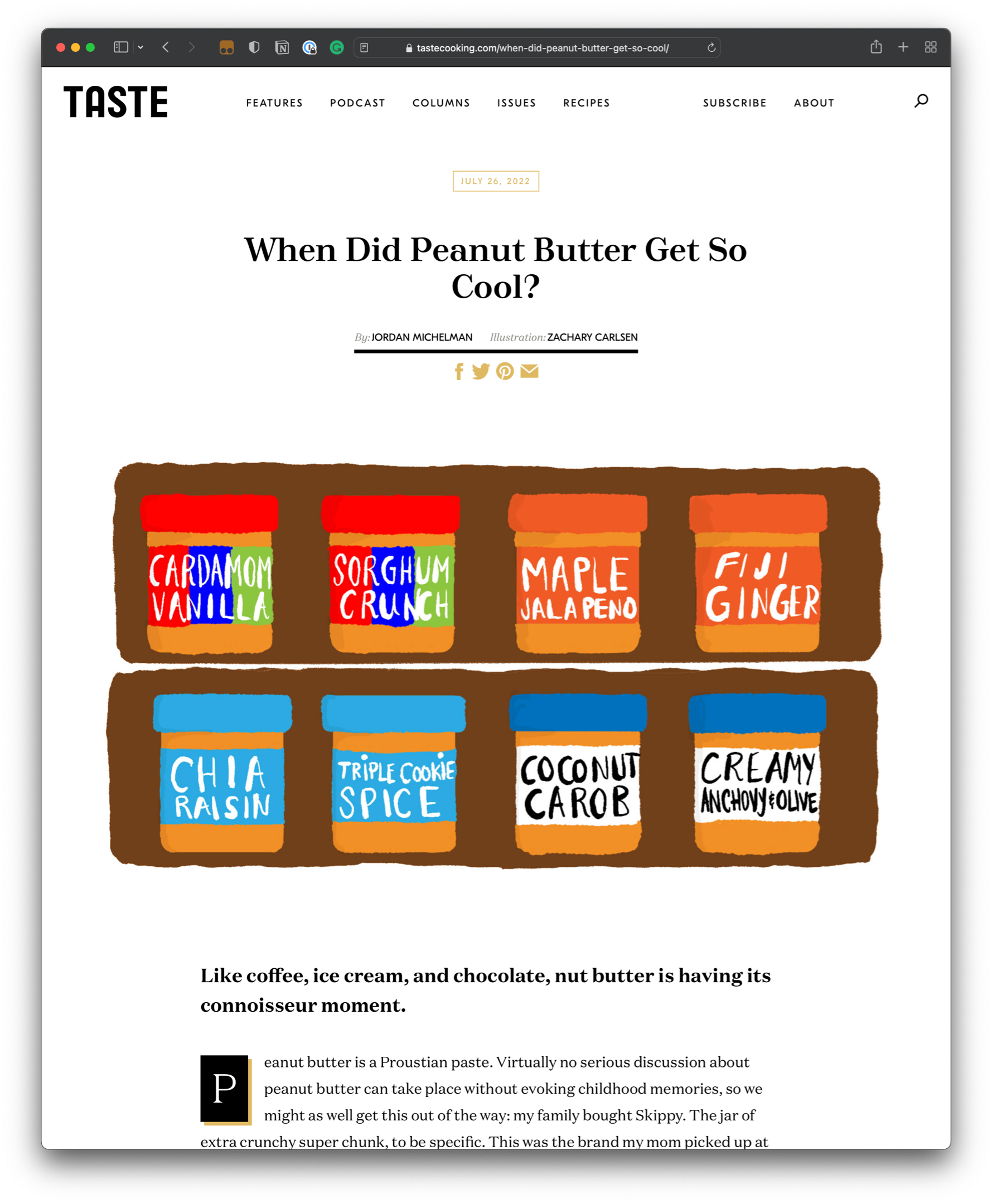
The TASTE website uses transparent images that blend into the background color of the content. There’s plenty of space between elements and bold accents — like thick borders and a heavy drop cap — pull the reader’s eye down the page. 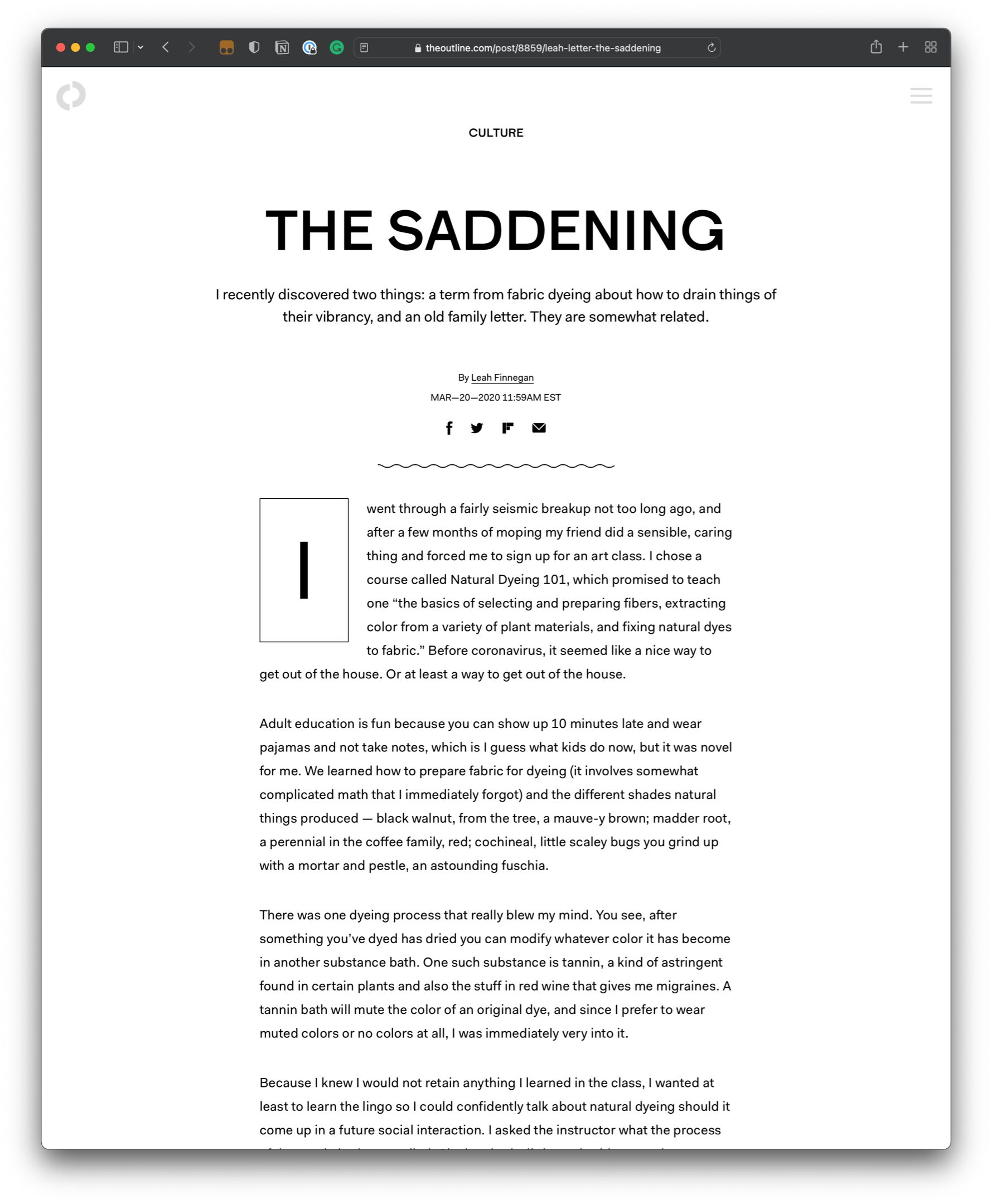
The Outline is a prime example of minimalism. Notice how something as subtle as a squiggly horizontal rule can be an eye-catching embellishment when there are fewer things competing for attention. 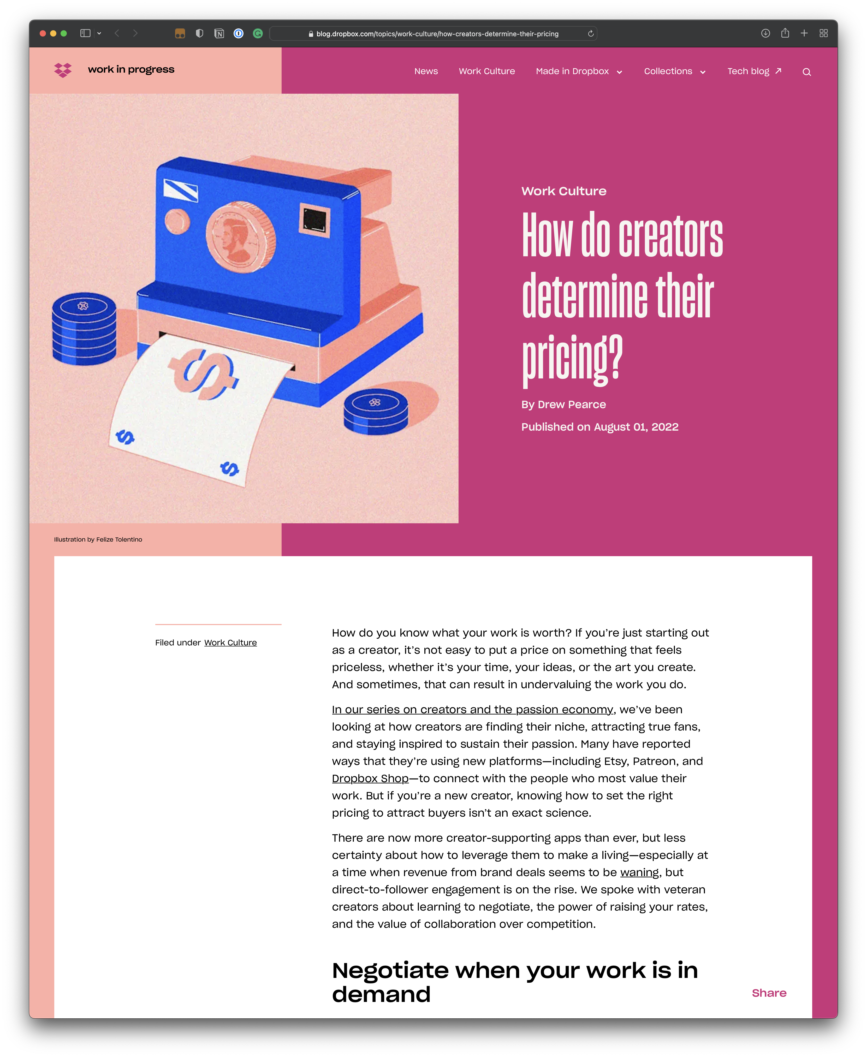
The brutalist style of the Dropbox blog is probably a controversial one. The colors, fonts, and use of space are all over the place, and the content being floated to the right just feels unfamiliar. But does it break any design ‘rules’? Nope. I could grow to like it in time, especially in a milder form. 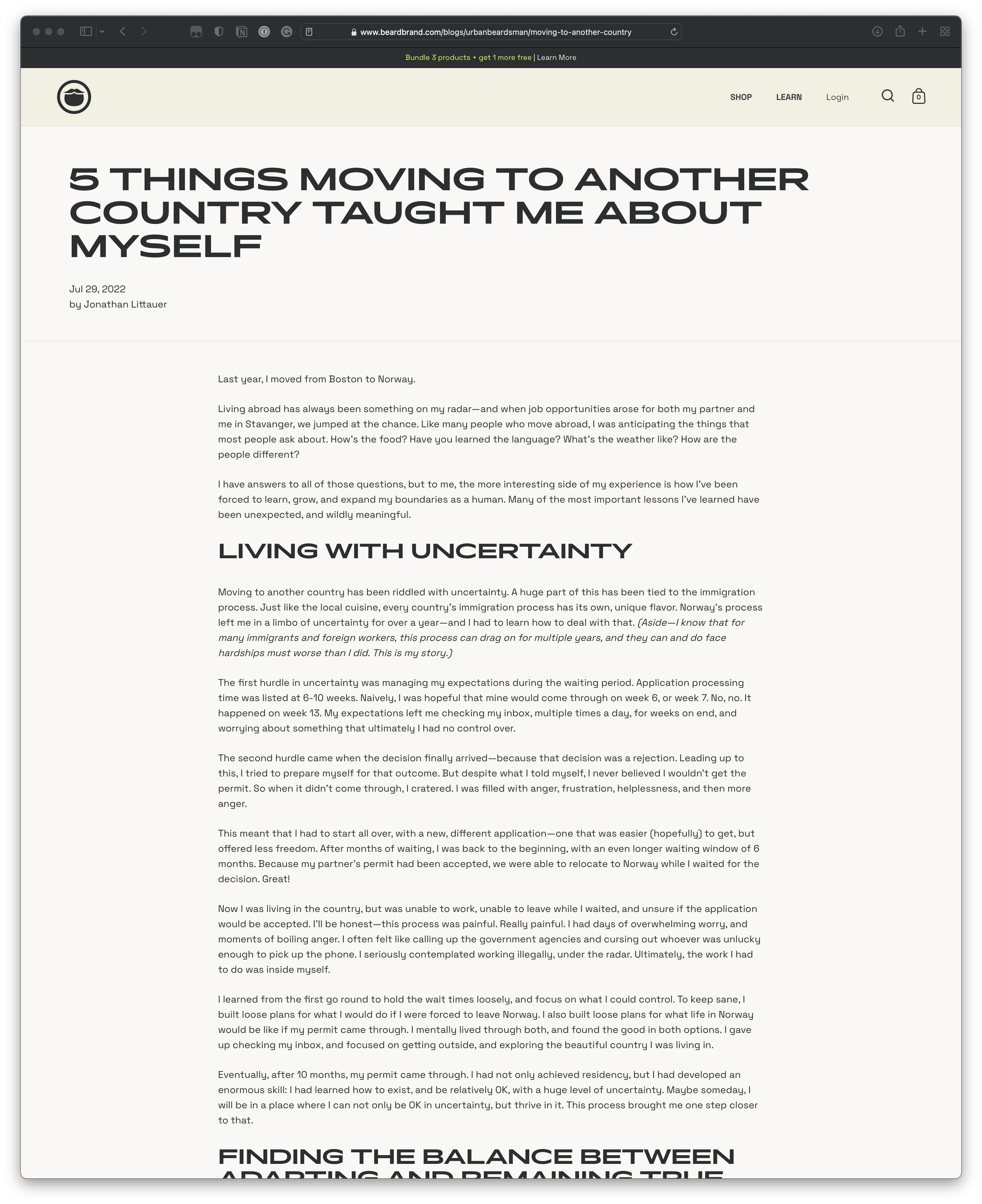
Urban Beardsman’s design is extremely linear. As somebody that has difficulty concentrating and is easily distracted by sidebars, in-article CTA boxes, and even blockquotes, I very much enjoy how easy it is to read this blog like a book. The perfect example of “less is more.” 
There’s nothing unique about the GoSquared blog, but it managed to include pretty much all of the things we discussed in the article — a better underline design, seamless images, and some very readable typography. Quite impressive. 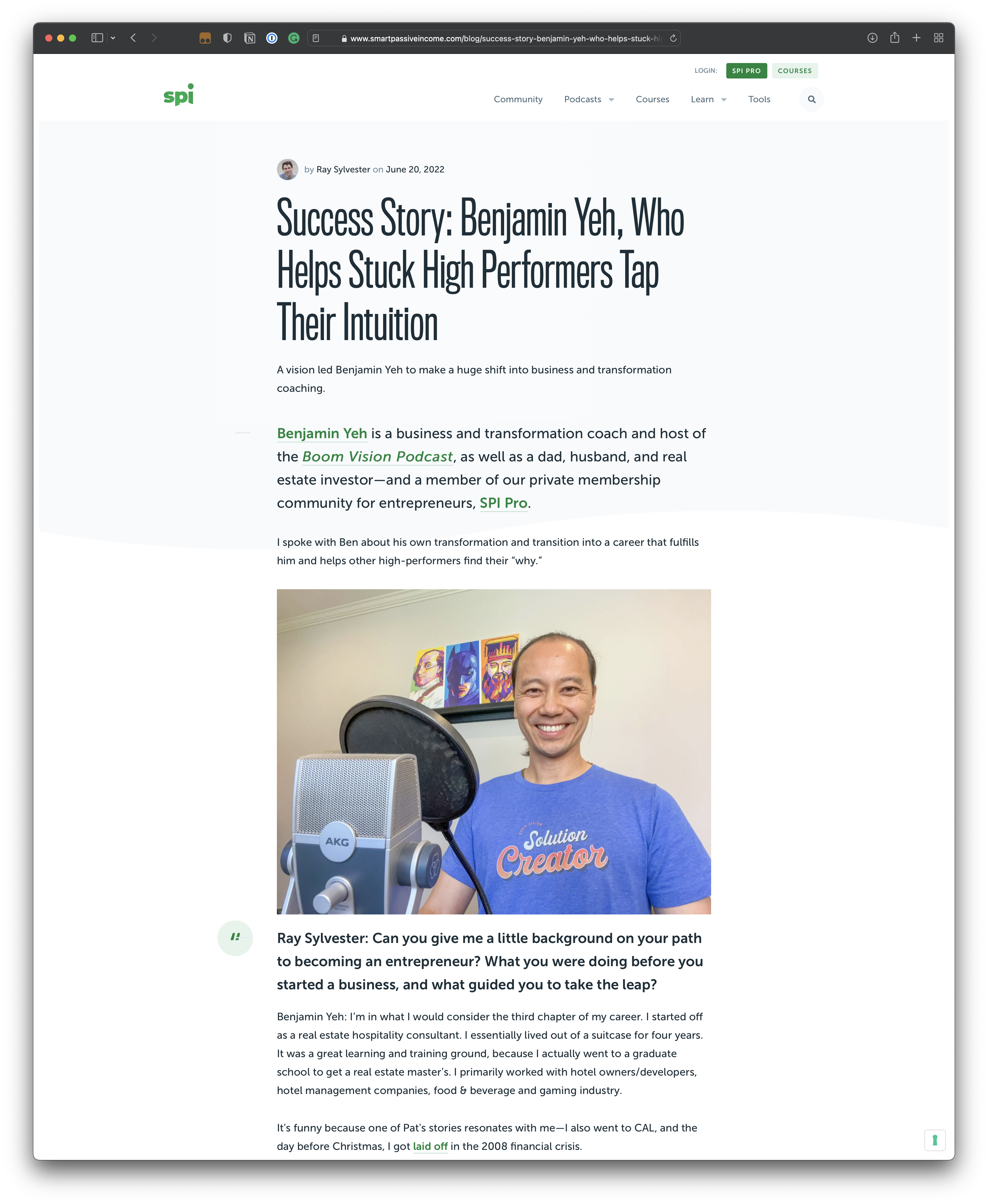
The Smart Passive Income blog proves how far you can get just by choosing a legible font and using readable font sizes, line heights, letter spacings, and paragraph spacings. 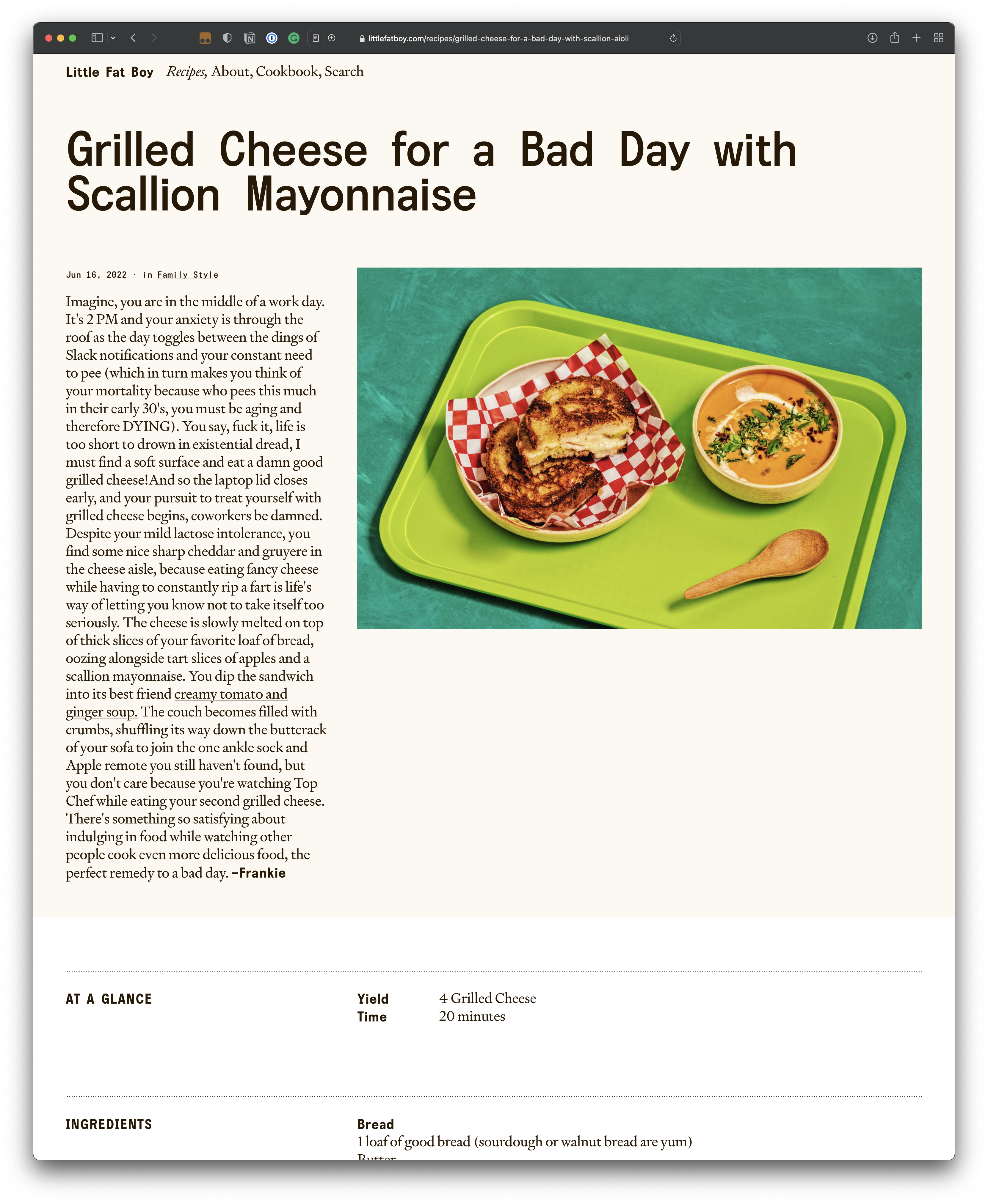
Recipe pages are consistently sucky, but not Little Fat Boy. The lack of sameness throughout the page makes it easy jump to different parts of the recipe without getting lost. Plus, the ingredients are pinned to the top-right for your convenience.



