

Charts That Do More Than Plot Points
ApexCharts is a modern charting library built around a straightforward API, and React-ApexCharts is its official React wrapper. The system is centered on a configuration object that defines two core properties: series and options. The series property holds the data to be visualized, with each entry's data array plotted on the y-axis and its name shown on hover. The options property determines the chart's appearance, features, and axis labels. These two objects are then passed directly as props to the ReactApexChart component.
To begin, install the React-ApexCharts package in your application:
npm i react-apexcharts apexcharts

import ReactApexCharts from 'react-apexcharts'
A basic setup for a React ApexChart instance looks like this:
const config = {
  series: [1, 2, 3, 4, 5],
  options: {
    chart: {
      toolbar: {
      show: true
      },
    }
  }
}

return (
  <ReactApexChart options={config.options} series={config.series} type="polarArea" />
)
Note that the official documentation often shows the chart's width, height, and type inside the options object. That approach is for vanilla JavaScript. When using React, these values are passed as separate props directly to the ReactApexChart component.
const config = {
  series: [44, 55, 13, 43, 22],
  chart: {
    width: 380,
    type: 'pie'
  }
},
Line Charts For Trends Over Time
Line charts are ideal for displaying how data changes over a period. They connect individual data points with straight lines. For instance, a financial application might use a line chart to show a user their spending growth. A typical line chart includes a title at the top, a toolbar in the corner for zooming and exporting, axis labels, and data labels at each point for readability.
To create a line chart, you define your series data and pass line to the type prop of the component.
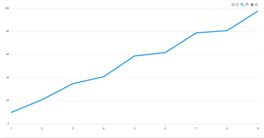
While defining series is essential, the options object is flexible. The data will render even if it is empty, but a chart with no customization can be harder to read. Let's explore the enhancements you can add through options:
- The Toolbar: Set within the
chartproperty toshow: true. It provides controls for zooming and exporting the chart. It is visible by default. - Data Labels: Adding a
dataLabelsproperty withenabled: truemakes each value visible on the line, improving data interpretation. - Curved Lines: The default line stroke is straight. To curve it, add a
strokeproperty and set itscurvetosmooth. - Title and Axis Labels: Use the
titleproperty for the main heading. To label the axes, definexaxisandyaxisproperties, each with its owntitle.
options: {
  chart: {
    toolbar: {
      show: true
    },
  },
}
dataLabels: {
enabled: true
},stroke: {
curve: "smooth"
}title: {
text: 'A Line Chart',
align: 'left'
},xaxis: {
categories: ['Jan', 'Feb', 'Mar', 'Apr', 'May', 'Jun', 'Jul', 'Aug', 'Sep'],
title: {
text: 'Month'
}
},
yaxis: {
title: {
text: 'Performance'
}
}Adding Volume With Area Charts
Area charts function just like line charts—plotting and connecting data points—but with one significant difference: the area beneath the line is filled with color or shading. This fill makes area charts particularly effective at representing volume or showing how different data series intersect. For example, you could use this type of chart to show the volume of users visiting your site from different browsers.
To build an area chart, set the component's type to area. The stroke is set to smooth by default.
const config = {
  options: {
   stroke: {
      curve: 'smooth'
    }
  }
}

return (
  <ReactApexChart options={config.options} series={config.series} type="area" />
)
To create a stacked area chart, you add the stacked property to the chart object and set it to true. This will overlay the series on top of each other, making it easy to see how they accumulate.
const config = {
  options: {
   stroke: {
      curve: 'smooth'
    },
    chart: {
      stacked: true
  }
}

return (
  <ReactApexChart options={config.options} series={config.series} type="area" />
)
Comparing Categories With Bar And Column Charts
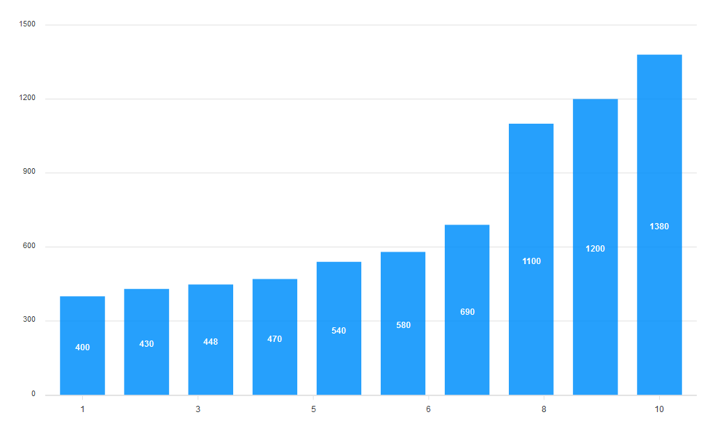
Bar charts are best for visualizing and comparing distinct categories. The horizontal bars have lengths proportional to the values they represent, making it easy to compare different data points like sales on different days.
Start by defining the series and setting the type prop to bar.
const config = {
   series: [{
    data: [400, 430, 448, 470, 540, 580, 690, 1100, 1200, 1380]
  }],
  options: {}
}

return (
  <ReactApexChart options={config.options} series={config.series} type="bar" />
)
By default, the bars are vertical. To make them horizontal, use the plotOptions property:
- Set
horizontaltotrue. - Adjust the
dataLabelsposition tobottom,top, orcenter. - The
distributedoption applies distinct colors to each bar and enables the legend at the bottom. - Control the bar's edges with
startingShapeandendingShape.
You can then add categories and titles to the chart to give it context.
xaxis: {
  categories: ['South Korea', 'Canada', 'United Kingdom', 'Netherlands', 'Italy', 'France', 'Japan', 'United States', 'China', 'India']
},

title: {
  text: 'A bar Chart',
  align: 'center',
},
Column charts are the same as bar charts but oriented vertically. You can easily convert a horizontal bar chart into a column chart by simply setting the horizontal property in plotOptions to false.
To turn a basic column chart into a stacked one, just add a stacked property to the chart object and set it to true. It’s often best to also set the endingShape of the bars back to flat for a cleaner look when stacking.
options: {
  chart: {
    stacked: true,
  },

  plotOptions: {
    bar: {
      endingShape: 'flat',
    }
  }
}
Part-To-Whole With Pie And Donut Charts
Pie charts show individual categories as slices that make up a whole. The donut chart is its variant, which displays the data as arcs instead of slices. Both are very effective for showing parts-to-whole relationships, like revenue by product or election results.
The key detail for pie and donut charts is that your series values should sum up to 100, as they are interpreted as percentages. Constructing a pie chart involves setting the type to pie and defining the labels in options. The order of your labels must match the order of your values in the series array.
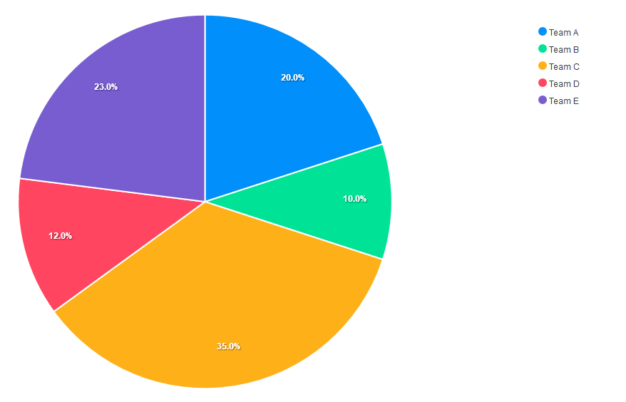
You can improve the chart's mobile responsiveness with a responsive property in options. For instance, you can set a breakpoint for screens 480px and down, then adjust the chart's width to 450px and shift the legend's position to the bottom.
options: {
  labels: ['Team A', 'Team B', 'Team C', 'Team D', 'Team E'],
  responsive: [{
    breakpoint: 480,
    options: {
      chart: {
        width: 450
      },
      legend: {
        position: 'bottom'
      }
    }
  }]
  },
Switching to a donut chart is a simple change—just change the component's type prop from pie to donut.
Combining Types With Mixed Charts
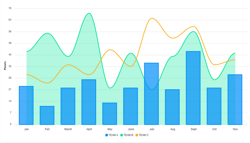
Mixed charts are a powerful way to combine two or more chart types in a single view. This is very useful when your data series have different units or ranges, such as comparing price with volume. In a mixed chart, the chart type is defined for each series individually, rather than on the main component.
When building a mixed chart that combines line, area, and column, note the following:
- The
typeis specified inside each object in theseriesarray. - To control the appearance of each chart type separately, you can pass arrays to properties like
strokewidth andfillopacity. The order of values in these arrays should correspond to the order of charts in theseriesarray.
Finally, add the necessary labels for the x and y axes to complete the visualization.
Beyond Default Styling
ApexCharts lets you go beyond simple color swaps. One of the most useful enhancements for readability is adding a grid. You can configure the appearance of both rows and columns through the grid property, assigning distinct colors to each. This visual structure can make data points and trends significantly easier to interpret at a glance.
options: {
  grid: {
    row: {
      colors: ['#f3f3', 'transparent'],
      opacity: 0.5
    },
    column: {
      colors: ['#dddddd', 'transparent'],
      opacity: 0.5
    },
  },
}
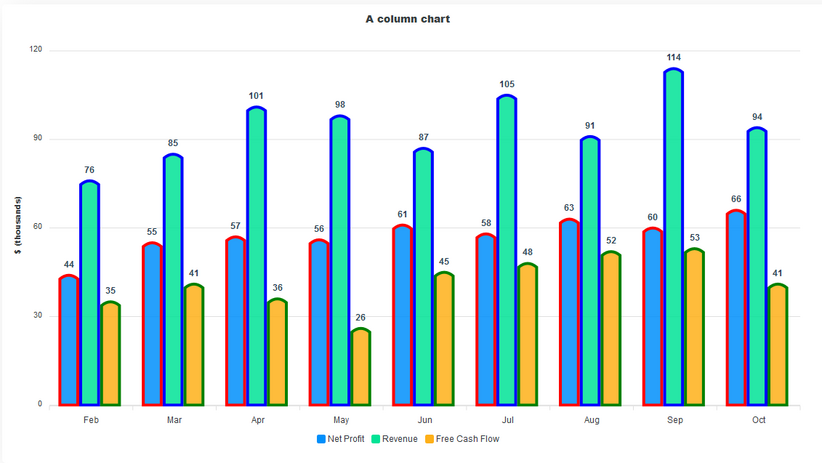
Another aspect you can fine-tune is the chart's stroke. For example, with a column chart, you can define custom colors for the strokes to match your design system. The colors array in this context maps directly to the order of data in the series array, so each dataset gets its own distinct outline color.
options: {
  stroke: {
    show: true,
    width: 4,
    colors: ['red', "blue", "green" ]
  },
}
Where To Go Next
This overview covers just a fraction of what ApexCharts has to offer. You've seen how to implement several core chart types and how to switch between them. We've also looked at some customization tactics to alter the visual output. To unlock the full potential of the library—from advanced interactions to more granular theming—check out the official ApexCharts documentation. You might also find the following articles useful for your broader front-end toolkit:
- Using AI To Detect Sentiment In Audio Files
- The End Of My Gatsby Journey
- The Forensics Of React Server Components (RSCs)
- The Timeless Power Of Spreadsheets



