

Interface labels carry the weight of a promise. "Cancel," "quit," "exit," "back," "close," "end" — each sounds interchangeable until a user clicks one expecting X and gets Y. The cost is not just confusion; a form submitted with wrong information and dismissed with a red Cancel button, only to persist anyway, leaves the user contacting support or abandoning the task. Choosing words for endings deserves the same rigor as naming things in code.
Cancel: An Invitation to Confirm
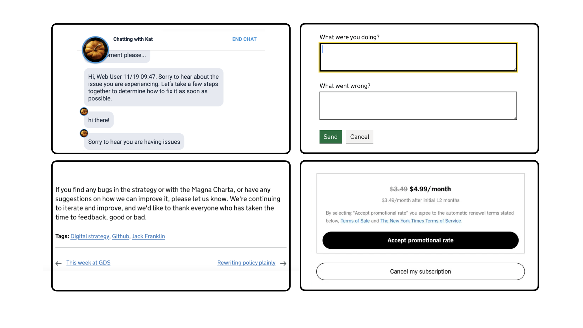
Cancel is the most widely used word for ending something, and it is sharp and tenacious. Someone uses it to bail on a process that did not go as expected: a form turns out far longer than anticipated, or a person realizes at checkout that the credit card is not at hand. Though "cancel the payment" and "Cancel The Subscription" can feel personal, what the user actually wants is to undo an incorrect action or decision, leaving no trace behind in favor of a clean slate.
The betrayal comes when the canceled process continues regardless. That is the bottom line: treat cancel as an opportunity to confirm — a signal that says, in effect, "that wasn't what I meant to do." Wiping the mistake clean and offering a second chance is not really ending anything; it is starting fresh. Labels that encourage another attempt, like reset or retry, can be worth considering too.
Quit and Exit: The Hard Stop and the Softer Goodbye
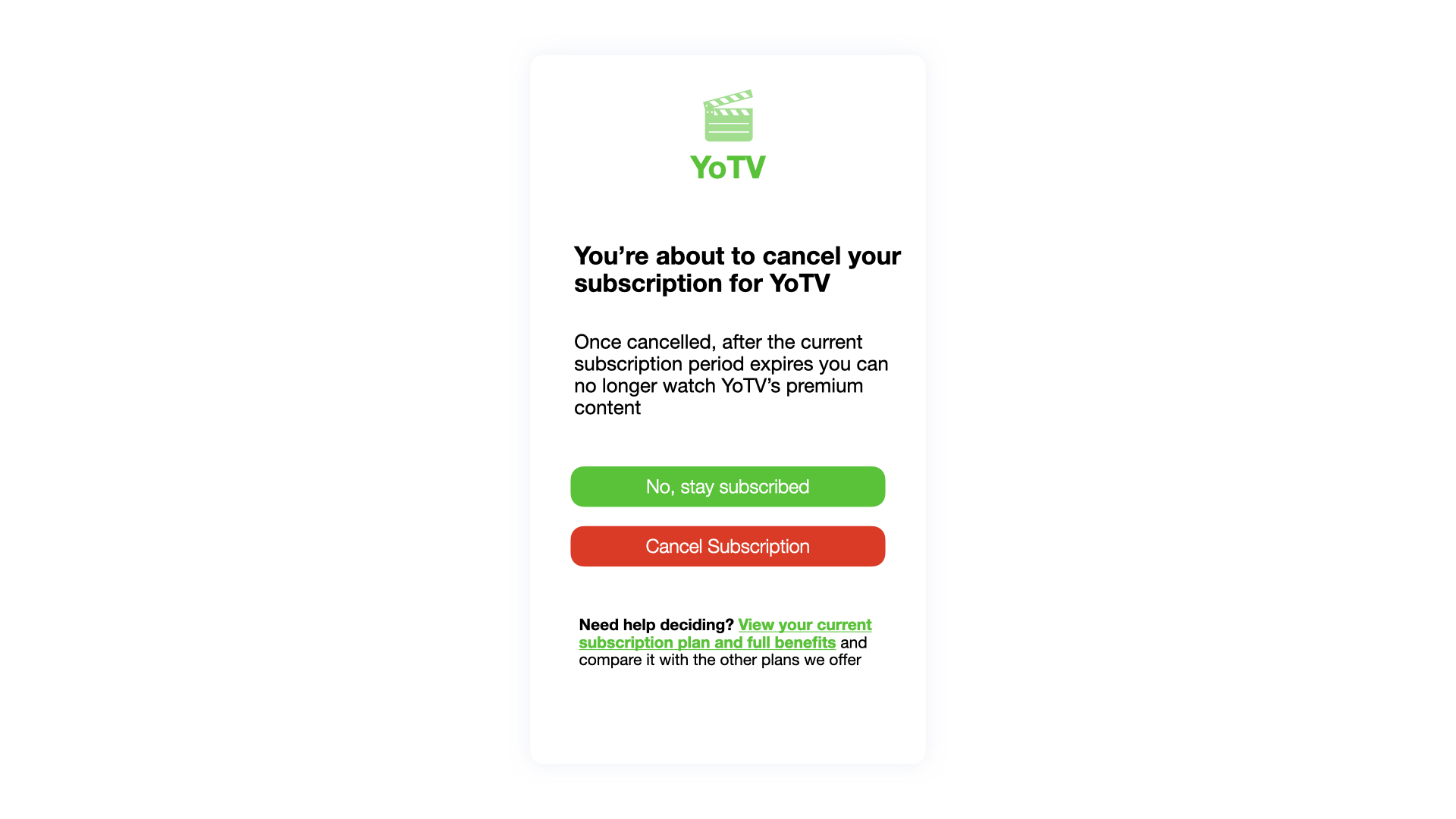
Quit and exit denote hard stop points in an application. Once engaged, the experience is put to rest and nothing may follow except a restart or reopen. Where a page can nuke the current experience and the user accepts, quit is the more accurate label — no plans to restart or re-engage, much as quitting a job means the employer should not expect you on Monday.
The advice, generally, is to use quit only when necessary. It is so effective at conveying finality that it shuts the door on future actions; cancel often works in its place, and "cancel payment" is both more widely applicable and softer, leaving room to resume later. Note also that quit implies a simple process — clear everything and be gone — so if data or progress could be lost, users need a warning, and exit and save may be better guidance.
Exit is the gentler twin. It appears less often than quit, occasionally chosen for its softness even where the semantics point the other way. A tougher term can be more reassuring when the user truly wants a clean wipe.
Exit is an excellent fit, however, for actions that end human-to-human interactions: Exit Group, Exit Chat, Exit Streaming, Exit Class. The person is saying a kind goodbye while remaining open to future interactions — not quitting, and not being shoved out the door.
Back Is a Move, Not an Ending
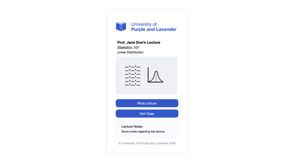
Navigation is a journey across the web, and it is not always linear. Breadcrumbs exist precisely so people can go back where they came from, perhaps to recover a forgotten step before moving forward again. Back, along with its synonym previous, displaces people in two directions. Laterally, it backtracks across the same level in a process — between two sections of one form, or two pages of one document. Hierarchically, it moves a level up the navigation hierarchy, as more explicit variants like "Home" make plain.
Explicit beats ambiguous. "Home" leaves no question about the destination, and the verbose "Back to Top" link is clearer than a bare "Back" even on an otherwise obvious page. Back where? The answer may not be obvious to users, particularly with in-page anchors, and communicating hierarchy explicitly is itself a navigational feature.
For lateral navigation, though, back is best avoided, since moving laterally usually means moving between states rather than pages — logged in to logged out, for example. Here even more explicit labels pay off, such as Save and Go Back or Cancel and Go Home, because state is changing on top of moving away from something.
Close: Reserved for Modals
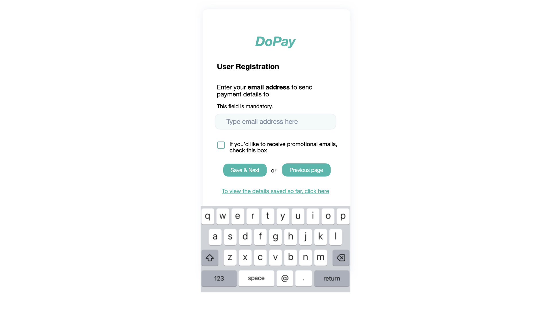
Close, like back, serves double duty: it can mean navigate away, or cancel an action with the data entered either saved or discarded. It is a poor fit for either. In navigation, Go Back, Previous, or Go Home all state where the user will land, which a bare Close does not. In actions, Save and Close reassures the person their data will be kept, whereas cancel in the same spot insinuates lost work.
One context makes Close ideal: pop-up dialogues and modals. Placed in the top-right corner — or block-start, inline-end for logical directions — it says exactly what happens to the modal, and a trapped focus affords less explicit semantics.
End: A Proper Goodbye
Pair End with what is ending: End Chat, End Stream, End Webinar. What terminates here is an established connection with a human rather than with a process, and the act is not the abruptness of quit or cancel — it is a proper goodbye.
Treat end as close to exit: the person ending the interaction may only be taking a break, not quitting for good. Leave the porch light on for their return.
Words can be technically correct and still mislead visitors. Ambiguity creeps in because many phrases say the same thing, and the constant goal is to be unambiguous — clarity is the milestone. The effort required to settle on the right word, or combination of words, mirrors the effort of naming things in code; the same care applies outside of it.



