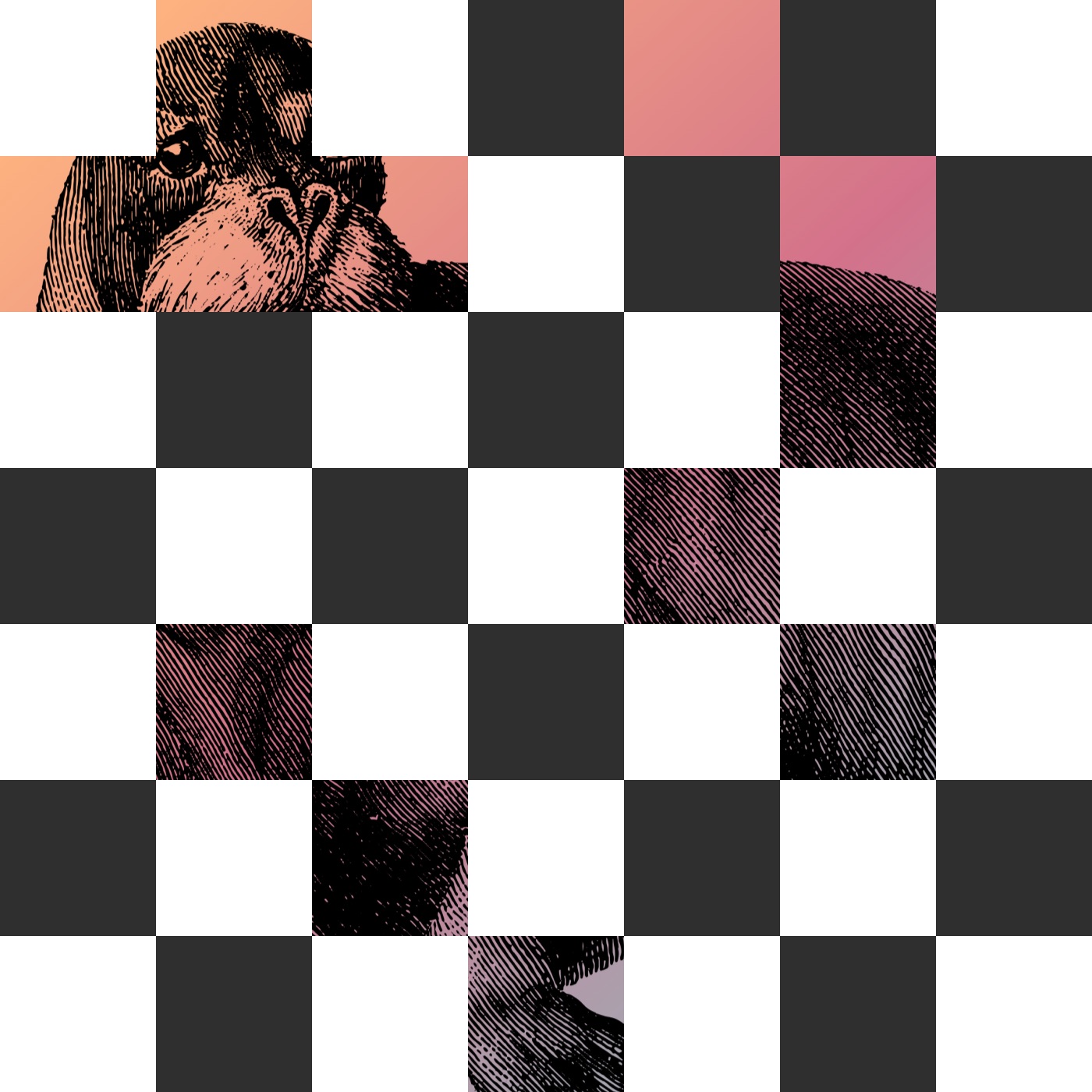
Marking up a tile grid
The background image is handled as CSS on an element — either the <body> or a sized <div> — so it needs no special handling in the markup. The checkerboard does: it suits CSS Grid, so the structure is a single grid container filled with <div> elements. The square count was picked by choosing seven arbitrarily and squaring it, giving 49 tiles.
<div class="grid">
  <div></div>
  <!-- etc. -->
  <div></div>
</div>
Hand-writing those divs is tedious and could be generated with JavaScript, but for developer convenience Haml produces the same output:
.grid
  - 49.times do
    %div
Background and grid styles
The image can sit as a background-image on the <body> or any other element, as long as it covers the full space. Since a grid container was needed anyway, that element carries it.
.checkerboard {
  background-image: url('walrus.jpg');
  background-size: cover;
  /* Might need other properties to position the image just right */
}
The gradient is baked into the raster image, though an overlay could have been done instead — for example a pseudo-element such as :after on the <body>, a common technique.
A 7×7 grid is straightforward with CSS Grid:
.checkerboard {
  background-image: url('walrus.jpg');
  background-size: cover;
  display: grid;
  grid-template-columns: repeat(7, 1fr);
  grid-template-rows: repeat(7, 1fr);
}
Proportions are the weak point: the grid does not hold its aspect at different viewport sizes, so tiles get squishy. The aspect-ratio property should improve this once it is widely supported; in the meantime there are workarounds, but the demo leaves the grid as is.
Tile colors and the fade
Tiles alternate between white and a dark shade of grey:
.checkerboard > div {
  background-color: #fff;
}
.checkerboard > div:nth-child(even) {
  background-color: #2f2f2f;
}
At this point markup and styling are complete. The animation only needs each tile to transition from opacity: 1; to opacity: 0;, which CSS Animations handle directly, so no starting keyframe is required:
@keyframes poof {
  to {
    opacity: 0;
  }
}
.checkerboard > div {
animation-name: poof;
animation-duration: 0.25s;
animation-fill-mode: forwards;
background: #fff;
}The animation shorthand would work, but the individual properties are easier to read and identify than a single dense line. The animation-fill-mode: forwards matters: set to forwards, it keeps the animation from looping back to its start, so each tile stays at opacity: 0; after the animation finishes instead of reappearing.
Staggering animation-delay in pure vanilla CSS hit a series of dead ends, so the work moved to a small amount of SCSS that loops over the tiles and offsets the animation for each with a standard function:
$columns: 7;
$rows: 7;
$cells: $columns * $rows;
@for $i from 1 through $cells {
.checkerboard > div:nth-child(#{$i}) {
animation-delay: (random($cells) / $columns) + s;
}
}Three variables drive it — the number of columns ($columns), rows ($rows), and total cells ($cells), the product of the first two; for a known-perfect-square grid, that count could also be computed with exponents. Every tile from 1 to $cells (49 here) receives an animation-delay keyed to its :nth-child() value, so the first is div:nth-child(1), the next div:nth-child(2), and so on; the compiled output shows the full breakdown.
.checkerboard > div:nth-child(1) {}
.checkerboard > div:nth-child(2) {}
/* etc. */The delay is calculated as a random number between 1 and $cells, divided by $columns, with seconds appended. Whether that is optimal comes down to experimentation and landing on something that feels right.
CSS Custom Properties would have been the more creative route, partly because their values can be updated client-side, whereas SCSS values are calculated at build time and stay fixed; this is also where JavaScript would be tempting. The compiled CSS makes the computed values visible:
/* Yes, Autoprefixer is in there... */
.checkerboard > div:nth-child(1) {
-webkit-animation-delay: 4.5714285714s;
animation-delay: 4.5714285714s;
}
.checkerboard > div:nth-child(2) {
-webkit-animation-delay: 5.2857142857s;
animation-delay: 5.2857142857s;
}
.checkerboard > div:nth-child(3) {
-webkit-animation-delay: 2.7142857143s;
animation-delay: 2.7142857143s;
}
.checkerboard > div:nth-child(4) {
-webkit-animation-delay: 1.5714285714s;
animation-delay: 1.5714285714s;
}Respecting reduced motion
Not everyone tolerates movement, so the tiles should get their styling and animation only when the user actually prefers it, using the matching media query:
@media screen and (prefers-reduced-motion: no-preference) {
.checkerboard > div {
  animation-name: poof;
  animation-duration: 0.25s;
  animation-fill-mode: forwards;
  background: #fff;
}
.checkerboard > div:nth-child(even) {
background: #2f2f2f;
}
}