
Bringing responsive drag-and-drop to Workflow Builder’s new sidebar
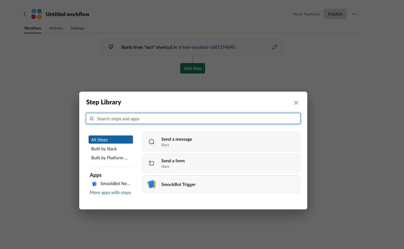
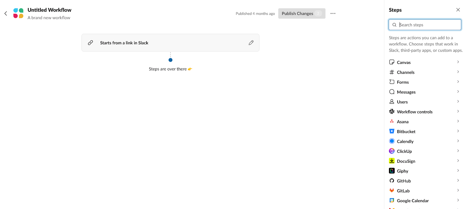
Workflow Builder in Slack has grown well beyond its 2019 debut. Alongside new steps and triggers, the team recently introduced a dedicated sidebar that lists every available workflow step, removing the need to open a modal to browse them. But a new surface meant a new expectation: if steps can be grabbed from the sidebar, users will naturally try to drag one straight into an existing workflow. Supporting that gesture required reworking how Workflow Builder handles drag-and-drop animation.
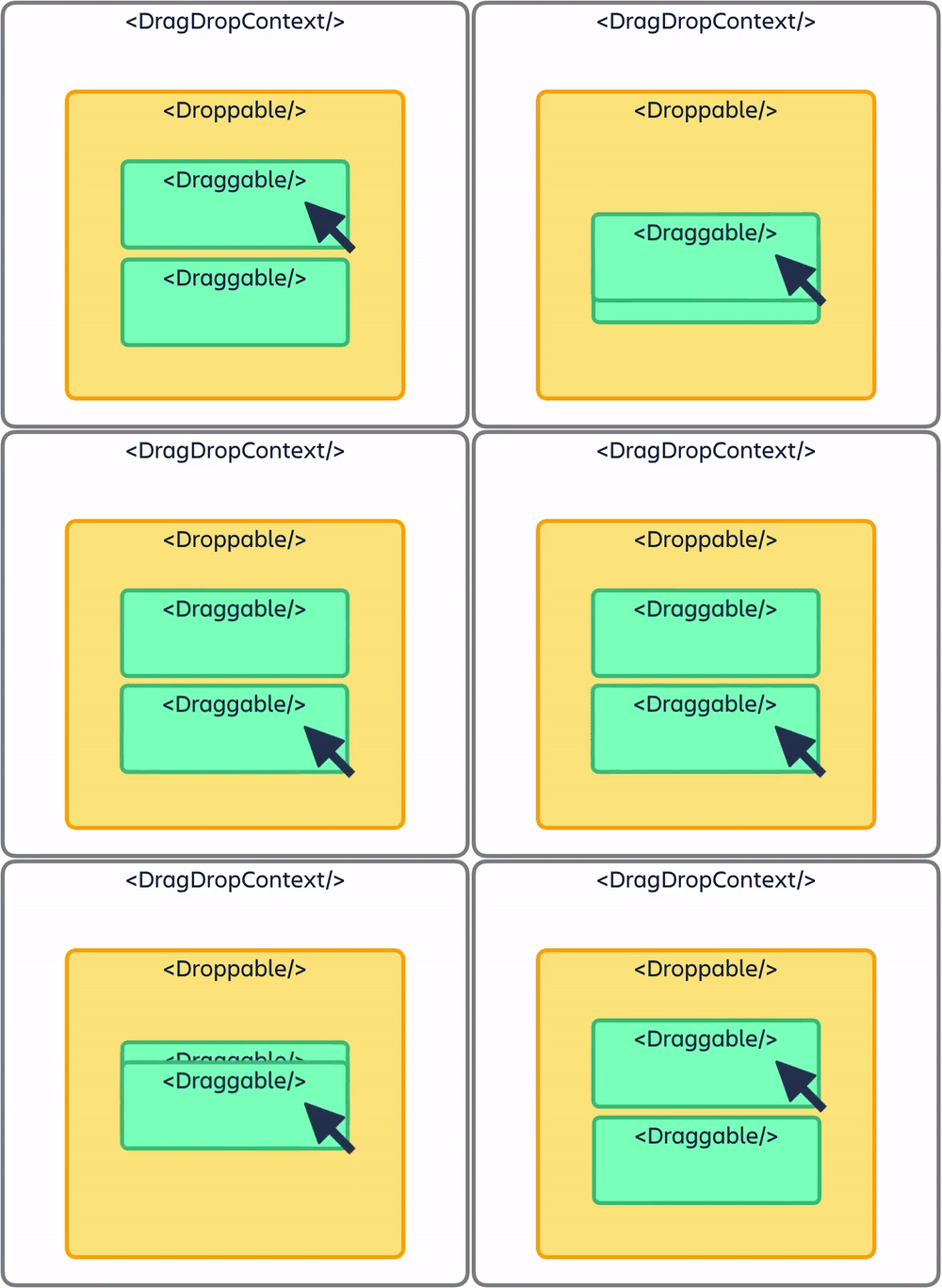
The builder already used react-beautiful-dnd for reordering steps inside a workflow. That library provides smooth animations, but it is also opinionated. It expects a single <DragDropContext /> wrapping the drag-and-drop area, with <Droppable /> containers that hold lists of <Draggable /> items. That structure worked fine for one list of steps, but it could not support moving items between the new sidebar and the workflow canvas as-is.
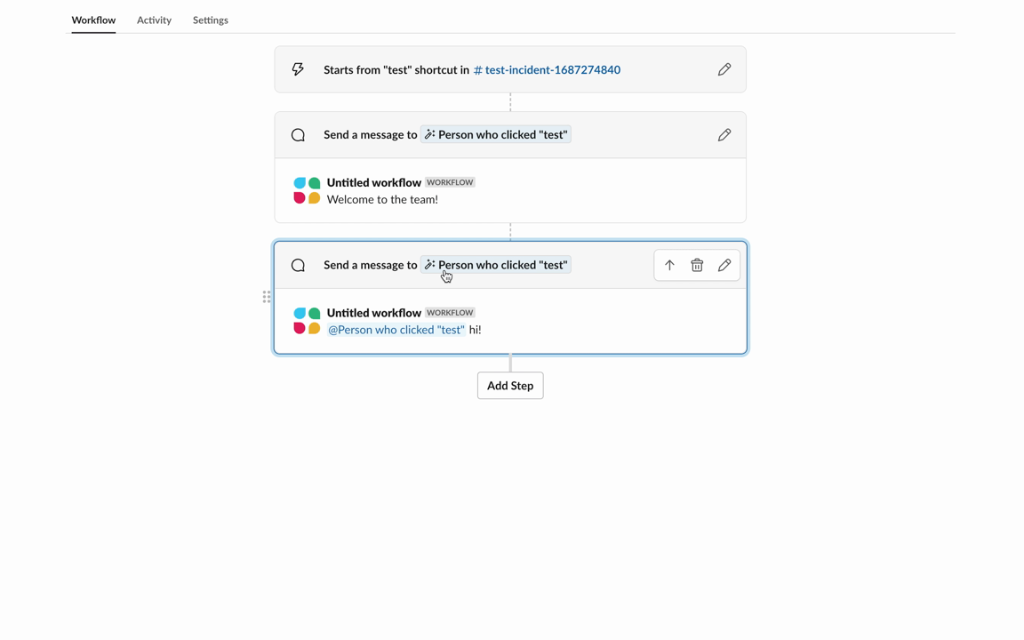
The solution was to wrap the entire builder page in the drag-and-drop context, then define two separate lists of draggables and droppables — one for the sidebar, one for the workflow. That lets users move a step from one list to the other, with react-beautiful-dnd handling the mechanics of the transfer.
Getting the feature to work technically was only the first step. The team’s bar for shipping UI is that interactions should feel intentional and pleasant, not merely functional. That meant paying attention to several details that are easy to overlook when wiring up drag-and-drop.
An isolated context for drag state
React-beautiful-dnd relies on responders — top-level events that fire during a drag — to keep application state in sync. The Workflow Builder team needed a central place to track what step was being dragged, where it was headed, and which actions to trigger on drop. They built a custom context provider wrapper that stores this information and exposes the actions that mutate it, with the library’s responders updating that shared state dynamically.
<WorkflowDragDropContext.Provider value={workflowContexts}>
			   <DragDropContext
				   onBeforeCapture={onBeforeCapture}
				   onBeforeDragStart={onBeforeDragStart}
				   onDragUpdate={onDragUpdate}
				   onDragEnd={onDragEnd}
			   >
				   {children}
			   </DragDropContext>
 </WorkflowDragDropContext.Provider>
The new UI sits on top of the legacy Workflow Builder frontend components — a deliberate choice made early on to reuse validation, step interfaces, and trigger logic. To let both old and new workflows coexist, the drag-and-drop context is mounted conditionally based on the workflow type and feature flag. That way, legacy workflows keep their original behavior while new workflows get access to the expanded drag-and-drop support.
Polishing the drag animation
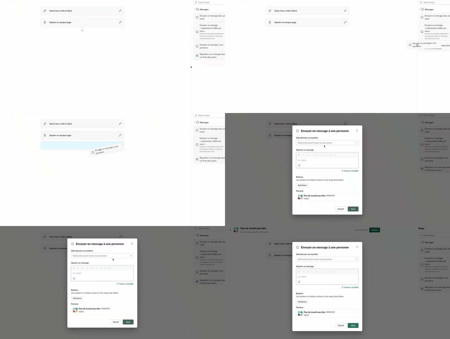
One of the first problems the team hit was a mismatch in dimensions. A step in the sidebar is not the same size as a step rendered in the workflow list, so the default animation when dragging between the two looked jarring.
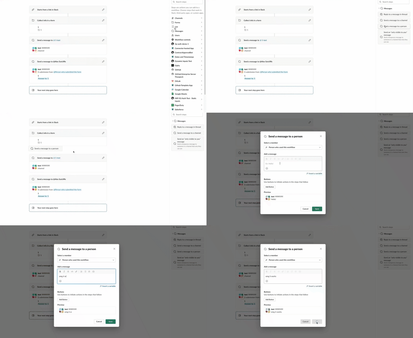
To fix it, the team wrote helper functions that override react-beautiful-dnd’s default styling. Using the onBeforeDragStart responder, they query the DOM before the drag begins, find the destination droppable container, and read its width. That value is used to translate the dragged step’s position so it lines up with the middle of the workflow list during the drop.
const translate = `translate(${moveTo.x + destinationWidth - stepItemWidthHalf}px, ${moveTo.y}px)`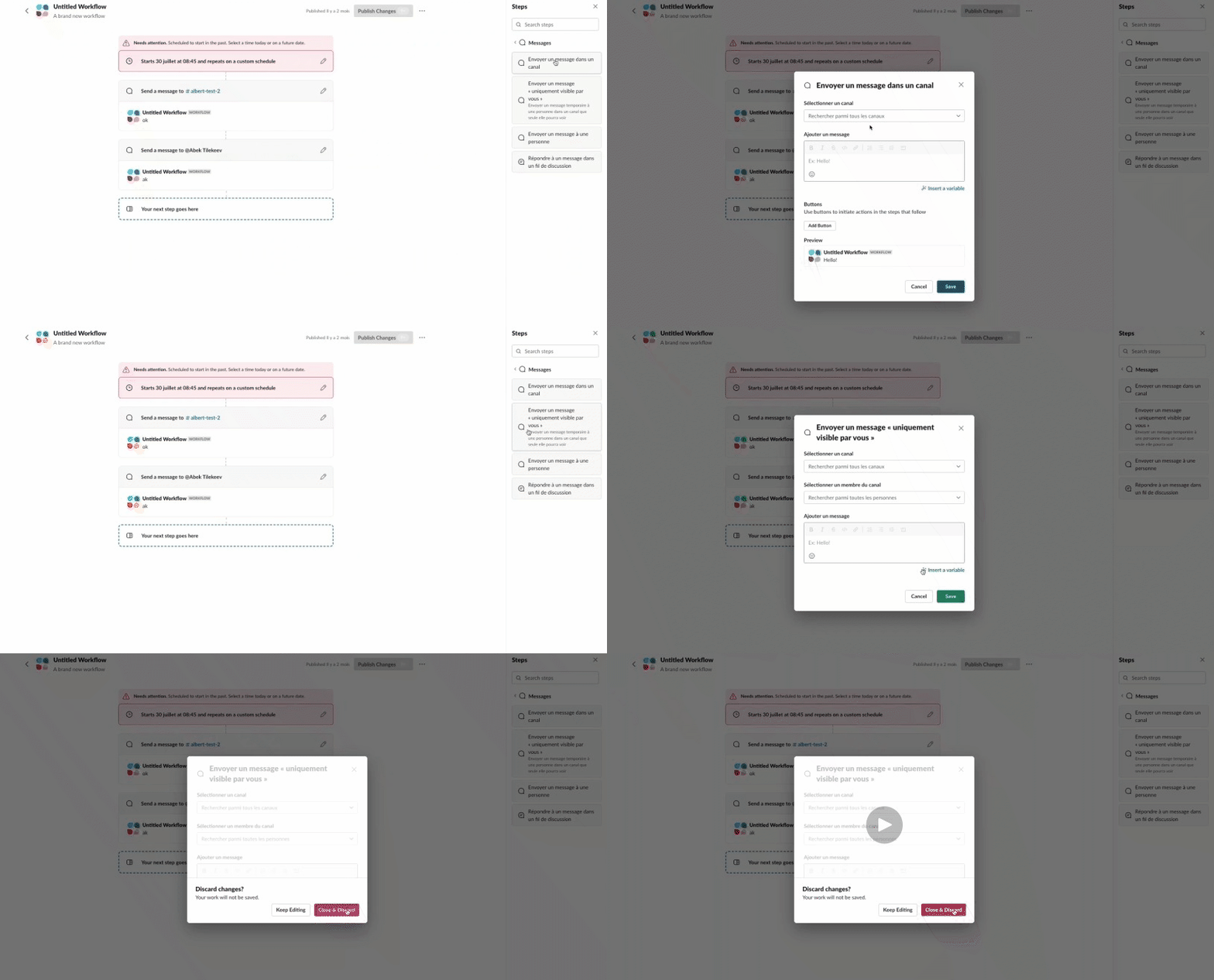
The same responder-driven data is also needed for a custom placeholder. React-beautiful-dnd does not support placeholders out of the box, and the team found that without one, it was hard to tell where a step would land. Drawing on a community prototype, they built a custom segment that renders a dynamic placeholder based on the drag position. As the drag updates, they locate the destination and dragged DOM elements, compute the placeholder’s width and height, and calculate its x- and y-coordinates from the destination index. That placeholder data is pushed into the workflow step list through the context provider.
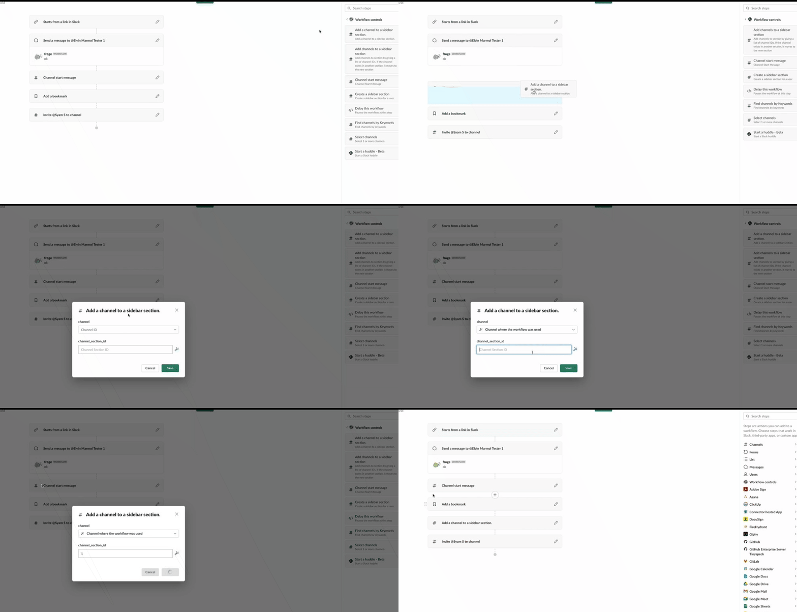
{{      (isDraggingOver || (isDraggingOverLastDroppable &&
	   !isSourceWorkflowList)) && (
			  <div
				  style={{
				  top:
				  placeholderElementSizing.clientY +
				  HALF_DIVIDER_HEIGHT,
				  left: placeholderElementSizing.clientX,
				  height: placeholderElementSizing.clientHeight,
				  width: placeholderElementSizing.clientWidth,
				  }}
				  />
					  )}
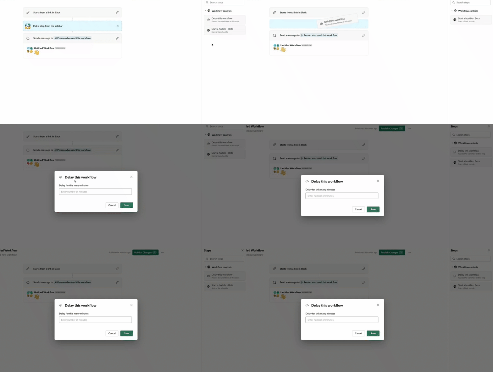
Placeholders brought their own problem. Workflow Builder shows a hint box between steps when users click in that gap — a prompt to add a step. That box would collide with the placeholder during a drag, causing spacing glitches. The fix was to hide hint boxes while dragging, but doing it correctly required understanding the difference between two responders.
The team first tried onBeforeDragStart, but state updates did not happen quickly enough. React-beautiful-dnd’s DOM would still detect the removed placeholder, leaving a visible gap. Switching to the onBeforeCapture responder solved it, since that event fires before any layout calculations occur. Hiding the hint box before the drag starts keeps the layout clean.
  const OnBeforeDragStart = useCallback(
       () => {
           // Before dragging starts reset the
           // hint box to avoid awkward spacing
           setHideHintBox(true);
       },
       [dispatch]
   );
A tilt that scales with speed
With the mechanics in place, the team pushed the interaction further. Designer Kyle Tezak proposed adding a subtle tilt to the step while it is being dragged — a small flourish to make a repetitive action feel a bit more alive. After a proof-of-concept, the team built a Natural Drag component that takes the style object from react-beautiful-dnd and modifies the rotation based on how quickly the user is moving the pointer. The effect runs on requestAnimationFrame, producing a smooth tilt that continues until the drag ends.
const newStyle =
		   snapshot.isDragging && !snapshot.dropAnimation
			   ? {
					   ...style,
					   transform: modifiedAnimation.transform,
				 }
			   : style;
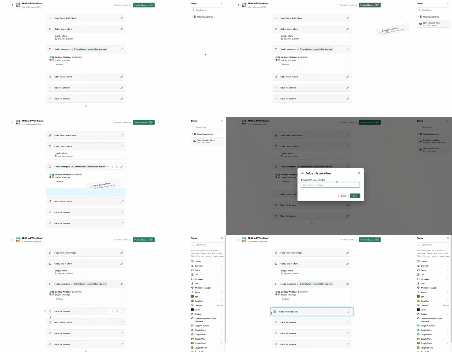
Each of these refinements — custom animations, responsive placeholders, recalibrated responders, and a dash of style — turned a potentially intimidating new interface into something approachable. For the team, that kind of polish is more than a nice-to-have. Small, delightful interactions build confidence in a feature, making users more likely to explore it and stick with it. In that sense, animation was not just about looks; it was the bridge between a powerful new capability and a genuinely usable one.



