
Firefox Catches Up on Conic Gradients
Firefox 75, released April 7, ships with conic gradient support behind a preference. In about:config, search for layout.css.conic-gradient.enabled and double-click it to flip it from false to true.

With the flag on, Firefox can render CSS that uses conic gradients, which is required for the examples that reference CSS variables inside a gradient; other demos also run through a polyfill.
The payoff is a smaller, clearer way to build many of the patterns in Lea Verou's decade-old linear-gradient() gallery. Four examples below show the rewrite.
Pyramid
The original pyramid stacks four linear gradients:
background:
  linear-gradient(315deg, transparent 75%, #d45d55 0) -10px 0,
  linear-gradient(45deg, transparent 75%, #d45d55 0) -10px 0,
  linear-gradient(135deg, #a7332b 50%, transparent 0) 0 0,
  linear-gradient(45deg, #6a201b 50%, #561a16 0) 0 0 #561a16;
background-size: 20px 20px;
That CSS is hard to reason about by eye, and honestly you don't need to — a single conic-gradient() layer produces the same result.
A useful habit with repeating patterns is drawing equidistant vertical and horizontal lines to mark the boxes set by background-size — here they are obviously squares, but the trick scales to anything.
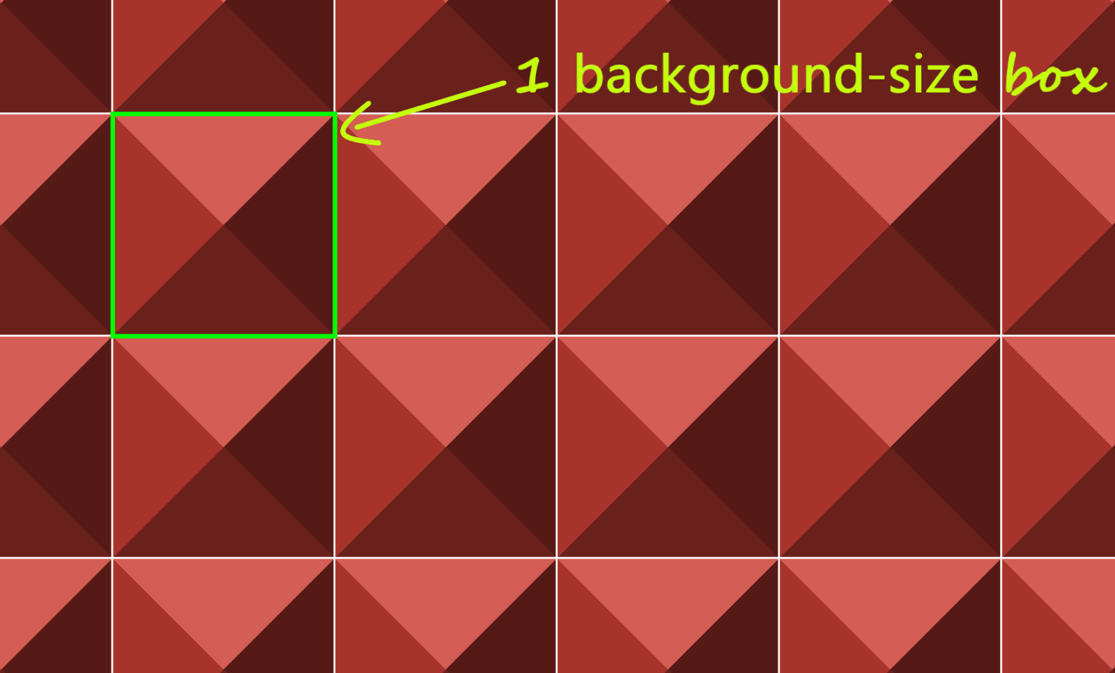
Conic gradients default to a 12 o'clock start and run clockwise; here the start is offset by 45° clockwise, then the four shades each take a quarter (25%) of the space around the midpoint.

25% starting from 45° w.r.t. the vertical axis (live).The pattern reduces to:
$s: 20px;
background:
  conic-gradient(from 45deg,
    #561a16 25%,
    #6a201b 0% 50%,
    #a7332b 0% 75%,
    #d45d55 0%)
    50%/ #{$s $s};
The compiled size drops from 260 bytes to 103 bytes — more than half the code gone — using the double position syntax, which is also well supported now.
Checkerboard and Its Diagonal Variant
The checkerboard uses two linear gradients:
background-color: #eee;
background-image:
  linear-gradient(45deg, black 25%, transparent 25%,
    transparent 75%, black 75%, black),
  linear-gradient(45deg, black 25%, transparent 25%,
    transparent 75%, black 75%, black);
background-size: 60px 60px;
background-position: 0 0, 30px 30px;
Draw the vertical and horizontal guides to see the boxes. In the deeppink square, the conic gradient starts at the default 12 o'clock: one quarter black, one quarter dirty white, then the same two quarters repeat.

Because the second half of the [0%, 100%] interval repeats the first, repeating-conic-gradient() works, taking compiled CSS from 263 bytes to 73 bytes — over 70% smaller:
$s: 60px;
background:
  repeating-conic-gradient(#000 0% 25%, #eee 0% 50%)
    50%/ #{$s $s};
The diagonal checkerboard also starts from two linear gradients:
background-color: #eee;
background-image:
  linear-gradient(45deg, black 25%, transparent 25%,
    transparent 75%, black 75%, black),
  linear-gradient(-45deg, black 25%, transparent 25%,
    transparent 75%, black 75%, black);
background-size: 60px 60px;
Split into identical rectangles with the same guides, it is essentially the same pattern as before, except the start is 45° clockwise rather than 12 o'clock, which changes the code to:
$s: 60px;
background:
  repeating-conic-gradient(from 45deg,
    #000 0% 25%, #eee 0% 50%)
  50%/ #{$s $s};
That's 229 bytes down to 83 bytes, roughly two-thirds removed.
Half-Rombes
Four linear gradients build the original:
background: #36c;
background:
  linear-gradient(115deg, transparent 75%, rgba(255,255,255,.8) 75%) 0 0,
  linear-gradient(245deg, transparent 75%, rgba(255,255,255,.8) 75%) 0 0,
  linear-gradient(115deg, transparent 75%, rgba(255,255,255,.8) 75%) 7px -15px,
  linear-gradient(245deg, transparent 75%, rgba(255,255,255,.8) 75%) 7px -15px,
  #36c;
background-size: 15px 30px;
With the guides drawn, the repeating unit is a set of congruent isosceles triangles — dark blue mirroring light blue — formed where three families of parallel lines cross: horizontal, angled clockwise, and angled the other way.
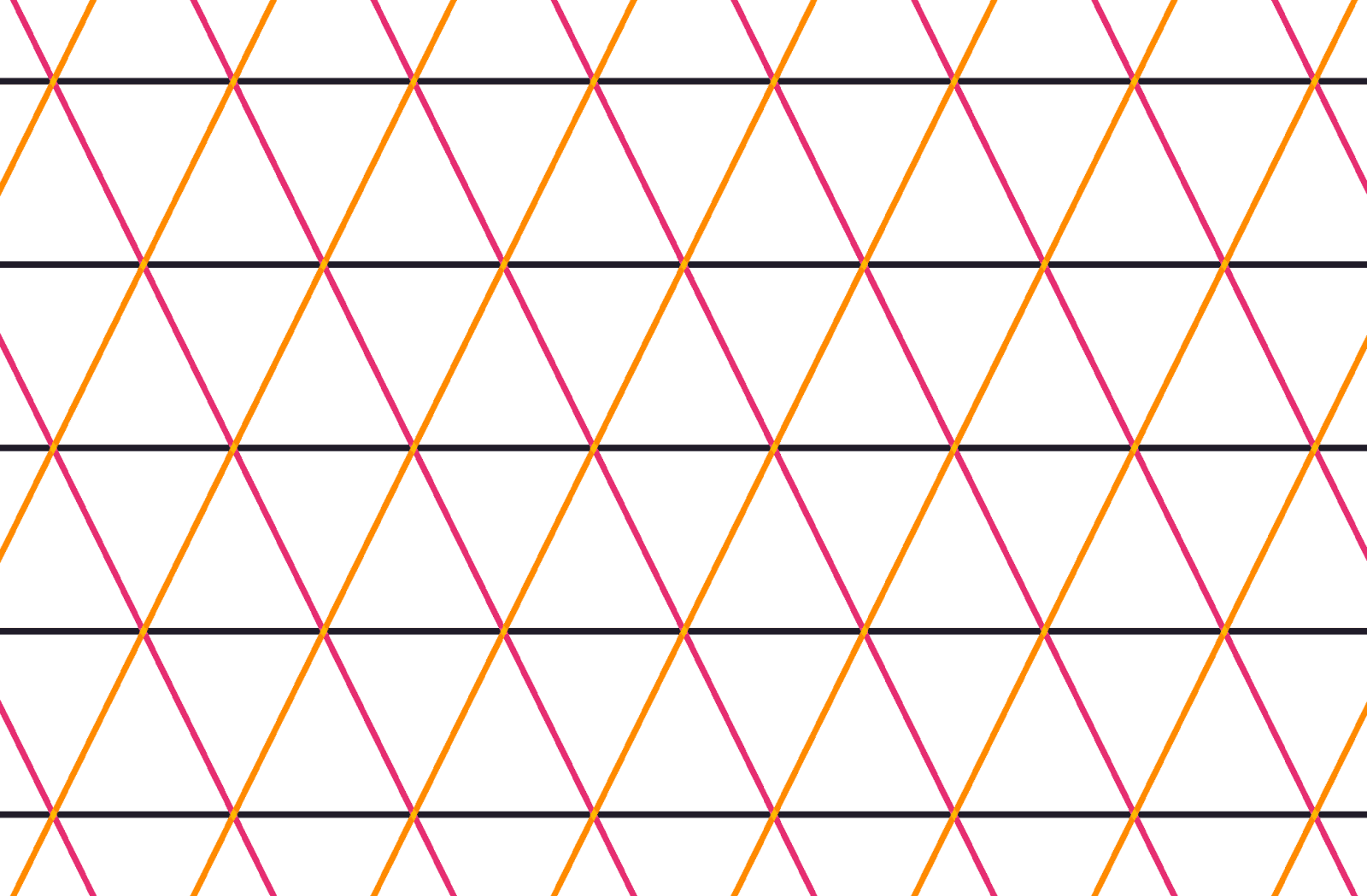
Each cell holds one whole triangle plus two adjacent halves up top, mirrored below, so the angles for the conic-gradient() come from a handful of right triangles.

The gradient starts at β from 12 o'clock. The first slice goes to α, the second to 2·α, the third sits halfway around (180°, or 50%), the fourth to 180° + α, the fifth to 180° + 2·α, and the sixth fills the rest.
tan(α) = (.5·h)/(.5·w) = h/wFrom a pattern cell of width w and height h, the angles α and β follow:
α = atan(h/w)
β = 90° - α
The code and its equilateral special case
$w: 15px;
$h: 30px;
$a: atan($h/$w)*180deg/pi();
$b: 90deg - $a;
$c0: #36c;
$c1: #d6e0f5;

html {
  background:
    conic-gradient(from $b,
      $c1 0% $a,
      $c0 0% 2*$a,
      $c1 0% 50%,
      $c0 0% 180deg + $a,
      $c1 0% 180deg + 2*$a,
      $c0 0%)
    0 0/ #{$w $h};
}
Compiled CSS goes from 343 bytes to 157 bytes. Adjusting $w and $h in the Sass shows how different aspect ratios stretch the pattern.
When the angle between 2*$a and 50% (or 180deg) is also $a, $a is 60deg, the isosceles triangles become equilateral, and the gradient collapses to a repeating one — under 100 bytes compiled:
$a: 60deg;
$b: 90deg - $a;
$w: 15px;
$h: $w*tan($a);
$c0: #36c;
$c1: #d6e0f5;

html {
  background:
    repeating-conic-gradient(from $b,
      $c1 0% $a, $c0 0% 2*$a)
    0 0/ #{$w $h}
}
Intersecting Lines, Without Repetition
Not every case repeats. A single conic gradient can also deliver effects that once required several linear ones, including straight lines that cross inside the rectangular background box.

The gradient wraps the intersection point at x,y, starting at β — the angle of the line segment nearest the top-right corner — with hard stops at α, 50% (or 180°) and 180° + α. This is the setup for CSS variables:
.panel {
  background:
    conic-gradient(from var(--b) at var(--xy),
      var(--c0) var(--a), var(--c1) 0% 50%,
      var(--c2) 0% calc(180deg + var(--a)), var(--c3) 0%);
}
Set the position (--xy), the start angle (--b), the first angle (--a) and the palette (--c0 through --c3). Values can be generated randomly or pulled from a data object by a preprocessor and written inline as custom properties. Because the gradients read custom properties, such demos need native conic gradient support.