

Why Accessible Images Aren’t Just “Add Alt Text”
At first glance, accessible images seem straightforward: just add alt text. But there’s far more nuance involved, especially when the image in question carries a critical public service announcement. With more than 65% of the population identifying as visual learners, images are a primary way information gets absorbed. Yet for users with visual impairments, dyslexia, or cognitive disorders, that same visual content can become a barrier rather than a bridge.
The key question isn’t simply “what does this image show?” but rather “what is this image for?” Knowing whether an image informs, evokes emotion, acts as a link, or is pure decoration changes how it must be handled for assistive technology (AT) devices.
Sorting Images by Purpose
Start by imagining your image has vanished. If the page’s content and meaning remain intact without it, the image is decorative. If not, it’s informative and contextually necessary. Tools like the W3C’s image decision tree can help with categorization, but the core distinction comes down to whether the image carries meaning that can’t be expressed elsewhere.
Decorative Images: Hide Them Properly
Decorative images must be programmatically hidden so AT devices skip them entirely. Common approaches include using an empty/null alt attribute (alt=""), ARIA attributes (role="presentation" or aria-hidden="true"), or CSS background images. Note that an empty alt is not the same as a missing alt—if the attribute is absent, AT may read the file name or surrounding text, adding noise rather than clarity.
When using aria-hidden="true", be cautious: it removes the entire element from the accessibility API, which can be overkill depending on the element’s role.
“When it comes to accessible code, more is not always better.”
Consider a decorative drop cap illustration—a letter “S” with a cat drawing. If removed, the article reads exactly the same. That’s a clear decorative case. Redundant hiding methods (both ARIA and empty alt) aren’t harmful here, but they’re unnecessary. Beyond hiding, there’s little else to manage. The tricky ones are “emotional” or “mood” images, which fall into a gray zone: one person’s decoration is another’s essential context, so judgment is required.
Informative Images: Content and Context Matter
Informative images require programmatically discernible alternative text per WCAG. Typically that’s the alt attribute, though other methods exist depending on image type (e.g., SVG vs. <img>). But having alt text isn’t enough—it must be meaningful. If an image conveys “feeling safe at home” and the alt says “house,” the full message is lost.
Take a linked logo that both identifies the brand and functions as a home link. The link title might say “Back to the homepage” while the image alt reads “Smashing Magazine.” Hearing both is acceptable because each phrase serves a distinct purpose—one describes the destination, the other the content.
For more complex alt text, try the telephone test: if you called a friend and said “purple slug,” then hung up, you’d leave them confused. Say “the purple slug is eating my hydrangeas,” and they get the full picture. That’s the level of specificity needed. Still, aim to keep alt text under around 150 characters, as screen reader users must listen to every word. For complex images requiring more detail, other descriptive patterns can provide extended context without overwhelming the primary alt.
Beyond the Alt Attribute
Once alternative text is handled, image accessibility still has more ground to cover. Three areas deserve particular attention: color and contrast, typography and layout, and the copy and icons that carry the message.
Color and Contrast
Color may drive a design, but contrast is what makes it legible. When color perception differs — or when visual impairments affect how contrast is seen — the intended message can fail to get through.
Color blindness affects an estimated 300 million people worldwide, roughly 95% of them male. Red/green color blindness is most common; blue/yellow is less so; total color blindness is rare. Separately, about 246 million people globally have low vision, and conditions like glaucoma, cataracts or macular degeneration often make text contrast harder to discern. People using monochrome displays, or viewing screens in glare or dim light, can also struggle with contrast.
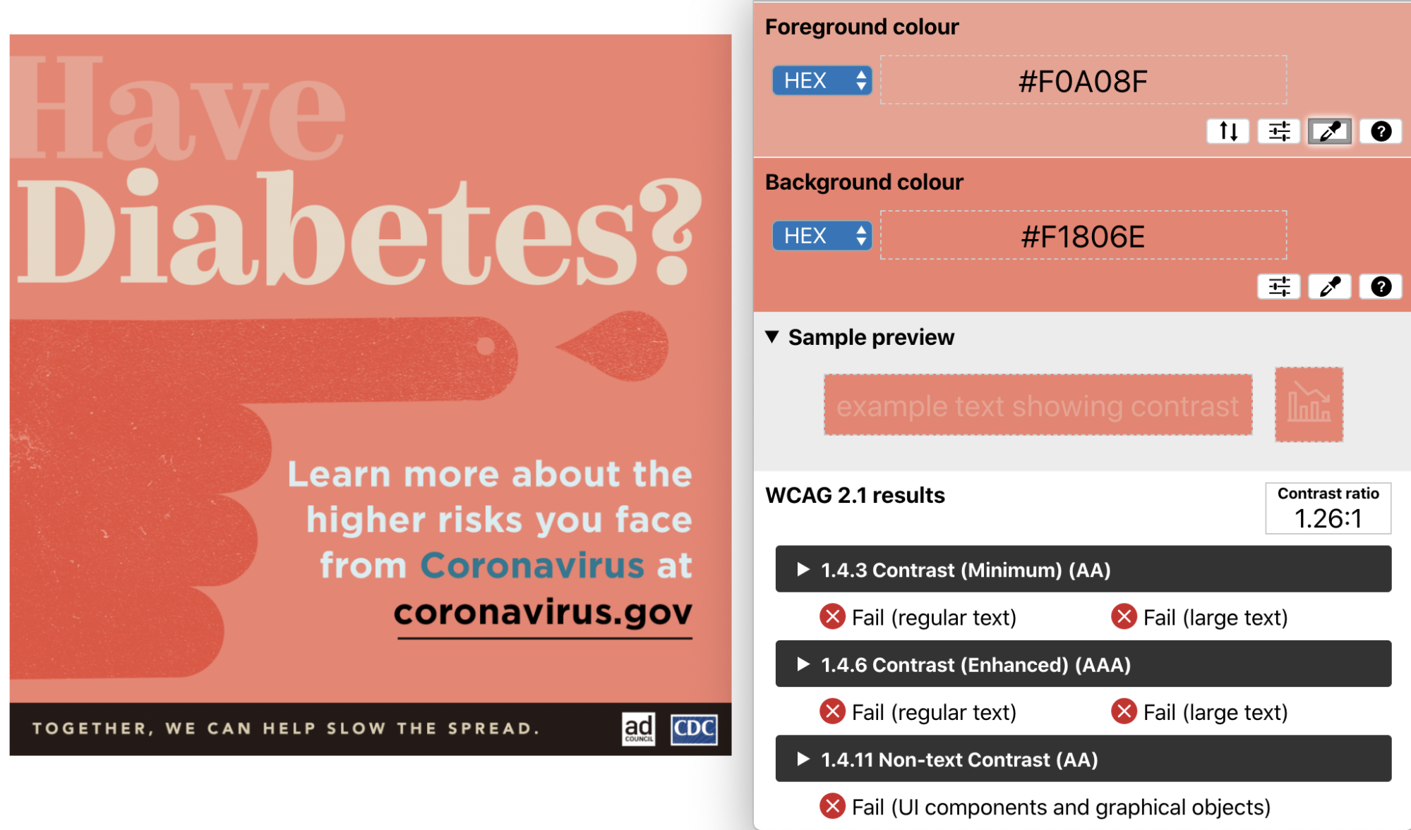
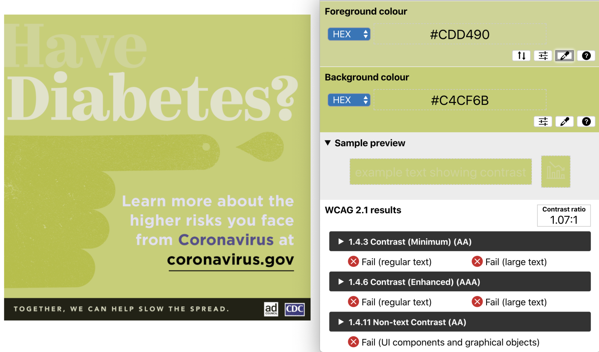
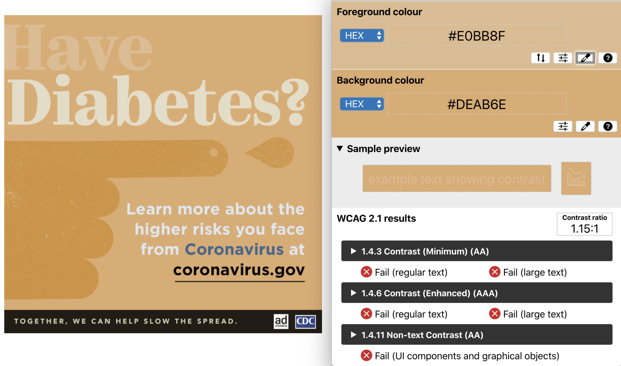
Testing a set of Ad Council PSAs aimed at people at higher risk from COVID-19 shows how quickly contrast ratios deteriorate under simulation. The ChromeLens extension can apply color blindness filters to web content. In the unedited PSA, the text “Have” against its background measured a contrast ratio of 1.26:1. Filtered for deuteranopia (red/green blindness), the ratio fell to 1.07:1; filtered for protanomaly (red-weak), it dropped to 1.15:1.
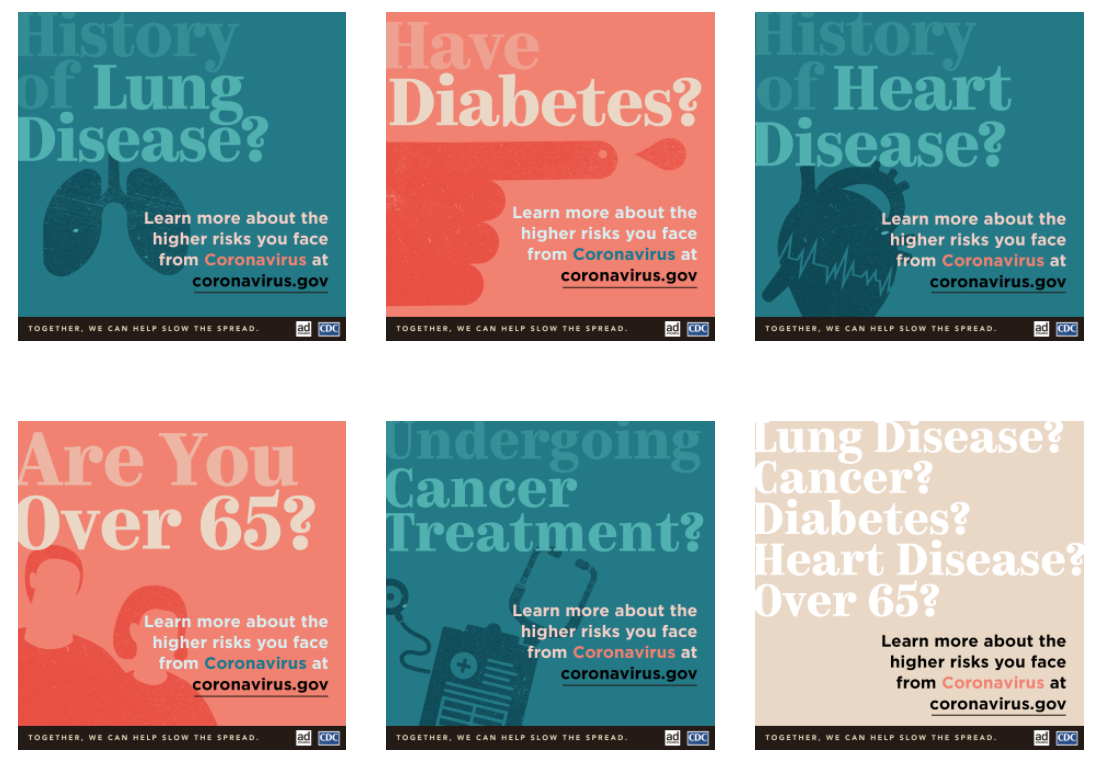
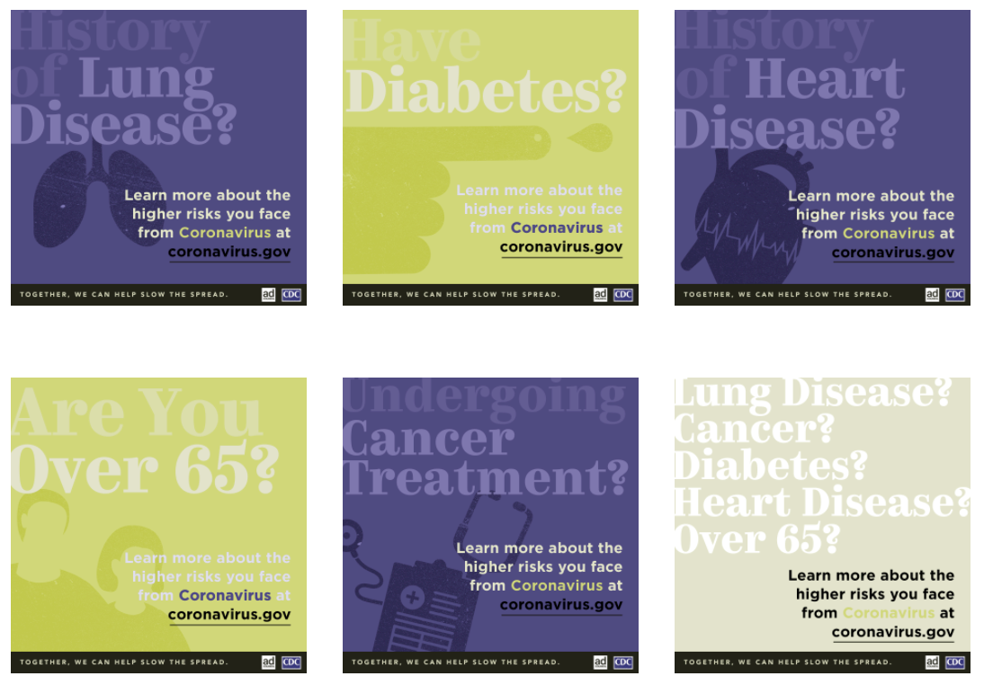
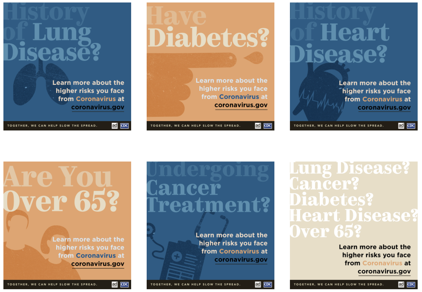
None of those ratios approach the WCAG thresholds — even the unedited version falls far short. The NoCoffee Vision Simulator demonstrates a parallel problem under low vision conditions. In another Ad Council PSA, the word “Undergoing” registered a 1.33:1 contrast ratio in the original. Simulated low vision reduced that to 1.25:1; a simulated cataract filter reduced it further to 1.06:1.
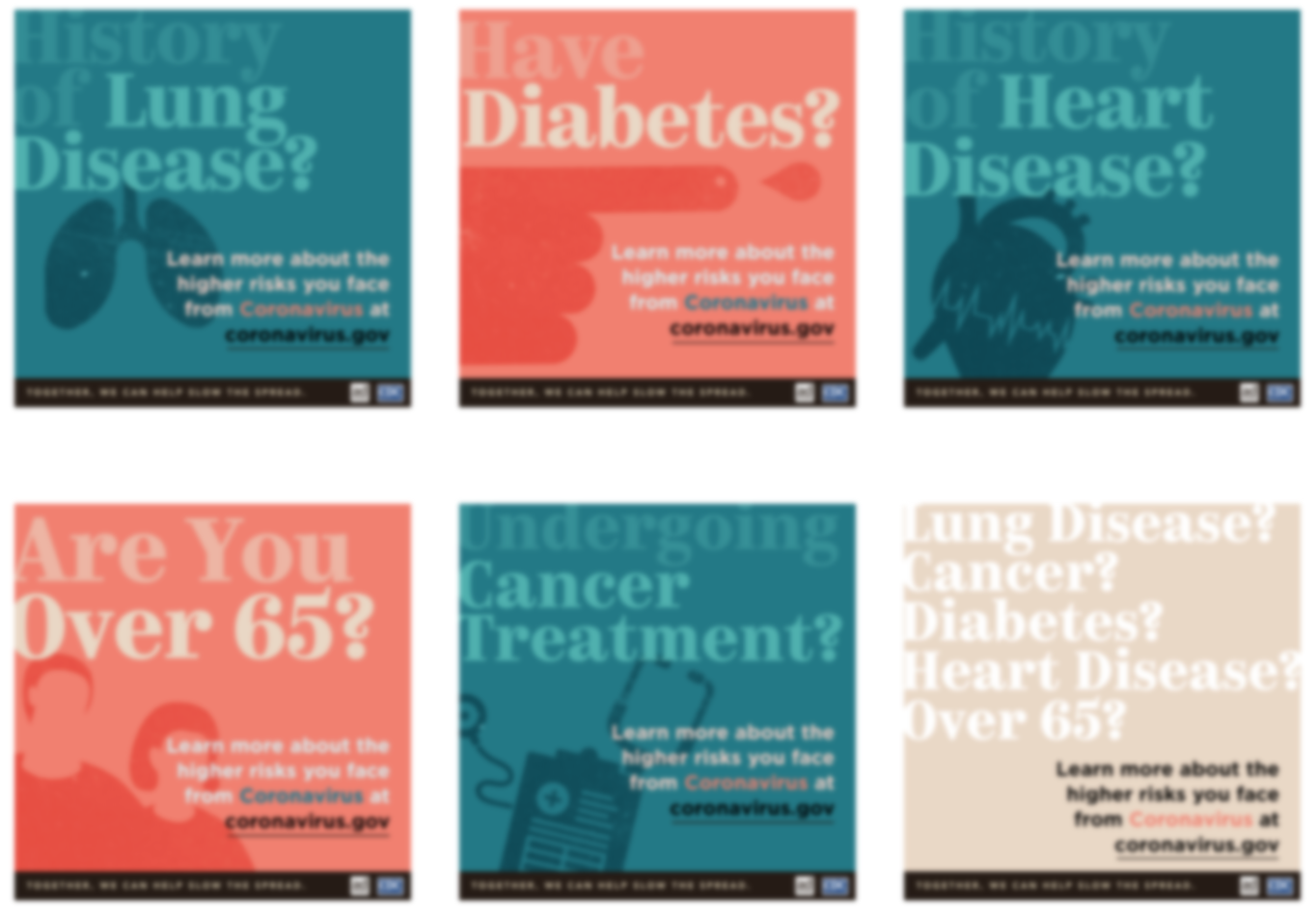
These examples illustrate that contrast — not just color choice — is often the real obstacle. Even where the colors themselves are not changed, the legibility problem is clear.
Remediation starts with WCAG’s contrast guidance: at least 4.5:1 for regular text, 3:1 for large text (18pt and up) and 3:1 for essential icons. The Colour Contrast Analyser can verify ratios in a design, and tools like the A11y Color Palette or Coolors help build accessible palettes from the start. Avoid relying on red/green or blue/yellow combinations, examine final designs through color blindness simulators like ChromeLens, and be mindful that light grays are particularly hard to read for people with low vision. NoCoffee can simulate low-vision conditions for testing as well.
Beyond ratio compliance, never use color alone to convey meaning — phrases like “the blue button” or “the information in red” fail for users who cannot perceive the distinction. Sensory characteristics such as shape, size, orientation or sound are equally unreliable as the only signal: “the link to the left of the image” leaves assistive technology users guessing.
Typography and Layout
Ideally, text and images would never be merged into a single fixed graphic, because users could then resize, re-space and reflow content at will. But social media posts, email and PDFs — not to mention many PSA graphics — leave no such option. Typography and layout choices matter all the more in those fixed formats.
An estimated 15-20 % of the world’s population has dyslexia, where letters and numbers can appear to flip or shift. People with low vision may struggle with tight letter spacing that morphs one word into another. And for users with attention-deficit or reading disabilities, complex layouts with little whitespace create real barriers; without a clear linear pathway, it is hard to keep one’s place.
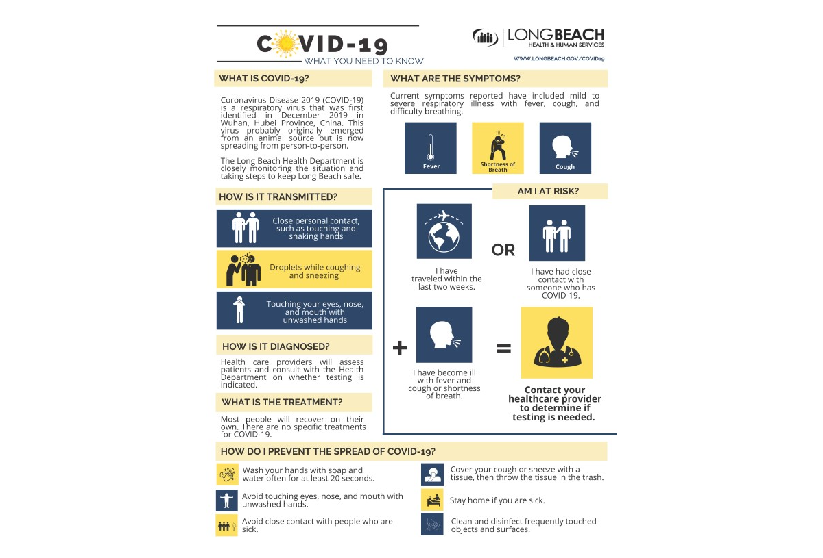
A flyer from the Long Beach Health and Human Services department illustrates the problem: mixed font families, an abundance of caps and bolds, tight leading, and text set at varying angles and widths. One panel even sets content in a tight column that would be difficult for many readers to follow.
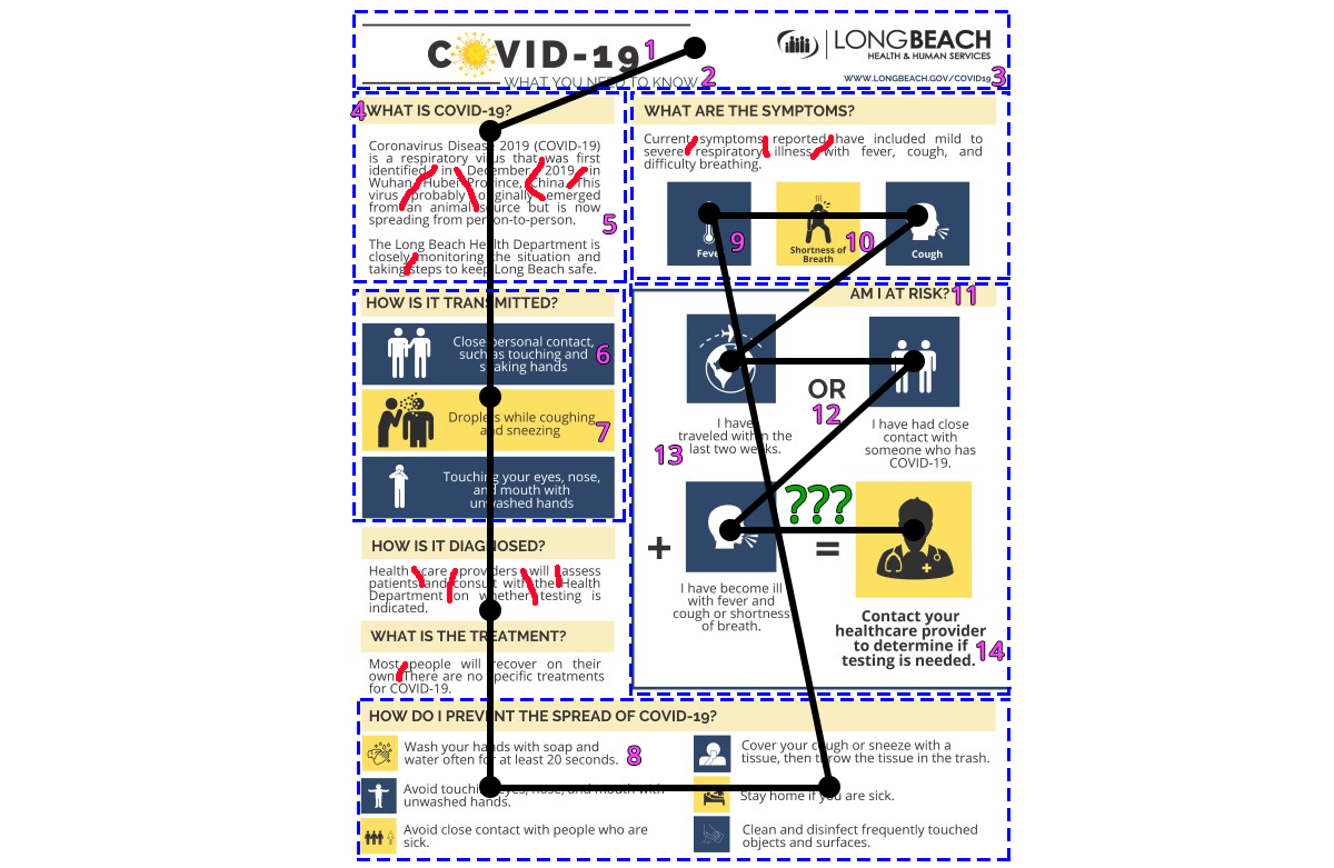
| Red hand-drawn lines | Illustrating the multiple “rivers of space” created by the justified alignment. |
| Blue dotted boxes | Outlining six different layout changes. |
| Pink numbers | Highlighting the 14 different typography treatments discovered (ignoring the logo). Some changes are more obvious like font family or color changes, some are more subtle like alignment, size, or weight changes in the typography. |
| Green question marks | What does this equation even mean? Cognitively this is a difficult thing to ascertain given the odd layout. |
| Black lines and dots | Expected 12 points of visual interest in an UX eye-tracking test based on the order of the content blocks (top to bottom, left to right) and typical equation flow (X + Y = Z). |
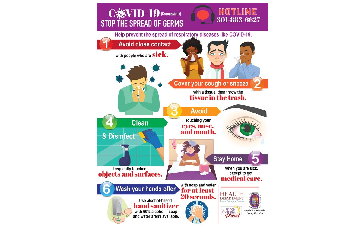
A second flyer, from the Health Department of Prince George’s County in Maryland, shows overlapping text blocks in different sizes and font styles, with multiple alignment modes competing for attention.
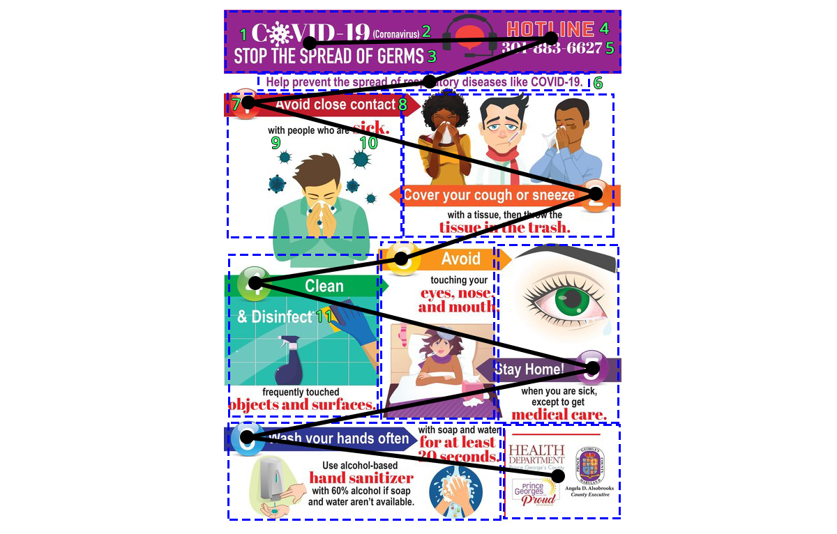
| Blue dotted boxes | Outlining nine different layout changes. |
| Green numbers | Highlighting the 11 different typography treatments discovered (ignoring the logos). Some changes are more obvious like font family or color changes, some are more subtle like alignment, size, or weight changes in the typography. |
| Black lines and dots | Expected 10 points of visual interest in an UX eye-tracking test based on the order of the content blocks (top to bottom, left to right) and numbering order (1 to 6) forming a zig-zag type eye movement. |
By comparison, a Prevention Action Alliance PSA from Columbus, Ohio, is far more restrained: consistent type, generous whitespace, and a straightforward single-column flow. The difference in readability is immediately apparent.
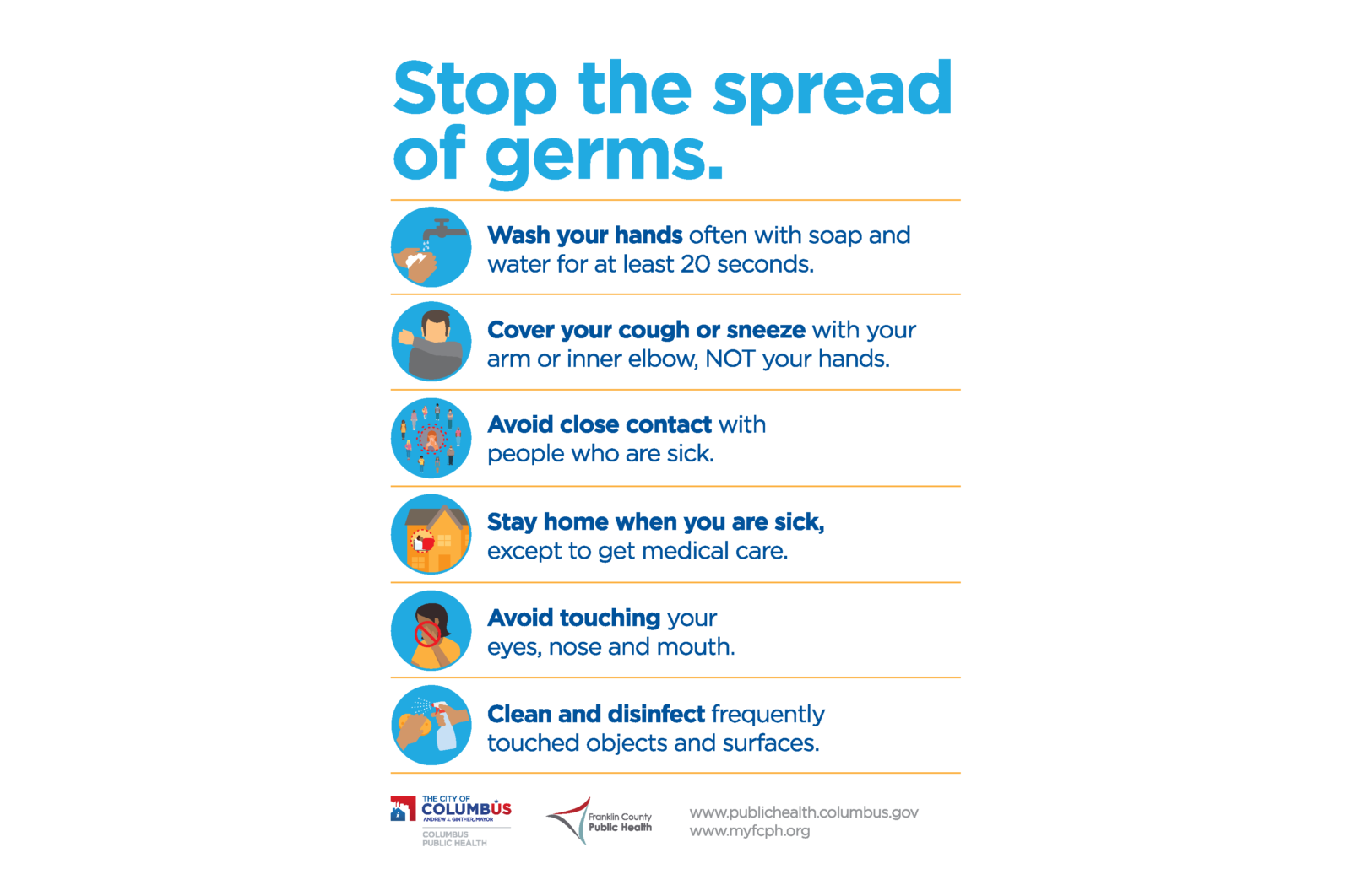
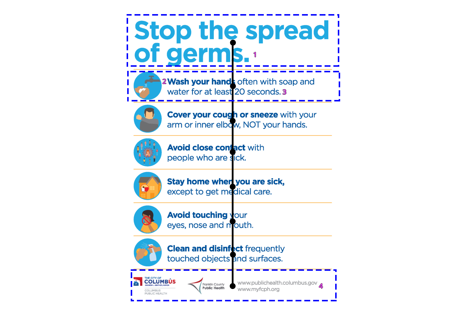
| Blue dotted boxes | Outlining three different layout changes. |
| Pink numbers | Highlighting the four different typography treatments discovered (ignoring the logos). In this case, only one font family was used, with variations only on size, color, and weight. |
| Black lines and dots | Expected eight points of visual interest in an UX eye-tracking test based on the order of the content blocks (top to bottom). |
Accessible typography means restraint. Limit the number of font families and avoid styling methods that hinder recognition — italics, bold stretches, all-caps passages. Select typefaces with clearly distinguished letterforms. Confusion-prone pairs such as uppercase “I” vs. lowercase “l” vs. the digit “1”; mirrored pairs like “b”/“d” and “p”/“q”; or “B” vs. “8” are all common failure points.
Layout rules of thumb from WCAG’s visual presentation guidance also apply: keep block widths at 80 characters or less (40 for logograms), avoid justified text whose uneven spacing creates “rivers” of whitespace, use at least 1.5 line spacing within paragraphs, and make paragraph spacing at least 1.5 times that. These practices keep the content’s path clear for all users.
Copy and Icons
In a public-health announcement, the words and the graphic symbols next to them must reinforce the same message. Copy that is too demanding and icons that are ambiguous both undermine that goal.
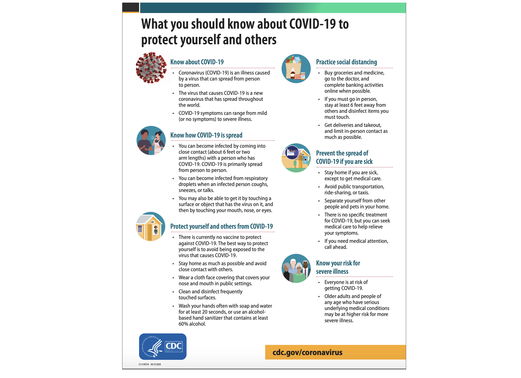
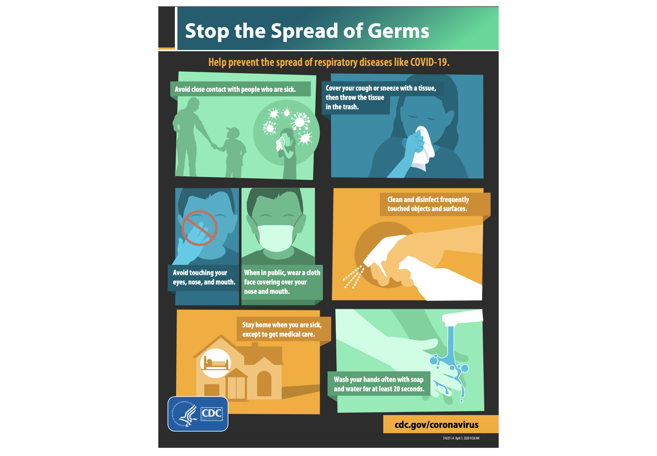
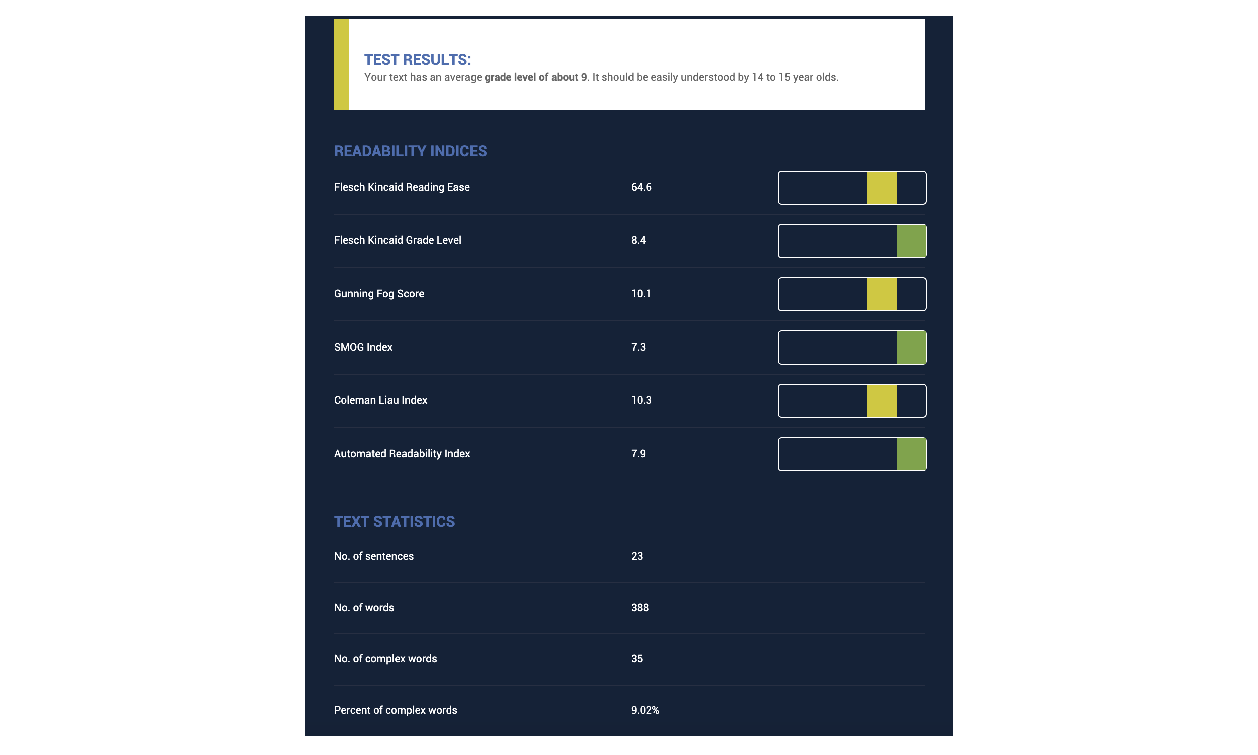
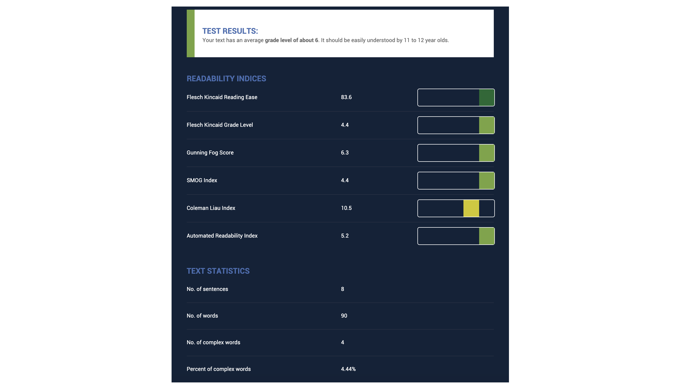
Readability testing of two CDC PSAs demonstrates the range. “What you should know about COVID-19 to protect yourself and others” runs 388 words, tests at an average 9th-grade reading level, scores 64.6 on the Flesch Kincaid Reading Ease scale (where lower is harder), and contains 35 complex words (9.02%). The CDC’s “Stop the Spread of Germs” infographic is far lighter: 90 words, a 6th-grade average, a reading ease score of 83.6, and just four complex words at 4.44% frequency. Whatever the PSA’s visual merits, the second is more likely to be understood by more people — 298 fewer words, roughly three grade levels easier, and less complex overall.
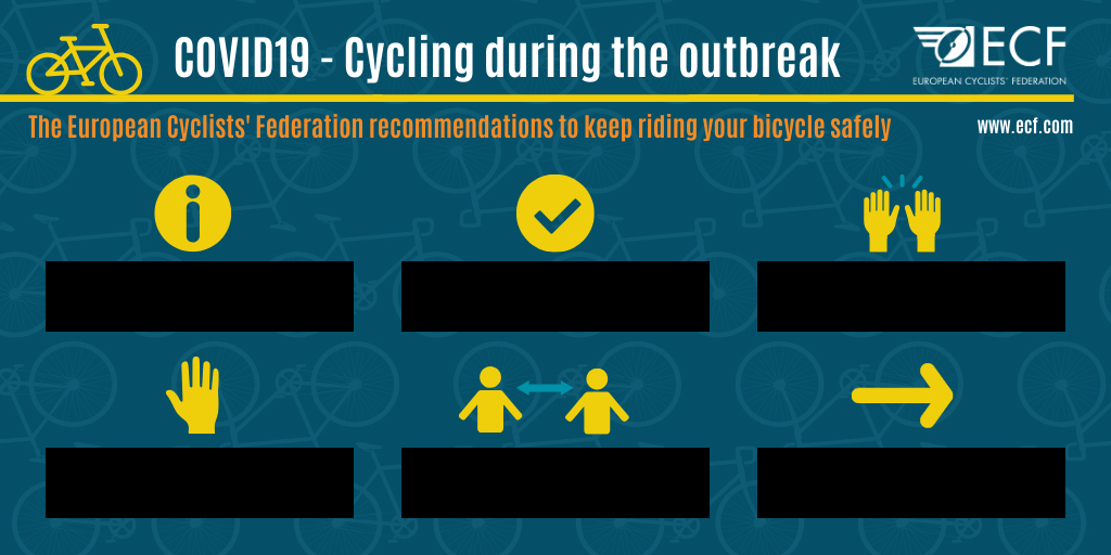
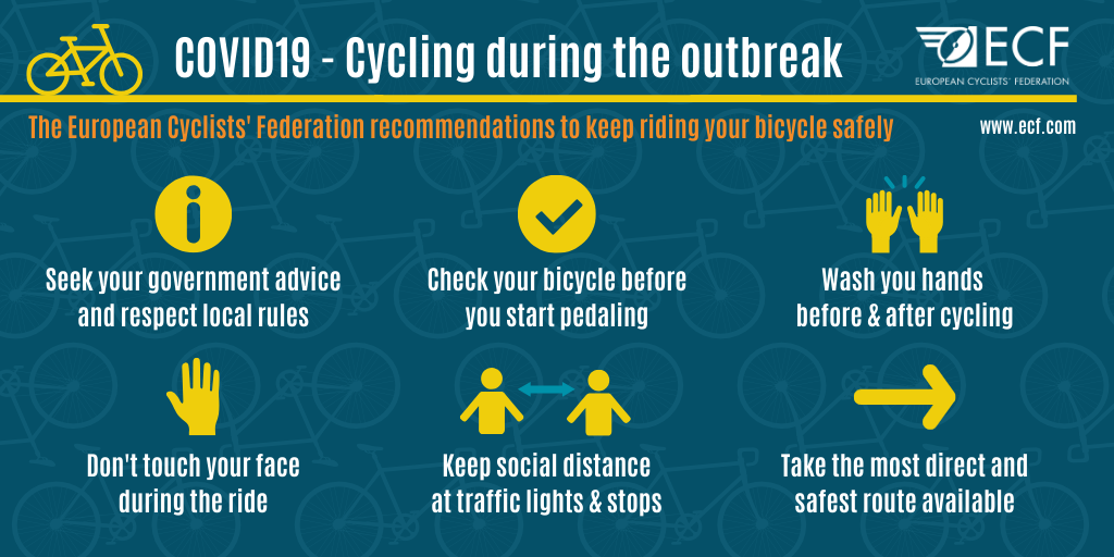
Icons are the other half of the equation. When the text labels are removed from icons in a European Cyclists’ Federation graphic about cycling safely during COVID-19, the intended instructions — which include maintaining distance and avoiding group rides — become guesswork. Some icons are legible, but a number depend entirely on caption copy. The same exercise with a Pennsylvania Department of Health graphic may produce slightly better results, but still relies on text to pin down precise meanings.
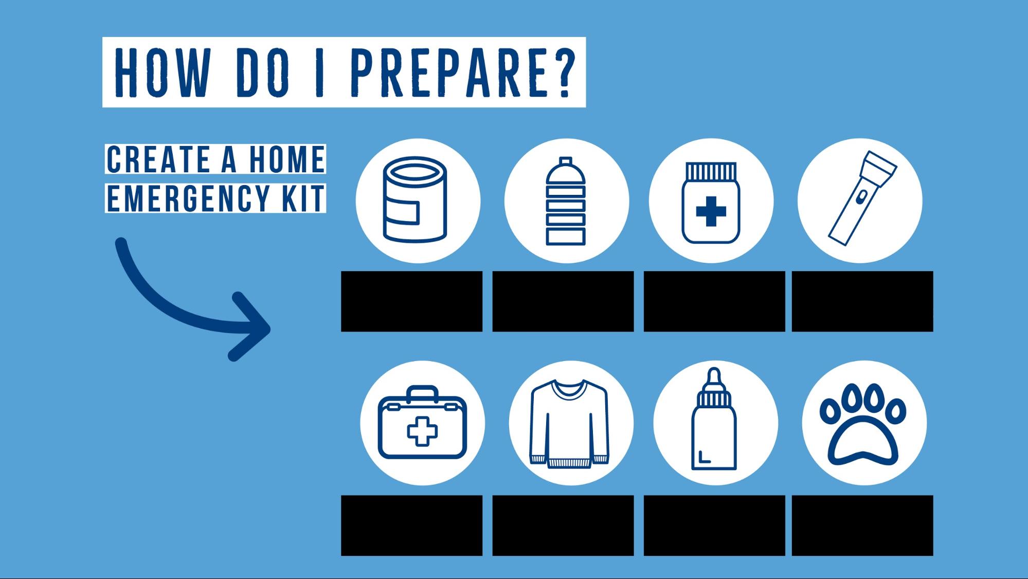
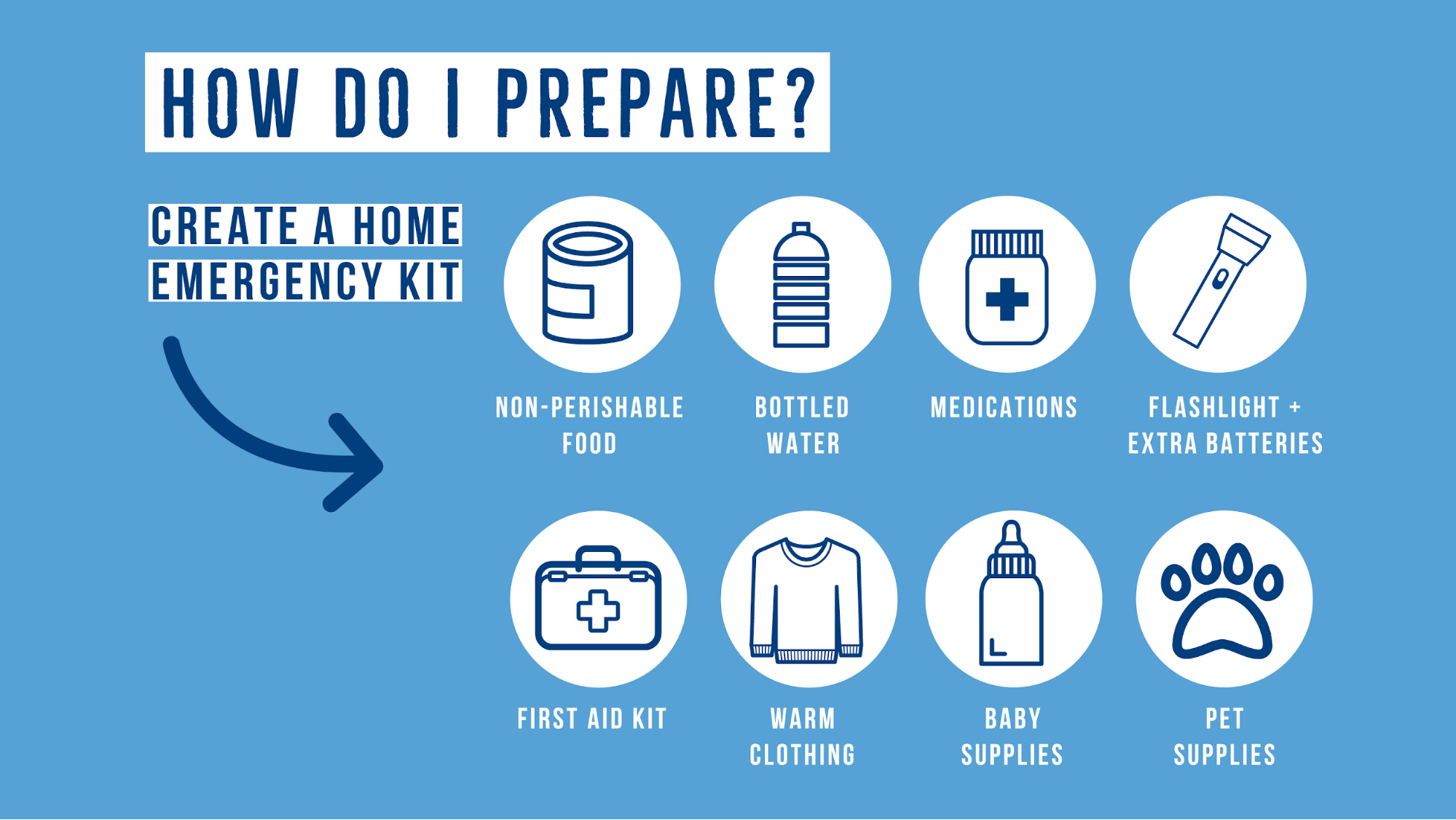
For accessible copy, write at a 9th-grade reading level, use plain language, and explain or define any acronym, abbreviation or uncommon term. Tools like Readable and The Readability Test can gauge the level of existing text; Hemingway Editor or Grammarly suggestions help simplify. Whenever possible, supplement language with icons, graphics or symbols — but use common, easily recognizable imagery. Following these practices makes an image’s message reach its widest possible audience.
Beyond Alt Text: Building Inclusive Images
Accessible images require more than a well-written alt attribute. Every visual element you place into an image communicates something to your audience, and each of those elements carries its own accessibility considerations. Color choices, contrast ratios, typography, layout, copy, and icons all work together to either include or exclude users.
The full picture of accessibility involves giving deliberate attention to how these components interact. A high-contrast palette does little good if the text overlay is too dense to parse. Clear typography fails if the surrounding color creates visual vibration. Icons that are intuitive in one cultural context may confuse in another.
Building these principles into your image workflow takes added time, but the reach is worth the effort. When you create images that are inclusive by design rather than as an afterthought, you make your messaging available to more people on their terms. Accessibility is not a constraint on creativity; it is a lens for ensuring the message actually arrives intact.
Further Reading
- Getting To The Bottom Of Minimum WCAG-Conformant Interactive Element Size
- How To Improve Your Microcopy: UX Writing Tips For Non-UX Writers
- How To Harness Mouse Interaction Data For Practical Machine Learning Solutions
- Mobile Accessibility Barriers For Assistive Technology Users

Explore more on


