
Why media queries fall short for web apps
Media queries are an excellent tool for adjusting layouts across screen sizes, and for many sites they are all you need. But if you are building a single-page web app, layout tweaks alone leave three problems unsolved:
- Every device downloads the same JavaScript, CSS, and media assets, which means needlessly slow load times on mobile.
- All devices receive the same initial DOM, which pushes you toward overly complex CSS to accommodate every form factor.
- You have limited ability to craft interactions that suit specific input methods, such as touch versus mouse and keyboard.
Techniques like responsive images and dynamic script loading can mitigate some of this. But for complex UIs, you may find that incremental CSS patches are no longer enough. At that point, serving tailored versions to different classes of devices becomes the more practical path—provided you can share code between versions to keep the work manageable.
Choosing your device classes
Web-capable devices span an enormous range: laptops, desktops, phones, tablets, smart watches, and more. The right number of categories depends on your product. Broader categorization means less work but a weaker experience for some users; fine-grained categories improve UX at a cost of more design, implementation, and maintenance. For high-traffic applications like search or social networking, the divide between phone and desktop experiences is often worth the extra effort — a point illustrated by native apps such as Flipboard, which offers very different tablet and phone interfaces.
A practical middle ground is to classify devices into three groups:
- Small screens with touch, mostly phones.
- Large screens with touch, mostly tablets and some laptops.
- Large screens with a mouse and keyboard, mostly desktops and laptops.
This leaves out older feature phones and e-book readers without touch, but those devices generally work fine with careful accessibility, keyboard navigation, and screen readers. Alternative category splits are fine, and your choice should be based on what makes sense for your users.
Server-side device detection
On the server, the main signal available on every request is the User-Agent header. You can parse it directly, or use a database service like WURFL or DeviceAtlas. These are capable but cumbersome. WURFL ships about 20 MB of XML, which can add significant per-request overhead, requiring projects to split the data for speed. DeviceAtlas is not open source and requires a paid license.
Lighter-weight projects like Detect Mobile Browsers are free and simpler, but they are less comprehensive, and they generally only separate mobile from non-mobile browsers with limited tablet support.
Client-side device detection
Feature detection in the browser can tell you what you actually care about: whether the device supports touch, and how large its screen is. A caveat on size measurements applies: CSS pixels are not the same as physical screen pixels. On high-density screens, including Apple's Retina displays, browsers still report an uncompressed device-width in CSS pixels, so you can use that value directly.
Choose a threshold that separates phones from tablets. Overlaying the portrait and landscape outlines from common devices, a cutoff of 650 CSS pixels cleanly separates most 4-7 inch phones from tablets.
if (hasTouch) {
  if (isSmall) {
    device = PHONE;
  } else {
    device = TABLET;
  }
} else {
  device = DESKTOP;
}
An alternative to feature detection is user-agent sniffing on the client, which applies heuristics to the navigator.userAgent string, but that technique requires constant updates as new browsers and devices appear.
What to do after client-side detection
If you detect device type on the server, you can serve tailored HTML, CSS, and JavaScript from the start. Client-side detection requires one of two strategies:
- Redirect to a device-specific URL, with the History API available to clean up the address after the redirect.
- Dynamically load the device-specific CSS and JavaScript into the document that was already served.
Redirects are simple but slow, particularly on mobile networks. Dynamic loading avoids that but adds complexity: you need a module loader, you cannot change the <meta viewport> tag after the fact, and reworking the originally served DOM from JavaScript can be slow or inelegant.
Which approach to pick
Client-side pros:
- Detection is based on capabilities and screen size rather than on an aging user-agent list.
- No maintenance burden of keeping the UA list current.
Server-side pros:
- Full control over which version each device receives.
- Better performance because you avoid client redirects or dynamic loading.
A reasonable starting point is client-side detection using a library like device.js, which performs semantic, media-query-based classification. The approach requires no special server-side configuration. First, declare your available versions in the document <head>:
<link rel="alternate" href="http://foo.com" id="desktop"
    media="only screen and (touch-enabled: 0)">
You may then handle the redirect on your own server, or rely on device.js to perform feature-based client-side redirects. Starting client-side is easy to set up and can stay that way. If later you find client redirects a performance problem, swap the traversal of device.js for server-side user-agent sniffing using the already declared versions.
Keeping the shared core, swapping the shell
This approach does not mean building three entirely separate applications. The key is code sharing, and that starts with a clean separation of concerns. If you are already working with an MVC-style framework (Backbone, Ember, or similar), you are used to keeping your UI layer distinct from your models and business logic. If you are not, it is worth looking into MVC patterns and JavaScript MVC libraries before proceeding.
That existing structure drops neatly into a cross-device workflow. Keep your models and controllers as the shared, device-agnostic core. To provide an optimized experience for each target device, create separate folders—one per device class—for the view code, HTML templates, CSS, and assets. Only this shell of "presentation" files is served differently.
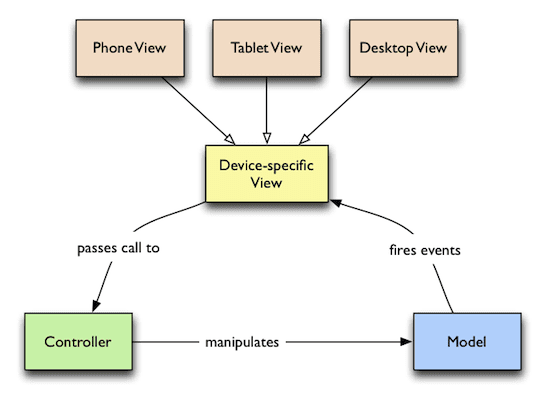
A typical project layout looks like this, though you are free to adapt it to your application’s needs:
models/— shared models, e.g.,item.js,item-collection.jscontrollers/— shared controllers, e.g.,item-controller.jsversions/— device-specific code broken down intophone/,tablet/, anddesktop/folders, each with its ownstyle.css,index.html, andviews/
Because each version has its own HTML, CSS, and JavaScript, you have full control over what assets load on any given device. That control leads to leaner pages and avoids the need for tricks like adaptive images to manage bandwidth or rendering complexity.
At build time, you can concatenate and minify the JavaScript and CSS for each target into single files. A production HTML file for the phone version (using device.js) looks like the snippet below.
<!doctype html>
<head>
  <title>Mobile Web Rocks! (Phone Edition)</title>

  <!-- Every version of your webapp should include a list of all
        versions. -->
  <link rel="alternate" href="http://foo.com" id="desktop"
      media="only screen and (touch-enabled: 0)">
  <link rel="alternate" href="http://m.foo.com" id="phone"
      media="only screen and (max-device-width: 650px)">
  <link rel="alternate" href="http://tablet.foo.com" id="tablet"
      media="only screen and (min-device-width: 650px)">

  <!-- Viewport is very important, since it affects results of media
        query matching. -->
  <meta name="viewport" content="width=device-width">

  <!-- Include device.js in each version for redirection. -->
  <script src="device.js"></script>

  <link rel="style" href="phone.min.css">
</head>
<body>
  <script src="phone.min.js"></script>
</body>
A note on that media query in the example: the (touch-enabled: 0) syntax is not standard (it exists only behind a moz prefix in Firefox), but device.js supports it correctly by leveraging Modernizr.touch.
Letting users override version detection
Device detection can misfire, and sometimes a user simply prefers a different layout. A phone with a large screen (e.g., a Galaxy Note) is a good example of where a tablet layout might be more suitable. Provide an explicit choice, starting with the usual "View desktop version" link. device.js makes this easy via the device GET parameter, which lets you bypass the automatic classification.
Putting it into practice
Building an SPA that doesn’t fit the responsive mold comes down to a series of deliberate decisions:
- Decide which device classes you will support and define the precise criteria for classifying a device into one of them.
- Structure your MVC app with a strict separation of concerns, isolating view code from the logic and data layers.
- Use
device.json the client for device class detection and routing to the correct version. - At release time, bundle all assets, producing one set of concatenated and minified CSS/JS for each device class.
- If the client-side redirect proves too slow, drop
device.jsand move the detection logic to the server, using UA parsing to serve the right version up front.


