
Tables Are Fine Until They Aren’t
Tables are the default choice for presenting data, and often that’s the right call. If the goal is to show a small, tidy set of values and let readers look up specific numbers, a table is compact, precise, and easy to scan. The caveat is that tables only excel at straightforward lookups. The moment the data carries a second layer of meaning — say, a comparison across categories — the limitations show quickly.
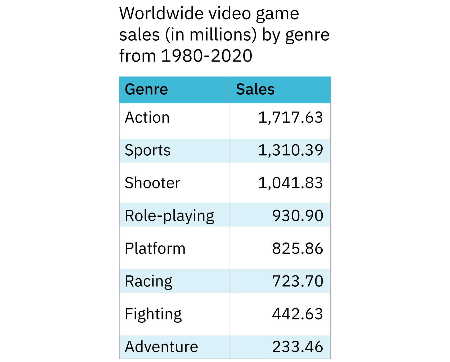
Consider a dataset of video game sales broken down by genre. One table offers the full picture: each genre in one column, total worldwide sales in the other. Sorting by sales instead of alphabetically makes it immediately clear which genres dominated from 1980 through 2020, and the whole thing fits in a fraction of the screen space a chart would need. The message is simple — these genres sold the most — and the table delivers it.
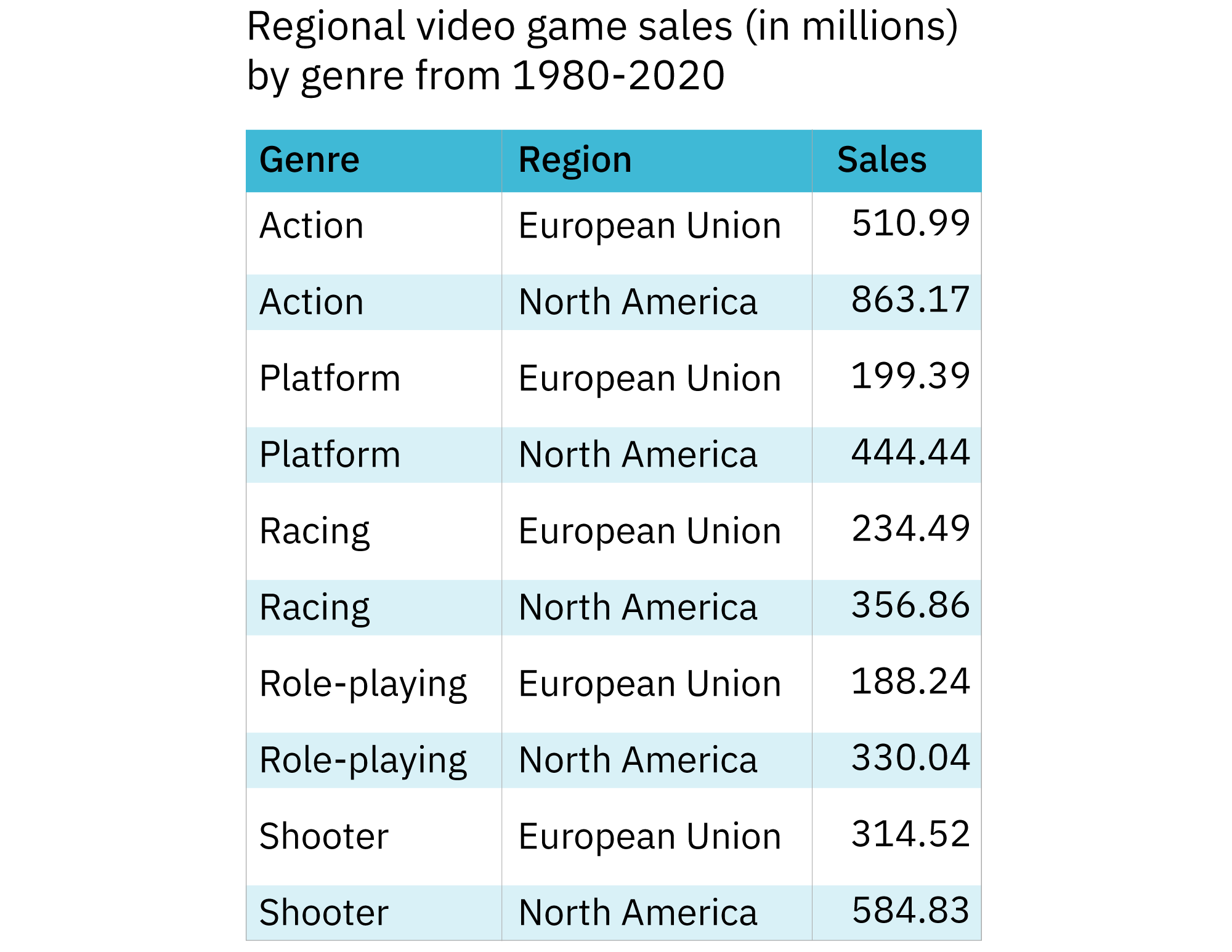
Now take the same dataset but add regions. A table with five genres and two columns of sales figures — European Union and North America — still answers the question which genre sold more in which region? But it fails at the second, implicit question: how do the regions compare across all genres? Eyeballing two columns of numbers and mentally ranking them is not how most people read data.
Switching to a grouped bar graph changes the dynamic. With the genres on one axis and sales on the other, each genre gets a pair of bars side by side, one per region. The comparison becomes visual: scan the height of adjacent bars to judge a genre’s regional split, or scan across the full set to see regional totals. The same data now communicates both messages that the table implied but never delivered.

This is the guiding principle: a visualization should be as simple as possible while still carrying the full intended message. Tables earn their place when they do the job without embellishment; charts earn theirs when they compress a comparison or a trend into something a reader can absorb in a glance.
What Is the Message Supposed To Do?
Beyond the message itself, the intended action matters. If the point is purely informational — a single fact, a quick reference — a static, minimal format wins. If the point is to persuade, highlight a problem, or drive a decision, a more deliberately structured chart is warranted. Charts can carry emotional weight that tables cannot, whether that’s a stark bar showing a sudden drop or a line that climbs toward a goal.
Four broadly accepted purposes cover most visualizations:
- Comparison: How do items differ? Across categories or over time.
- Composition: What parts make up the whole, and does that breakdown change?
- Distribution: Where do values fall, and are there outliers?
- Relationship: How do variables correlate or interact?
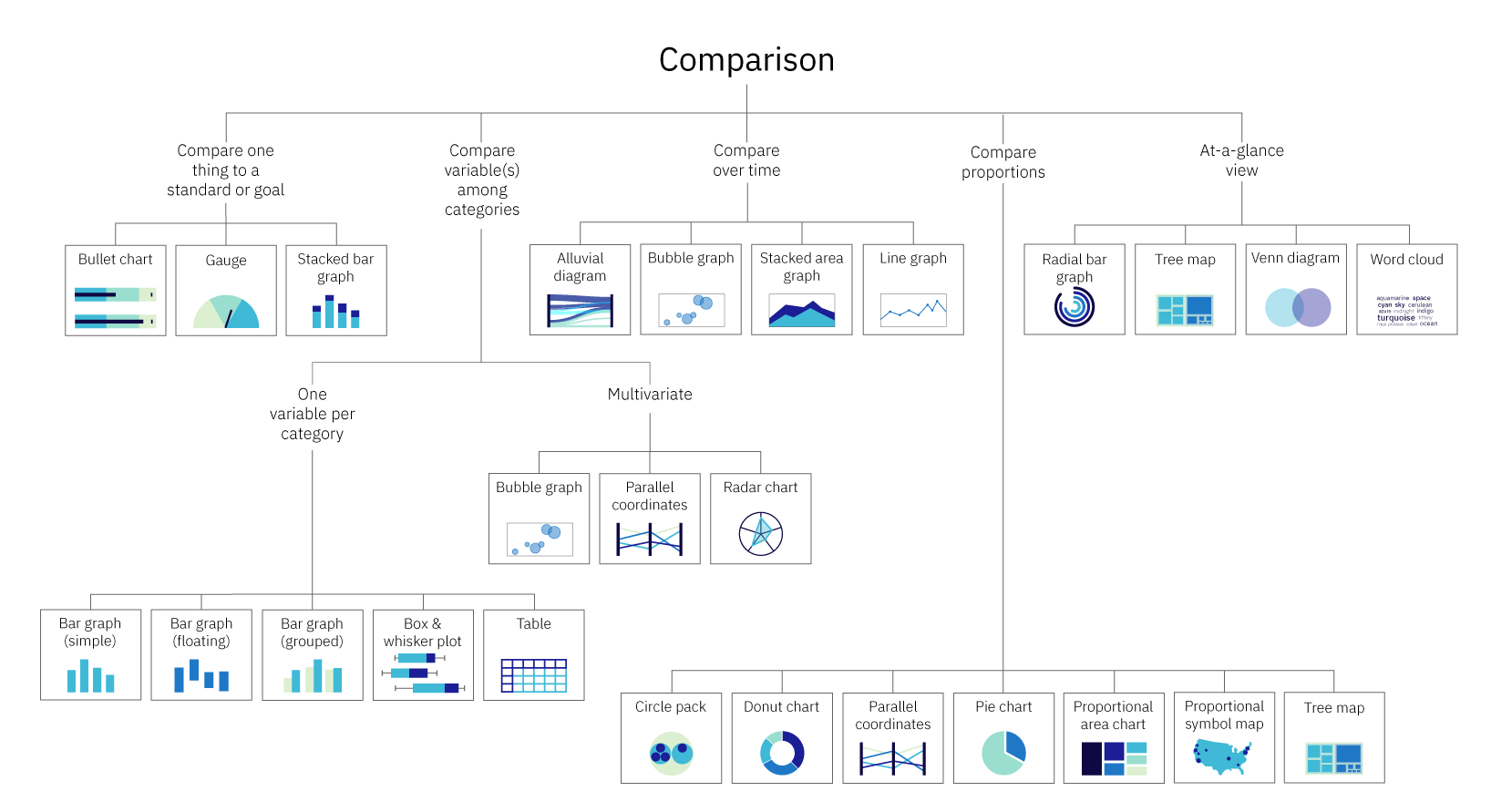
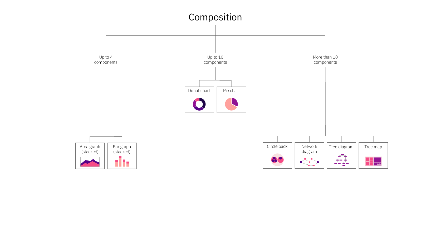
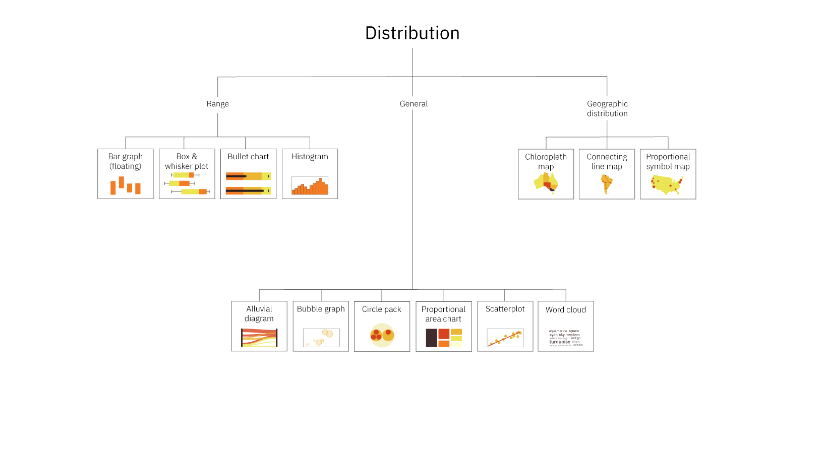
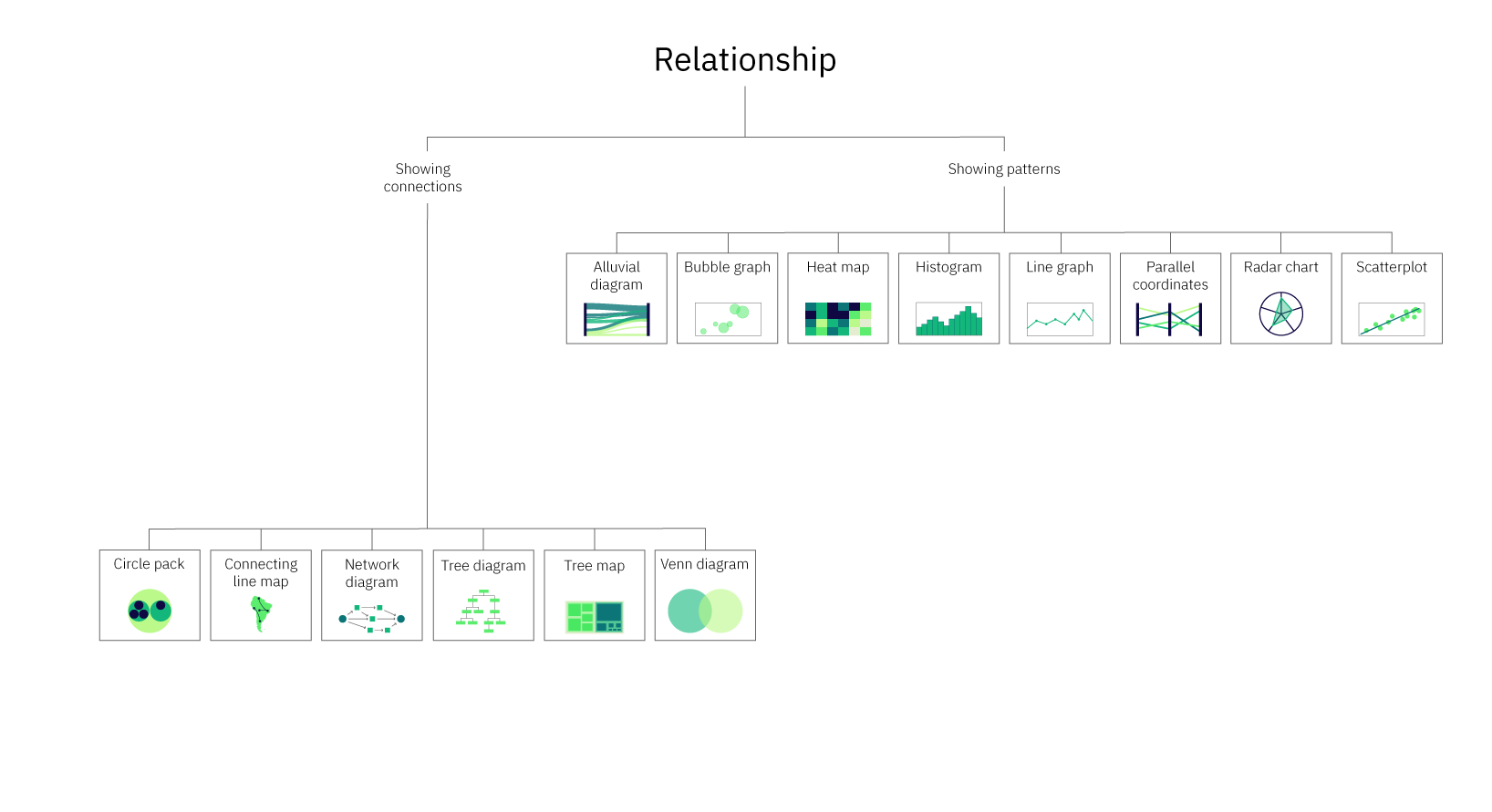
Each purpose maps to a family of chart types. Comparisons are served by bar graphs, line graphs, and pie charts. Composition calls for stacked versions of those, plus treemaps and donut charts. Distribution work leans on histograms, box plots, and scatterplots. Relationship questions point to scatterplots, line graphs, and network diagrams. A full mapping of chart type to purpose is best done with a reference table, since many charts serve several masters.
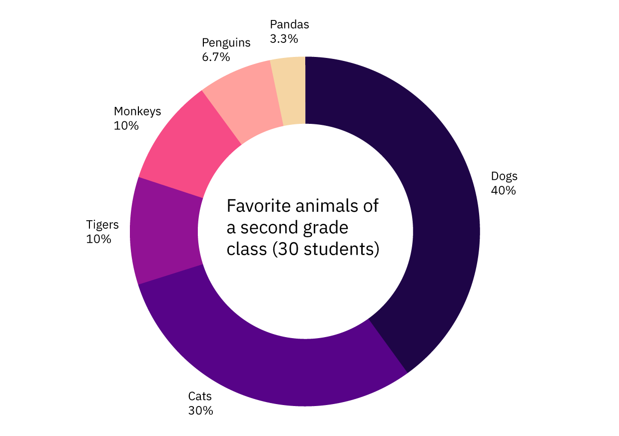
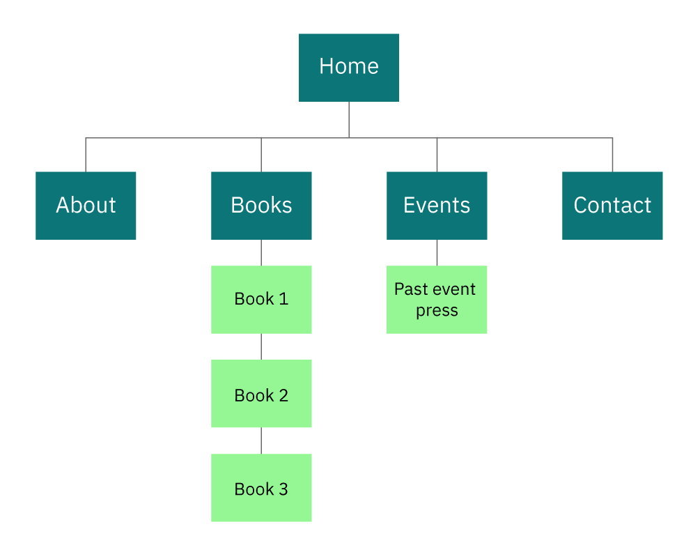
A treemap, for instance, shows both composition (which categories exist) and comparison (how large each is relative to others). Site maps are essentially tree diagrams that communicate both a list of pages and the hierarchy tying them together. Donut charts work the same way. Results from a class poll on favorite animals, rendered as a donut, give a complete list of choices while also letting the eye rank their popularity.
Sometimes, though, a single chart cannot carry the full load. When the data answers multiple questions across different purposes, multiple charts often serve better than one dense, multi-layered graphic — particularly for an audience that may not read visualizations fluently. Serving several simple charts is easier than demanding one complex one be untangled.
Know Your Audience
Who is reading the chart changes what you can draw. A specialist in the field will parse a scatterplot matrix or a parallel coordinates plot without blinking with a lay audience, those same forms can look like visual noise. Before committing to any chart type, it pays to ask two questions about the audience.
First: how familiar are they with data visualization conventions? Readers who have seen a hundred bar charts expect bars to start at zero, lines to run left to right on a time axis, and colors to mean something consistent. Deviating from those expectations — truncating a y-axis, using a broken scale, mapping categories to arbitrary hues — forces the audience to work harder just to decode the chart, which undermines the point.
Second: how much context do they already have? A revenue trend that is obvious to an operations team still needs a clear annotation or threshold line for a general audience. The less the audience knows about the subject, the more the chart needs labeled highlights, a descriptive title, and a restrained set of variables.
Shape the Data To Fit the Chart
The data itself constrains the options. Data types fall into a few buckets: categorical, ordinal, and quantitative. Categorical data is divided into named groups — genre, region, brand — and supports most comparison and composition charts but not much else. Ordinal data has order but no fixed interval, like survey responses ranging from “strongly disagree” to “strongly agree.” Quantitative data is numeric and continuous, enabling the axes and math behind scatterplots, histograms, and line graphs. On top of type, volume matters. A handful of categories look fine as a pie chart, but if the categories number in the dozens, a horizontal bar chart or treemap reads better.
Precise numeric values won’t survive a chart, though. Charts are the fastest way to convey shape, trend, and relation, but the moment the audience needs an exact figure, a table annotation or tooltip must fill the gap. Sizing also plays a role: a chart with dozens of bars in a small space creates overlap that obscures data.
Choose for the Takeaway, Not the Ornament
With so many chart types and an equal number of aesthetic variations, it is tempting to let visual appeal drive the choice. But a data visualization is a functional artifact first. The right chart for a given task is the one that turns the intended takeaway into the most immediate reading of the graphic. A clean, well-labeled bar graph that answers a regional comparison beats an elaborate radar chart that warrants an explanation.
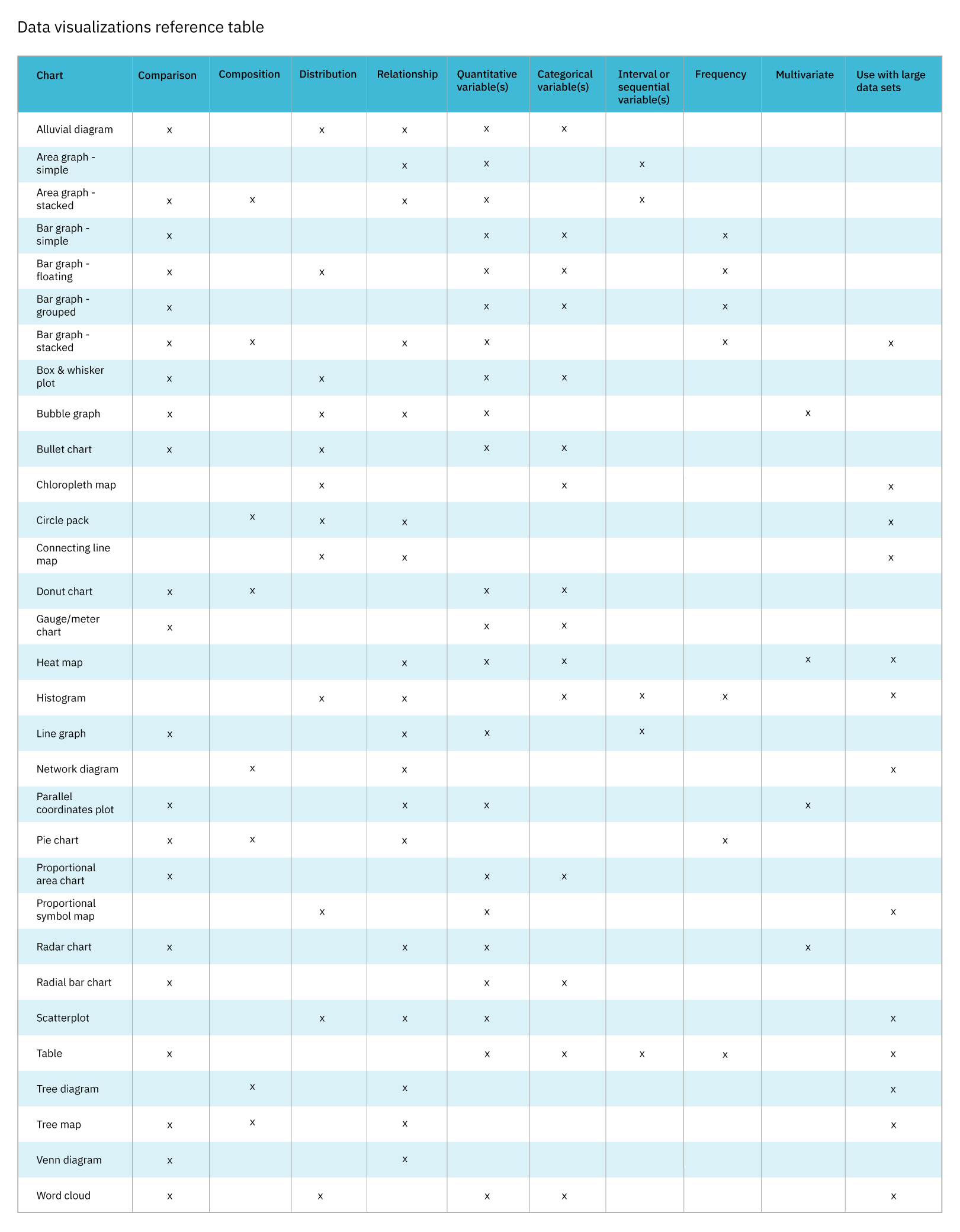
A solid workflow is to name the message, decide whether comparison, composition, distribution, or relationship is at play, factor in the audience’s data literacy and the size and type of the dataset, and only then choose a chart from the family that fits. Two reference tools are useful to have on hand. The first is a chart reference guide, which lists chart types by their purpose, the variables they support, and examples for each; the second is a data visualizations table, which checks off, for every chart type, the categories it covers and the variables it uses.
Graphs sit on axes and charts are the wider category that also includes them — squares and rectangles, as it were. What matters is that the choice aligns with the takeaway, not with the trendiest option.
Match the Chart to the Audience
Before committing to a chart type, consider who will be reading it. Their familiarity with both the subject matter and common data visualization formats should influence your choices. For example, radar charts can be an excellent way to compare multiple variables across a few items, but many readers are unfamiliar with their circular layout and will struggle to parse them.
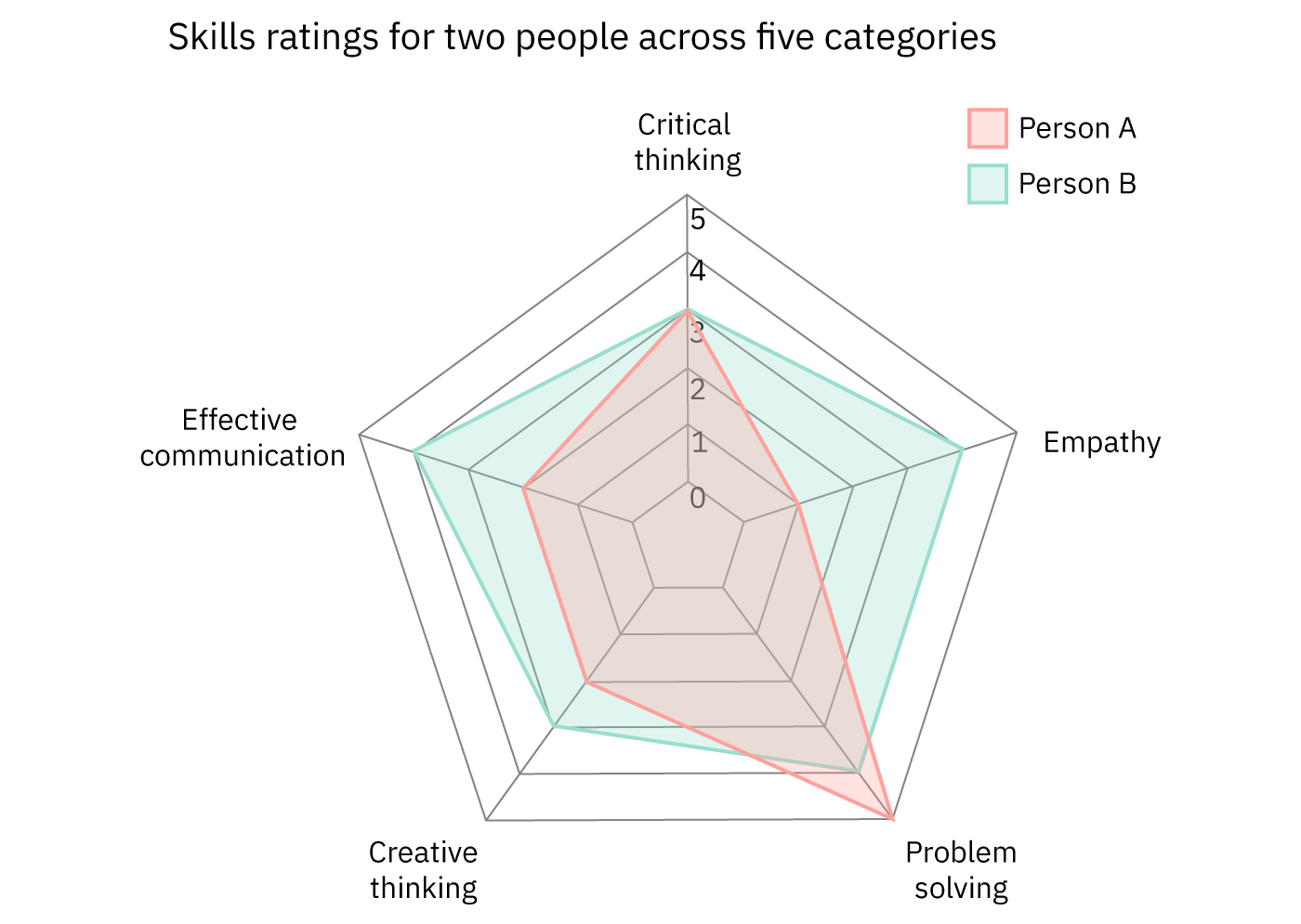
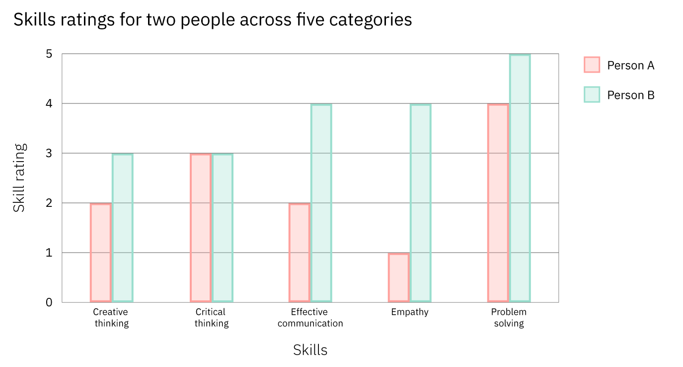
A grouped bar graph is a more universal option for this same data. Because most people have encountered this format before, they are more likely to grasp the comparisons quickly. Conversely, for an expert audience that regularly reads radar charts, the radar version may actually be more effective at conveying the comparative relationships at a glance. Simplicity matters, but it must be weighed against what the chart succeeds at communicating for its intended readers.
The audience also dictates how much context and labeling are appropriate. Since stacked area graphs can be tricky for those unfamiliar with them, adding data labels or explaining the cumulative nature of the chart is often necessary.
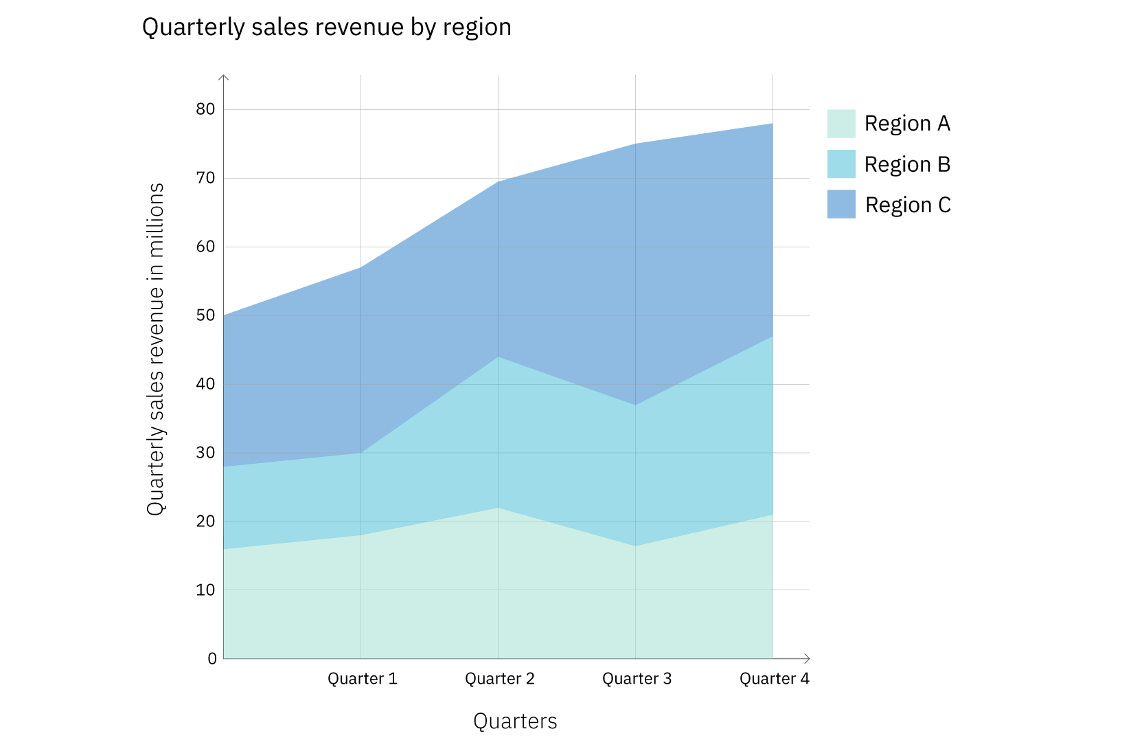
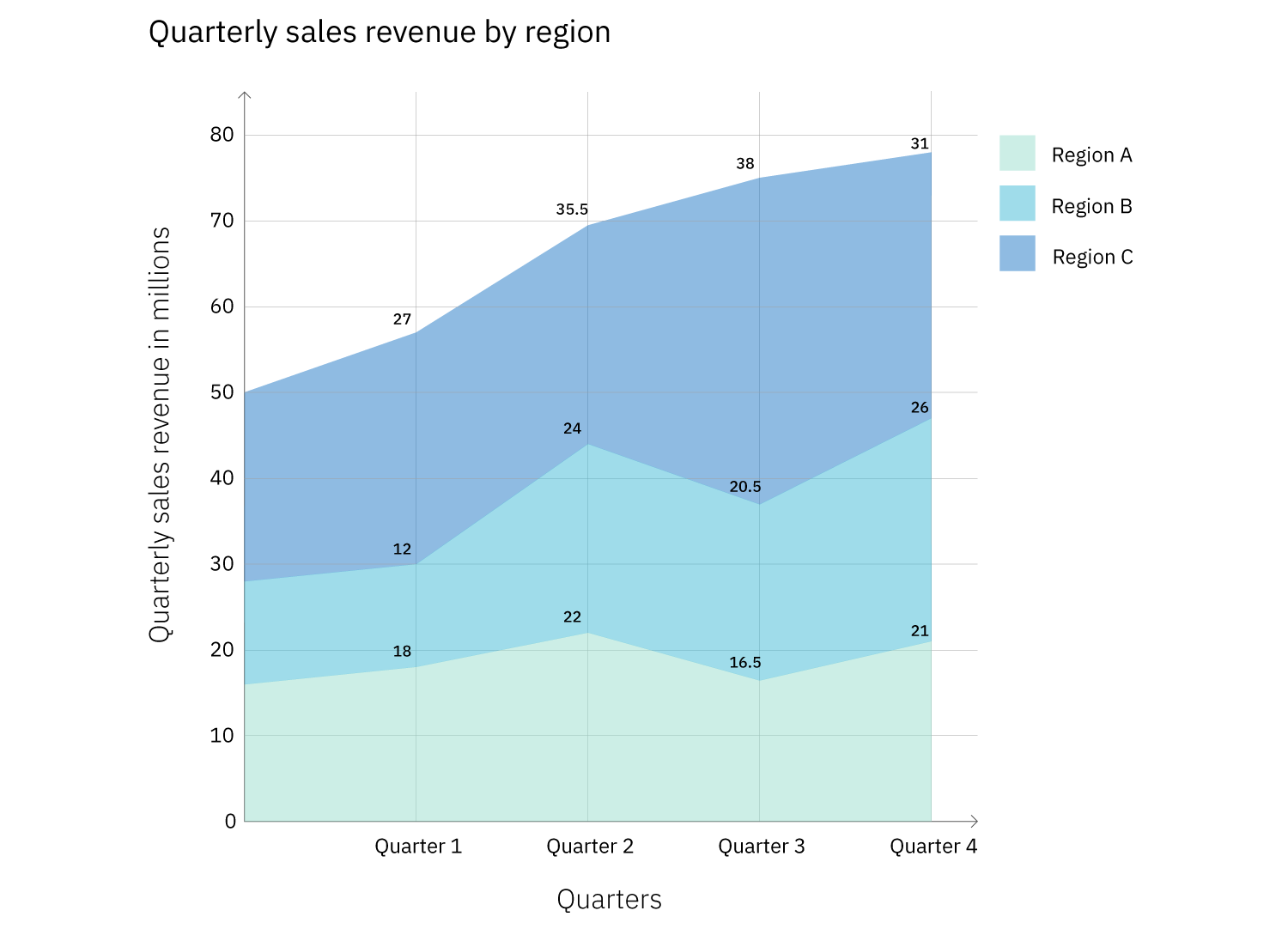
These two figures use the same underlying values, but Figure 9 labels each regional series by quarter. This eliminates the need for the reader to perform subtraction to derive a single region’s value. However, labeling every element is not always a good idea; with large data sets, such annotations often lead to clutter and reduce readability, as shown in Figure 10.
Data Type and Size Constrain the Choices
By now, your options should have narrowed from your message and audience considerations. The next step is to match your data's type and volume. The main categories are:
- Quantitative (numerical data, either continuous or discrete), such as population or temperature.
- Ordinal data, which is non-numerical but has a natural order (e.g., days of the week or spiciness levels).
- Categorical (or nominal) data, which lacks any inherent order (e.g., types of trees or colors).
The data type can disqualify certain charts. For instance, a histogram requires frequency data from a quantitative variable split into intervals, so it’s unsuitable for a mix of categorical and quantitative data. Data volume is an equally important filter. Bar graphs and pie charts work best when they have a relatively small number of categories. A chart with eighteen bars or twenty slices becomes difficult to digest and understand.
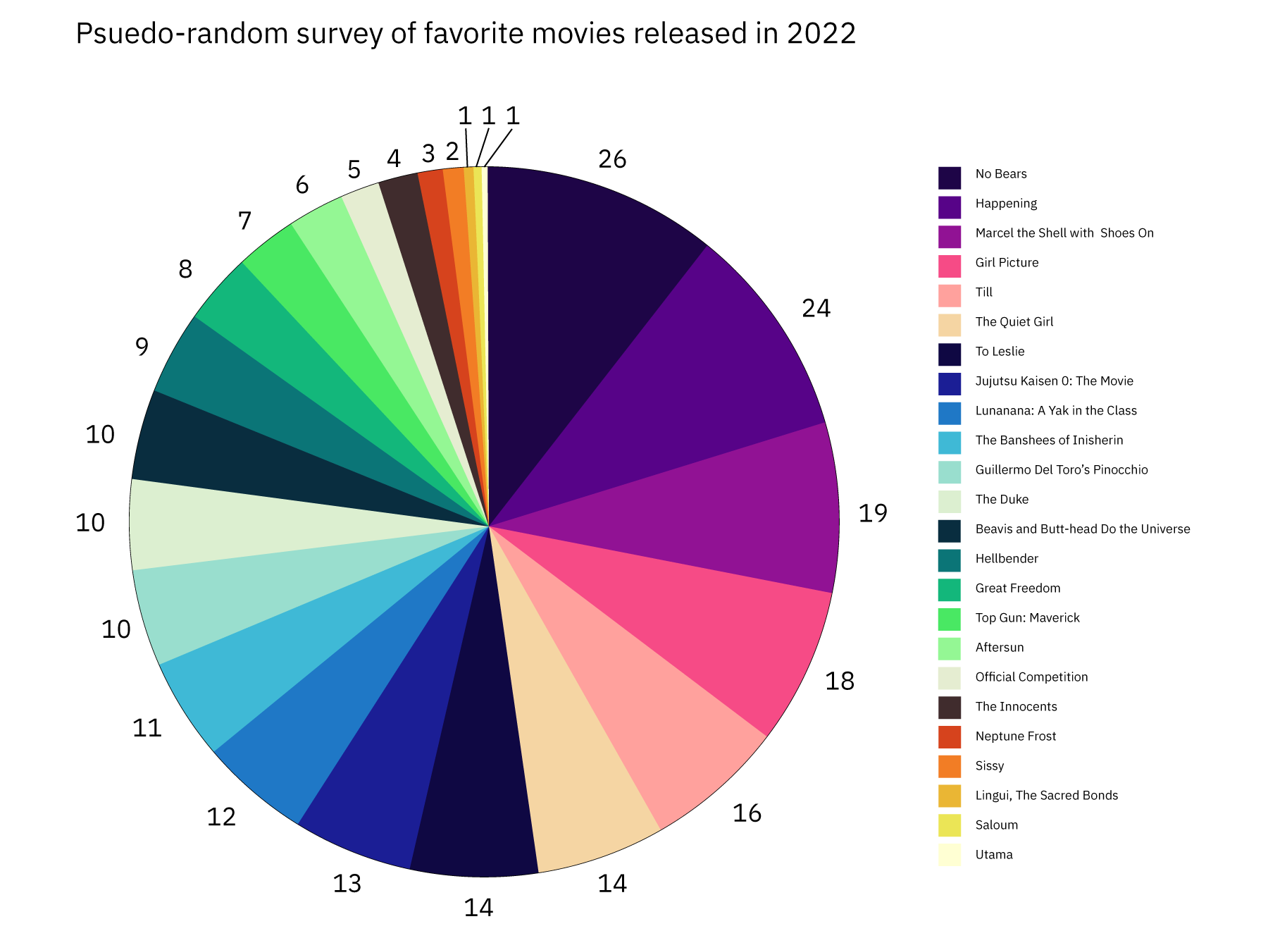

For guidance on which chart types can absorb a high volume of data, refer to a comprehensive reference guide. Many such resources cover layout patterns, best-use cases, and the nuances of more than 30 popular formats.