

Streamlining Log Review in GitHub Actions
Debugging failed workflow runs in GitHub Actions is getting a significant upgrade. A new set of improvements to the log viewer aims to reduce the friction of hunting through thousands of lines, with a focus on faster load times, smoother navigation, and more precise interactions.
The core changes touch on several areas: a simplified layout, a single virtualized scroll, a more responsive search, expanded color support for terminal output, interactive URLs, a new full-screen mode, and a refreshed interface that improves readability and accessibility.
Faster Loads and Smarter Navigation
The most visible gains are in performance. Logs now load faster and scroll more smoothly, especially in runs with heavy output. The engineering behind this includes moving to a single, virtualized scrolling model that renders only what is visible, cutting down processing time for large files.
To support that performance, the layout has been restructured. Users can now navigate between jobs without losing their place in the currently selected step. The sidebar and main log pane are separated in a way that makes it easy to switch context when log density is high.

This structural clarity is meant to keep you oriented: you can jump between search results or job outputs while still seeing which step is active. The goal is to make the log viewer a less disorienting place when you are deep in a debugging session.
Readability and Interaction Updates
Beyond layout, the visual design of the logs has been tightened. Contrast, spacing, alignment, and accessibility have all been improved across desktop and mobile views. The result is an interface that is easier to scan quickly, especially when sorting through dense output.

Search has also seen functional changes. The interaction has been refined with visual updates, and a performance threshold now prevents the system from querying unintended matches. This adjustment is especially beneficial in logs with a high volume of content, where faster search can save considerable time.
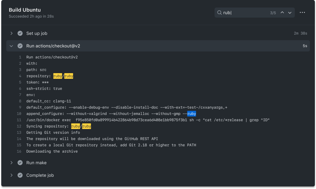
Color With More Information
Color is treated as more than decoration. For status states—such as tasks in progress, waiting for input, or failing—the log output now uses a clearer color language to indicate where attention is needed. In most normal runs, the logs will look similar to before, but when action is required, the relevant items stand out more instantly.

Support for richer terminal colors is also expanding. This goes beyond the standard ANSI palette to include 8-bit and 24-bit color. That means content generated by user scripts and third-party tools can more closely reflect its intended styling when rendered in the Actions log viewer.
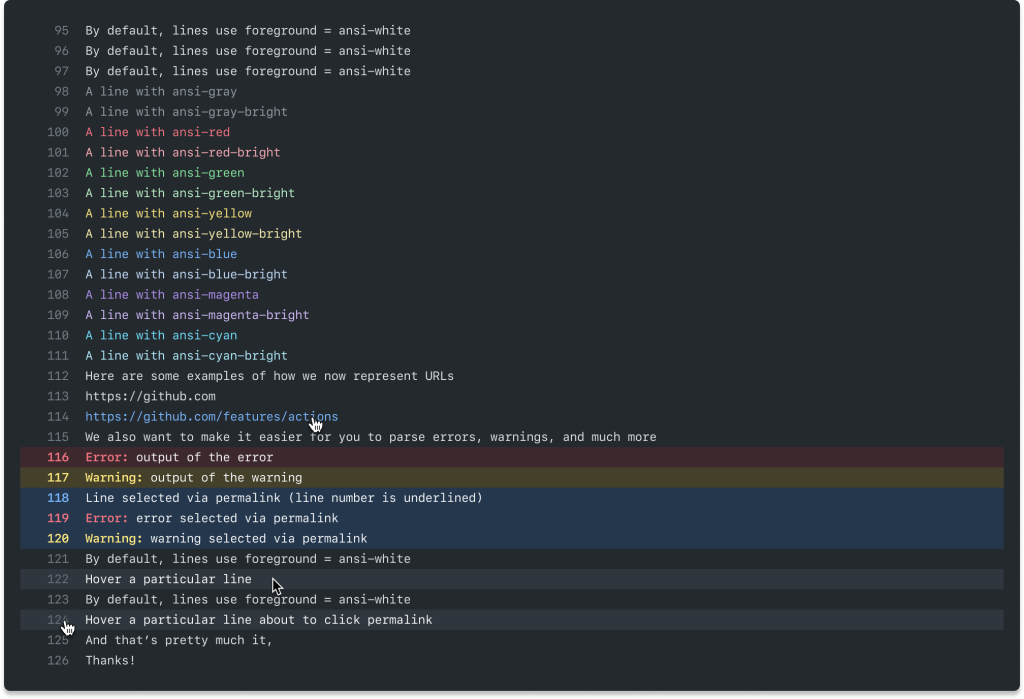
Interactive elements are another addition: URLs in logs are now clickable, and a full-screen view mode is available for focusing on a single log without page distractions. Combined with the visual refresh, these changes are intended to reduce the time you spend wading through logs and get you back to building.


