

Page layout—deciding where items sit on a page—leans on a small set of CSS properties: display (usually grid or flex these days), margin, padding, width, height, position, and the offsets top, left, bottom, right. border-width sometimes joins the list as a minor player. For that job, Tailwind is a strong fit. The reasons follow.
Layout info survives only if it stays next to the markup
Layout styles are tightly coupled to the HTML structure. Move the layout into CSS and you lose the mental picture; rebuilding it costs effort. Describe a three-column grid in HTML and CSS and then read only the CSS with the HTML covered up—you have to work to imagine the structure it targets.
<div class="grid">
  <div class="grid-item"></div>
  <div class="grid-item"></div>
</div>
.grid {
display: grid;
grid-template-columns: 2fr 1fr;
.grid-item:first-child {
grid-column: span 2
}
.grid-item:last-child {
grid-column: span 1
}
}
The same layout in Tailwind utilities reads differently:
<div class="grid grid-cols-3">
  <div class="col-span-2"></div>
  <div class="col-span-1"></div>
</div>
You can almost watch the layout form before seeing any output: three columns, the first item spanning two, the second spanning one. Utilities like grid-cols-3 and col-span-2 still look foreign at first, because you are parsing Tailwind's way of writing CSS. Push the syntax aside and define the layout through CSS variables instead, and it snaps into focus:
<div class="grid-simple [--cols:3]">
  <div class="[--span:2]"> ... </div>
  <div class="[--span:1]"> ... </div>
</div>
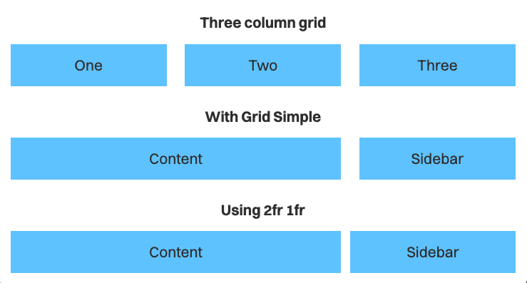
Same three-column result, but easier to write, read, and picture. The 2fr 1fr shortcut does not substitute for it: fr is calculated against the space left after subtracting the grid's gutters (or gap), so a two-track 2fr 1fr declaration produces something different from a true three-column grid.
.grid {
  display: grid;
  grid-template-columns: 2fr 1fr;
}
Layouts escape the naming problem
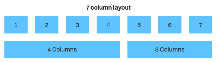
Layouts are among the hardest things to name. Most of us end up with a number plus columns (.two-columns) or a semantic label (.content-sidebar), and neither captures what is actually happening. .two-columns could mean equal columns, 1fr auto, auto 1fr, or a seven-column arrangement where the first object takes four and the second takes three—try explaining that last one aloud.
Rather than force a name, let the numbers do the talking, and the structure becomes obvious.
<div class="grid-simple [--cols:7]">
  <div class="[--span:4]"> ... </div>
  <div class="[--span:3]"> ... </div>
</div>
The variables paint a picture.
Context changes the layout requirements
A "two-column" layout can behave differently from one context to the next.
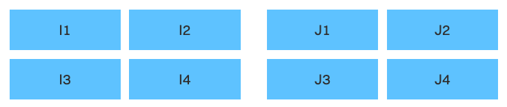
Here a larger gap separates the I and J groups, while a smaller gap sits within each group. The difference is subtle but signals that the items belong to separate groups. The same idea appears in real projects, where the gap inside a newsletter container differs from the gap between the newsletter and quote containers.

If such a layout appears in only one place, there is no need for a modifier class just to change gap. Change it directly:
<div class="grid-simple [--cols:2] gap-8">
  <div class="grid-simple gap-4 [--cols:2]"> ... </div>
  <div class="grid-simple gap-4 [--cols:2]"> ... </div>
</div>
The same applies to sizing. A marketing heading reads better when its max-width can vary so the text isn't orphaned. text-balance may work, but manual positioning often looks nicer. Without Tailwind you might reach for an inline style:
<h2 class="h2" style="max-width: 12em;">
  Your subscription has been confirmed
</h2>
With Tailwind, the max-width is specified more tersely:
<h2 class="h2 max-w-[12em]">
  Your subscription has been confirmed
</h2>
Responsive variants without new classes
When you design layouts you also choose the breakpoint at which each one changes—call it the responsive factor. Layouts of the same kind usually share a responsive factor, which makes grouping them into a named layout sensible.
.two-column {
  @apply grid-simple;
  /* --cols: 1 is the default */

  @media (width >= 800px) {
    --cols:2;
  }
}
Other layouts resist that grouping: two columns on mobile, a much larger column count on tablet and desktop—a style common to site footers. Because the footer grid is unique, Tailwind's responsive variants let you change the layout on the fly.
<div class="grid-simple [--cols:2] md:[--cols:5]">
  <!-- span set to 1 by default so there's no need to specify them -->
  <div> ... </div>
  <div> ... </div>
  <div> ... </div>
  <div> ... </div>
  <div> ... </div>
  <div> ... </div>
</div>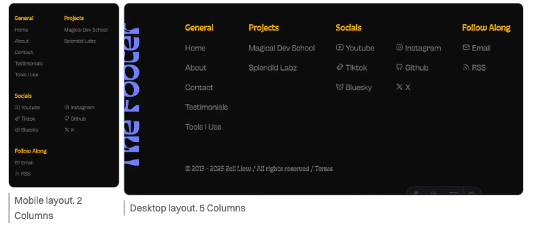
Once again a new layout is created on the fly without an extra modifier class, keeping the CSS clean and focused.
Working with Tailwind rather than against it
Used well, Tailwind and CSS are synergistic. The better approach is not to litter HTML with utilities but to build utilities that make layouts and styles easy to create—the direction explored in Unorthodox Tailwind, the course this article was drawn from.



