
When a Mascot Misses the Mark
Businesses adopt mascots for understandable reasons: to put a friendly face on the site, to forge an emotional connection with shoppers, or to give the brand a personality that works across marketing channels. But the effect is not guaranteed. The same character that was supposed to win hearts can just as easily drive prospects away. If user feedback or site metrics suggest the mascot is part of the problem, there are practical ways to course-correct.
Option 1: Modernize the Character
Before redesigning, figure out what is actually wrong. Run user surveys, poll customers, or study on-site behavior to learn whether the issue is the look, the tone, the fit with the brand, or something else entirely. Common complaints include a mascot that is boring, looks dated, resembles competitors’ characters, fails to represent the audience, or clashes with the rest of the site’s messaging.
Once the problem is identified, a redesign can do a lot of the heavy lifting. HostGator’s alligator is a case in point. Early versions of the site showed only the mascot’s head and shoulders in the header, which made it read more like a puppet than a character. Later redesigns showed the full body, giving the gator a more human, relatable presence, and eventually the character was softened considerably to feel less intimidating. The core identity stayed the same, but the execution was brought in line with what a contemporary audience expects.
Chuck E. Cheese went further. The 2011 site and mascot had a noisy, cartoonish Nickelodeon feel. The current version is far more subdued, with a product- and customer-focused layout. The mascot still appears, but it has been redrawn to look more like a modern animated film character than a Saturday morning cartoon. The takeaway is that even a mascot that isn’t necessarily broken can benefit from an update to stay culturally and visually current.
Option 2: Change the Mascot’s Tone
Sometimes the issue is not the look of the mascot but the message it carries. GEICO spent years running smart, critically praised ads built around the caveman. But the company eventually dropped the character in favor of the animated gecko, which came with a lighter, more approachable personality. Even if the caveman commercials were well received creatively, the shift suggests customer data pointed toward better results with a less serious, more universally charming tone.
Aviation Gin took a different path. For most of its history, the brand had no mascot at all; the bottle of gin was the sole focus. In 2018, Ryan Reynolds bought a stake and became the public face of the company. The change wasn’t just about adding a character — it altered the entire tone of the brand’s marketing. A human mascot with a distinct voice gave the company new storytelling options and changed how the audience received the product. For a site that performs only adequately, adding a well-matched mascot — or replacing one that is out of sync — can reset the brand’s tone entirely.
Option 3: Pull Back on Its Presence
A mascot can also fail because it is simply too dominant. If the character takes up too much space or its imagery gets in the way of the brand’s main message, the answer might not be a redesign but a retreat. A/B testing and heatmap analysis can help identify where the mascot helps and where it hurts.
Cats Who Code gradually reduced its feline presence over the years. A 2009 version of the site leaned heavily on cat imagery and a cat-centric tagline. By 2014, the mascot had been redrawn and the messaging adjusted. Today, the character is barely present, reduced to a small logo mark, and the site reads as a straightforward, buttoned-up web development blog. Whether the change came from user feedback or a brand pivot, the result is a much less mascot-forward experience.
Green Giant followed a similar path. The mascot was front and center in the hero of the 2013 site, then was later moved into the logo, and eventually disappeared from both, leaving only a subtle shadow in the current design. As the company shifted its focus to sustainability and mission-driven messaging, the cartoonish figure no longer fit the story the site needed to tell. Keeping the mascot present in a very small way allowed the brand to retire the character without fully abandoning its equity.
If audience research suggests the mascot itself is not the problem, consider whether its prominence is. Scaling down its role and giving more room to products, content, or brand messaging can turn a liability into a non-issue without having to start over.
When Public Enemy #1 Becomes Your Best Asset
Sometimes the smartest move isn't to fix the mascot — it's to amplify exactly what people are reacting to. But this only works under specific conditions.
If the backlash stems from the mascot being offensive or simply boring, there's no saving it. Cut your losses and invest in content and trust-building instead. However, if the negative reaction comes from the mascot being genuinely novel or unexpected, leaning into that reaction can transform haters into the most devoted fans you'll ever have.
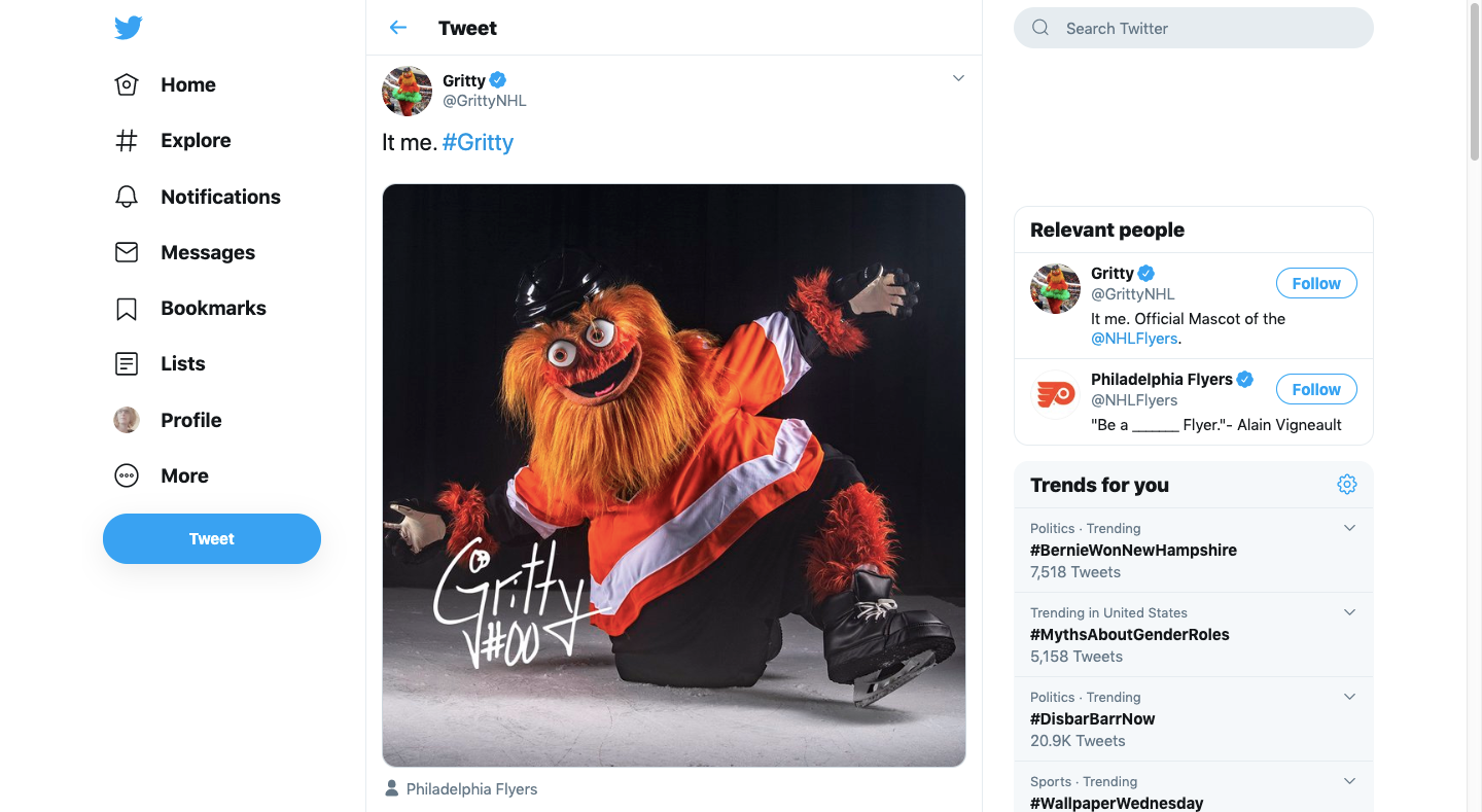
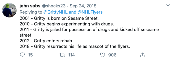
Consider the case of Gritty, the Philadelphia Flyers' mascot. When introduced, the creature with a giant beer gut and flaming-orange googly eyes was met with widespread shock and speculation about its origins. Initial responses ranged from fear to pure confusion:
Some speculated about where such a creature could come from:
Others expressed genuine fear:
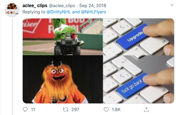
And many were simply stunned:

But the story didn't end there. Gritty won over the city — and the world — by fully committing to the absurdity. Posing with champagne bottles Kim Kardashian-style and entering arenas on a wrecking ball like Miley Cyrus turned initial disgust into affection:
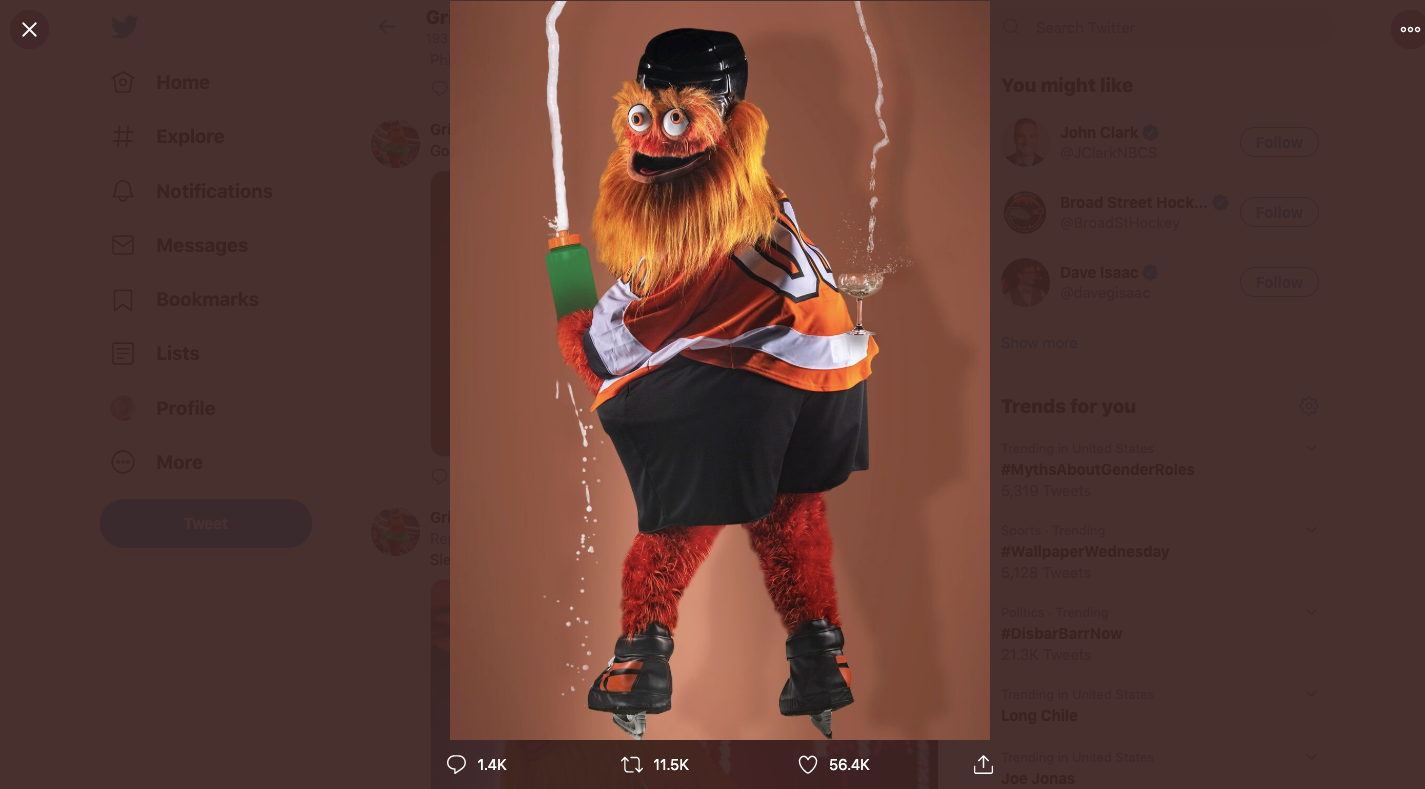
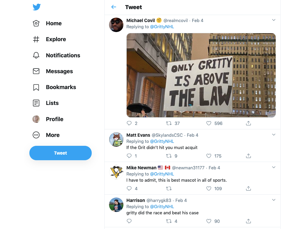
That affection proved durable. When Gritty was accused of hitting a child at a game earlier this year, fans rallied behind the mascot during the investigation, which ultimately cleared Gritty of any wrongdoing. The support was unwavering:
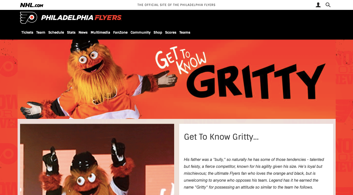
Notably, the Flyers' website only features one page with the mascot, while Gritty's personality lives almost entirely through social media interactions — awkward situations and pop culture riffs included:
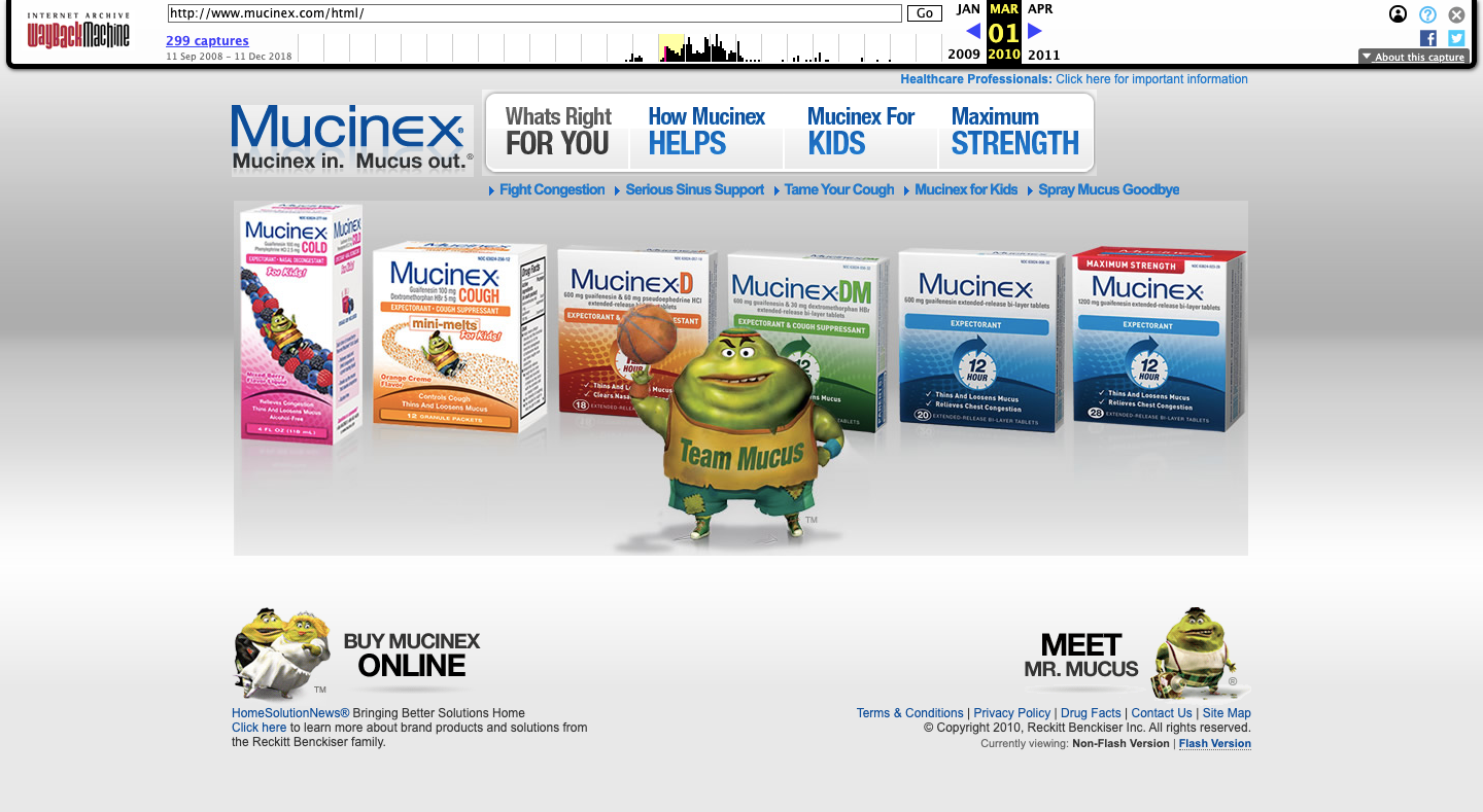
A more dramatic example of embracing the grotesque comes from Mucinex. The 2010 version of their website introduced Mr. Mucus, a mascot that is literally human-shaped mucus:
By 2015, Mr. Mucus had taken on a sweaty, unwell appearance:
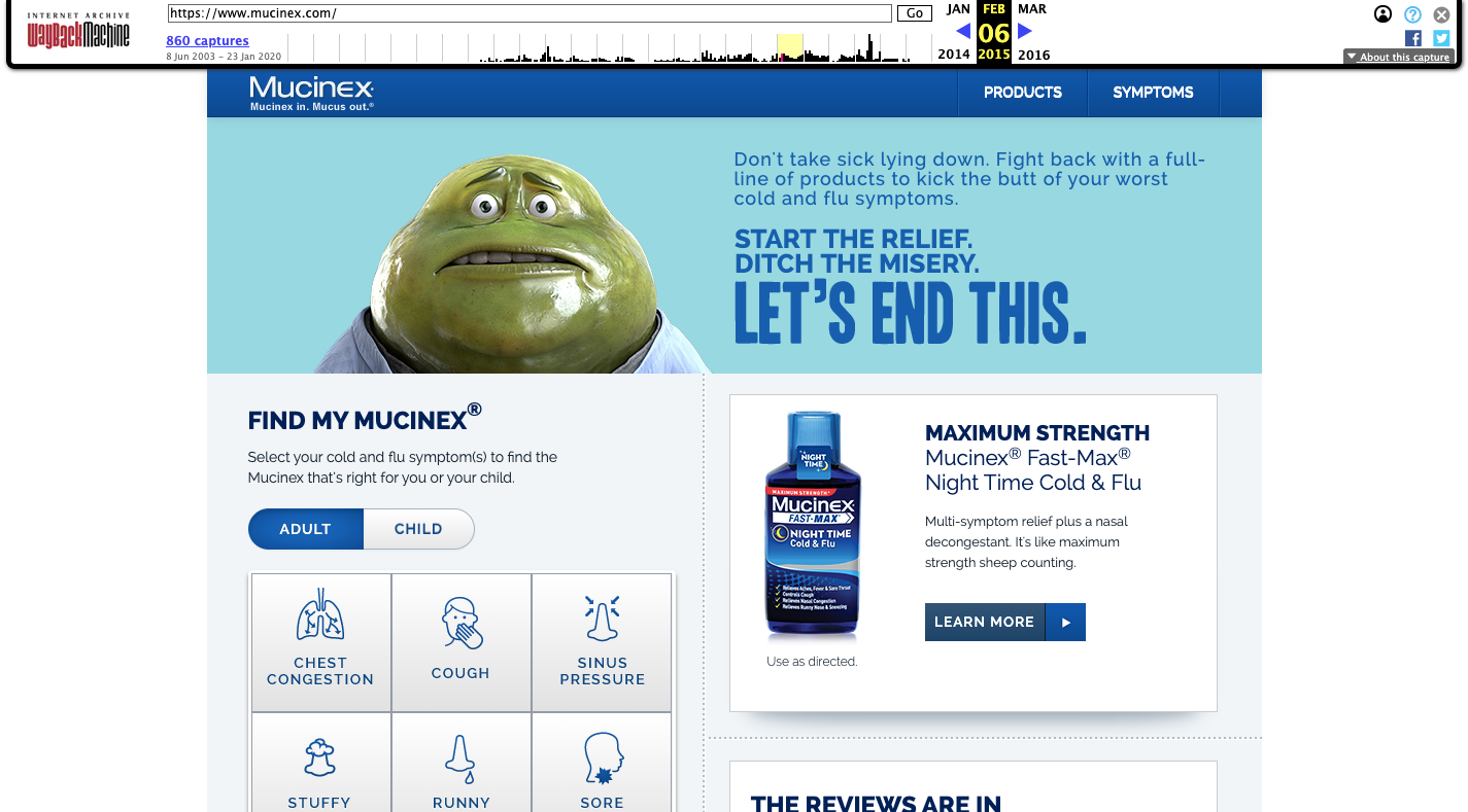
That iteration didn't land particularly well, resembling Jabba the Hutt more than a lovable cold-fighting companion. But the company persisted, and the 2020 website featured Mr. Mucus in various states:
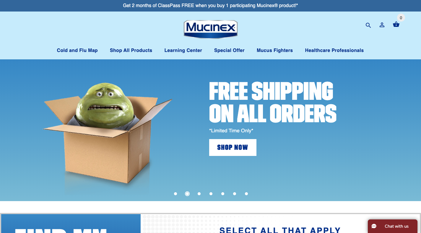
The messaging alongside these visuals shifted the interpretation completely. A banner reading "Please don't order this cold medicine. I don't want to go away!" gives the clammy skin and pained expression a comedic twist.
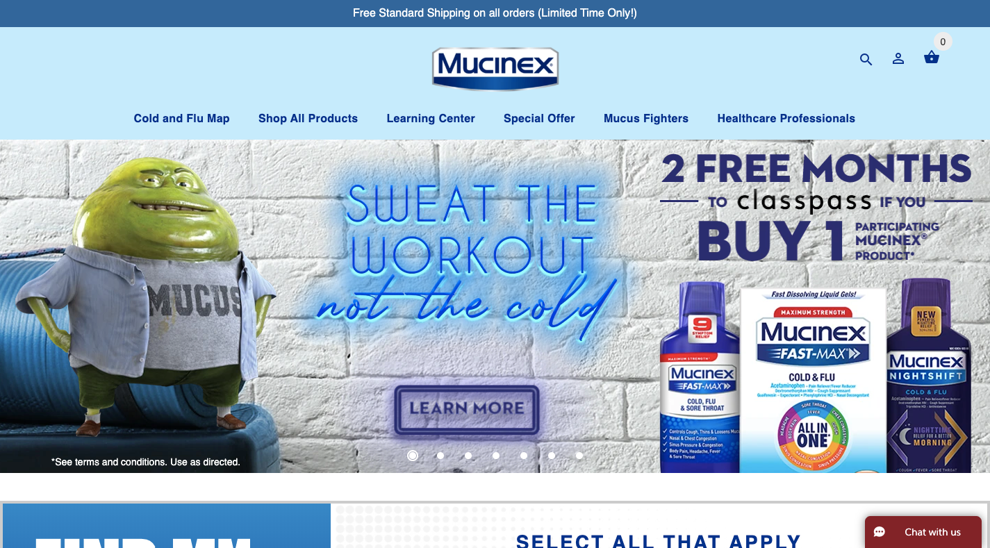
Another banner shows Mr. Mucus with a dad bod, paired with workout-related messaging:
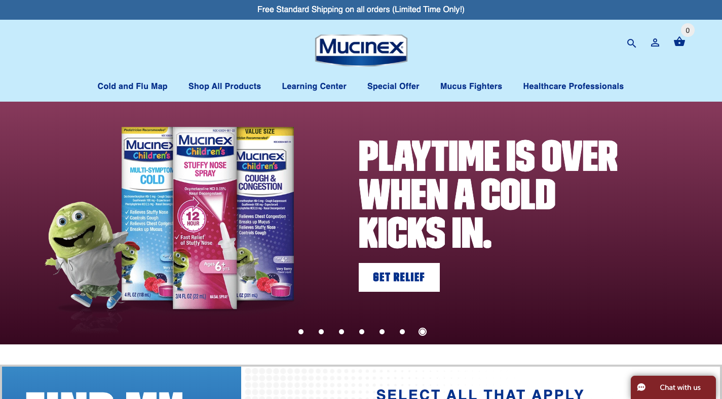
Even a children's cold remedy banner gets the treatment, featuring a younger version of the mascot:
According to CBC, Mucinex more than doubled its profits after launching the Mr. Mucus campaign in 2004 — despite (or perhaps because of) Mr. Mucus being simultaneously one of the most recognizable and least liked mascots on television.
For Mucinex, being hated was the whole point. The brand's purpose is helping people fight phlegmy throats and stuffed noses, so a disgusting mascot perfectly embodies the problem the product solves. Before abandoning a hated mascot, examine where the hate originates and whether it can be redirected to serve the brand's narrative.
If you can create a mascot with the right kind of personality, message and purpose, your website and brand will be able to experience this kind of die-hard fandom and support.
Choosing Your Path Forward
Mascots can inject levity into a website and draw visitors into both the content and the brand's story. But not every successful mascot needs to be funny or shocking — many beloved mascots have understated personalities. The key is aligning the mascot with the brand's existing personality and letting it evolve from there.
Further Reading
- When Friction Is A Good Thing: Designing Sustainable E-Commerce Experiences
- Crafting Experiences: Uniting Rikyu's Wisdom With Brand Experience Principles
- Getting To The Bottom Of Minimum WCAG-Conformant Interactive Element Size
- The Case For Brand Systems: Aligning Teams Around A Common Story



