

A Gallery of Data With a Pulse
Data is everywhere, but it only earns its keep when it can be understood. The Web is full of figures waiting to be turned into narratives, yet raw spreadsheets and unwieldy JSON snippets rarely inspire. When done well, data can feel dynamic and vivid rather than dormant. The following projects show how visualization can turn complex information into experiences that are both informative and intuitive.
Living Maps and Ancient Texts
One of the most elegant examples of real-time data is the Wind Map, which depicts wind patterns across the contiguous United States. The visualization uses movement and thickness of animated lines to convey wind strength, making it instantly understandable at a glance while still offering deeper details through hover and zoom interactions.
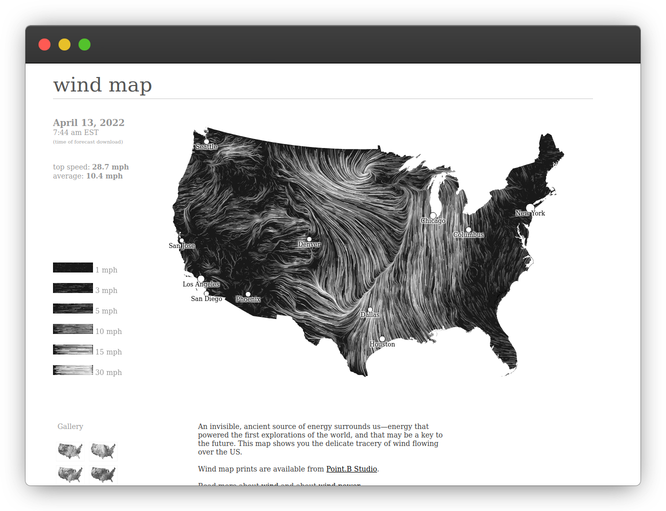
The project pulls data from the National Digital Forecast Database on an hourly basis. Its creators, Fernanda Viégas and Martin Wattenberg, describe the result as a "living portrait" of the nation's weather, demonstrating how public data sets can be transformed into something beautiful and accessible.
Data visualization also excels at revealing relationships over time. DivineComedy.digital is a digital humanities project that maps how Dante's Divine Comedy has appeared in art over the past seven centuries. The epic poem is broken down into chapters and passages, each linked to artworks from over 70 museums and more than 90 creators.
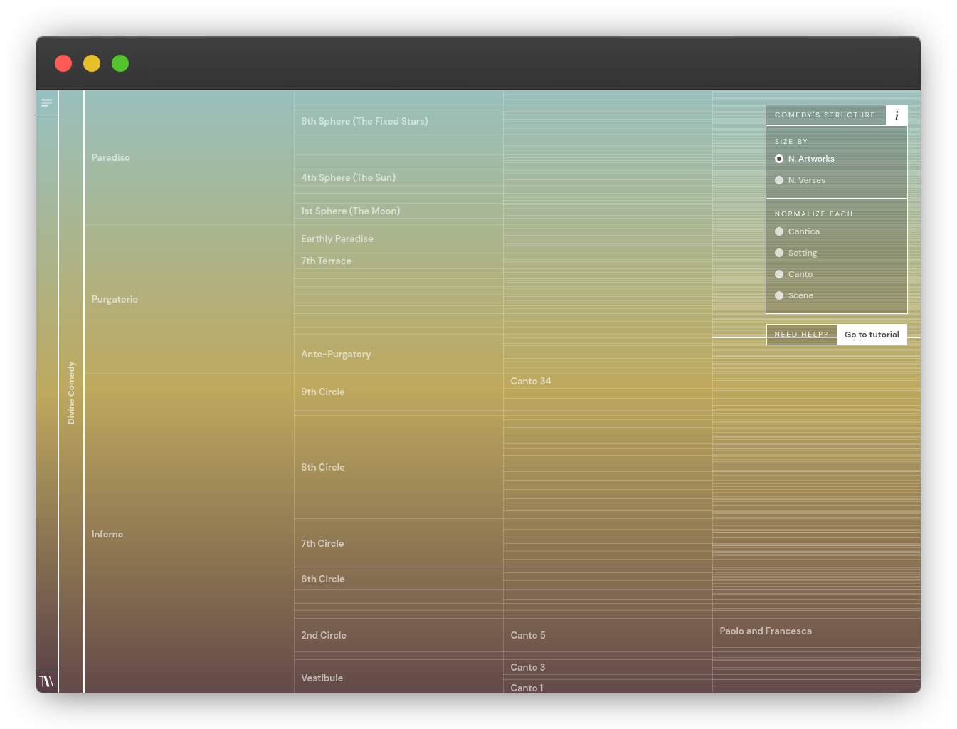
This tool illustrates the power of showing connections between a source text and the culture it inspired, highlighting how digital interfaces can capture the interconnectedness of creative works in ways a static list never could.
Networked Data at Scale
For a broader view of how information links together, the Linked Open Data Cloud maps more than 1,300 data sources and 16,000 links on the Web. Maintained by John Philip McCrae for the Insight Centre for Digital Analytics, the graph illustrates the scale of the Semantic Web's growth since it began with just 12 datasets in 2007.
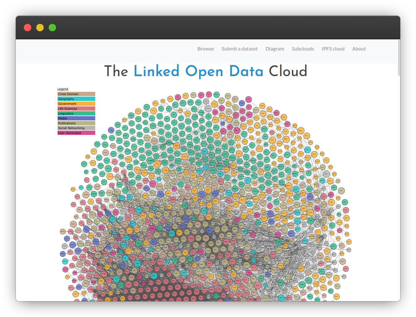
The project relies on LOD Cloud Draw, an open-source tool; D3's force-directed graph is a more mainstream option for similar builds. For those interested in exploring linked data further, DBpedia serves as a useful entry point, emphasizing that tools are only as valuable as the networks and open data fueling them.
Communicating Crisis and Health
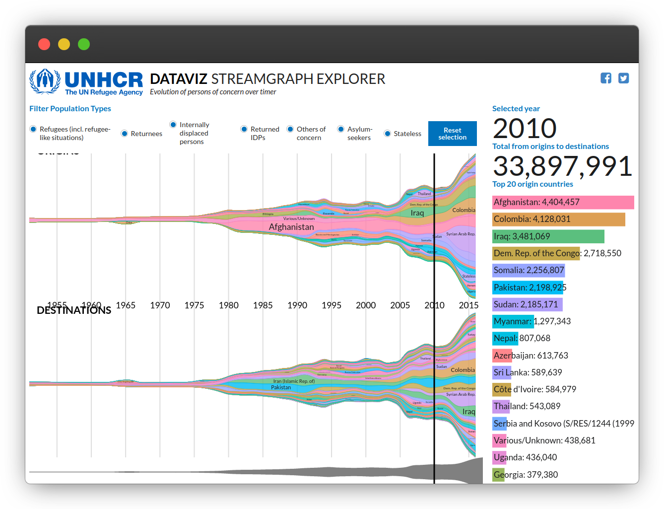
Purpose-driven visualization carries particular weight when it tackles complex global topics. A stream chart of refugee movements throughout the 20th and 21st centuries, commissioned by the UN Refugee Agency and built by Curran Kelleher, conveys the ebb and flow of millions of displaced people. Dense with data, the chart remains clear and accessible rather than overwhelming, demonstrating that simplifying presentation does not dilute the substance of the subject.
The Financial Times also set a strong example with its Covid-19 tracker, a major reference during the height of the pandemic. More notable than the interactive chart itself, however, is its emphasis on methodology and sources. The presentation takes time to explain its data and decisions, a level of transparency that enhances trust.
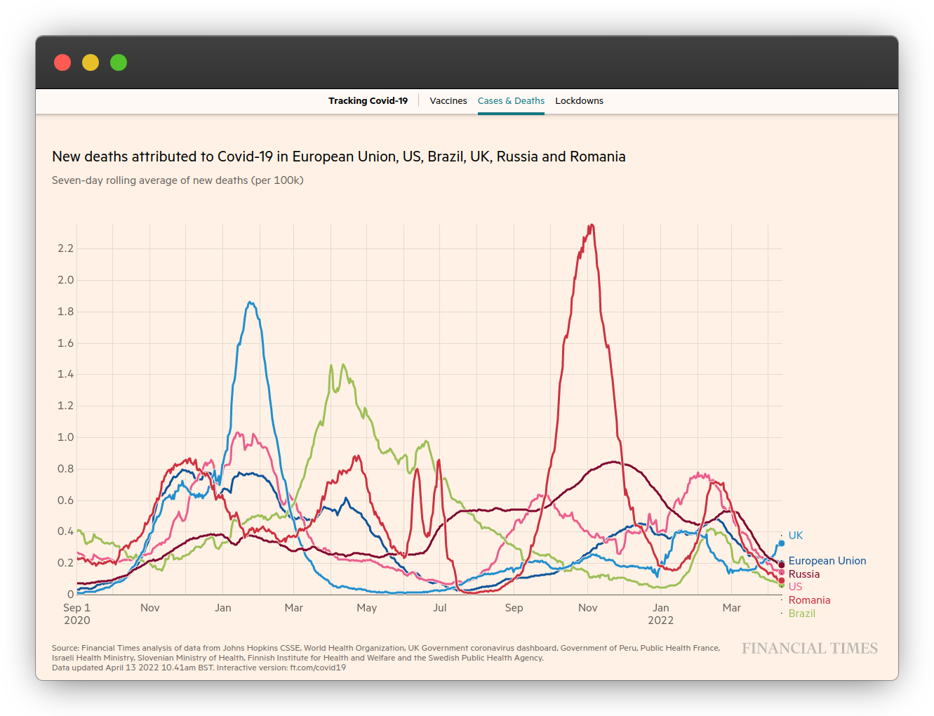
Well-documented visualization is the best kind. When design decisions remain opaque, the data loses its value.
Government and Civic Dashboards
Governments are increasingly responsible for making data not just available, but legible. Singapore's data.gov.sg stands out as an extensive open data platform with nearly 2,000 datasets spanning topics from housing prices to cultural programs. The portal was designed against a set of clear principles: data should be easy to access, available for co-creation, timely, machine-readable, and as raw as possible.
The German Federal Ministry of Health's vaccination dashboard likewise proves that public health agencies can translate overwhelming quantities of information into digestible visual formats. The site breaks down vaccine uptake by region, age, and manufacturer, with a cohesive design language across a range of chart types.
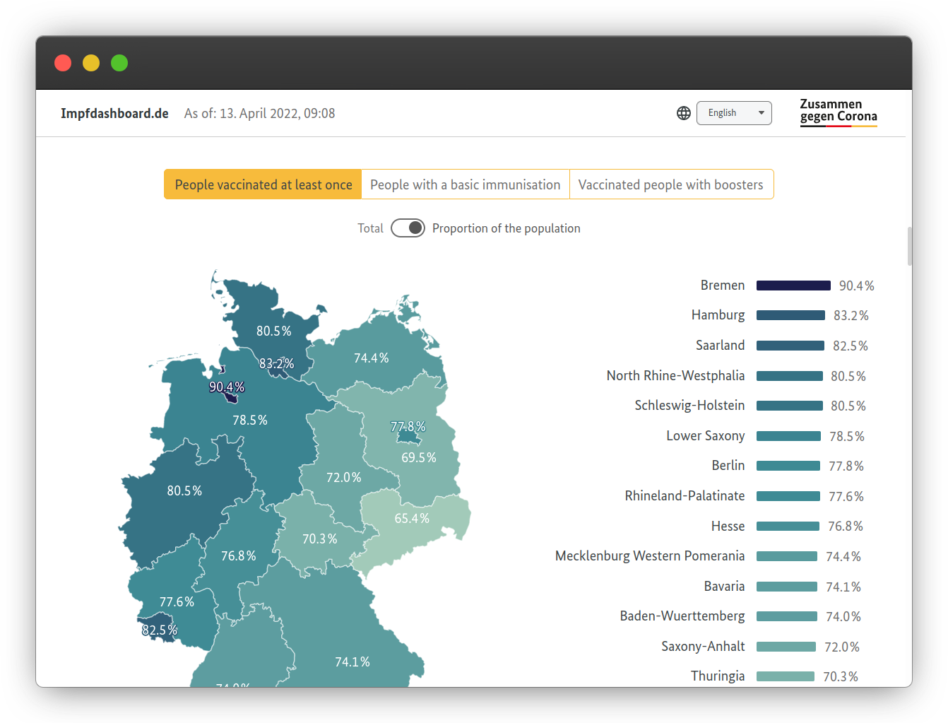
The maps and charts here — like Singapore's dataset portal — are also downloadable, reinforcing the ethos that public data should be usable for everyone.
Music, Astronomy, and Politics
Pop music pitch sounds less serious than pandemic tracking, but The Pudding's investigation into vocal registers shows that audio trends can produce genuinely rich data stories. The analysis draws on Pandora data to estimate the average pitch of every song in the Billboard Hot 100 since 1958, resulting in a piece that blends song clips, video, and charts into a singular — if partially inverted — look at music evolution.
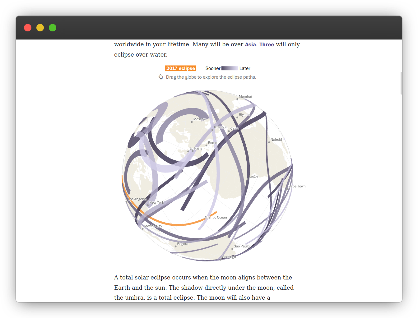
On a more cosmic scale, the Washington Post's solar eclipse explorer takes a surprisingly complex set of astronomical events and makes it personal. By entering a birth year, visitors see on a world map every solar eclipse that will occur within their expected lifetime, with further sections covering partial eclipses and the path of totality.
Rounding out the range, the Lunar Open Architecture project visualizes past and planned lunar missions as a constellation of nodes. Developed by MIT's Space Exploration Initiative with the Open Lunar Foundation, it groups missions by organization and status, conveying decades of activity in a single view. As the project's subtitle suggests, the future of lunar space is getting crowded — and visual tools like this help make sense of the crowd.
Politics also benefits from thorough visualization. The Nationscape Insights project, a partnership between the Democracy Fund Voter Study Group, and UCLA, aggregates survey data in the lead-up to the 2020 US election. Users can slice 80 weeks' worth of opinions on topics ranging from gun policy to the Green New Deal by region, demographics, and party affiliation. The presentation stays neutral and clear, revealing where the public actually stands, not where platforms assume it does.
These examples share more than visual polish. They all treat data as something to be uncovered and clarified rather than merely decorated — and that distinction often makes the difference between a graph and a story worth telling.
Dig Deeper Into Data Visualization
The examples above only scratch the surface of what data visualization can achieve. Any dataset can be turned into something that informs, surprises, or delights — as long as the people behind it are willing to experiment and document how they got there.
If you want to build on those ideas, the ecosystem of tools, tutorials, and reference work is rich. Here is a curated starting point, from structured courses to general-purpose libraries and publications that treat data as a craft.
Courses To Learn The Craft
Coursera: Data Analysis and Visualization Foundations Specialization — a free, IBM-led series that introduces the analytical groundwork.freeCodeCamp: D3 basics — a hands-on grounding in the library that powers much of the web’s best interactive graphics.freeCodeCamp: A 17-hour course by Curran Kelleher covering D3, React, and SVGs. It’s intensive and code-along friendly; by the end, you’ll be surprised by what you can build.
Libraries Worth Knowing
D3— the standard for low-level, high-control web visualizations.Three— for 3D scenes and WebGL-heavy work.P5.js— a friendly canvas and animation toolkit with a creative-coding ethos.WebGL— when you need raw GPU performance for complex graphics.Web Audio API— a less obvious but powerful way to turn data into sound.
Reference And Inspiration
- The Pudding — playful, long-form visual essays.
- The Guardian’s visual journalism and NYT visuals team — benchmarks for editorial graphics at scale.
- FiveThirtyEight — a staple for statistics-driven storytelling.
- The
/r/dataisbeautifulsubreddit — a community forum where charts face constant critique. - The Sigma Awards and Our World in Data — for award-winning projects and open, structured global datasets.
- La Nación and Texty.org.ua — powerful examples of how newsrooms in Argentina and Ukraine push the field forward.
Related Reading
- “Can Data Visualization Improve The Mobile Web Experience?” by Suzanne Scacca (Smashing Magazine)
- “A Guide To Building SVG Maps From Natural Earth Data” by Chris Youderian
- “Fun With Physics In Data Visualization” by Antanas Marcelionis
- “Data Visualization and Infographics Resources” by Cameron Chapman



