Why Carousels Divide Opinion
Carousels have earned a poor reputation, and often for good reason. They bring a cluster of accessibility problems, tend to show low engagement numbers, and auto-advancing versions can actively disrupt reading. Small progress dots with cramped tap targets, barely legible labels, and decorative parallax effects only make things worse.
Yet the pattern refuses to disappear. Carousels still surface in image galleries, landing pages, corporate sites, onboarding flows, testimonial sections, and product showcases. The question is not whether to use them, but how to build one that genuinely helps people instead of frustrating them.
Not Every Carousel Is The Same
Despite their downsides, carousels can be effective in the right situation. Like accordions, they let you show and hide content, which is useful when you need to present multiple features or options but lack the space to show everything at once. The pattern comes in many shapes: horizontal swipers on mobile, arrow-driven sliders on desktop, and occasional vertical arrangements that jump between page sections.
- progress dots
- horizontal bar
- slice numbers
- slice thumbnails
- “prev” and “next” arrows
- auto-advancing
- steppers
The boundaries between these variants are fuzzy, but they each set different expectations for how the component should behave.
The User Engagement Reality
In practice, many people simply do not engage with carousels. Some users actively ignore them, and others dismiss them as soon as they appear. It is not uncommon for people to scroll past an auto-advancing carousel entirely, especially when the content is promotional or unrelated to the task at hand.
This is not surprising when a carousel can occupy anywhere between 50% and 90% of the screen. When the first slide fails to grab attention or connect with the user's goal, the rest of the slides rarely get a chance. Carousels are also a weak vehicle for content discovery: anything tucked into a later slide is effectively hidden. And for keyboard and screen reader users, carousels introduce serious accessibility hurdles unless extensive development effort is invested.
None of these problems are solved by auto-advancing. Moving content is easy for users to tune out, and in mobile onboarding flows, the first thing many people hunt for is the "skip" button.
When Carousels Actually Work
Carousels do have contexts where they perform well, particularly when they are integrated into a task the user is already trying to complete. In those cases, users advance slides at a roughly linear rate, meaning they are actively working through the content rather than skipping past it.
- selecting a pricing plan or exploring options
- browsing reviews, testimonials, or product features
- studying product image galleries to understand what they are buying
- previewing an experience, such as a hotel, vacation, museum, or restaurant, especially when large fullscreen images or videos are involved
- swiping through card-based content on mobile
These scenarios share a common thread: the carousel delivers relevant content in a meaningful context. That is where the pattern shines, not as a container for general promotions or internal news.
Match Directional Cues To Actual Movement
Carousel controls set expectations. Arrows, dots, and swipe gestures all tell the user which way content will move, and breaking those expectations leads to confusion.
Some designs get this wrong in subtle ways. A carousel with a vertical slider track, for instance, might prompt users to drag the handle or click numbered steps, yet actually require dragging the slider from right to left. The fix is to rotate the progress indicator 90 degrees, turning it into a horizontal slider that mirrors the actual movement.
The same issue appears when a scrolling indicator is horizontal but the cards require vertical scrolling, or when drag gestures are not supported at all. If slides move horizontally, the indicator should be horizontal too; if they move vertically, the indicator should follow suit. Adding prev/next buttons above or below the content gives users a more predictable alternative to gestures.
Rethinking Carousel Navigation
Progress dots are a familiar sight, but they carry several usability problems. Users often try to click them for navigation, yet their small size makes precise clicking difficult and frequently leads to frustration and misclicks. Dots also fail to communicate what each slide contains, so they don't encourage exploration. They show position, but give viewers no compelling reason to move through the carousel.
The shorthand solution is to avoid progress dots entirely, or at least not make them the only navigation option.

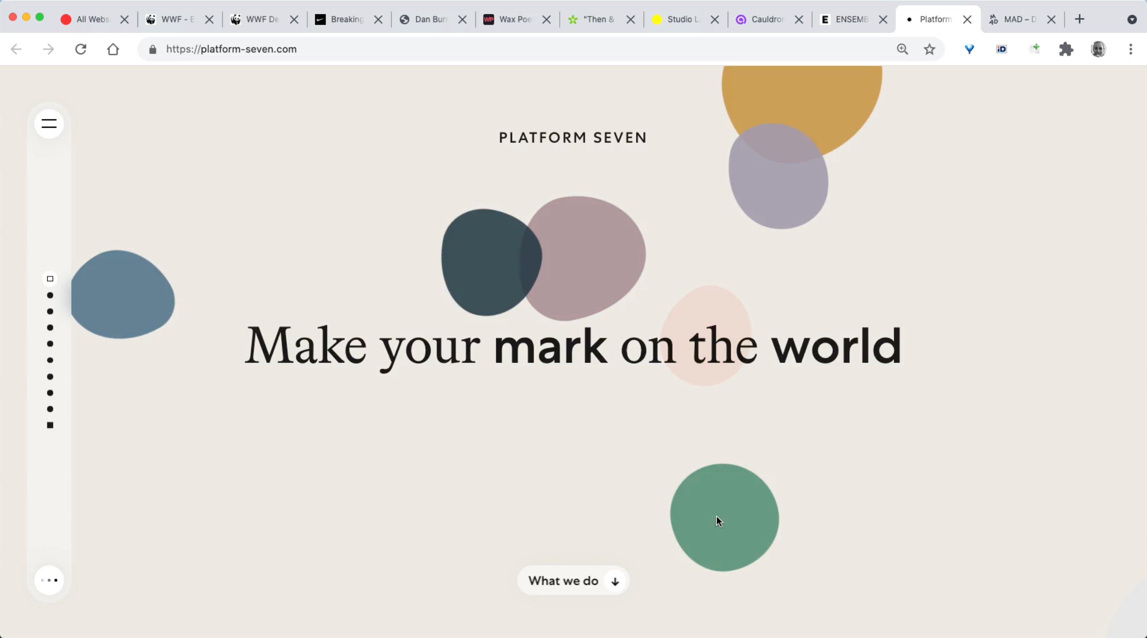
On Platform Seven, the carousel's interactive nature isn't immediately obvious. The dots use different shapes and states that are hard to interpret, and the white background highlighting various page sections adds further confusion. The dots communicate position in space, but they neither invite exploration nor explain why a viewer should bother.
This problem extends beyond carousels to regular navigation. Stripe Press, for example, relies on a left sidebar whose contents only make sense on hover. Adding labels or thumbnails for direct context would likely improve discoverability there as well.
A better approach is to add context to each slide's indicator. Replacing dots with labels, thumbnails, or video previews gives users a reason to engage. CreativeDenmark labels each section and includes a video preview on hover, though the carousel isn't keyboard-accessible and rotates mobile labels 90 degrees — a compromise that works because the labels are short enough.
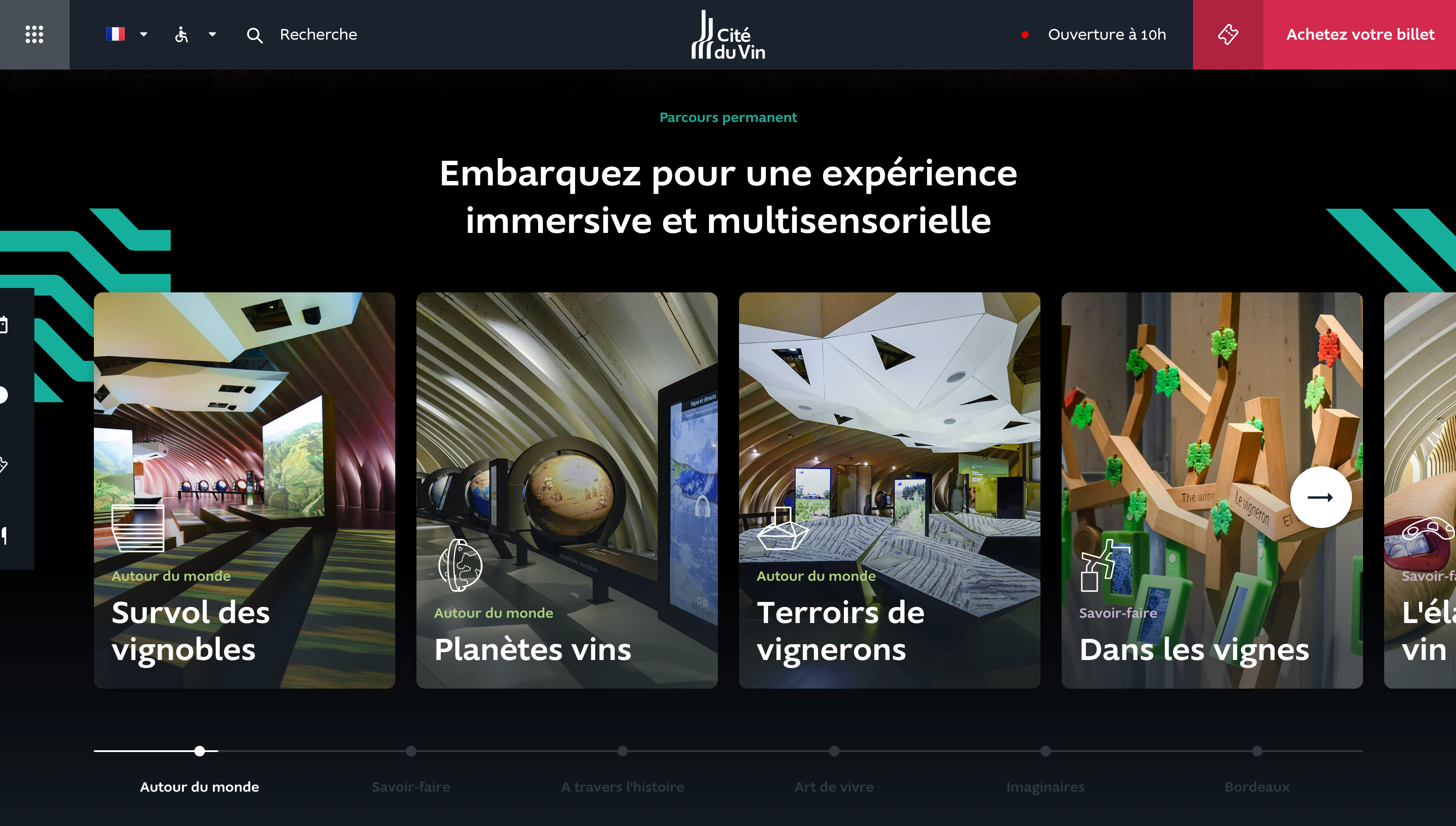
La Cité du Vin uses text labels instead of dots to signal what's coming, though most labels remain unreadable until clicked. Squarespace Circle labels each contributor's story in a circular full-height carousel, making a jump to a specific story more compelling than working through anonymous dots.
Carousels don't have to be limited to images. MySwitzerland.com demonstrates a video carousel that auto-advances through segments, each represented by a label in a mini-navigation at the bottom left. The implementation is fully keyboard accessible and visually strong.
Testing meaningful labels or key highlights in place of progress dots can dramatically improve click-through rates. If the carousel has too many items or labels get too long, there are other options for encouraging interaction.
Slider Bars as Position Indicators
Progress dots do one useful thing: show position. A horizontal slider can serve the same role. Rolex uses a slider with a step-by-step arrow, sidestepping the rage-click problem small dots invite.
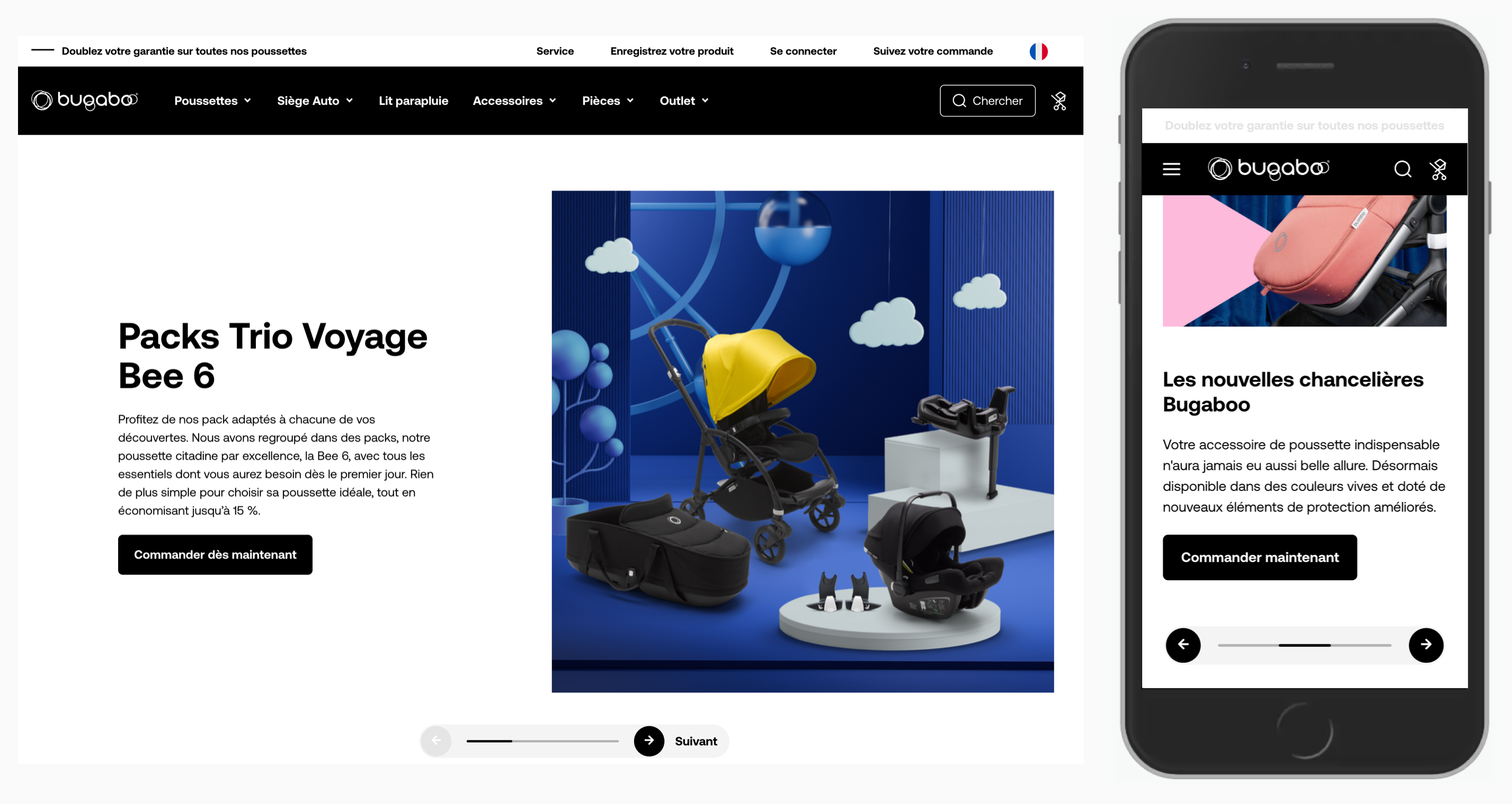
Tylko pairs a horizontal slider with arrows in both directions, folding user profiles, photos, and customization options into a single component. Bugaboo positions a progress slider and arrows below the carousel; the bar shows the current position without auto-advancing.
Numbers Beat Visual Indicators
Sliders alone don't adequately show where a user is in longer carousels. Visualizations like percentages or pie charts can help, but numbers are the clearest option.
Daphne Wilde uses large, sliding numbers. Clicking images jumps between options — a non-obvious interaction — but the numbers themselves are easy to read and hard to mis-tap.
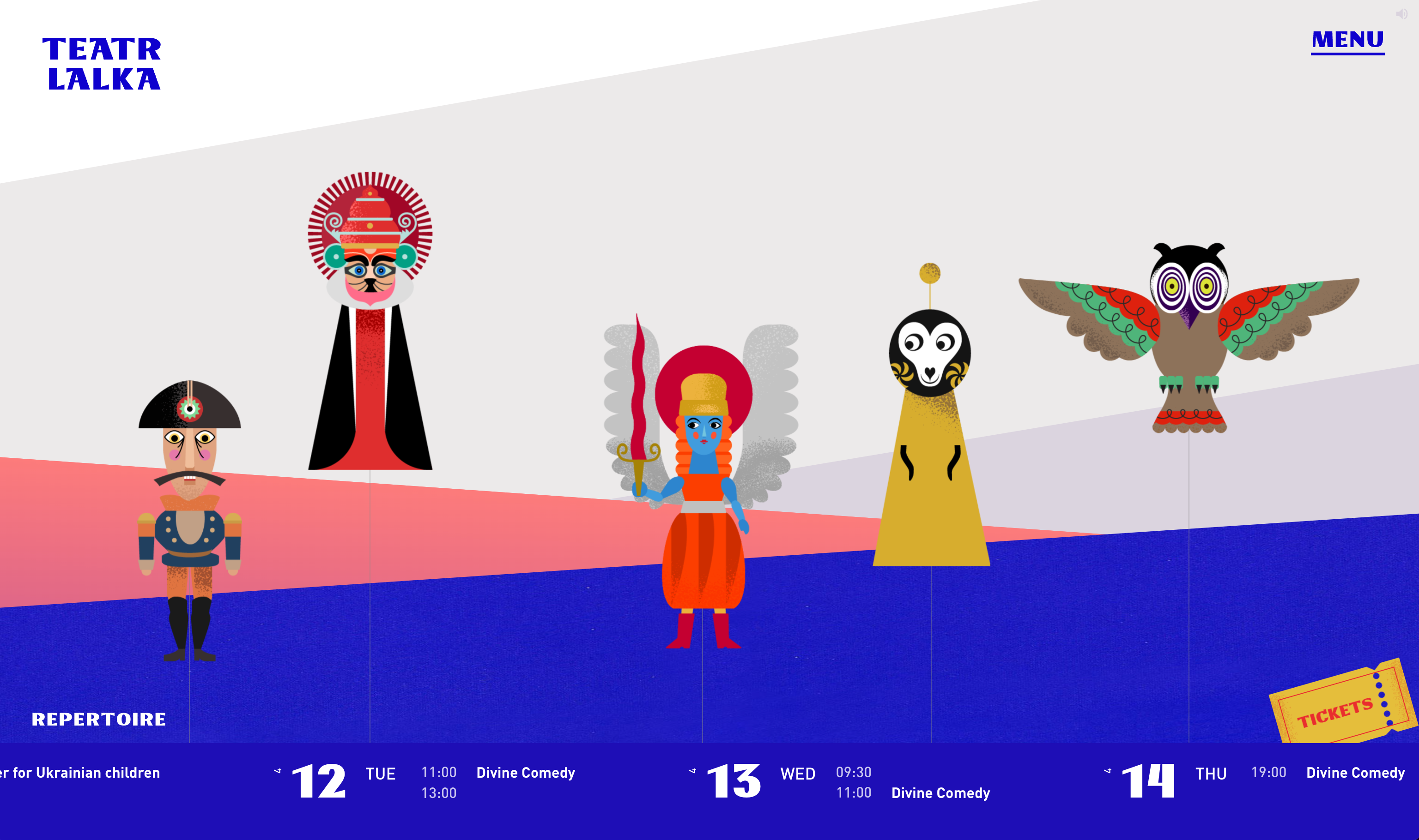
Vallourec uses a pie chart indicator alongside sub-section highlighting, layered with a parallax effect and vertical carousel. Teatr Lalka, a Polish puppet theater, delivers a more creative solution: each photo is labeled and its website uses puppetry-themed transitions throughout.
26day.ge, a centennial site for Georgia's first Democratic Republic, combines grouped numeric buttons with a position indicator under the gallery.
No visual device matches the clarity of numbers. When you use horizontal sliders as position indicators, consider supplementing them with a "current / total" count.
Prev and Next Buttons
Carousels should always have prev/next buttons. Dots don't reveal how a carousel is meant to be navigated. Swipe gestures may work on mobile, but not every implementation supports them, and desktop users rarely think to try. Swiping can also work too quickly — users overshoot and then slowly page back for fear of skipping something. Explicit single-step buttons provide a simple, expected pattern.
Choosing the Jump Distance
One detail worth studying is how many items a carousel moves per navigation step. Large jumps make users lose track of how far they've moved; they then double back to make sure nothing was missed. Moving one item per step is slower but results in fewer errors and feels acceptable from time to time.
With lengthy carousels containing 10 or more items, one-by-one movement is tedious and couple-item jumps obscure list boundaries. In those cases, moving by the full visible viewport usually performs best. The right choice ultimately depends on how your users browse and how far through the list they tend to go.
Where To Put Carousel Controls
The placement of prev/next buttons is a frequent source of confusion. The design goal is twofold: minimize misclicks by keeping tap targets large and well-spaced, while also speeding up navigation by minimizing the distance between the forward and backward actions.
Designers have many options for arrow placement. Buttons can sit above the carousel, be centered vertically or horizontally on the slides themselves, or be placed beneath the carousel. They can be grouped together or spaced out on opposite sides.
Vertically centered arrows on the slides, as seen on Stripe Life at Jobs, are a common choice, but they carry an inherent risk: since carousel slides are typically links, users who miss the arrow's hit target may inadvertently navigate to an unintended page. Floating the buttons away from clickable content, as Casper.com does, reduces mis-taps but forces users to travel across the carousel to switch direction, which can feel slow.
A more efficient pattern groups the buttons together. Allianz.de places them next to the progress dots below the carousel, and Ritual.com offers a strong example with grouped arrows that are large enough — 62 CSS pixels in both dimensions — to be generous for precise input. Overpass takes a different approach, embedding the arrows within the carousel itself, under the image and next to the description.
The central question is whether grouping buttons reduces errors in practice. A larger distance between the two controls makes the carousel feel slower to navigate. The best vertical placement — above, on, or below the carousel — will depend on the user's device.
Desktop vs. Mobile Button Placement
For desktop, placing buttons above the carousel tends to yield the fewest usability issues. When the carousel sits at the top of the page, users will notice buttons above it early on; buttons placed below might be missed entirely, especially with tall slides. Buttons overlaid on slides also suffer from contrast problems, as arrows can blend into a background color, and they invite accidental clicks on the slide's underlying links.
Ritual.com's desktop carousel is a good reference here. The buttons are large and grouped, minimizing the travel needed to change direction. They live above the carousel, leaving room below the images for descriptions, while swipe gestures and keyboard access are also supported. This configuration makes mistakes far less likely.
On mobile, placing buttons above the carousel is problematic because users' fingers will inevitably cover the content as they tap. Centrally overlaid buttons are also troublesome since taps are less accurate at the screen's edges; increasing tap areas to compensate takes valuable space away from the carousel content.
The better approach on mobile is to place buttons below the carousel. However, the slides should not consume more than about 45–50% of the screen height, as users tend to read, swipe, and scroll in the center of the screen. With shorter slides, this placement ensures buttons remain visible and keeps fingers away from the carousel content, preventing inadvertent taps.
Enhancing Carousels With Tabs, Filters, And Thumbnails
Carousels often push content that users have little control over. Adding filters or tab-like controls gives users a way to select what they want to see, making the component more relevant.
Reuters.com combines cards, tabs, and a carousel, with arrows in the section's upper-right corner, and adds a "See all World" link. The Swiss Federal Statistical Office uses tabs that change the active slide; once a user selects a topic, the carousel stops auto-advancing. Keeping all slides at the same height prevents layout jumps and uncomfortable transitions.
Thumbnails can also be used in place of text labels to drive engagement. Weber Grill Original uses image thumbnails to highlight recipes rather than lifeless dots. Philips.de goes further with an icon-based tabbed navigation, though this example fails users because its carousel auto-advances without any method to pause it, even on hover or focus.
Don't Rely Solely On Dragging
Some implementations depend entirely on dragging, but this interaction is nearly impossible to make truly accessible. While swipe gestures are essential on mobile, they shouldn't be the only navigation method offered. LeadDev uses a green icon to hint that content can be scrolled, but lacks precise arrows for jumping from one pane to the next. On Magasins Generaux, a draggable gallery isn't keyboard-accessible at all: tabbing skips from a preceding link straight to the footer, so users can't reach the images or have their alternative text announced. Carousels must always offer an alternative navigation path — such as arrows, dots, or keyboard controls — and never rely on dragging alone.
Give Users a Reason to Keep Exploring
Carousels have a well-known discoverability problem: if a slide isn’t visible right away, users may never know it exists. When the carousel edge cuts off the next slide or lets it fade out, it signals that more content is waiting. This visual cue is known as an information scent and it is a simple, effective way to make hidden slides apparent without requiring users to guess.
On sites like the restaurant website Neufuntrois.com, each panel is a distinct shape, and the overlapping next panel is clearly visible at the edge. Visitors can tell at a glance that they haven’t seen everything. The same approach appears on SRF, where a fade-out effect on the last visible slide is paired with grouped prev/next buttons at the carousel’s right edge.
The problem becomes acute when a carousel relies solely on drag interaction. Some browsers hide scrollbars and some viewport sizes crop content at awkward points, leaving no clue that there is more to see. If you don’t use a progress bar, a slide counter, or visible prev/next controls, do not expect users to understand how the carousel works. In these cases, a deliberate visual cue at the edge of the slide area is not a nice-to-have — it is a usability requirement.
Auto-Advancing: Tread Lightly and Give It Time
Auto-advancing carousels fight against two well-documented behaviors: users ignore motion that resembles advertising, and any unexpected movement on a page shifts attention elsewhere. On mobile, the effect is even stronger, since users often scroll past the carousel before ever noticing it rotates.
If auto-rotation is unavoidable, the minimum safe delay is 5–7 seconds per slide. That's enough time for a user to read a headline or short message, take action, or leave the page without being interrupted mid-read. Design agency 7h34 uses a clockwise-rotating circular carousel with five-second intervals. Some implementations go further and tell users when the next slide will appear. The Google Pixel Buds page fills a progress indicator over a six-second delay per slide. On Timeless.ee, trolleybus names slowly fill in as a visual clock for the rotation, always exceeding five seconds. Ferrari.com uses a small circular indicator with a seven-second delay, though no pause control is offered. Casper.com animates a left progress bar while accordion panels expand and collapse on the same cadence of seven seconds.
Christian Holst’s advice from his earlier work on home page carousels still holds up: the amount of text in a slide should define how long the slide stays visible. Short headlines work in 5–7 seconds, but text-heavy slides require more time — Nielsen Norman Group recommends one second for every three words. In practice, this means unique durations per slide rather than one universal interval.
A Pause Button Is Non-Negotiable
When auto-advancing is perceived as necessary, include a visible “Pause” button — no exceptions. The carousel on Walmart.com demonstrates the right approach: it advances slowly and only when the user is not interacting with the images. The pause control is present on both desktop and mobile, and the slider shows a clear active state. The one missing piece is an indication of the total number of slides in the sequence.
Regardless of whether users can pause rotation via the button, autoresizing must stop completely when a user hovers over, focuses on, or taps any slide or control. Interrupting an active exploration is one of the quickest ways to send users away from the carousel for good.
Think Twice: Carousels vs. Alternatives
It is worth remembering that carousels rarely prove to be the most effective component for conversions or KPIs. Hiding content inside a rotating deck makes it less discoverable and less accessible. If your carousel is meant for navigation — to lead users toward content — a set of explicit cards, teasers, or buttons will work better. Carousels make more sense for showcasing product features or upcoming promotions.
If you suspect your carousel is underperforming, test its removal during a low-traffic period and build a case. The alternative may be simpler than you think. ResidentAdvisor ditched carousels altogether and instead shows three recent features with a “View more features” link. Australia Post lays out several high-priority items in a responsive grid. 168plymouth uses compact, non-rotating mini-carousels with a single direction of movement and only four images per panel. The Deutsches Museum site uses a “load more” pattern to keep the page clean while giving users control over when they want to see more.
Final Takeaways
Carousels share a core function with accordions: they hide and show content. That flexibility is their only real advantage. Before you commit to one, examine whether a less dynamic layout would serve content discovery more effectively. If a carousel is the right answer, pay attention to the details that make or break its usability. Order slides deliberately and lead with the most important. Consider labels or thumbnails instead of small progress dots, and show an obvious indicator of the user's current slide. Keep the height limited to roughly half the screen, support swipe on mobile, and make the whole component navigable with a keyboard.
Group prev/next controls and place them consistently in the layout — above the carousel on desktop, below it on mobile. If a carousel must rotate automatically, honor the 5–7 second minimum and stop rotation as soon as the user hovers, focuses, or taps. Wherever possible, provide an explicit pause option. Design with the assumption that some users will not notice movement at all. They still deserve to find every piece of content you intended for them.
Carousel UX Checklist
- Choose the sequence of slides carefully.
- Most important slides always come first.
- Limit the height of the slides to 45-50% of the screen's height (max).
- Slides shouldn't rotate too quickly (min delay of 5–7s).
- Try to avoid auto-rotation on mobile.
- Always pause auto-rotation on hover, stop on interaction.
- Don't rely on dragging the carousel alone.
- Make sure the slides are keyboard-accessible.
- Always support swipe gestures on mobile.
- Always indicate a slice of the upcoming slide.
- Always show at which slide a user currently is.
- Consider replacing progress dots with labels, thumbnails, key highlights.
- On desktop, group prev/next steps and display them above the carousel.
- On mobile, group prev/next steps and display them below the carousel.
- Combine carousels with navigation, tabs, or filters.