
Where “Color” Actually Comes From
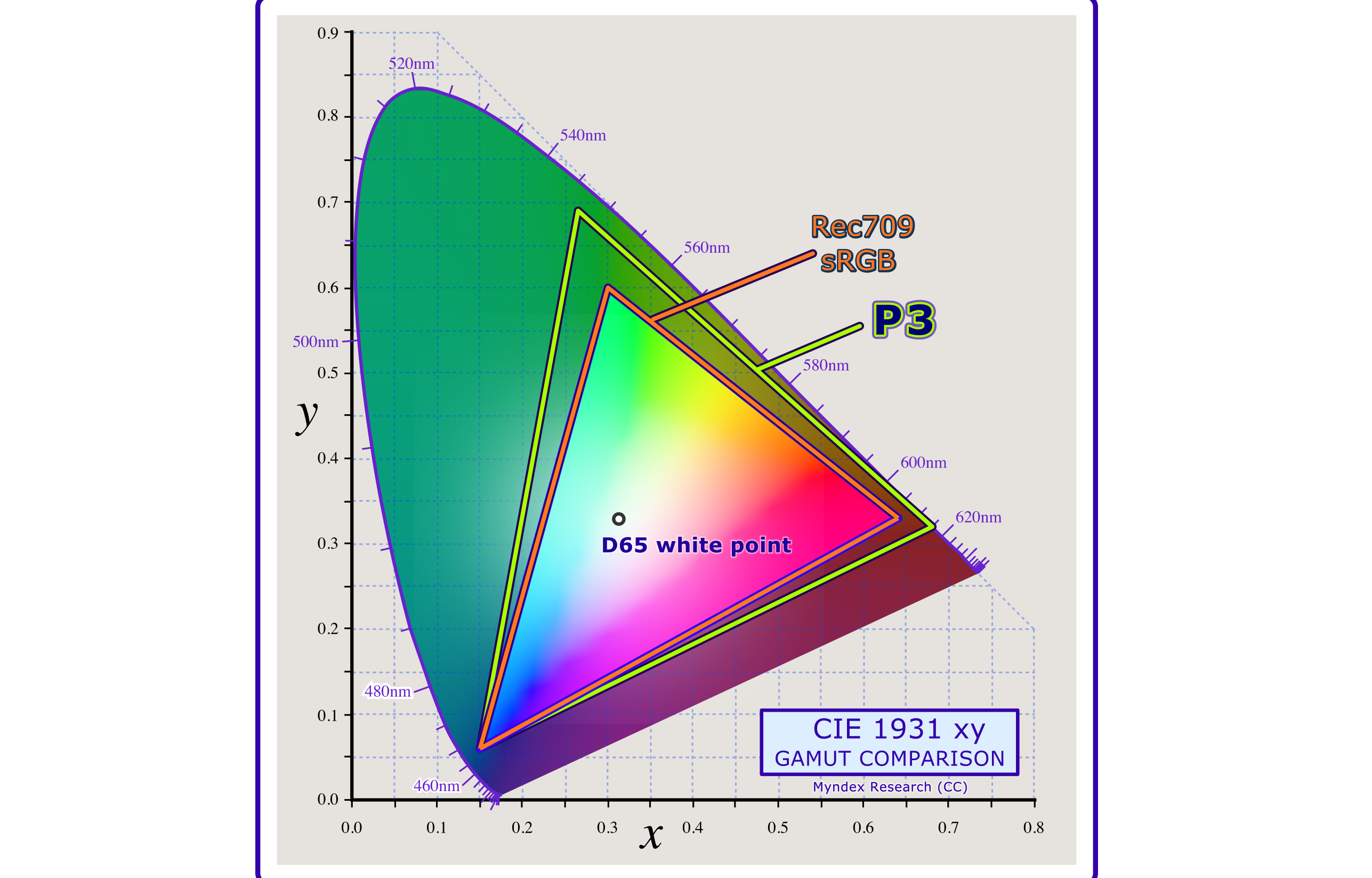
Modern color technology traces its lineage back to 1931, when the CIE consolidated color-matching experiments by W. D. Wright and J. Guild into a “standard observer” — a mathematical model of human color vision. That work became the foundation of colorimetry, the science that made color television and every modern display possible.

That familiar kidney-shaped diagram maps the full range of human color perception. The smaller triangle inside represents the gamut of an sRGB monitor; the larger one, a P3 display. Each corner is one of the additive primaries — red, green, blue — and the area inside the triangle shows what happens when those lights are combined. Calling these colors “primaries” is something of a misnomer: no set of three real-world colors can be mixed to produce every color humans can see.
The Biology Behind The Pixels
Light enters the eye and lands on the retina, where cone cells handle daylight and color vision. Rods handle night vision but are essentially inactive in normal lighting and are not useful for reading. Standard vision relies on three cone types, often loosely called “red,” “green,” and “blue” cones. Their scientific names are more revealing: L, M, and S, for the long, medium, and short wavelengths they respond to.
Those labels are approximate. The L cone’s peak sensitivity is actually near yellow-green, and its response curve extends into deep reds. That extension creates a differential from the M cone, which is what lets humans perceive red as a distinct hue. All three cone response curves overlap substantially.
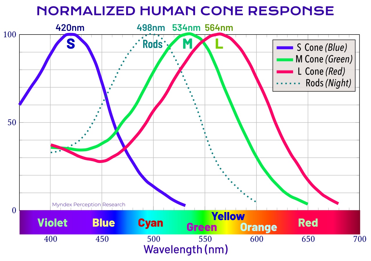
Displays exploit these overlaps. The “red” primary from a monitor is chosen not at the L cone’s peak but at a longer wavelength, deliberately reducing crosstalk into the M cone. But the sensation of color does not happen in the retina at all. The first stage of visual cortex processing is concerned with light and dark — finding edges and fine detail. Color information, specifically hue and chroma, is handled separately in later stages. Over 20% of the brain is dedicated to visual processing, and 62% of the brain involves vision, often shared with other senses.
Different visual tasks route to different brain regions. The Visual Word Form Area, which recognizes letter pairs and words, receives essentially luminance-only information — no color. Object recognition, by contrast, leans more heavily on color.
Perception Is Not Reality
Color is not a property of light itself; it is a perception constructed by the brain, heavily influenced by context. The two yellow dots in the graphic below emit identical colors from the monitor, yet appear different. These are not optical illusions but neurological ones — genuinely fabricated by the brain.
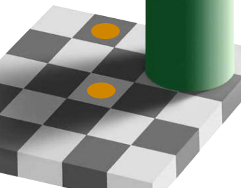
Displays are entirely built on this illusion. The “yellow” on a screen is actually separate red and green subpixels. The light does not mix in the air; the mix happens in the neurology of the visual system.
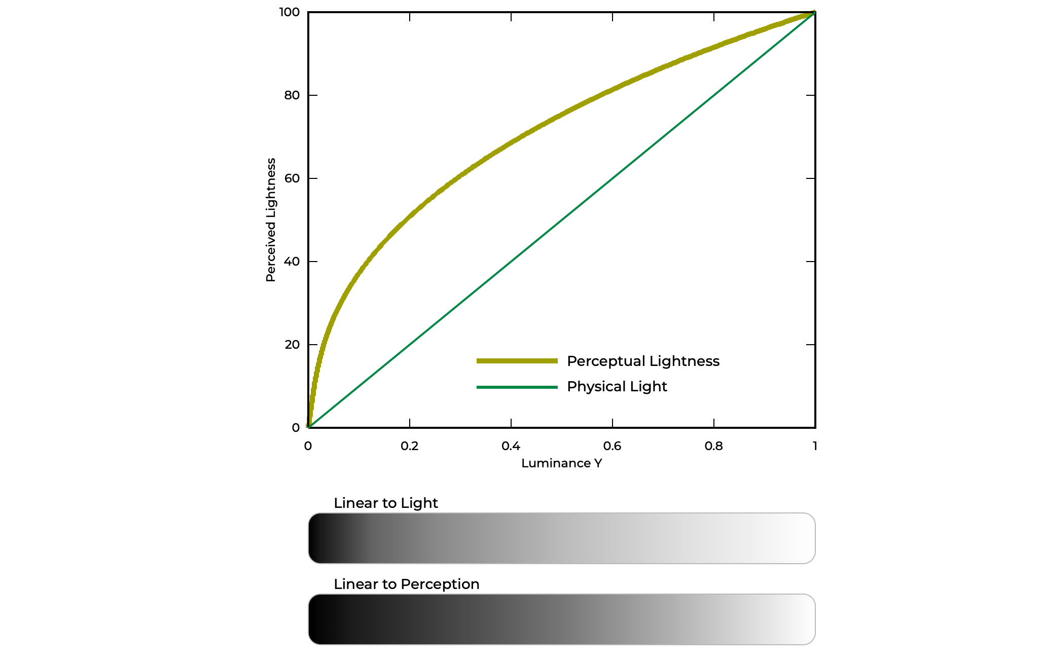
Perception is also non-linear, which matters greatly for contrast. Light in the real world is linear: triple 100 photons and you get 300. But tripling luminance does not look like a tripling to the eye — it appears as a modest increase. Power curves model this perception usefully, and the distinction matters: luminance is a linear, additive quantity, while lightness, darkness, and brightness are qualitative, context-dependent perceptions.
Vision Changes With Age And Circumstance
Contrast sensitivity takes about 20 years to reach its peak and declines with age. The eye’s optics gradually yellow, reducing sensitivity particularly to blue. Visual acuity — the ability to focus — is separate from contrast sensitivity, and reading is among the most demanding acuity tasks because letters are thin and small.
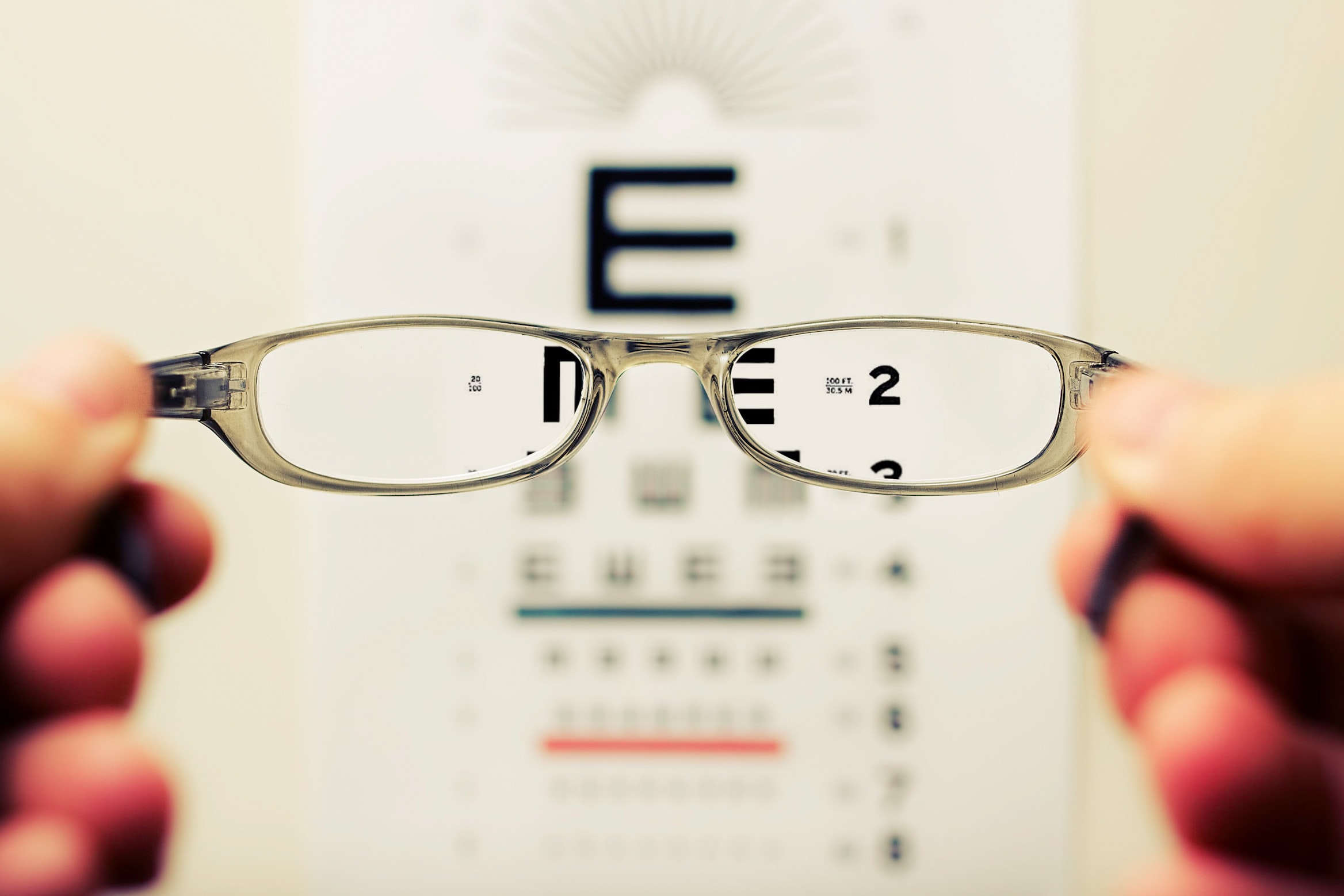
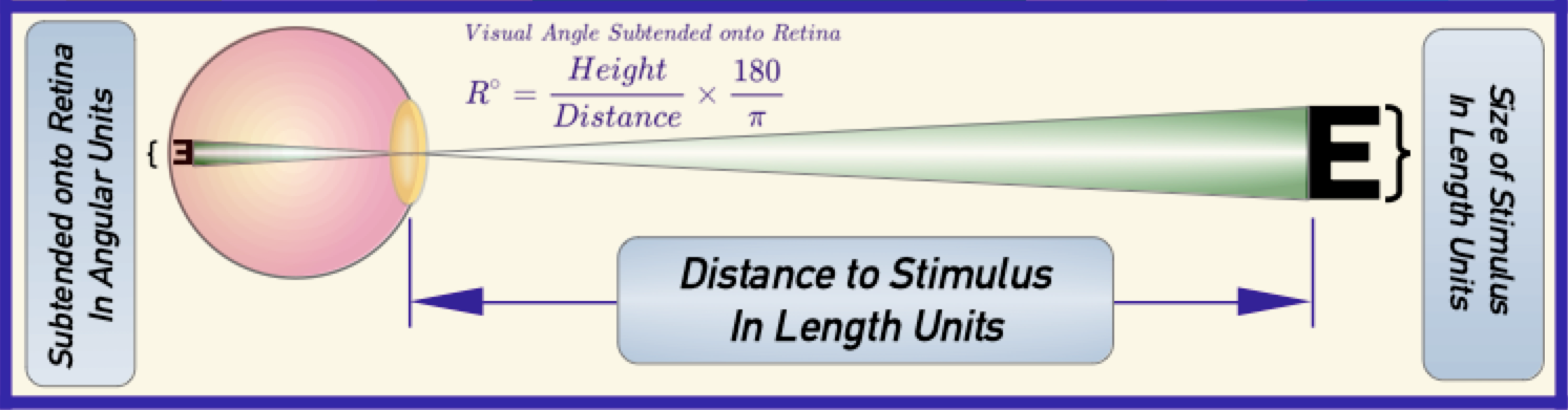
Standard acuity is denoted 20⁄20 in the US or 6⁄6 in Europe, meaning someone with standard vision can read a capital E at 20 feet or 6 meters that subtends five arc minutes of visual angle on the retina. This is not “perfect” vision; human perfect vision is closer to 20⁄12 to 20⁄16, and the world record is 20⁄09. An eagle, by comparison, sees at about 20⁄04.
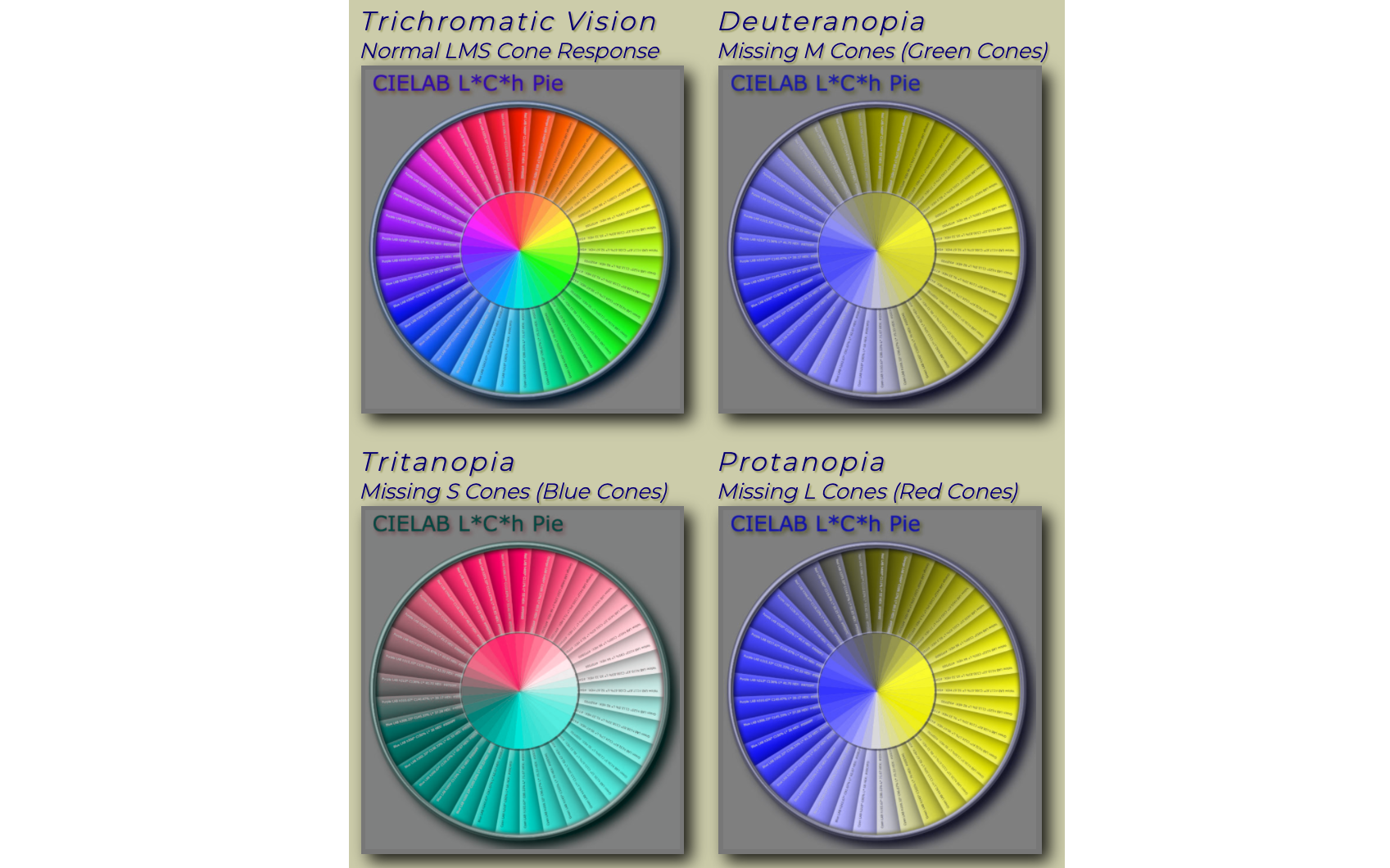
Color Vision Deficiency (CVD) affects about 5% of the world’s population, though “color blind” is inaccurate for most cases. The common forms involve a missing or malfunctioning cone type: deutan affects the M/green cone, protan the L/red cone. Rare forms include tritan, affecting the S/blue cone, and achromatic vision, missing two or all three cones — these are the only genuinely color-blind forms, and they usually come with additional issues like low acuity and severe photophobia, often requiring dark glasses indoors and assistive reading technology.
What CVD Means For Readability
For the common deutan, protan, and tritan types, luminance perception matches standard vision. That means their contrast needs for text are the same as anyone else’s. The singular exception is the pairing of red with black: protan forms are insensitive to red, so red text on black has severely diminished contrast and should be avoided for text and semantic non-text elements.
What Contrast Actually Means For Readability
When designers talk about contrast, they usually mean the lightness difference between text and its background. This “perceived lightness contrast” is distinct from color contrast. Luminance is the physical measurement of light; lightness is how humans perceive it, and that perception is heavily influenced by context. Because readability depends on the brain's ability to decode letterforms quickly, it relies primarily on lightness differences. Color contrast, by contrast, is more useful for object recognition and categorizing information.
How Size Changes The Contrast Equation
Contrast perception is less about the ratio between two colors and more about what vision scientists call “spatial frequency.” For designers, spatial frequency translates to font weight, font size, and line thickness. Higher spatial frequency means smaller, thinner elements, which makes the same color pair look lower in contrast. A quick look at the human contrast sensitivity curve makes this concrete.
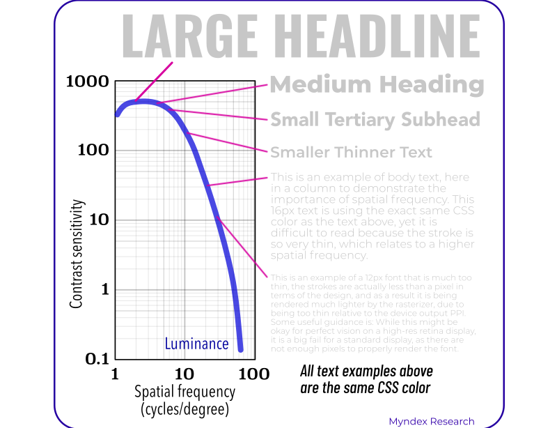
The headline in that chart is larger and bolder, so it appears to have more contrast than the small body text samples—even though every sample uses the exact same gray. The smaller the text gets, the more luminance difference you need to maintain perceived contrast.
The Hidden Cost Of Font Smoothing
Antialiasing complicates matters further. When fonts are rasterized to a screen, slight blurring is applied to smooth jagged edges. At sizes around 18px and below on standard displays, normal-weight fonts can effectively disappear into the background because of this blending.
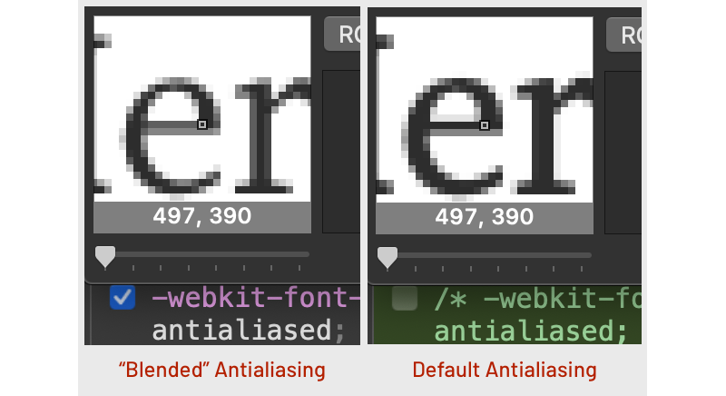
Screen resolution matters, too. Retina displays at two or three times standard resolution render text much more sharply. But sub-pixel antialiasing on some systems may be overridden by the CSS declaration -webkit-font-smoothing:antialiased;, which replaces the sharper default with a softer blend. On standard-resolution displays with small fonts, that override noticeably damages legibility. Any use of this property should be wrapped in a resolution media query and applied with caution.
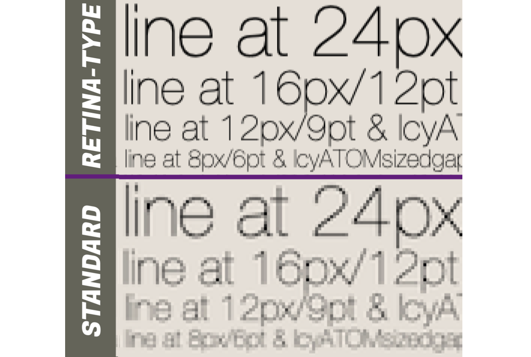
What this means in practice: small, thin body text needs a significantly greater lightness/darkness difference to stay readable. Even ultra-thin fonts at weight 100 can be problematic—they may need to be larger than 42px before font smoothing stops degrading them. And because of these factors, designs tested only on a high-resolution P3 display may fail badly when viewed on a standard-resolution sRGB monitor. Testing on standard resolution equipment is essential.
Predicting Contrast Reliably
For practical design guidance, you need a way to predict contrast before shipping. The WCAG 2 method has been in use for years, but its math doesn't align with human perception, especially for dark color pairs. It's particularly unreliable for dark mode, light text on saturated colors, and a few other edge cases.
APCA—the Accessible Perceptual Contrast Algorithm—directly models perceived lightness differences and produces a “lightness contrast” value known as Lc. That value can guide minimum font sizes and weights for fluent reading. APCA is the candidate contrast method for WCAG 3.
Readability Levels And “Critical” Contrast
Not every element on a page needs maximum contrast. Research by Whittaker and Lovie-Kitchin introduced the ideas of “critical contrast” and “critical size”—the point at which bigger or darker text stops improving reading speed. Below that level, text remains readable but at reduced fluency.
For design hierarchy, it helps to think in terms of “contrast reserve.” A long column of body text needs near-maximum contrast for fluent reading. But non-content elements, such as a small copyright notice over an image, only need enough contrast to be legible when focused on. Keeping those elements at lower contrast reduces visual clutter and directs attention to the primary content.
When Accessibility Requirements Conflict
Human vision varies widely, and what works well for one person may hinder another. Visual impairments extend beyond simple refractive error—problems can occur in the retina, optic nerve, or the brain's visual processing pathways. And many people don't realize their vision is impaired because the brain adapts, sometimes through processes like a “sharpening filter” in the visual cortex that improves perceived acuity.
Because needs are so diverse, giving users options is critical. This goes beyond static accessible design: sites must allow users to adjust settings like zooming, dark mode, or custom color palettes. In practice, user-adjustable visual preferences should be treated as part of responsive design, not as an afterthought.
Structure And Hierarchy As Accessibility
A clear visual hierarchy benefits users with cognitive or neurological differences such as dyslexia and ADHD. Good design uses multiple kinds of contrast—luminance, size, weight, position—to create a semantic flow through content, guiding the eye from one piece of information to the next.
The semantic structure of HTML serves as the backbone here. Screen readers rely on this markup to navigate content for blind users, while sighted users depend on a visual hierarchy that maps to the same semantic meaning. Matching visible design to semantic structure ensures both groups can follow content logically with less fatigue.
For all sighted users, minimum contrast standards must consider the expected use-case of an element. Size minimums additionally need to account for screen resolution and glyph design, since antialiasing can change how a font renders at small sizes.
Moving Beyond WCAG 2
WCAG 2's guidance is simple: a 4.5:1 ratio for fonts smaller than 24px at normal weight (or 18.8px at bold), and 3:1 for everything else. But these numbers, which originated from standards in the 1980s, can prove insufficient in some cases and excessive in others.
WCAG 3 is currently being developed as the next generation of web content standards, and APCA is its candidate contrast method. APCA is grounded in human visual perception research and is tuned specifically for text readability on self-illuminated displays. Unlike WCAG 2, it accounts for spatial features like font weight and size, human perception, and the specific use-case of the element.
Because WCAG 3 conformance specifications are still in development, designers can start exploring APCA now through the public beta. Those with legal or contractual requirements to follow WCAG 2 must weigh compliance obligations before adopting a new standard. For interim use, a method called “Bridge-PCA” offers backward-compatible improvements—it fixes many dark-mode issues under the older WCAG 2 success criteria, though it sacrifices some of the design flexibility that the full APCA method affords.
Practical Steps For Today’s Readability
As the industry awaits the next-generation contrast standards, there are concrete actions designers can take now to improve readability and accessibility. The most impactful lever remains typography, not color.
Stroke Weight And Perceived Contrast
Color ratio alone is not the primary driver of text legibility. Weight and size dominate perceived contrast before the specific lightness values matter. The examples below pair identical colors at a 3:1 ratio with varying outline strokes.
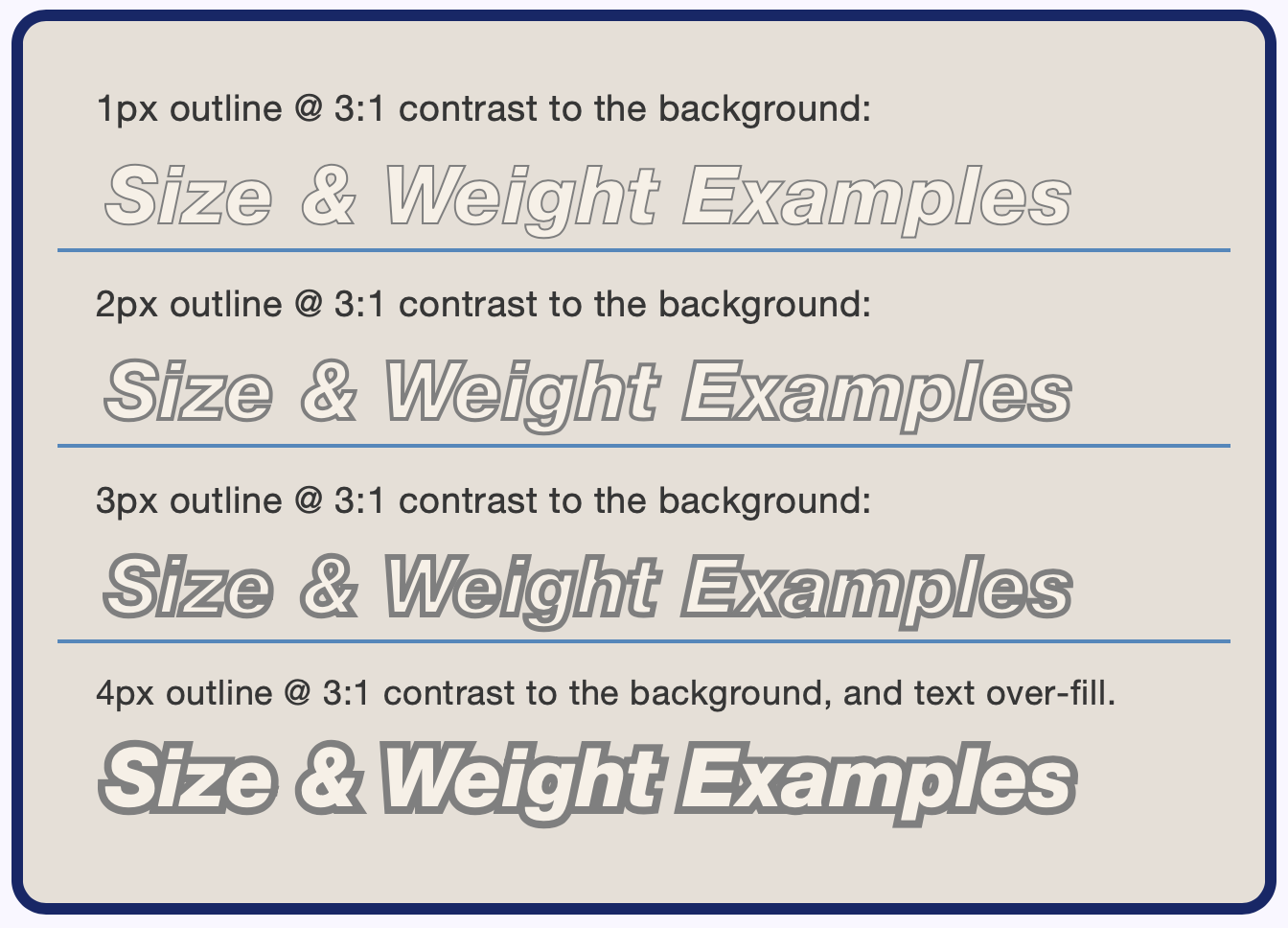
The same colors are used across all rows, yet the thicker strokes appear progressively more readable. This is a matter of spatial frequency: as the stroke grows, the spatial frequency decreases and the visual contrast increases. Repeating the exercise with 7:1 colors produces only a modest improvement over the 3:1 examples.
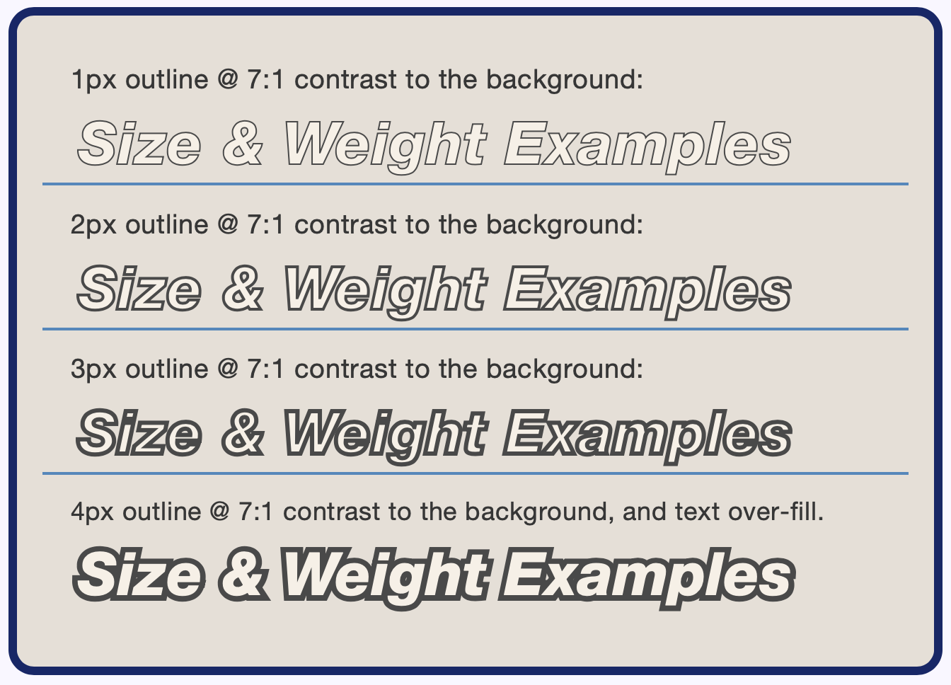
In both cases, the spatial change from a thicker stroke is what drives the noticeable difference in contrast. Prioritizing weight and size also acknowledges that not every reader is on a high-resolution display. On lower-resolution screens, antialiasing reduces effective color contrast and can make thin type appear even thinner.
Weight Consistency Warning
The numeric CSS weight (300, 400, 700) is not standardized across font families. “Arial Black” is marked as normal 400 weight despite looking extra-bold; meanwhile, Courier New reports a 400 weight when it is clearly ultra-light.
Intermediate weights like 500 or 600 only render accurately if that specific weight is imported or the font supports variable weights. Fallback fonts typically support only 400 and 700, so a specified 500 renders as 400 and a 600 as 700. Since weight is central to perceived contrast, unexpected weight shifts from missing fonts or fallbacks are critical planning concerns.
Setting Meaningful Contrast Targets
Future guidance may recommend different contrast levels based on how a piece of text is used. The following categories reflect the hierarchy of importance:
- Body Text: Blocks or columns of readable text.
- Other Fluent Text: Headings, menu items, primary navigation, tooltips, and captions that are necessary for comprehension.
- Sub-Fluent Text: Colorized code, data visualization callouts, informative placeholders, secondary text, and non-essential photo captions.
- Non-Text: Icons, pictograms, buttons, and controls.

- The WCAG 2 values presented here are for light-mode only, meaning the background is never darker than roughly
#aaa. - These listed values are intentionally higher than the official WCAG 2 numbers to account for known weaknesses in the older math.
- APCA and WCAG 3 are still under development and not yet W3C recommendations.
- For fonts larger than
24px, APCA’s maximum recommended contrast isLc 90— more is not always better.
Defining Body Text
Body text has different typographic needs than other elements. Spacing between letters, words, paragraphs, and especially lines (the CSSline-height) is more critical for long-form reading.
A practical definition: body text is a column of more than 2½ lines with a font size under 32px (or an x-height under 16px) and a line height less than four times the x-height.
Setting Leading With The x-Height
When adjusting line-height, the concern is the vertical space between lines of lowercase letters, making the font’s x-height a better reference than its em size. The CSSexunit measures the height of the lowercasex. Using it, a baseline-to-baseline distance of three times the x-height is a solid starting point:
p{line-height: 3ex;}
Some fonts need a larger value. For paragraph spacing, add at least1.5exof extra padding.
Guidelines For Body Text
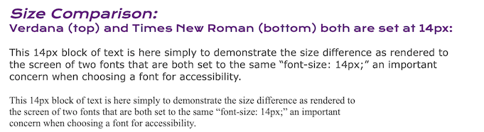
- Font Choice: Verdana exemplifies a readable body font with a large x-height ratio and clearly defined glyphs.
- Minimum Size: For Latin alphabets, focus on x-height, not the nominal font size. A minimum x-height of about 9.4px supports standard 20/20 vision. This equals roughly 18px for Helvetica and 21px for Times. Impaired vision benefits from a range of 24px to 32px. Divide by 1.33 for point sizes. Non-Latin scripts need different minimums.
- Font Weight: A normal 400 is often ideal for well-designed fonts. A weight of 300 is too thin for fonts under 24px; avoid 100 and 200 entirely for body text.
- Column Width: For eye comfort, keep full lines near 50 to 60 characters. Do not exceed 80 characters, and lines shorter than 35 characters force the eye to jump too often.
- Line Spacing: Use the CSS
line-heightproperty. A unitless value is em-relative, but relative to the glyph size is preferable, hence using theexunit.line-height: 3ex;is a starting point. - Alignment: For left-to-right languages, left-align columns of text. Centered alignment hinders finding the start of each line, though it is acceptable for headings or menu items. Full justification should not be used on the web. Print justification requires a typesetter’s skill, while web content is dynamic and reflows — locking text in place undermines accessibility.
Dealing With Excessive Contrast
Too much contrast is possible, especially for large, bold elements, but the remedy is not to lighten dark text. Excess contrast typically comes from brightness — the first fix should be making the lightest element a bit darker.
Practical Limits For Dark And Light
On most calibrated monitors, colors darker than approximately#222orrgb(34,34,34)are indistinguishable from black. However, using pure#000for small, thin fonts can help text cut through antialiasing artifacts.
Conversely, subtle differences between#fffand#eeeor#dddare perceptible and significantly reduce visual fatigue caused by brightness.
Looking Beyond The Legacy Of Print
The movable-type printing press is over a thousand years old in Asia and nearly 600 years old in the West. The internet is young in comparison, and electronic type still introduces novel readability challenges. Most existing contrast guidance assumes dark text upon light paper, and print is inherently fixed in place. Today’s web offers dark mode and user-controlled color schemes, proving that older metrics like WCAG 2 are inadequate over the full visual range of the modern UX.
That limitation is the driver for perceptually uniform contrast methods. The basics here only scratch the surface of this evolving field; more design considerations will follow as these new standards mature.
Resources For Further Reading
- “How the CIE 1931 RGB Color Matching Functions Were Developed from the Initial Color Matching Experiments”, Yuhao Zhu
- The Wright – Guild Experiments and the Development of the CIE 1931 RGB and XYZ Color Spaces
- “Evaluating the 1931 CIE Color-Matching Functions”, Mark Shaw and Mark Fairchild
- International Commission on Illumination
- Stevens’s power law, Wikipedia
- “An event-related functional MRI study of the stroop color word interference task”, H. C. Leung et al.
- “Visual requirements for reading”, S. G. Whittaker and J. Lovie-Kitchin
- “Contrast sensitivity of patients with congenital color vision deficiency”, Cagri Ilhan et al.
- “A Contrast of Errors. The WCAG 2 color contrast guidelines”, Andrew Somers
- W3C Accessibility Guidelines (WCAG) 3.0
- Color Vision Deficiency Simulator
- Why APCA as a New Contrast Method?
- Bridge PCA Contrast Calculator



