
Design Rules for People Who Weren’t Taught Graphic Design
Beginner designers often have the talent and the tools, but they lack the frameworks that trained graphic designers rely on. Laurent Baumann, who has spent years mentoring novice designers, noticed this pattern: when faced with a mockup, a landing page, or a simple card, beginners get stuck — not because of a lack of skill, but because they don't know the invisible rules that structure visual communication.
This article focuses on four fundamentals that are easy to apply and can dramatically improve almost any design project. Master these, and your work will not only look better but also become more accessible to a wider range of viewers, including those with disabilities.
Let Structure Carry the Message
Before your eyes recognize a specific field in a form, they recognize the form itself. Before you can discern an individual tool in a toolbar, you see the toolbar. Structure is the front door — the main menu that lets people access information quickly and intuitively.
Consider a webinar registration page. The content includes the event title, a short synopsis, price, date and time, host name and photo, short bio, social links, a register button, and a “Join me live!” call-out. The problem is that all these items are presented as a single, flat list. The solution is to organize them into groups.
| Headline | Host | Logistics |
|---|---|---|
| Call-out | Host name | Event date |
| Title | Host photo | Time & duration |
| Synopsis | Host bio | Price |
| Social links | Register button |
The grouping is only the first step. The next is determining reading order. A logical sequence would put the headline and event logistics first, with the register button prominent. The host details become a secondary track — optional information someone can explore if they want to learn more.

Notice how much easier the structured version is to absorb. The organization of information directly dictates how well it can be understood — and well-organized information has a tendency to appear beautiful on its own.
“In short, don’t try to make something beautiful. Try to make something well-organized, and watch the beauty emerge!”
Spacing Gives Content Air to Breathe
Spacing governs how elements are arranged in a layout. It does more than make things look tidy — it directs attention, builds hierarchy, and improves legibility. Spacing also reflects structure: when the gaps around related elements are tight, a visible grouping emerges; when gaps are uniform, the content becomes a wall of information.
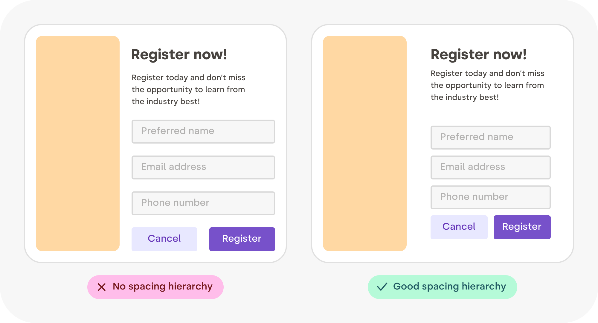
This used to be a luxury. In print, white space was expensive because paper costs money — wide margins were found only in high-end magazines. Now, 空白的 space in digital design is virtually free, making visual breathing room accessible to everyone.
However, whitespace doesn't need to be white; it is simply empty area in any color, texture, or even a background image. It can be a tool to balance elements and organize content for better visual communication.
Keep Space Consistent
When space around different elements is irregular, the eye is diverted. Regular, harmonious spacing lets content speak. This principle applies to both interior and exterior gaps: consistent spacing between elements provides visual harmony across a whole composition.
Create nice, flowing spaces by keeping a few finer points in mind.
Centering Inside a Box
Should you need to fit an image or logo into a container, maintain a minimum margin equal to at least half of the logo’s shortest dimension. For a wide logo, work with half of its height; for a tall one, work with half its width.

Centering Text Vertically
Most of the mass of a text line sits between its baseline and the top of its lowercase letters — squint and you'll see. When centering, align the bulk of text correctly using its x-height rather than the distance between ascenders and descenders.
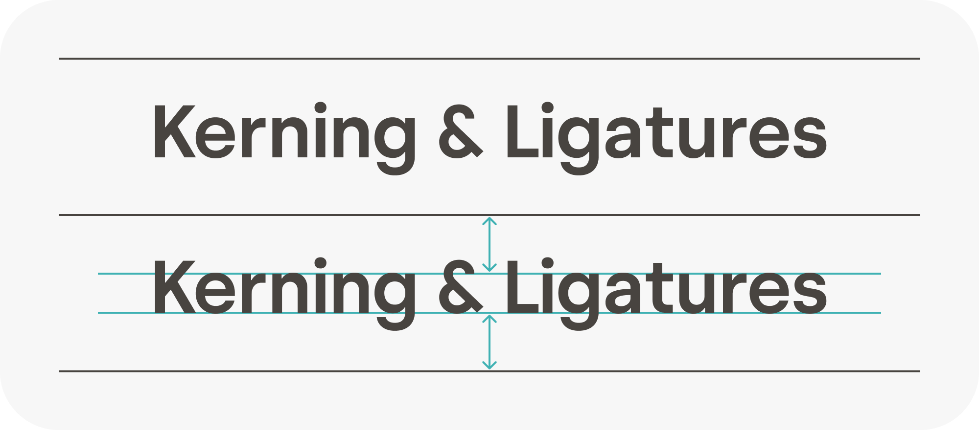
The letter “x” is the only alphabet character whose terminals all touch the baseline and meanline, with no ascending or descending parts — which is where the x-height gets its name.
Text in a Shape
Inside a shape like a button or label, center the text using its lowercase height as well. Doing so establishes equidistant space all around the glyphs, keeping a uniform look and avoiding squeezed or unbalanced padding.

Centering Polygons
When positioning an irregular shape such as a polygon, use the circumscribed circle (passing through each of its points) for centering rather than its bounding box. It gives a cleaner, more even optical balance.

Nesting Rounded Boxes
Placing a rounded box inside another rounded box is a common technique in modern UI — but it often fails. Keeping the same border-radius on both the outer and inner box will produce a varying band width between them. The correct approach is to use a proportional radius that scales based on the inner box size.

Rhythm Keeps the Eye Moving
Human attention spans are short, and eyes get bored quickly. To keep someone engaged, they need a steady supply of something interesting to parse — but not so much that it is tiring. Visual rhythm creates a gentle, interesting path through your layout by providing regular contrasts, patterns, or variation. It creates directional cues that guide the reader through the content and towards final action.
This rhythm can be applied to a slide deck, an onboarding flow, or a portfolio as much as to a single page. Begin with left-right alternation, and later experiment with third-position variations if you feel comfortable.

“Rhythm in art and design refers to a relationship between elements that creates a sense of harmony. Rhythm can be seen in patterns, in relationships between colors and shapes, and in repetitions of lines and forms. Rhythms help to guide the viewer’s eye around a piece rather than allowing the eye to settle on a particular focal point.”
Repetition Holds Rhythm Together
Visual repetition is a mechanism you can deliberately reuse across a design. Repeating colors, shapes, and text styles builds a more organized and intentional composition. It establishes a loop and reassures the viewer, making the whole feel connected.
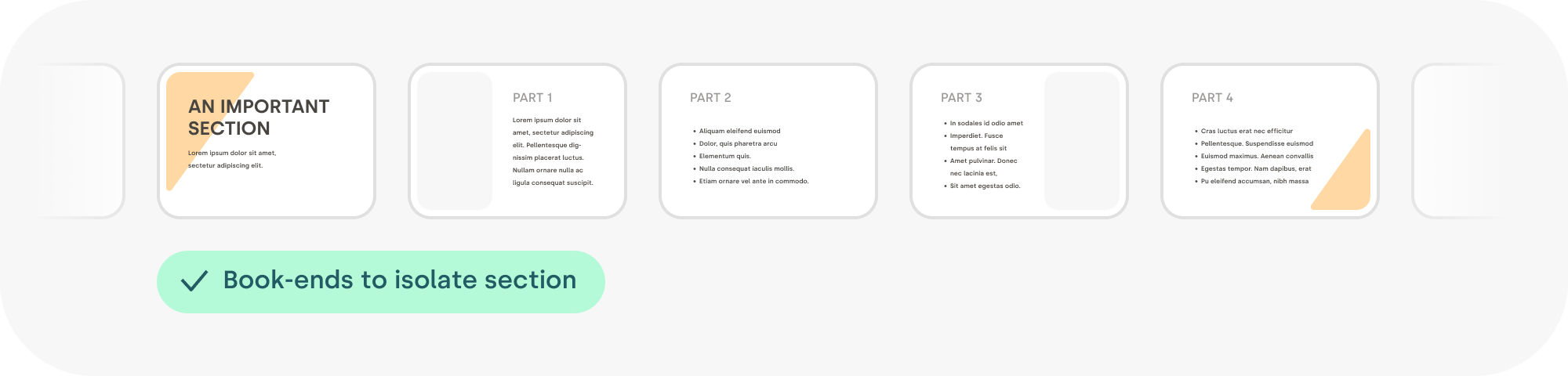
A book-end, for example, is an element repeated to mark the open and close of a section — a tiny color, a shape, or an accent can help to signal that a topic has ended softly, adding structure. Repetition like this forms patterns that catch our eye and pull it along in a harmless way, like a musical hook in a song. In this very article, the chosen color scheme, certain arrow styles, and different shapes were picked to achieve the same effect across all its visual assets. This approach at a bigger scale is the basis of what is frequently called a design system.

Reading Rhythm
Reading includes a physical — even mechanical — component where your eyes have to physically travel across each line. Correct text block width ensures this physical travel is easy. Lines that are too long make it hard for the eyes to return to the next line; too narrow lines make reading interrupted for that constant line return.
A practical optimization target for the main text block is a line that averages somewhere between eight and twelve words. There is no need to measure strictly — just the considered feel of the reading rhythm is enough. For sidebars, captions, or narrow columns, five to six words per line may be better. It's a rule of thumb that stands for English text; some other languages have their own best widths.
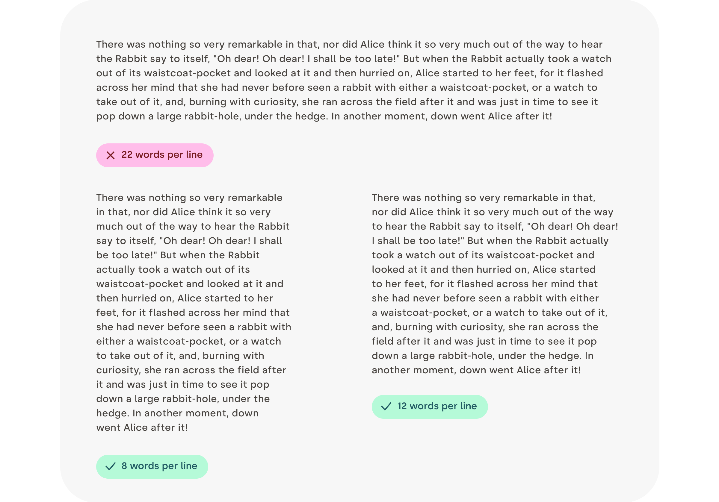
Varying the rhythm of text and sentences is equally important to overall design rhythm, as Gary Provost suggested in this excerpt:
“This sentence has five words. Here are five more words. Five-word sentences are fine. But several together become monotonous. Listen to what is happening. The writing is getting boring. The sound of it drones. It’s like a stuck record. The ear demands some variety…”
Reconsider Justification
Full justification, which aligns text along both left and right sides, is challenging to do well. Natural justified text requires manually tuning word spacing, letter spacing, and sometimes adding decent hyphenation across different lines to avoid whitespace gaps breaking reading flow. The visual severity of a hole can weaken the reading rhythm that text width builds, making two-column layouts prone to such issues.
Editing tools rarely produce suitable justified text on their own. Therefore, for anyone who does not want to spend the time hand-tweaking it, a safe default is to use left-aligned text. The payoff of having a perfectly straight right edge is often less important than the rhythm and flow of unharmed reading.

Contrast Does More Than Decorate
Where rhythm gives a layout its beat, contrast provides the melody. By playing with differences in color, size, shape, weight, direction, or texture, you can pull attention to specific elements, build a clear hierarchy, and make text easier to read. Contrast also carries emotional weight — high contrast tends to feel energetic, while low contrast often reads as calm.
Keep Text Legible With Proper Contrast Ratios
If you’re placing text on a colored background, it needs enough contrast to remain readable for everyone, including people with visual impairments. A contrast ratio of 4.5 or higher is recommended. You don’t have to guess — a wide range of apps and plugins can calculate ratios for you (some are listed in the Further Reading section).

Use Type Size to Clarify Structure
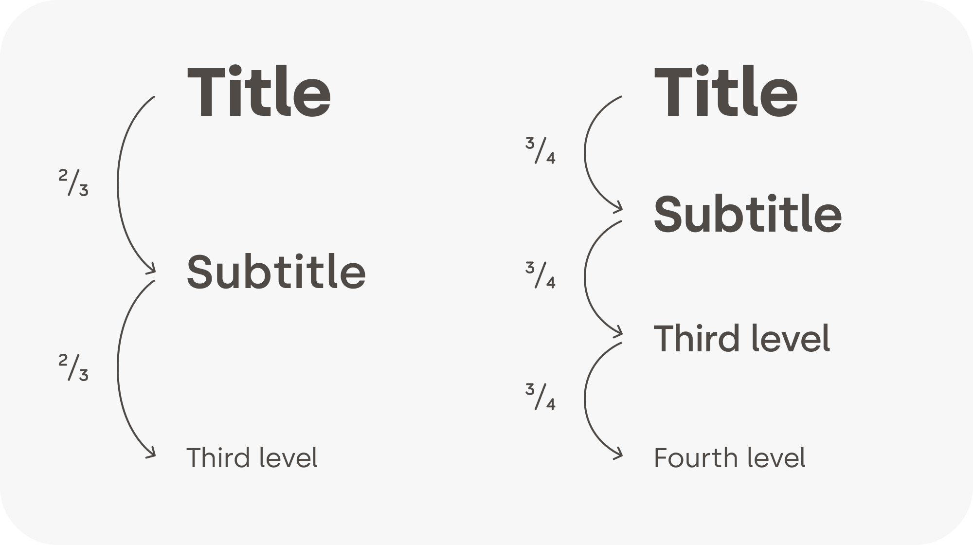
Text size is one of the most practical tools for structuring information. When heading levels contrast clearly with each other and with the body copy, the viewer’s eye can map the content hierarchy with minimal effort.
A consistent ratio between heading levels tends to look more elegant than arbitrary jumps. As a general rule of thumb, text weight (bold, regular, light) should also step down as the heading level goes up.
Choose Weights Carefully
When a typeface includes many weights — medium, semibold, light, and so on — skip one weight when pairing them. Jumping from light to semibold, for example, gives you enough contrast to make the distinction obvious.

Watch Out for Accidental Contrast
Pairing an icon with text can strengthen meaning and add visual interest. But make sure the visual weight of the icon matches that of the text. When the thicknesses align, the icon feels like part of the typeface itself rather than an afterthought. That level of polish prevents the viewer from pausing to consider the mismatch — and, as the saying goes, good design is invisible.

“Although we can’t help but notice poor design, good design is much harder to detect. We’d go even further:* good design is invisible*. This raises a logical question: what, then, is good design? Is it when form follows function? Is it the perfect arrangement of design elements on a modernist grid? Is it 24-point headings and 8-point body text? Is it a solid set of principles that you work to every time on every job? The answer might surprise you — good design is all of this. And none of it.”
— Damien Stanyer, “Why is good design invisible?”
Beyond the Visuals
Design work that looks polished isn’t the end goal. Your real job is to lower the cognitive load required to ingest information, create a rhythm that holds the viewer’s attention, and ensure content is accessible to everyone.
“The most important advice I would give to emerging designers — even those that have already won awards — is that* learning never stops*. You can always improve your craft, whether you’ve won one award or twenty. Remember, you’re never going to be an expert in everything. I have worked on so many things, from book design to exhibition design, hospitality, tech, and everything in between — and I’ve taken something new from the experience every time. Now I’m the executive creative director at a global agency, and I still find myself learning something new every day.”
— Lisa Smith, “Learning Never Stops”
The next time you face a design task, keep these tips nearby. Everyone can design — but every designer has more to learn, and the learning process never really ends.
Resources for Further Reading
The following links cover the topics touched on above in more depth. If you know of something valuable that’s missing, leave a comment at the end of the article.
- “The Importance of Information Architecture to UX Design,” by Anastasia Stefanuk
- “The Power of White Space in Design,” by Mads Soegaard
- “X-height,” Wikipedia
- “What Are Cap Height and X Height in Typography?,” by Sirine Matta
- “Rhythm,” part of the Principles of Design BBC series
- “Design Systems 101,” Nielsen Norman Group
- “Good Design is Invisible: Understanding Design’s Impact,” by John Hawley
- “Recommended contrast ratios,” University Information Technology Services (UITS)
- “Contrast and Color Accessibility,” WebAIM
- “10 Usability Heuristics for User Interface Design,” Nielsen Norman Group
- “Why is good design invisible?,” by Damien Stanyer, Thirst Creative
- “Learn the logic of great typography,” an interactive tutorial on type, Learn UI Design
- “Accessible Color Generator,” a free accessibility tool by Learn UI Design
- “Type Scale,” a design web app for building font scales
- “Color Tools for Design Systems,” color tools for text, data visualizations, and more
- “Learning Never Stops” — award-winning creatives share their secrets, PRINT magazine



