

From Brief to Symbol: How Figma’s Product Icons Come Together
Designing an icon for an entire product line requires more than just sketching a clever glyph. Tim Van Damme, Product Designer at Figma, recently took on the task of creating four new product icons and redesigning the existing set to ensure they work cohesively as a family. With dozens—sometimes hundreds—of iterations behind each final symbol, his process is a study in balancing a strict visual system with open-ended creative play.

Establishing the Rules of the Grid
When Van Damme first joined Figma, he discovered there was no official system for creating the company’s icons. He built his own set of guidelines, making himself the de facto icon designer. These rules are the non-negotiable starting point for every new symbol, ensuring visual consistency across the entire suite.
The core principles of his system are simple:
- All strokes are one pixel wide.
- Cutouts are one pixel thick.
- All caps are rounded.
- Icons feel balanced, filling out the available space as best as possible.
- Icons are created in three sizes to work across all necessary surfaces.
This consistency is critical because the icons must function everywhere, from the toolbar to 40-foot billboards. A design that looks great up close is often eliminated early if its lines blur together or elements become hard to distinguish when scaled down.
Defining the Essence of the Product
Once the guidelines are set, the next challenge is distilling a product’s entire visual identity into a single symbol. Van Damme and the product teams brainstorm key concepts and themes to determine what detail matters most.
"We have to communicate a lot of detail within a small space," he says.
For Figma Community, this process involved words like "connection through community," "peers exchanging knowledge," and "learning together," leading to experiments with people, trees, and books. When working on Figma Buzz, the team explored themes like magic and AI image generation, sparking iterations on glass orbs, stars, and bee forms.
Iterating Through Creative Play
Armed with design parameters and early concepts, Van Damme moves into a phase of intense, hands-on experimentation. He uses tools like variable width stroke to edit multiple vector layers at once, saving time as he pushes and tweaks each symbol. Trees become faces, faces become mandalas, and abstract shapes rotate and intertwine during this process.
This iterative approach is driven by years of experience as well as a love for creative wandering. For Figma Make, he drafted wheels, butterflies, compasses, and fidget spinners to explore concepts of motion. For Figma Buzz, he spent a day creating hundreds of bee variations with different wing shapes, lines, and antennas.
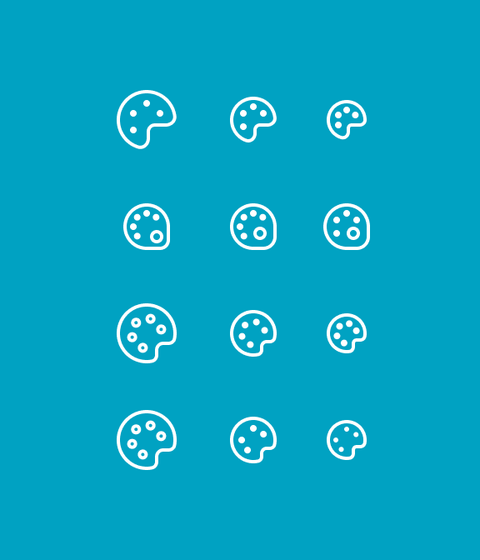
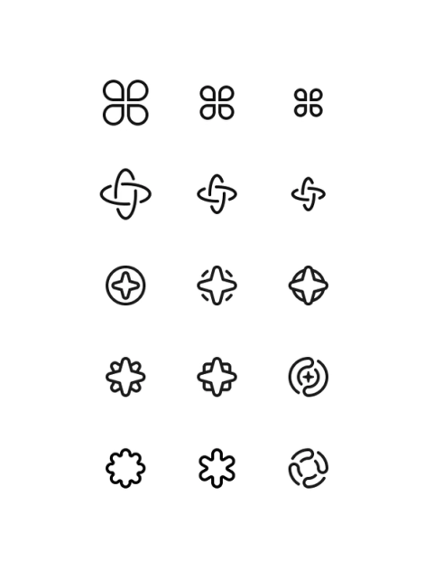
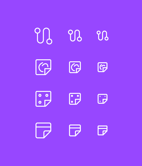
At this point, Van Damme checks how the new icon fits into the broader collection. He asks whether one icon stands out too boldly, if they feel disjointed, or if their functionality is too similar. As he notes, "Every single icon is unique, but in the end, if you put 20 of them together, you should be able to say, ‘Those are Figma icons.’"
Weighing Feedback from Many Voices
Van Damme doesn’t design in a vacuum. He regularly checks in with product designers and managers, using a one-to-five star rating to show his confidence in a given direction. Feedback can be concise ("too much happening") or vague ("this doesn’t feel right"), and a full day’s work can be scrapped by a single comment. Even when a bee concept for Buzz was abandoned in favor of a megaphone, he took it in stride: "It’s a life experience. Even though we went a different direction, I can still say that no one has ever put more time and effort into trying to come up with the perfect bee icon."
He also looks for input beyond the design team. When recreating the FigJam icon, he asked around the company for words people associated with the product. The unanimous answer was "stickies," so the new icon became a sticky note. He used the same approach for launches like Figma Make and Figma Draw, gathering public feedback in Slack channels.
"Not all designers like to work that way because there’s a lot of input," he says. "But I love engaging with non-designers and getting to hear what they think."
Trusting Intuition in the Final Stretch
In the end, logic must make room for a gut feeling. When designing the new Community icon, Van Damme scrapped early book symbols for fear they would mirror an existing Figma library icon. It wasn’t until he combined the outlined figures from Figma’s very first Community icon with the book that the design clicked. "It felt so powerful. I still have a hard time explaining why. But when I look at the icon, it just makes me feel something."
To finalize, Van Damme presents six options to the leadership team. With so much iteration built in, the decision is fairly straightforward, judged against the design system, his icon guidelines, and how they mesh with the existing family—plus that final, less measurable factor: a shared intuition about what feels right.


