

UX Is a Balance Sheet Issue
Carrie Webster, a UX designer with experience dating back to the early mobile-first era, argues that interface friction is no longer a matter of lost clicks. In the current economic climate, she contends that poor design decisions translate directly into millions in wasted engineering spend and forfeited business value. The path from the design studio to the boardroom, she insists, is paved with hard metrics rather than aesthetic argument.
The business case for UX has shifted from a "cosmetic preference" to a core operational requirement. Webster’s central thesis is that data—not opinion—is the most effective tool for convincing stakeholders that UX is a non-negotiable element of financial health. The following ten facts represent what she views as the clinical, data-backed pillars of growth in a saturated market.
Webster cites a personal example from a B2C mobile project where reducing visual assets shaved 1.2 seconds off load time. That single adjustment yielded a 12% lift in completed transactions, illustrating that even tenths of a second function as direct revenue levers.
The Economics of Early Fixes
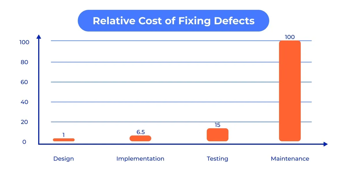
The most compelling financial argument for UX is the 1:100 rule. Research cited from the IBM Systems Institute and Sugue Technologies indicates that correcting an error post-launch can be up to 100 times more expensive than addressing it during the design and prototyping phase.
Webster frames UX as "engineering insurance." By the time code is written, every interaction should already be validated. Discovering a fundamental navigation flaw after release means paying not just for the fix, but for technical debt, lost developer time, and revenue lost while users contend with a broken flow.
Speed as a Primary Design Element
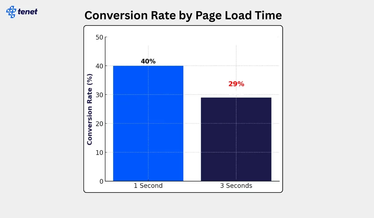
Performance is the non-negotiable foundation of user experience; a beautiful interface is worthless if users bounce before it renders. The data is harsh: 47% of users expect a page to load in two seconds or less. A one-second delay can reduce conversions by 20% and satisfaction by 16%, with retail businesses losing an estimated $2.6 billion annually to slow load times. When mobile load time extends from one to three seconds, bounce rates spike by 32%, and conversion rates plummet from 40% to 29%.
Yet this volatility cuts both ways. A microscopic 0.1-second improvement can lift retail conversions by 8.4% and travel-site conversions by 10.1%. Even improving Largest Contentful Paint (LCP) by 31%—a benchmark 67% of websites achieved as of June 2025—can drive a direct 8% increase in sales.
If the site isn't instantaneous, the design hasn't just failed — it effectively doesn't exist.
Impression Windows Are Milliseconds Wide
First impressions are visceral. Research indicates that users form an opinion about a website's visual appeal in approximately 50 milliseconds (0.05 seconds). This split-second gut reaction dictates whether a user stays to explore a value proposition or bounces immediately.
In today's market, 94% of first impressions are strictly design-related. If the interface feels dated or "off," users subconsciously project that lack of quality onto the entire product or service. Content effectively does not exist if the design has not earned the few seconds of attention required to read it.
The Hidden Tax of Choice
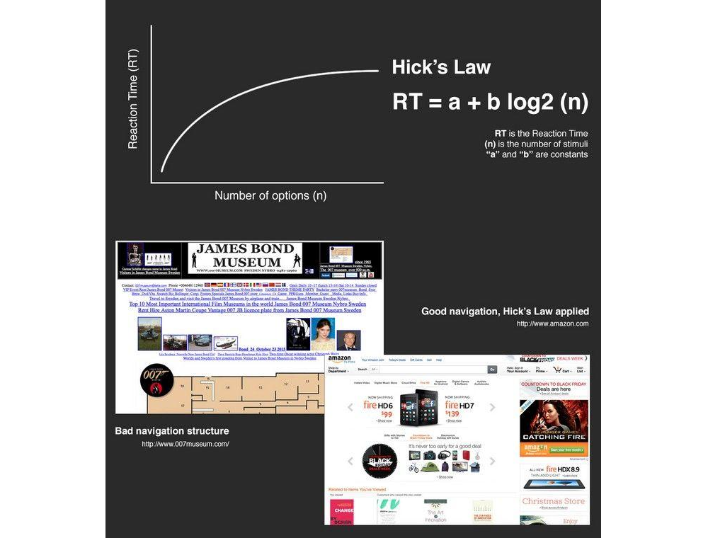
Stakeholders often believe more options equal more value; psychology proves the opposite. Hick's Law states that decision time increases with the number of available options. Every extra menu item or form field acts as a tax on the user's cognitive load.
Top-performing sites now achieve conversion rates exceeding 11%, while average performers struggle below 3%, according to Landbase. The difference lies in personalization and optimization strategies that simplify the experience rather than complicate it.
If you want to increase your revenue by tomorrow, find one field to delete from your checkout flow today.
Spacing as a Comprehension Tool
White space is often dismissed as wasted real estate by non-designers, but it is fundamentally a tool for focus. Strategic application can increase content comprehension by up to 20%. It prevents cognitive load from peaking and guides eyes toward the most important elements: typically the "Buy" or "Sign Up" button. With attention spans having dropped to roughly 8 seconds, simplicity is a major driver of engagement.
Webster provides an example from a fintech dashboard where analysts were overwhelmed by a "data dump" layout. Applying more white space around the data lowered cognitive load, resulting in a 25% decrease in time-on-task and a significant boost in trial-to-paid conversions.
The Psychology of Perceived Progress
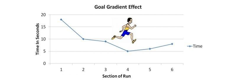
One of the more surprising psychological hacks in UX is the Goal Gradient Effect: users complete tasks faster if they believe they have already made progress. In a classic study, a 10-stamp coffee card with two stamps "pre-filled" was completed faster than an 8-stamp card with zero pre-fills, despite identical required spend.
Applied to digital design, a progress bar starting at 15% (simply for creating an account) increases onboarding completion rates by over 40%. Designers are not just building screens—they are managing the user's sense of momentum.
Typography That Converts
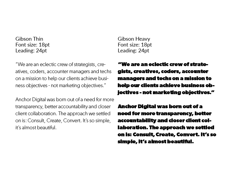
Cramming more text above the fold may seem like a value-add, but the data argues otherwise. Proper line spacing (leading) and paragraph width can increase comprehension and reading speed by up to 20%. Optimal line height—generally 1.5x the font size—reduces "visual noise," letting the brain process information with less effort. When users struggle to read tight or small text, perceived effort rises, increasing bounce rates. If it is hard to read, it is hard to buy.
Designing for Scanners, Not Readers
Users do not read websites; they scan them. On a typical page, users read only about 20% to 28% of the text. Because modern users scan in an F-pattern or Spotted pattern, designing for reading is a tactical error. Designing for scanning requires:
- Bold headers that narrate the value proposition.
- Bullet points for key benefits.
- White space to connect users to key information.
- High-contrast call-to-action (CTA) buttons.
If a core message is buried in a paragraph, it is effectively invisible to nearly 80% of the audience.
The Pitfalls of Large-Scale Testing
While companies sometimes waste six-figure budgets on studies with 100 participants, testing with just 5 users typically uncovers 85% of usability problems. This is a mathematical sweet spot—after the fifth user, diminishing returns set in, and more money yields fewer new bugs.
The competitive advantage lies in small, frequent testing cycles: test with 5 people, iterate, and test with 5 more. Webster states she has followed this practice consistently and confirms it delivers the majority of issues in a design.
The Persistent ROI Equation
The industry's most staggering statistic remains consistent: on average, every $1 invested in UX returns $100. This 9,900% ROI is not magic—it is the sum of increased conversion and reduced support costs. A fully optimized UX design can improve conversion rates by up to 400%. Intuitive design also lowers customer support requirements; a self-explanatory product does not need a massive call centre to explain how to use it.
The Cumulative Value of Maturity
Beyond individual statistics lies the cumulative effect of a mature UX practice. The most successful firms treat UX as a continuous improvement loop rather than a one-off project. Companies with high design maturity see 32% higher revenue growth and 56% higher total returns to shareholders compared to less design-focused peers.
Mature UX organizations move beyond "user delight" and into "user efficiency." Shaving 30 seconds off a workflow for 1,000 employees reclaims hundreds of thousands of dollars in annual productivity—an internal ROI often overlooked but just as vital as consumer-facing conversion rates.
The "experience gap" remains a significant market opportunity. 80% of companies believe they deliver a "superior experience," but only 8% of customers agree. Bridging this disconnect through continuous testing and performance optimization captures market share that competitors are leaving on the table.
AI Changes the Game, Not the Rules
AI is now inescapable in UX work, but none of the ten data-backed truths above have been superseded. Rather, AI is turbo-charging how teams apply them:
- Agentic UX: 60% of designers are now building “AI agents” that act on the user’s behalf. Doing the decision-making for them cuts the impact of Hick’s Law by reducing options before the user ever sees them.
- Real-Time Personalisation: 32% of teams now use AI to adapt interfaces live. Instead of forcing everyone through the same layout. they can respect F-Pattern scanning habits by moving the most relevant content to where a particular user’s eyes are most likely to land.
- Automated ROI: With 93% of designers using generative AI to accelerate prototyping, the 1:100 Cost Ratio improves further because teams can discover and correct flaws before production code is even written.
The net effect is that UX shifts from a static map to a dynamic guide. Human psychology, however, remains constant — the same 50ms impressions and need for white space still apply.
Design at the Strategy Table
Summarising the core findings:
- Fixing issues at the design phase is one hundred times cheaper than later.
- Performance shapes the user experience.
- Your site has 50 milliseconds to make an impression.
- Hick’s Law: too many choices overwhelm users.
- White space boosts comprehension.
- The power of “fake” progress.
- Make your content readable.
- Users typically read only 20% of your content.
- User testing with five people hits the magic number.
- Financial ROI can exceed 9,900%.
As the late 2020s approach, the separation between design and business strategy is effectively gone. According to McKinsey research, design-led companies beat competitors by 1.7x in revenue growth.
UX design is no longer just the team you hire to “make things look nice.” It is the research-driven, data-backed discipline that turns a digital product from a cost centre into a revenue-generating machine.
Those are measurable, verifiable outcomes, not claims of vague intuition. When design changes follow the evidence, they matter.
The era of subjective guesswork is finished. The psychology is established, the ROI has been proven, and the data is out for anyone to read. The remaining question isn’t whether facts improve design — it’s whether you decide to use them before your competitors make the same call.


