Naming is hard. The vocabulary a team settles on shapes both how its members think about a thing and how they talk about it — which is why colors, icons, components and features so often end up mired in confusion, and why design tokens, HTML classes and variables are so painful to label. Names that are too generic leave everyone guessing what is meant; names that are too specific close off flexibility and reuse.
Class names and color names
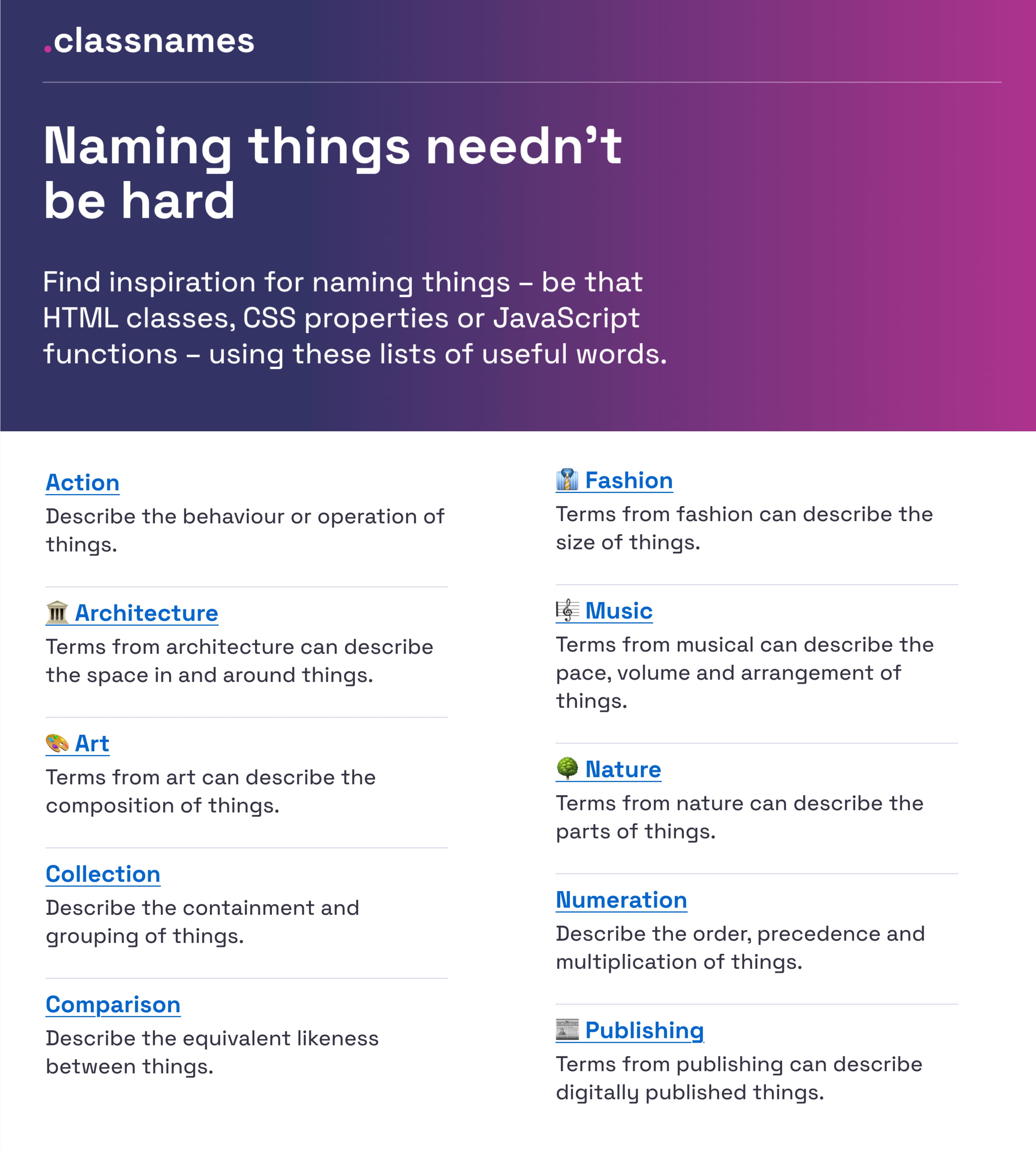
For HTML classes, CSS properties or JavaScript functions, Classnames offers thematically grouped lists of words intended to push you past the obvious. Terms cover behavior, likeness, order, grouping and association, alongside themed collections drawn from nature, art, theater, music, architecture, fashion and publishing.

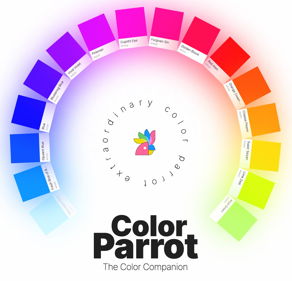
For colors, David Aerne maintains a repository of color names holding 30355 unique color names, sourced from various references and 1000s of user contributions. It ships with a color picker and name search and pointers to plenty of other color pickers.
Layers, groups and components
Javier Cuello's naming best practices describe how to name layers, groups, and components consistently and at scale. A good name, in his account, has a logical structure, is short, meaningful, known by everyone, and unrelated to visual properties. He sets out do's and don'ts and examines the details that matter when naming sizes, colors, groups, layers and components.
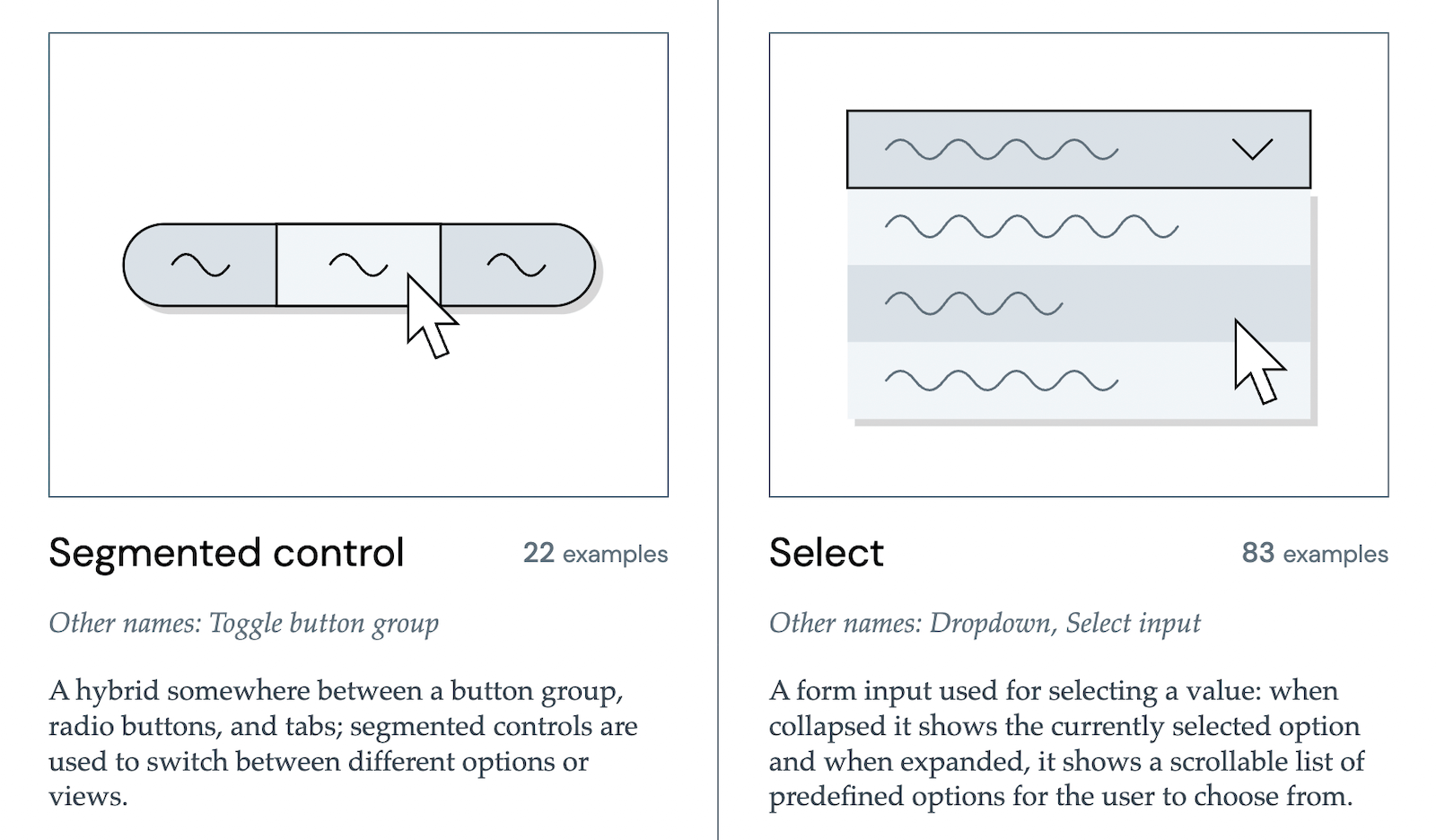
When what other people call similar things is the open question, design systems are a useful reference. Iain Bean's Component Gallery collects examples of more than 50 UI components — from accordion to visually hidden — and lists the other names those components go by.
Bonus: Name That UI, a visual dictionary of common UI components.
Design tokens
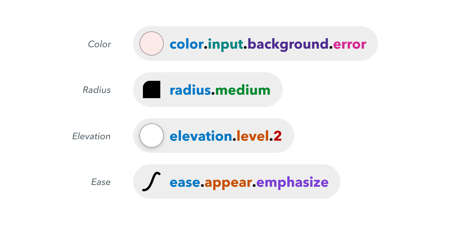
Intuit, parent of Mailchimp, QuickBooks, TurboTax and Mint, needed a flexible token system that went beyond the brand theme to serve as a foundational layer across a wide array of products. Nate Baldwin's case study covers the making of Intuit's design token taxonomy: the pain points of the old system, the criteria set for the new one, and how it was built.
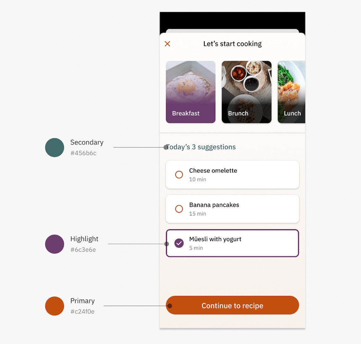
Romina Kavcic's design token naming guide works from how tokens function and how to name them well through to configuring your own naming structure around components, categories, states and roles.
Bonus: the Design Token Names Inventory spreadsheet gives a four-level structure and a bird's-eye view of every token, so rows, themes and modes can be added without losing track — and tokens can be filtered.
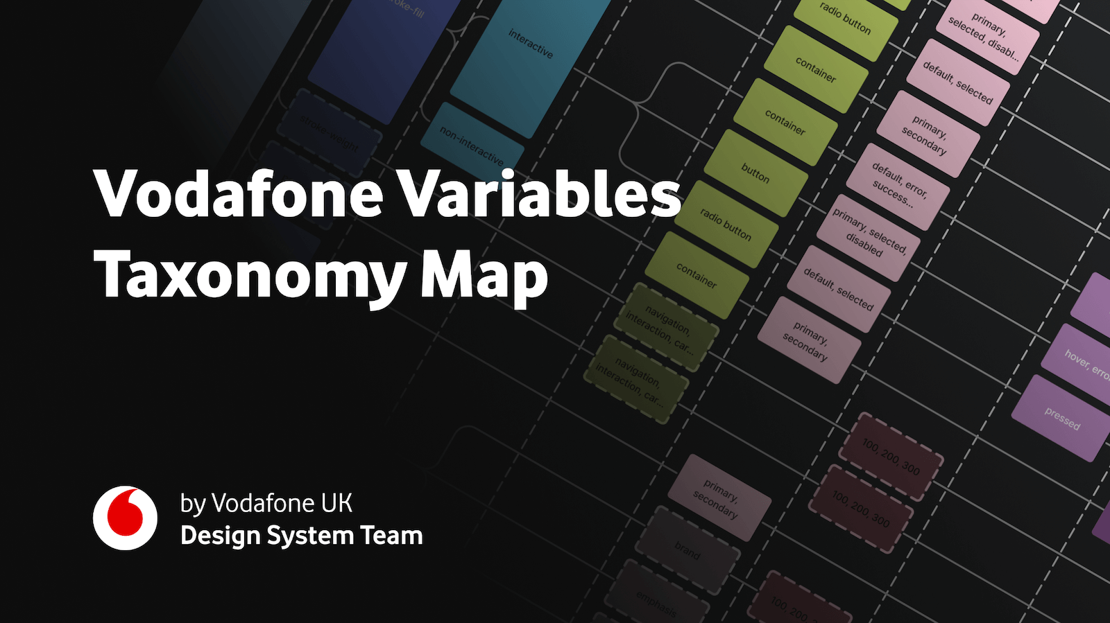
For multi-brand, multi-themed systems, the Vodafone UK Design System team's Variables Taxonomy Map breaks the anatomy and categorization of a design token into a system of collections. It lays out the four collections the system needs and the connections between tokens — from brand and primitives to semantics and pages — building on Nathan Curtis' work on naming design tokens so that a token's name alone reveals where it is used and what it represents. A wider list of Figma kits and resources covers further approaches to token naming.
Features and products
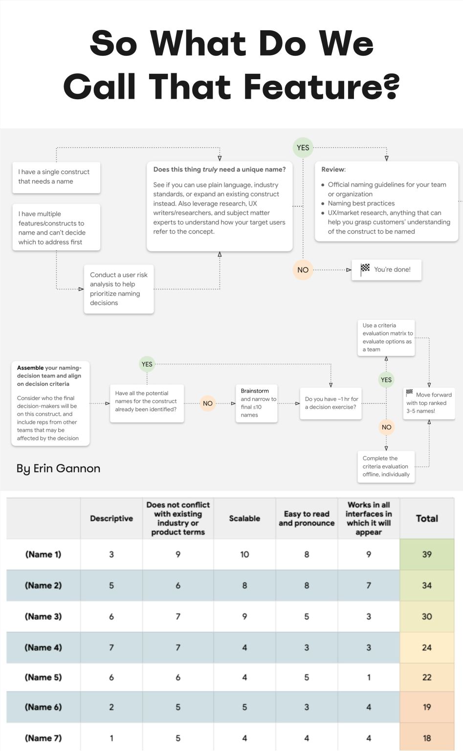
Low feature adoption frequently traces back to poor discoverability: a feature has to be discovered, then understood, then tried, learned, and finally folded into an existing workflow. Erin Gannon's practical guide addresses each step. Good names come from user needs and problems, signal the value or outcome of the feature (the job-to-be-done), and tap into the user's own language — so ask people to explain a feature in their own words and reuse their words.
For products and services rather than features, Onym is an open-source repository of naming tools and resources: brainstorming, vetting, guides, sprints, etymologies, cautionary tales, naming agencies and books.
Quick reference
- Naming buttons → NN/g on UI copy
- Naming classes → classnames.paulrobertlloyd.com
- Naming colors → parrot.color.pizza
- Naming design tokens → Intuit's design token taxonomy
- Naming features → Shopify Polaris naming guide
- Naming icons → Iconography guide
- Naming layers → goodpractices.design
- Naming products → guide.onym.co
- Naming UI components → component.gallery
- Naming UI behavior → namethatui.com
- Naming variables → Vodafone UK Variables Taxonomy Map and naming-cheatsheet on GitHub
- UI terminology → Moccu's naming convention framework
The right name is the one that is well-understood and used by both the team and its users. Time disappears into conversations where everyone means the same thing but speaks in a different dialect — the designer's, the developer's, the product manager's, the user's — and that is what produces frustration and confusion. Low adoption may be nothing more than a naming problem, and naming conflicts are worth capturing in a backlog of things to address later.