
“Intuitive” Is a Misnomer
Few phrases get thrown around in design meetings as casually as “intuitive.” Stakeholders ask for it, requirements documents demand it, and yet the term is almost impossible to pin down. Dictionary definitions describe intuition as a gut feeling — a decision made without conscious reasoning. That works for life decisions, but it doesn’t translate to interfaces.
What designers actually build when they aim for “intuitive” is familiarity. Users recognize a pattern because they have encountered it before, and that prior experience makes the interaction feel natural. Instinct has nothing to do with it.
Consider the hamburger menu. The first time a user sees those three stacked lines, nothing about them announces “menu.” Discovery happens through trial and error. Once tapped, the pattern is learned — not intuited. The same goes for the mouse. As Jeff Raskin, the founder of Apple’s Macintosh program, noted, the mouse is often called intuitive, but it is far from it. In the 90s, one of my Pagemaker students physically picked up a mouse and clicked it against the monitor when asked to press OK. Nobody would do that today, but only because we have all learned how a mouse behaves.
Even something as simple as a registration form presents a barrier. Most users know to tap a field and start typing because they have done it countless times. Someone less experienced may not grasp that basic interaction without explicit instruction. What feels obvious to one person is opaque to another.
Design Patterns Fill the Gap
Since true intuition is off the table, the practical alternative is design patterns: recurring solutions to common design problems. These patterns carry meaning because users have seen them before, which reduces the time and effort required to understand an interface.
The benefits are mutual. Users complete tasks faster, and designers avoid reinventing proven components. Time saved on familiar ground can be redirected to the parts of a product that genuinely need custom thinking.
Several patterns have become staples across the web and mobile apps:
- Password strength meters give users immediate feedback on whether their input meets requirements, offering instruction as they type.
- Wizards guide users through multi-step processes, showing progress, completed sections, and a clear next action.
- Calendar pickers let users select dates, though a text field should remain an option for efficiency. Picking a birth date can be painful if the year selector isn’t easy to reach.
- Form defaults pre-fill fields based on typical selections, such as travel dates and passenger counts, speeding up the process.
- Navigation tabs organize content into distinct sections while visually indicating where the user currently is.
Applying a pattern is rarely a matter of copy-paste. Context matters. A calendar widget that works well for booking a flight may need adjustment for selecting a date of birth. The underlying pattern provides the structure; the designer adapts it to the situation.
The Risk of Breaking New Ground
Design patterns solve the problem of familiarity, but what happens when the product itself is unfamiliar? Any novel design introduces a learning curve. Balancing innovation with usability is a genuine tension.
Validation is the main defense. Business outcomes need to be clear, user research must confirm market fit, and testing with the intended audience should validate the interaction flow. These steps don’t eliminate risk, but they reduce the chance of shipping something that confuses its users. Where possible, designs should allow users to customize their path so they can reach their goals even in an unfamiliar environment.
AI Changes the Equation
Emerging technology often forces new interactions, but it can also make existing ones more intelligent. Pinterest, for instance, uses AI to interpret search intent and deliver personalized results. A search for “vegetarian” no longer returns a flat list of results — the AI engine surfaces related topics as tags across the top of the page, enabling further discovery. Personalization of this kind has a measurable impact: according to Wired, 80 percent of users are more likely to make a purchase when their experience is tailored to them.
AI is also shifting users toward a more passive role. Tasks that once required manual action now happen behind the scenes. Email spam filters are the most familiar example. Google’s filters have relied on rules and AI for years, but recent advances allow the system to recognize and act on individual preferences, such as moving weekly newsletters the user never opens straight to the spam folder.
As AI continues to shape products and services, interfaces will likely keep evolving — not toward some mythical state of intuition, but toward environments that understand users well enough to anticipate their needs.
Voice First, Visual Always
Speech is humanity’s native interface. That’s why the biggest platform owners — Apple, Amazon, Google, and Microsoft — are pouring resources into natural language processing. The goal is an experience where you state what you need and the device handles the rest, ideally anticipating the request before you finish it.
Siri already gestures at this future, but Bill Stasior, Apple’s former Siri chief, is candid about the gap between the demo and the daily reality. Users still learn which phrasings work and which don’t, and that constraint is a design flaw, not a user flaw.
“I think everyone learns what commands work with the assistants and what commands don’t work with the assistants. And while that’s improving very rapidly right now, I think there’s still a long way to go.”
— Bill Stasior
Natural language processing has come a long way since Siri’s 2011 debut, but the next wave will be measured in mainstream adoption across health and education, not just novelty. Consider an elderly patient who needs care but not technical literacy. A spoken request could book a doctor’s appointment, or a bot could triage symptoms against a medical history. For someone dealing with isolation or mental health issues, a conversational agent could be a first line of support.
Consumer hardware has already normalized this interaction. The current crop of smart speakers puts a voice assistant in the living room, making speaking to software a default behavior rather than a demonstration trick.
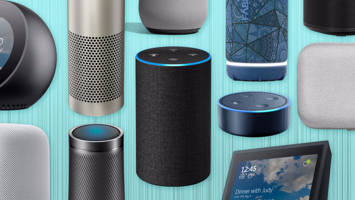
Yet a voice channel is still a designed artifact. Deloitte Digital’s work on conversational AI touch points makes it clear that removing the screen does not remove the design responsibility.
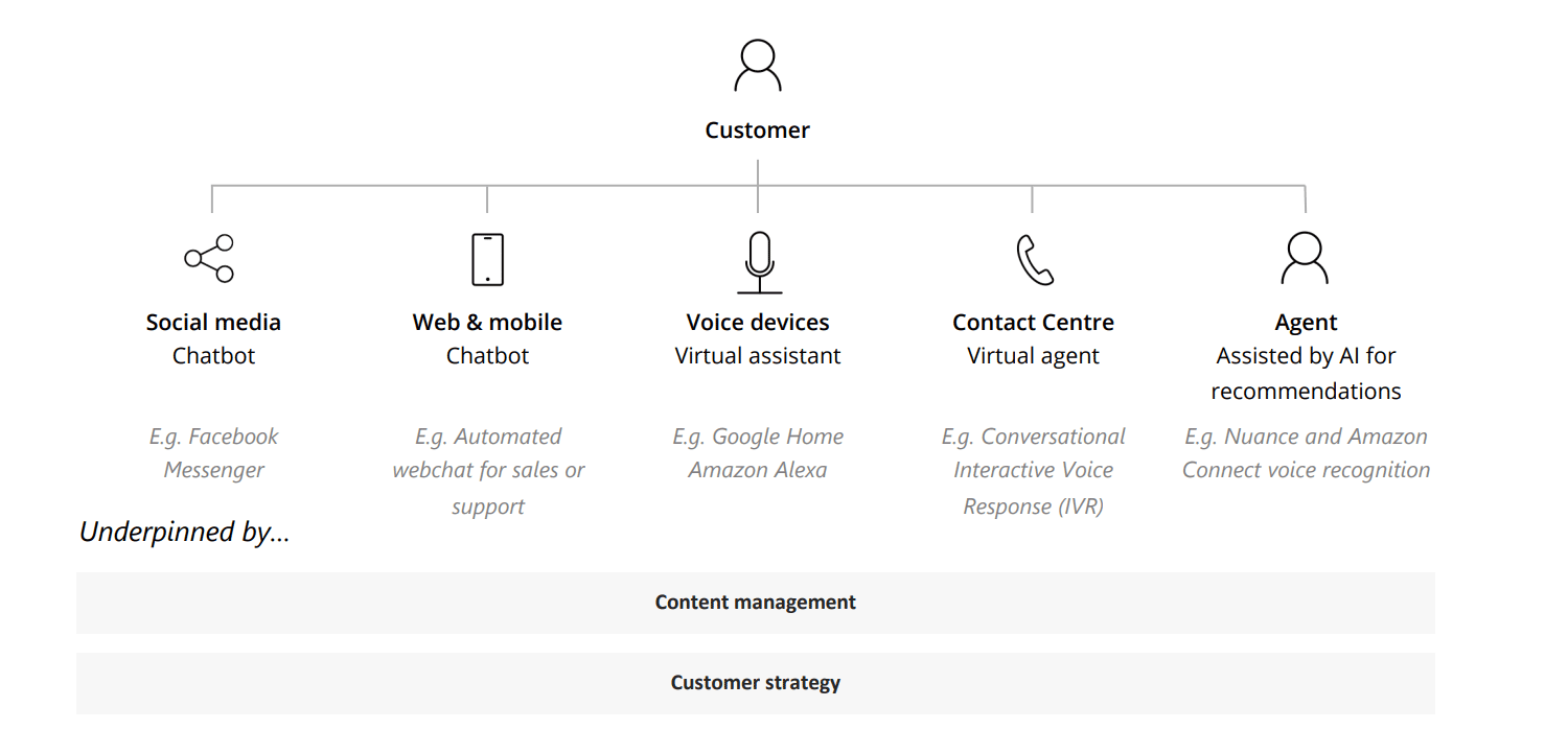
Deloitte’s guidance for voice design centers on a few practical constraints:
- Anchor on a specific business objective and define the measurable outcome.
- Plan for continuous testing and tuning — pronunciation varies by region, and the system must handle natural pauses and the emotional cues carried in pitch and pace.
- Design for the scenario at hand rather than trying to build a general-purpose conversationalist.
- Iterate relentlessly. Each pass can make the assistant sound more human if the underlying goal stays clear.
Why Screens Aren’t Going Anywhere
Does the rise of speech mean the end of the visual interface? The evidence from human perception says no. Visual processing remains dominant: the brain handles images tens of thousands of times faster than text, and the vast majority of information reaching the brain is visual. We are sight-first creatures, even when we voice our intent.
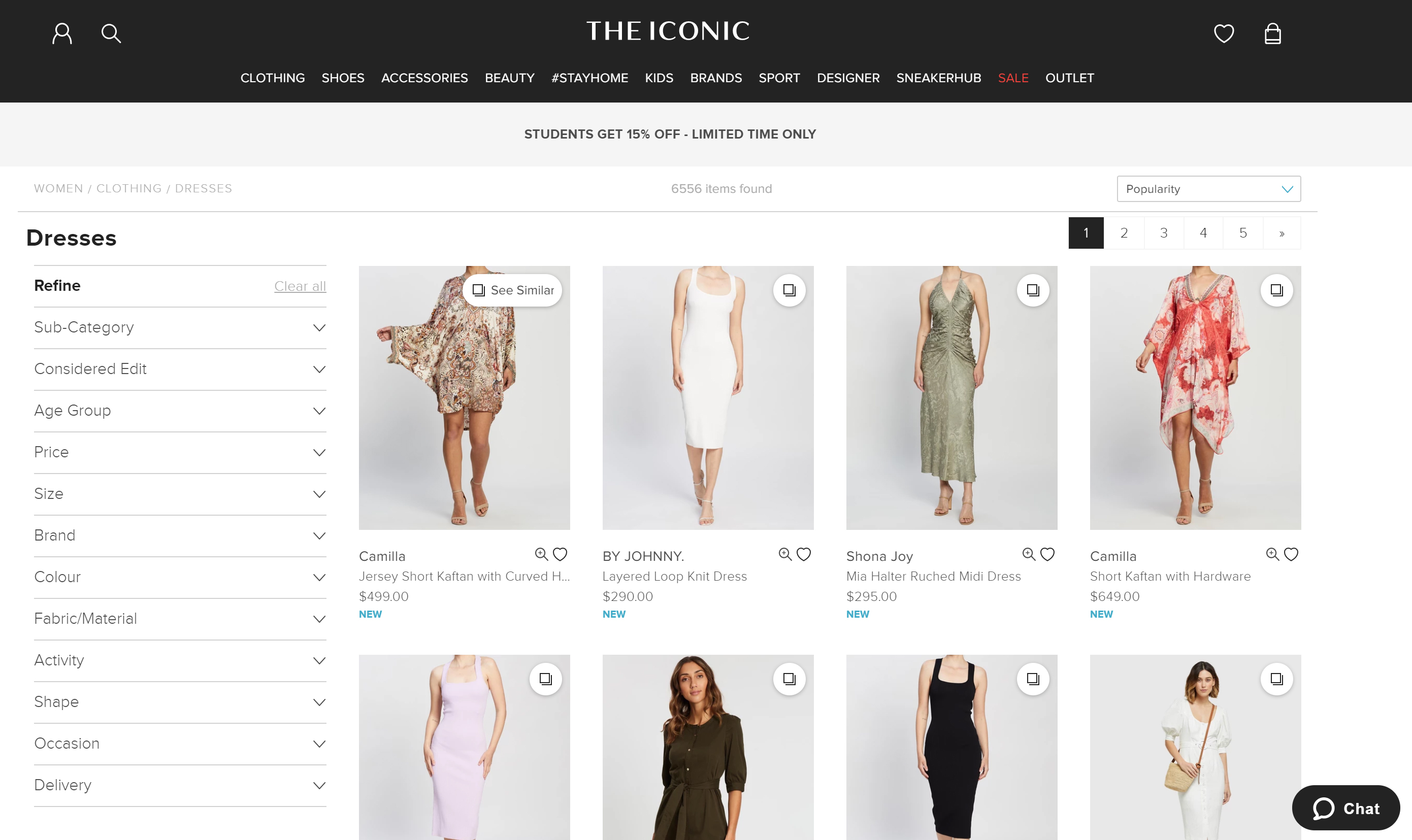
Try to imagine buying clothes by listening to a description. The item’s cut, color, and fit are fundamentally visual facts. A spoken query can get you to the search results, but you will still need to see them to decide. And when you don’t know exactly what you’re looking for — the browsing case — a list of spoken options is a poor substitute for a visual grid.
Designing in Three Dimensions
Augmented and virtual reality represent a different kind of departure from the conventional interface. AR layers digital content on a live camera view, while VR places the user inside a fully simulated environment. Both have found traction in education, retail, training, navigation, and health, and the field is young enough that design conventions are still being invented.
The shift is more radical than a new color palette. The design moves from 2D artboards to spatial composition, where depth, occlusion, and physical scale matter. Input changes too — gesture, gaze, and voice replace the pointer and the tap. Toptal’s designers working in this space emphasize that these are not just new tools but new ergonomics.

The retail example above is telling. Augmented reality lets a customer try on clothes virtually, solving a real problem without adding a new screen to the process.
The Design Work Remains
None of these advances — speech, AR, VR — erase the need for design, and none of them operate well in isolation. The likely pattern is hybrid: voice handles the request, a visual layer confirms the context, and a spatial layer lets you step into the outcome. What changes is the designer’s job. The goal shifts from crafting a screen to crafting a moment — but the discipline of testing, iterating, and validating against real user needs remains constant. The interface as a tool is likely to persist for decades; the design of that tool will just keep evolving. As speech recognition, virtual reality, and interfaces converge, the focus should stay on delivering experiences that work when users actually try them.


