

A Maintenance Workflow That Doesn’t Burn You Out
Running a design system as a solo maintainer is mostly about protecting your own time. The goal is to spend less of it answering questions in chat and more of it doing the actual work in Figma or code. Over the past few years, I’ve settled on a handful of practices that keep the system moving forward without turning management into a second full-time job.
Audit First, Then Plan
Unless you’re starting from zero, your design system probably didn’t begin as a clean slate. When I joined Karat, the company had two web apps — one customer-facing, one internal — sitting in the same repository alongside a shared design system package (KDS). Some styles and components came from KDS and were used by both apps; others were app-specific, and some were duplicated across both app packages and sometimes the KDS package itself.

Meanwhile, the Figma designs for the new look and feel were already in progress, with core elements and patterns defined through scenario exploration.

Instead of jumping straight into implementation, I spent the first two weeks auditing the apps, the codebase, and the new designs. That upfront investment paid off by revealing a logical rollout sequence and making the transition between the old and new interface much smoother. I wrote a tentative plan in Notion and made it visible to the whole company.
The plan had four pages:
- Progress: Universal — tracking foundations like colors, typography and breakpoints, plus shared components.
- Progress: Customer — tracking work for the customer-facing app.
- Progress: Internal — tracking work for the internal app.
- Other projects — smaller initiatives and future enhancements.

Making the plan company-wide changed the conversation. The vague question “When will the design system be done?” became the answerable “When will we be able to do X?” And crucially, I never treated the plan as fixed; priorities were expected to shift. It was just a rough draft and a place to track progress at a glance.
Short Updates Beat Fancy Release Notes
Half of design system work is implementation, and half is communication. If people don’t know what you’re doing, they can’t support you. The answer isn’t a heavy release-note page, though; it’s quick, regular updates in a channel everyone can see.
Set up a dedicated Slack channel — something clear like #design-systems, not an abbreviation only you understand. Make it public and post to it one or two times a week, never more. Each update should be at most a few bullet points, just a couple of lines each, easy to skim. Include screenshots (before/after, dos and don’ts work well), link out for details, and vary your posting schedule to catch different time zones. And use the update as a chance to thank the developer who helped implement a component or the copywriter who wrote the aria-label strings.

The mental blockers will come up. You’ll tell yourself nobody reads these updates or that everything you’d write is self-explanatory. Both doubts stem from the curse of knowledge — you live with the system daily, so it feels obvious to you, but most people have no idea what it involves. Even reaching five to ten people per post — possibly different people each time — grows awareness that wouldn’t exist otherwise.
If you’re in a deep work flow, don’t force yourself to stop and write. Finish one thing, and before starting the next, write a few lines. Morning works well if your mind is fresh. And remember, it’s not only about accomplishments; blockers and upcoming work are worth sharing. You never know who can help until you ask.
Keeping everyone informed also reduces interruptions. If your team doesn’t have to ping you to find out what’s happening, the fewer Slack pings you’ll receive. I used to maintain a separate release-notes page in Notion, inspired by the Carbon Design System changelog, but it was hard to keep current and nobody checked it. The short Slack updates accomplished the same goal for a small team. If a practice from a larger company doesn’t fit your context, let it go.
One Source of Truth for Documentation
Design systems exist to prevent duplicating components and styles, yet documentation itself often gets copied into multiple places. That leads to redundant work and, worse, discrepancies between sources that undermine trust. The fix is a single starting point — a simple design guide with an easy-to-remember URL.
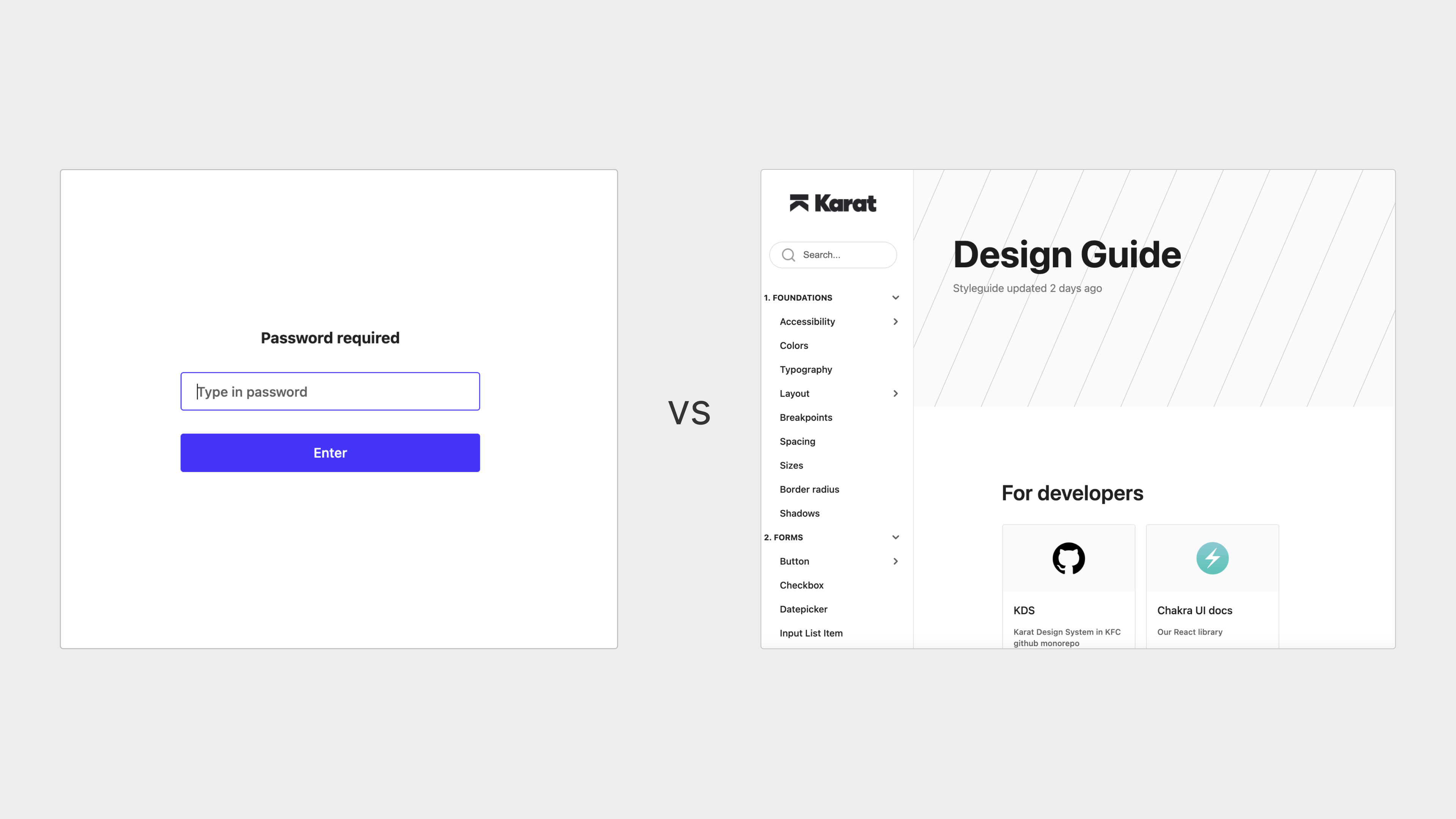
That guide should offer a rough overview of all styles and components, with links out to the tools your teams actually use. Designers get a link to the Figma component; developers get one to Storybook. You can use emojis to show state — an hourglass for in-progress work, a checkmark for complete. Keep general usage guidance in the guide, but leave frequently changing details like props and variants in their respective tools. If your company needs password protection on certain pages, pick a tool that allows it per page rather than protecting everything.

Then overcommunicate where the guide lives. Pin it in Slack, link it in every update and message. The biggest pain point for both designers and developers is knowing what’s available and where to find it. A minimal documentation site solves that with very little ongoing effort on your part.

Keep the Same Component Grouping Everywhere
While specifics don’t need to be duplicated, the high-level organization of components and styles should be consistent across tools. At Karat, we divide things into nine groups: Foundations, Forms, Navigation, Cards, Data Display, Feedback, Overlay, Brand & Media, and Composition. Each group contains two to nine components.

The contents inside a group may differ by tool — we have three table components in code but only one in Figma — but the group names and their order never change. That consistency makes it fast to switch between Figma, code and documentation, and those names hardly ever need updating.
Use the Component Library Your Developers Already Have
Most engineering teams rely on a component library — Chakra UI, Tailwind UI, Material UI, and similar tools are common. These libraries are usually well-documented and full of runnable examples. You don’t need to be a developer to benefit from them, though a basic familiarity with code helps.
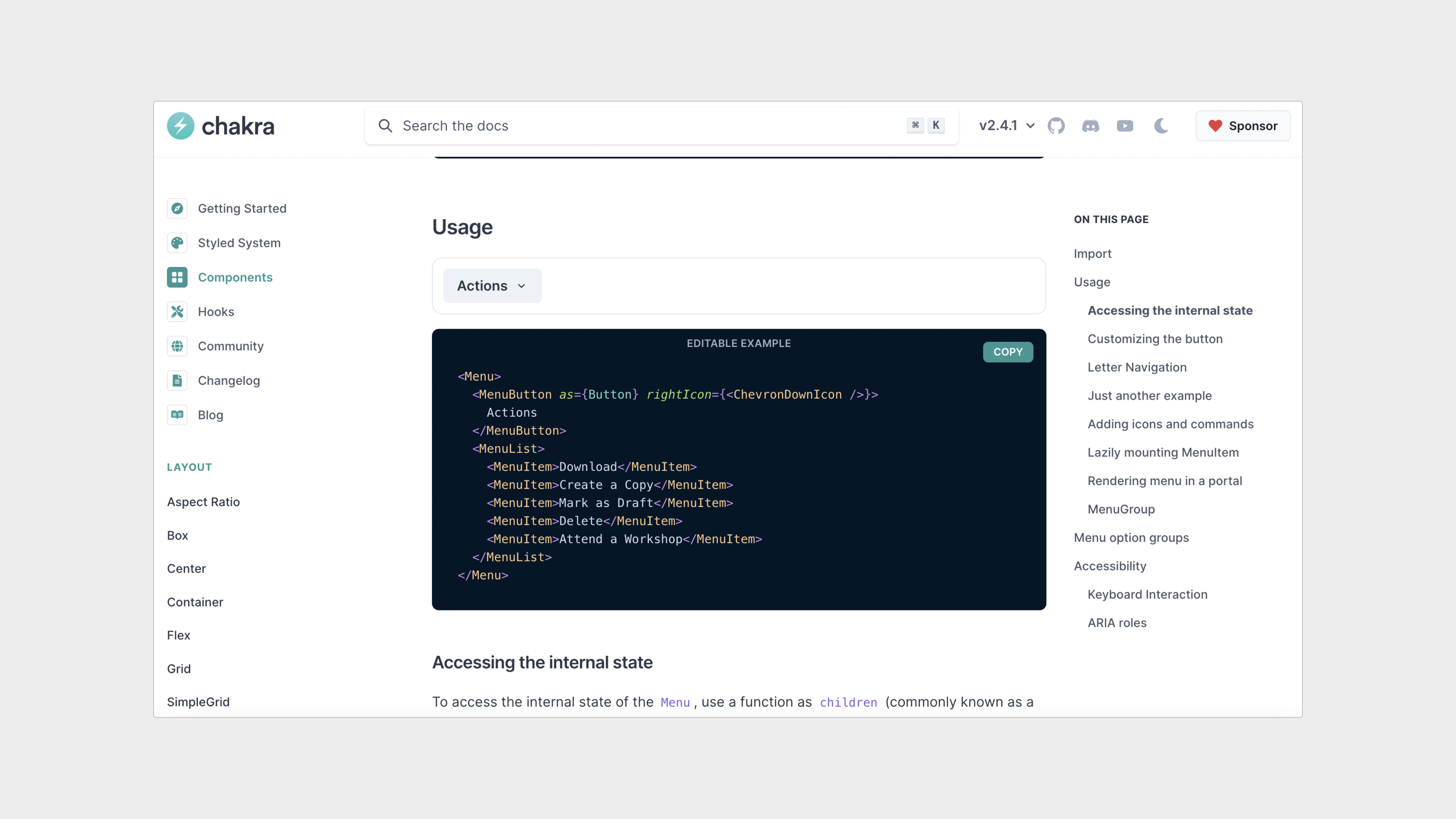
Basing your design decisions on the existing library saves you from deliberating over small details like how a component should look or behave. It also sidesteps the perennial naming debates: just adopt the library’s own naming conventions so the design and codebase stay aligned. Finally, your developers will spend less time implementing components that already match their tooling.
Here is a real-world example. The image below shows two filter menu components — one a designer’s Figma creation and the other pulled straight from the Chakra UI library:
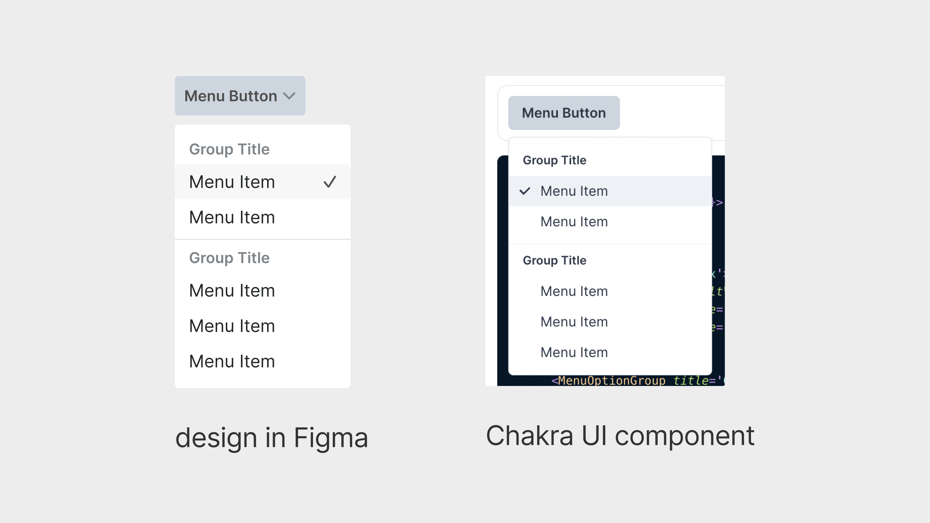
The designer had not thought much about where the checkmarks should sit and did not anticipate that the placement would create engineering friction. The developer, however, assumed the placement was intentional. They spent hours trying to replicate it, only to find the change was far from trivial. That led to a message to the designer, who had already moved on to other work and had little appetite to revisit this. Meanwhile, other designers had begun using the same component, dragging more people into the discussion.
The back-and-forth stretched across days before the component was finally updated — a disproportionate amount of time for a decision that did not warrant it. Referencing developer documentation from the start could have prevented the entire episode. Of course, ease of implementation should never trump user experience; the goal is to use the library as a starting point, not a constraint.
Remember Why You Build Design Systems
Spend some time writing down what draws you to design system work. For many, it is the way it removes repetitive tasks for both designers and developers, freeing them to focus on creative problem-solving and faster iteration. Your reasons may differ, but the underlying motivation is usually similar.
Having that clear purpose matters because it gives you something to hold onto when the work gets frustrating. Design system management can turn anyone into a control freak. With so much energy invested, it is easy to feel that success depends on universal adoption — and that mindset quickly leads to a restrictive environment rather than a freeing one.
Rereading, and occasionally rewriting, your stated purpose helps you approach friction with more calm. It becomes easier to recognize when to step back and tackle something more substantive. At the same time, it clarifies when you should push back. Knowing your deeper intent gives you the confidence to speak up because you are advocating for your team’s interests, not defending your own work.
Building a System You Can Sustain
Design systems work itself is often deeply satisfying — many of us get into a flow state while designing in Figma or writing code. But the administrative side, the organizing and communicating, does not disappear. A system no one knows about is a system no one uses, and it will quickly become obsolete.
Managing the system effectively means finding ways to spend less time on logistics and more on the work you actually enjoy. The strategies above are not meant to be followed dogmatically. Question any established practice, test approaches that feel unconventional, and only keep what works for you and your team.



