From HTML to Figma: Building a 1,400-Component Design Kit
Tailwind UI launched in early 2020 as a collection of over 400 responsive HTML components built on Tailwind CSS. Almost immediately, customers began asking for Figma files. By fall, the demand was impossible to ignore, so Tailwind Labs' Lead Developer David Luhr set out to build the official companion kit.
The scope was closer to a full design system than a typical UI kit. Over several months, Luhr created more than 1,400 Figma components and 10,000 distinct elements, all while keeping quality and usability in check. The key insight driving the project: when the Figma file itself is the product, the usual workflow flips. Instead of designing first and coding later, the final code components became the pixel-perfect standard that the design files had to match.
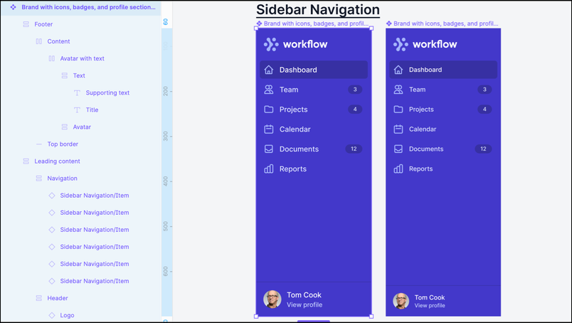
Naming and organizing layers for developers
Layer naming conventions matter more in a productized design file than in a disposable working file. Consistent names in Figma mean overrides survive when users swap instances or change variants. For example, a button component with a text layer named Text will carry custom copy over when switching from a small to a large variant. On complex components where users customize icons, headings, paragraphs, and links, that consistency saves real time.
Beyond naming, Luhr found that Figma's auto layout features, layout grids, and constraints could approximate HTML markup structure closely enough to be useful. Matching the stacking context of the web isn't perfectly possible — Figma layers stack top-to-bottom, not bottom-to-top — but a close approximation offers two benefits: designers and developers share a common mental model of what layout is possible in the browser, and customers can navigate similar architecture across both the design and code versions of a component.
This structural parity also surfaces patterns that might otherwise go unnoticed. Many Tailwind UI components share consistent responsive padding within a centered, max-width container. When the Figma layers reflect what HTML actually needs, developers can see that consistency and build a dedicated container to handle those repeated layout rules.
Variants keep the component count manageable
Well-structured variants make components far more adaptable while keeping the library lean. Instead of maintaining 80 separate badge components, Luhr built one Badge with variants for type, size, theme, and optional secondary elements. Users get an intuitive set of options rather than a sprawling collection of near-identical components.
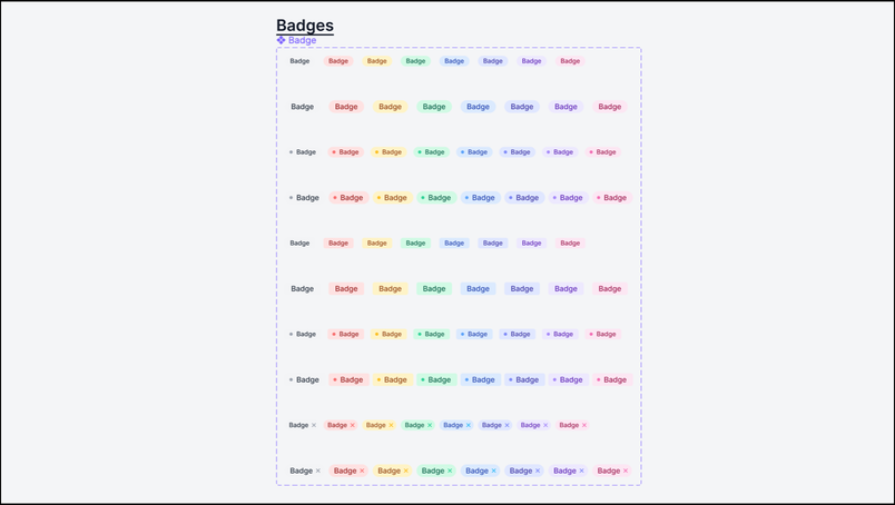
The same properties a developer would provide in a code component should exist as variants in Figma, using identical terminology. Across hundreds of final components, Luhr found six variant names covered the vast majority of cases: type, size, theme, position, breakpoint, and state. Variants are also effectively self-documenting — anyone can inspect a component, see its variations, and understand how settings map in the variants panel.
The math speaks for itself. The finished kit has 1,430 components with an average of seven variants each. Without variants, that would balloon to more than 10,000 components. Keeping the count near the roughly 400 code components customers actually use was a deliberate choice.
Auditing against screenshots
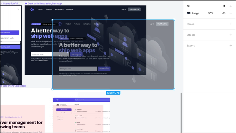
For pixel-perfect recreation, Luhr relied on Chrome Dev Tools' Screenshot Node feature. He captured images of each live component and overlaid them at 50% opacity on his Figma work. This caught visual inaccuracies quickly and even uncovered a few bugs in the original code components — inconsistencies that were then fixed on the website. Studying every component line by line paid off in both directions.
A showroom for the design kit
The Tailwind UI website displays every component in a responsive preview, letting users adjust viewport size and see how components adapt across Tailwind's defined breakpoints. Luhr wanted the Figma kit to recreate that showroom experience.
Every component was built at mobile and desktop breakpoints, made as flexible as possible with auto layout and layout grids. Each page in the kit mirrors a page on the website, with headings that link back to the corresponding code component. Pages contain only final components, displayed on example backgrounds that show context at the intended viewport size. Those backgrounds are themselves components, kept tidy in a locked group layer at the bottom of the layer list, so users can select components instantly without the backgrounds when they want to copy and paste into their own files.
All granular building-block components live on a dedicated Parts page. It can grow large, but auto layout and headings that back-link to relevant showroom pages keep it maintainable. Most users will never need it — but those who want a complete inventory have one.
Six lessons from building a design system at scale
- Start with foundations. Build the most granular components first — buttons, dropdowns, badges, avatars — and reuse them immediately to construct more complex pieces.
- Tackle the tough challenges next. Go after whatever seems most difficult, tedious, or unknown early. Luhr started with tricky tables, intricate description lists, and elaborate marketing sections. Solving the hard problems first reveals how to structure everything else and locks in naming conventions early.
- Polish as you go. Finalizing each component and page continuously made launch trivial. Luhr completed the final component on February 16 at 10 AM; the kit was announced and downloadable four hours later, with no QA scramble.
- Know when to rebuild. When Figma's new auto layout features and variants landed in November 2020, Luhr decided to completely redo months of work. A second pass is faster, and the result is more resilient and maintainable.
- Involve users along the way. Preview releases for existing customers provided valuable feedback on component features, naming, and organization. Luhr also livestreamed his building process so anyone could learn from the approach.
- Give back to the community. Tailwind UI is paid, but Tailwind Labs is deeply involved in open source. They released Figma Community files with Tailwind CSS styles, plus a free preview set of components for non-customers.
The design-code feedback loop
The project came full circle. Every Tailwind UI component started life as a Figma design, was developed into a code component, and was then recreated as a design component in Figma. That last pass revealed inconsistencies in the code that were fixed on the website immediately. Design informed development, which informed design, which informed development further — each loop polishing both sides. The result: more confidence than ever in both the design files and the code components.
A starter pack of the Tailwind UI Figma kit is now available on the Figma Community.


