Dark interfaces are back — and now they have standards
Dark mode has cycled from necessity to nostalgia to mainstream demand. Early monochrome CRT monitors rendered green text on black not by choice but by physics — the phosphor coating simply glowed green when struck by electron beams. When color CRTs arrived, they created white by activating red, green, and blue phosphors in unison, and with desktop publishing came the now-familiar convention of dark text on a white background, a trend carried into the earliest document-based web pages and later encoded in user agent stylesheets like Chrome's.
Display hardware has changed entirely since then. Backlit LCDs and energy-saving AMOLED panels now dominate, and computing habits have shifted with them. People browse, code, and game in dim rooms or in bed at night far more than in the era of desktop workstations. That shift has made light-on-dark interfaces appealing again — not just as a stylistic choice, but often as a practical or necessary one.
Why some users request dark mode
Surveys asking users why they prefer dark mode most frequently cite that it feels easier on the eyes, followed by aesthetic appeal. Apple's own documentation frames the light-or-dark decision as primarily aesthetic for most users, independent of ambient lighting conditions.
For others, dark mode functions as an accessibility tool. Users with low vision have historically relied on inverted color schemes — System 7's CloseView feature included a black-on-white/white-on-black toggle — but research by Szpiro et al. found that many low-vision users disliked simple inversion of full-color content. Apple's Smart Invert feature in iOS was designed with this in mind, reversing colors except for images and media. Meanwhile, digital eye strain is documented as a real cluster of vision problems tied to computer use, and blue light exposure at night is linked to sleep disruption. Dark themes don't eliminate blue light the way features like Night Shift or Night Light do, but they reduce overall brightness and irregular light output.
There is also a concrete energy benefit: on AMOLED screens, dark mode can reduce power draw significantly. Case studies of popular Google apps such as YouTube on Android measured savings as high as 60%.
Where users turn on dark mode
Dark mode support now ships in all major operating systems. On macOS X it appears as Appearance under General in System Preferences; Windows 10 exposes Choose your color under Colors. Android Q offers a Dark Theme toggle under Display, and iOS 13 has Appearance in Display & Brightness.
Users who enable these settings are expressing a preference not just for their OS chrome but for every app and site they visit. The web has a standard mechanism for respecting that preference.
The prefers-color-scheme media feature
Media queries let CSS conditionally apply styles based on features of the user agent or display device. Media Queries Level 5 extends this with user preference media features, which expose how the user would like content presented. The prefers-color-scheme feature tests specifically for light or dark theme preference.
It supports two values:
light— the user has indicated a preference for dark text on a light background.dark— the user has indicated a preference for light text on a dark background.
Serving dark and light themes without the overhead
Dark mode gives you only two states to work with—dark or light—and your loading strategy should reflect that. Users shouldn't download CSS for a mode they aren't using. To optimize load speed, split your styles so only the relevant theme reaches the critical rendering path:
style.cssholds generic rules used across the site.dark.csscontains only the rules needed for dark mode.light.csscontains only the rules needed for light mode.
Checking support and preferences at request time
Dark mode is reported through a media query, so you can check for browser support by testing whether prefers-color-scheme matches at all—without specifying a value:
if (window.matchMedia('(prefers-color-scheme)').media !== 'not all') {
  console.log('🎉 Dark mode is supported');
}
As of this writing, prefers-color-scheme is supported on Chrome and Edge from version 76, Firefox from version 67, and Safari from version 12.1 on macOS and version 13 on iOS (where available). For other browsers, consult the Can I use support tables.
At request time, the Sec-CH-Prefers-Color-Scheme client hint header lets servers pull the user's color preference so the right CSS can be inlined—avoiding a flash of incorrect theme before the page renders.
Conditional loading of theme stylesheets
The theme files are loaded conditionally using a <link media> query. For browsers that don't support prefers-color-scheme, a small inline script dynamically inserts a <link rel="stylesheet"> element for the default light.css file—light is an arbitrary choice here; dark could equally serve as the fallback. To prevent a flash of unstyled content, the page is kept hidden until that stylesheet finishes loading:
<script>
  // If `prefers-color-scheme` is not supported, fall back to light mode.
  // In this case, light.css will be downloaded with `highest` priority.
  if (window.matchMedia('(prefers-color-scheme: dark)').media === 'not all') {
    document.documentElement.style.display = 'none';
    document.head.insertAdjacentHTML(
      'beforeend',
      '<link rel="stylesheet" href="https://web.dev/light.css" onload="document.documentElement.style.display = \'\'">',
    );
  }
</script>
<!--
  Conditionally either load the light or the dark stylesheet. The matching file
  will be downloaded with `highest`, the non-matching file with `lowest`
  priority. If the browser doesn't support `prefers-color-scheme`, the media
  query is unknown and the files are downloaded with `lowest` priority (but
  above I already force `highest` priority for my default light experience).
-->
<link rel="stylesheet" href="https://web.dev/dark.css" media="(prefers-color-scheme: dark)" />
<link
  rel="stylesheet"
  href="https://web.dev/light.css"
  media="(prefers-color-scheme: light)"
/>
<!-- The main stylesheet -->
<link rel="stylesheet" href="https://web.dev/style.css" />
Architecting the stylesheets
CSS variables let a generic style.css stay theme-agnostic while all color customization lives in dark.css and light.css. Two core variables—--color and --background-color—define the baseline dark-on-light and light-on-dark palettes:
/* light.css: 👉 dark-on-light */
:root {
  --color: rgb(5, 5, 5);
  --background-color: rgb(250, 250, 250);
}
/* dark.css: 👉 light-on-dark */
:root {
  --color: rgb(250, 250, 250);
  --background-color: rgb(5, 5, 5);
}
In style.css, these variables are used in the body { … } rule. They are declared on the :root pseudo-class, which represents the <html> element with higher specificity, so the values cascade through the whole document:
/* style.css */
:root {
  color-scheme: light dark;
}

body {
  color: var(--color);
  background-color: var(--background-color);
}
Notice the color-scheme property in that sample, with the value light dark. This announces which themes your app supports, letting the browser apply its own user-agent adjustments—dark form fields with light text, theme-aware scroll bars, and a matching highlight color. The details are speced in CSS Color Adjustment Module Level 1.
From there, define variables for elements that matter on your site. It pays to name them semantically: rather than --highlight-yellow, prefer something like --accent-color, because the actual color may shift between modes. A few more examples from the demonstration app:
/* dark.css */
:root {
  --color: rgb(250, 250, 250);
  --background-color: rgb(5, 5, 5);
  --link-color: rgb(0, 188, 212);
  --main-headline-color: rgb(233, 30, 99);
  --accent-background-color: rgb(0, 188, 212);
  --accent-color: rgb(5, 5, 5);
}
/* light.css */
:root {
  --color: rgb(5, 5, 5);
  --background-color: rgb(250, 250, 250);
  --link-color: rgb(0, 0, 238);
  --main-headline-color: rgb(0, 0, 192);
  --accent-background-color: rgb(0, 0, 238);
  --accent-color: rgb(250, 250, 250);
}
Seeing it in practice and measuring the impact
A complete example implementing these ideas is available as a Glitch demo. Switch dark mode in your operating system's settings and watch the page react. Toggling and reloading also reveals the advantage of the media-query loading approach: the currently non-matching stylesheet is fetched at the lowest priority, so it never competes with resources the page needs right now.


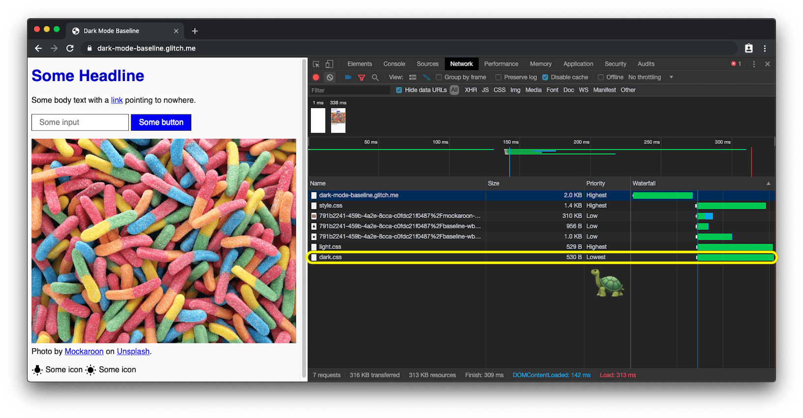
prefers-color-scheme loads the dark mode CSS with lowest priority.Responding to theme changes and updating the browser UI
Theme switches are regular media query changes, so they can be subscribed to from JavaScript. That lets you update the page favicon or the <meta name="theme-color"> that controls the Chrome URL bar color:
const darkModeMediaQuery = window.matchMedia('(prefers-color-scheme: dark)');
darkModeMediaQuery.addEventListener('change', (e) => {
  const darkModeOn = e.matches;
  console.log(`Dark mode is ${darkModeOn ? '🌒 on' : '☀️ off'}.`);
});
Since Chromium 93 and Safari 15, the theme color meta tag accepts a media attribute so you can supply distinct colors for light and dark; the first matching query wins. As of this writing, manifest-defined theme colors are not supported—see the w3c/manifest#975 GitHub issue.
<meta
  name="theme-color"
  media="(prefers-color-scheme: light)"
  content="white"
/>
<meta name="theme-color" media="(prefers-color-scheme: dark)" content="black" />
Testing dark mode without rebooting your OS
Emulation in DevTools
Switching the whole operating system's scheme to test a theme quickly grows tedious. Chrome DevTools lets you emulate the user's color preference for the current tab only: open the Command Menu, type Rendering to run the Show Rendering command, and change the Emulate CSS media feature prefers-color-scheme option.

Automated screenshots with Puppeteer
Puppeteer controls Chrome or Chromium through the DevTools Protocol. The dark-mode-screenshot script builds on it to capture a page in both dark and light modes—run it once or fold it into a Continuous Integration suite:
npx dark-mode-screenshot --url https://googlechromelabs.github.io/dark-mode-toggle/demo/ --output screenshot --fullPage --pause 750
Dark mode in practice: key techniques
Step away from pure white
One subtle but important detail in dark themes: avoid using pure white for text or surfaces. Pure white tends to glow and bleed against surrounding dark content. A slightly softened white like rgb(250, 250, 250) reads much more comfortably.
Re-colorize photos for dark mode
Beyond flipping the core theme from dark-on-light to light-on-dark, photographic images may also need attention. User research cited in the original post indicates that most people prefer slightly less vibrant and brilliant images when dark mode is active—a treatment referred to as re-colorization.
This can be achieved with a CSS filter applied to images. A selector that matches all images without .svg in their URL works well, letting you give vector graphics a different treatment than photos. Since re-colorization is only needed in dark mode, no corresponding rules exist in light.css. A CSS variable can be used to keep the filter configurable.
Because not everyone has the same dark mode preferences, the grayscale intensity can be exposed as a user preference and changed via JavaScript. Setting the variable to 0% disables re-colorization entirely. document.documentElement provides a reference to the root element, the same element targeted by the :root pseudo-class.
Invert icons and vector graphics instead
Research referenced in the post suggests that while inversion doesn't work well for photos, it does work well for most icons. For vector graphics referenced via <img> elements, a different re-colorization method applies. CSS variables determine the inversion amount for both the regular and :hover states.
These inversion rules only appear in dark.css, and the :hover intensity differs between modes so the icon appears slightly darker or brighter depending on the active theme.
Use currentColor for inline SVGs
For inline SVGs, inversion filters aren't necessary. Instead, the currentColor keyword—which represents the value of an element's color property—can be leveraged. When used as the value of the SVG fill or stroke attributes, it inherits its value from the surrounding text color.
This works for inline SVGs and for <use href="…"> references, allowing separate resources to still pick up the contextual color. Note that it will not work for SVGs loaded via an image src or through CSS.
Animating the transition between modes
Both color and background-color are animatable CSS properties, so the switch between light and dark can be smoothed with two simple transition declarations.
Art direction meets prefers-color-scheme
In general, using prefers-color-scheme inside the media attribute of <link> elements is recommended over inline usage for performance reasons. But art direction—where the designer decides which image best communicates mood or contrast for a given mode—is an exception worth making.
With the <picture> element, the media attribute on <source> children can switch imagery based on the user's color scheme preference. This allows, for example, showing a Western hemisphere image in dark mode and an Eastern hemisphere image in light mode or when no preference is set, with the latter as the default.
Give users an opt-out
For many users, dark mode is an aesthetic choice rather than a hard requirement. Some may prefer dark system UI but still want light web pages. A solid pattern is to respect the initial prefers-color-scheme signal while also allowing an optional user-level override.
The <dark-mode-toggle> custom element, built specifically for this purpose, adds a mode toggle or theme switcher that is fully customizable. Selections can even be persisted across page reloads, so visitors can keep their OS in dark mode while viewing a particular site in light mode (or vice versa).
Acknowledgements
The prefers-color-scheme media feature, the color-scheme CSS property, and the related meta tag were implemented by Rune Lillesveen, who is also a co-editor of the CSS Color Adjustment Module Level 1 spec. The loading strategy referenced earlier was devised by Jake Archibald, and Emilio Cobos Álvarez contributed the correct detection method. Timothy Hatcher pointed out the tip about referenced SVGs and currentColor. The post also thanks Lukasz Zbylut, Rowan Merewood, Chirag Desai, and Rob Dodson for their reviews, as well as the anonymous participants in the various user studies that shaped the recommendations.


