Focus Transitions: Building an Accessibility System for Slack’s Keyboard Users
Slack’s design system components are individually accessible, but keyboard and screen reader users still reported confusion when moving through multi-step flows. The root cause wasn’t a single broken widget—it was the transitions between them. When a user opens a thread, adds a reply, or deletes a message, each action should hand focus to the next logical element. If that handoff fails at any step, a non-sighted user is effectively stranded, unable to continue the workflow without restarting from the top of the app.


Why focus management is hard at scale
Achieving consistent focus movement across a large, evolving product like Slack means solving several interconnected problems:
- Context-dependent destinations: The same dialog can be opened from multiple buttons. When it closes, where focus goes depends on what the user did inside it. Pressing
Escmight return focus to the opener, while a different action might require focus to move to newly revealed UI. - React’s DOM churn: A state update can remove the currently focused element from the DOM. By default, focus then snaps back to the
, forcing the user to start over. Engineers must explicitly decide where focus should land on every state change. - Maintainability: Bespoke focus logic scattered across feature teams quickly bloats the codebase. As features evolve, these one-off solutions become hard to track, test, and update.
- User intent: The system must only move focus automatically if the user is actually navigating with a keyboard or screen reader—not a mouse user who happens to trigger the same action.
These constraints made a centralized, reusable system essential rather than optional.
A feature-agnostic coordinator
The solution is a React component called FocusTransitionManager that wraps the entire application. It uses the React Context API to control a central store, acting as a broker between two groups: components that want to move focus, and components that are ready to receive it.
Instead of passing refs directly, the system borrows the browser’s pattern of unique identifiers. Every component participating in the system registers a unique key—referred to as its focusKey. A sender announces a request to move focus to a specific focusKey, and the matching receiver component listens for that request.

The team recommends placing the focusKey on the component that holds the refs that will consume focus, so it can call ref.focus() directly when the request arrives. An internal naming convention prevents duplicate focusKey values across the app.
How the API works
The FocusTransitionManager exposes two primary methods. The sender initiates a move:
transitionFocusTo({ focusKey })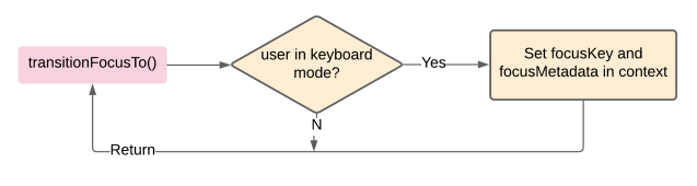
The receiver component checks whether the incoming request matches its own focusKey:
shouldTransitionFocus({ focusKey })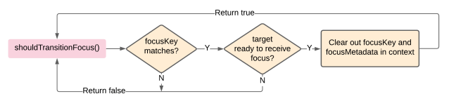
If the match succeeds, the manager immediately clears the pending context data, and the receiving component proceeds to call ref.focus().
For a simple A-to-B move, that’s sufficient. Real apps demand more flexibility, so the API extends with a few key parameters:
focusMetadata: A blob of additional data sent by the source to help the receiver decide precisely where to put focus within itself.
transitionFocusTo({ focusKey, focusMetadata: {} })For instance, a sender may want to focus a specific message in a long list rather than the default position, or target an element identified by a pseudo-selector-like value:
focusMetadata: {
		channelId: '{channelId}',
 		msgTimestamp: '{msgTimestamp}'
    }
focusMetadata: {
selector: 'lastVisibleMessage'
}forceFocus: A boolean that overrides the “keyboard user” gate. This is necessary for cases like the composer view opening—focus must always go to the message input, regardless of input device.
transitionFocusTo({ focusKey, focusMetadata, forceFocus: true })additionalCondition: Used by the receiving component to signal it isn’t ready for focus yet. A thread still loading its replies, for example, will defer focus until the content is available before itsshouldTransitionFocuscheck returns true.
shouldTransitionFocus({ focusKey,
    additionalCondition: () => this.state.replies.length})
{
    // Set focus using ref.focus() on the first reply
}
The manager also hardens itself against edge cases. Every request is bound to a timeout: if the target isn’t found within a few seconds, the context resets to defaults. To prevent race conditions, the manager always prioritizes the request already in progress, ignoring new requests until the active one completes.
Detecting keyboard mode
To know whether to move focus at all, the system relies on internal heuristics. It considers a user to be in “keyboard mode” if they are using a screen reader, or if a focus event was immediately preceded by a defined set of keys—such as Tab or the arrow keys—indicating keyboard-driven navigation.
Impact across the platform
The centralized approach paid off quickly. Within a couple of months, FocusTransitionManager was integrated into over 100 user flows. Its most significant adoption point was the site routing layer. When a URL change loads a new view, the router can parse the view’s associated focusKey and transition focus to the most probable next action with a single line of code:
transitionFocusTo({ focusKey: getFocusKeyForView(viewId)})When the primary view loads the composer, its primaryViewId matches the composer’s key, which then automatically focuses the input field—the expected next step. This pattern now scales across other primary sections of the layout, including Channels, All Threads, All Unreads, and Files.
The system also made its way into the core design system. The Modal component, for instance, now uses it to guarantee that focus returns to a reliable location after the modal closes. As a result, every menu, popover, and modal across Slack benefits from predictable focus movement, regardless of which feature team built the surrounding UI.
The broader lesson from this project is that accessibility improvements become scalable when they are treated as central infrastructure. By building a reusable “Accessibility Systems” layer, Slack’s designers and developers get reliable behavior without reinventing implementation details for each feature. The company is continuing to invest in this infrastructure to make accessibility features consistent across the entire product.


