From Broadsides to Badge Listings: How the NPS App Reimagines the Unigrid
Designing a digital experience for an organization that manages 431 vastly different locations is a problem of scale. The National Park Service (NPS) oversees everything from Yosemite's granite walls to the one-room Thaddeus Kosciuszko National Memorial in Pennsylvania. To help visitors navigate this diversity, the NPS launched a unified app in 2021, developed by studio GuideOne. The challenge was moving away from the separate, park-specific apps developed since 2016 and creating a single system robust enough for such a wide range of sites.
GuideOne founder Juan Sanabria notes the inherent difficulty in unifying the parks' content: many individual parks control their data and narratives. Collaborator Kevin Twohy of Twohy Design Works adds that government software must be durable and accessible for a wide range of users. Their solution for charting a path forward was not a new invention, but a translation of a famous design system from print—Massimo Vignelli's Unigrid System—reinterpreted as a flexible template for a digital interface, with Figma streamlining the flow of feedback between the NPS and the development team.
Reducing Routine Decisions
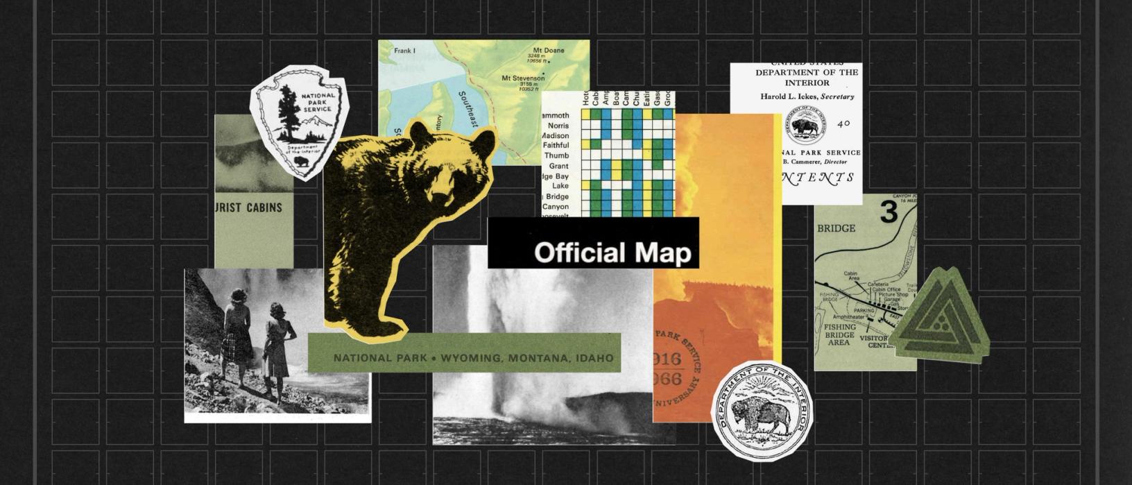
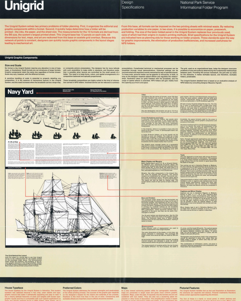
Before 1977, NPS brochures lacked a cohesive identity. The federal government's push to modernize design standards in 1972, through programs like the Federal Design Improvement Program, set the stage for the NPS to commission Vignelli. His challenge was to create a system that was both efficient to produce and instantly recognizable.
The resulting Unigrid System standardized everything from the house typeface and color palette that follows the NPS's signature burgundy, to map treatments and illustration principles. Instead of using fold lines, it relied on an underlying grid to organize content on a broadsheet, which defined 12 panels per side. This allowed designers to arrange text, images, and maps in scalable, harmonious compositions. The system was so effective it won a Presidential Design Award, specifically cited for "fulfilling the primary objective of a design system, reducing routine decisions so that effort can be concentrated on quality." For the Unigrid, these content modules act as design system components, a concept translated directly into the app's architecture.
A Template for the Giant and the Small
Sanabria and Twohy needed a structure that could serve basic amenities and details for any location, while also accommodating special features like self-guided tours and AR experiences. As Twohy explains, the vast difference in content scale between the largest and smallest parks demanded a system flexible enough to "flex across all of them." The app uses a responsive grid that lays out full- and half-size tiles depending on what content is available, ensuring that pages always feel balanced and design consistency is maintained without requiring each park's staff to create their own layouts.
The Acadia National Park page, for example, is populated with a map and its historic carriage road bridges. In contrast, the page for the Thaddeus Kosciuszko National Memorial—which has far more limited staffing and programming—uses the half-size tiles to make the page feel fuller, with nothing sparse. On the iPad, these two columns reflow into three. This templated approach prioritizes consistent, polished design over bespoke layouts, even when a park has scant content to offer.
Wayfinding in Two Modes
The app's core navigation mirrors the classic brochure's split between visual maps and text-based services. Each park page features a floating action button on mobile, which lets users switch to a map view at any time. Whether browsing where to go or what to do, users can choose between a list-driven flow or a more visual map mode. As Sanabria explains this dual support for spatial vs. list-based, map-reading preferences, they can complete the experience with download options for offline maps—a useful add in areas with scarce cell service.
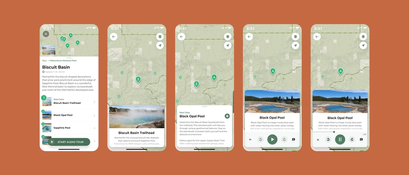
In planning stages, users can browse by activity theme, like hiking or stargazing, and save featured spots. On-site, there are self-guided walking tours that include informational exhibits, and in some locations, audio narratives. This extends the traditional ranger-led experience, but adapts the map content adapted from the Unigrid brochures and illustrated by NPS cartography.
Real-Time Communication
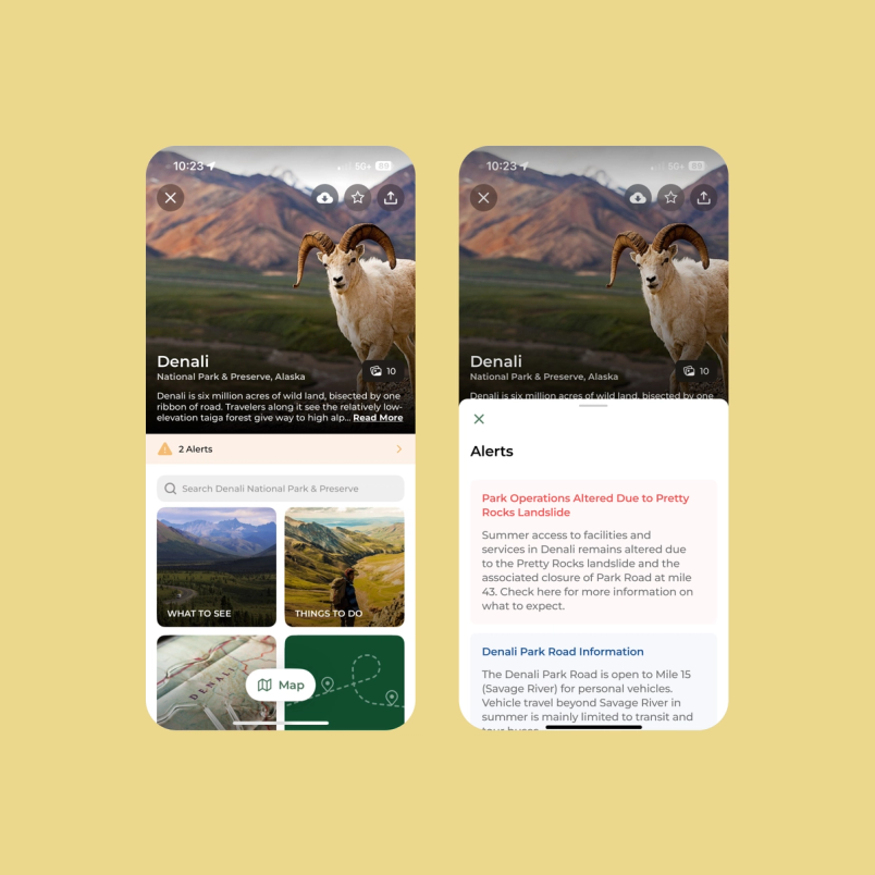
While park brochures disseminate static information, the app delivers alerts in real time, from bison warnings to immediate flash flood notifications. This dynamic callout can be updated instantly, doing away with the need for reprinting. The developers continue iterating on how alerts are surfaced, from a potential floating alert button to a dedicated alert tile on the home grid.
Experiential Layers
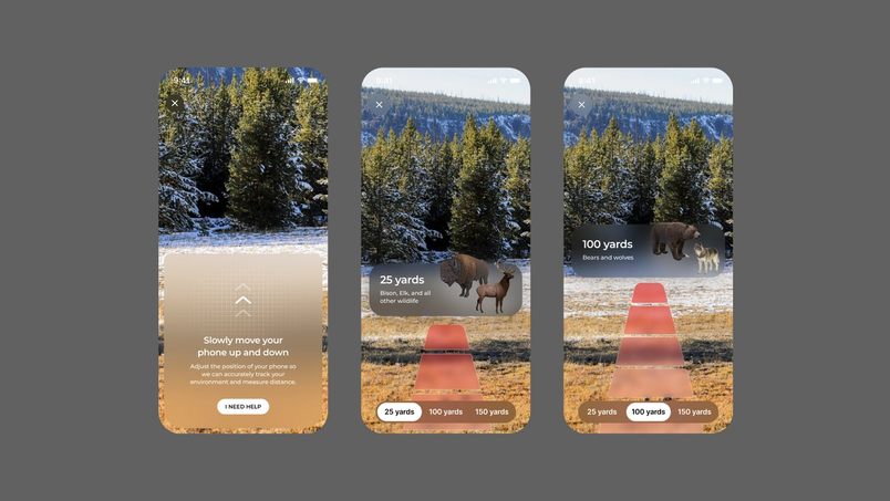
New AR experiences go beyond what a physical brochure can provide. At locations where the historical landscape is no longer visible, like the Antietam National Battlefield where troop movements occurred over what is now open fields, or a future project where visitors point their camera at Independence Hall to see the signing of the Declaration of Independence, AR adds context that is otherwise intangible. The app even supports collector culture by showing the passport ink stamp designs for each park, so enthusiasts can see them virtually.
Low-Fidelity Start, High-Fidelity Results
Sanabria and Twohy use an ideation loop that begins in FigJam since the project benefits from constant communication with the NPS team, who suggest new features and iterate on ideas. Messy sketches and notes about new capabilities are dropped in a FigJam whiteboard, influenced by a data feed the parks are always updating. Sanabria appreciates how Twohy seamlessly transitions a project from the messiness of exploration into a more formal design file.
Twohy finds prototyping pivotal for exploring design transitions, even with a prototype that doesn't represent the full picture, since it conveys the behavior in motion. Prior to using Figma for this workflow, a prototype request would take too long and would result in his sending static screenshots instead. The new process makes sharing designs for easier review with team members simple, without spending time managing file versions.
Even if you’re only 20% done with a design, you can still make a prototype in Figma that feels 90% done.“Even if you’re only 20% done with a design, you can still make a prototype in Figma that feels 90% done.”
What’s next for the NPS app
Ongoing user research led by the NPS will continue to shape the app’s evolution, particularly around how visitors use it before, during, and after their trips. One early assumption—that most users began their trip planning on the web and only switched to the app once at the park—turned out to miss a key segment. Younger visitors rely entirely on the mobile experience from the start. In response to frequent requests, the team is preparing account creation features that will let users save favorite places, tours, and photos.
The unigrid brochure system has long been a touchpoint between visitors and park staff. The NPS app builds on that legacy, aiming to draw a broader and younger audience into experiencing and preserving the country’s cultural and natural heritage.