

Finding Creative Freedom in the Everyday
In a design landscape dominated by interface refinement and UX simplification, the most rewarding creative challenges often hide in the least glamorous briefs. While big-brand work carries an undeniable allure—logos in a portfolio are good for business—tight brand guidelines frequently leave little room for experimentation. The projects that truly allow designers to add value and express themselves are often the ones dealing with decidedly unremarkable subjects.
Studying the careers of distinguished Swiss and Italian designers reveals a powerful lesson: the mundane offers exceptional opportunities for visual storytelling. The challenge lies in using images, layout, and typography to create distinctive messages for products and services that others might overlook.
“I do not attempt to speak on behalf of the machines. Instead, I have tried to make them speak for themselves, through the graphic presentation of their elements, their operations and their use.”
— Giovanni Pintori
Designers Who Made the Ordinary Iconic
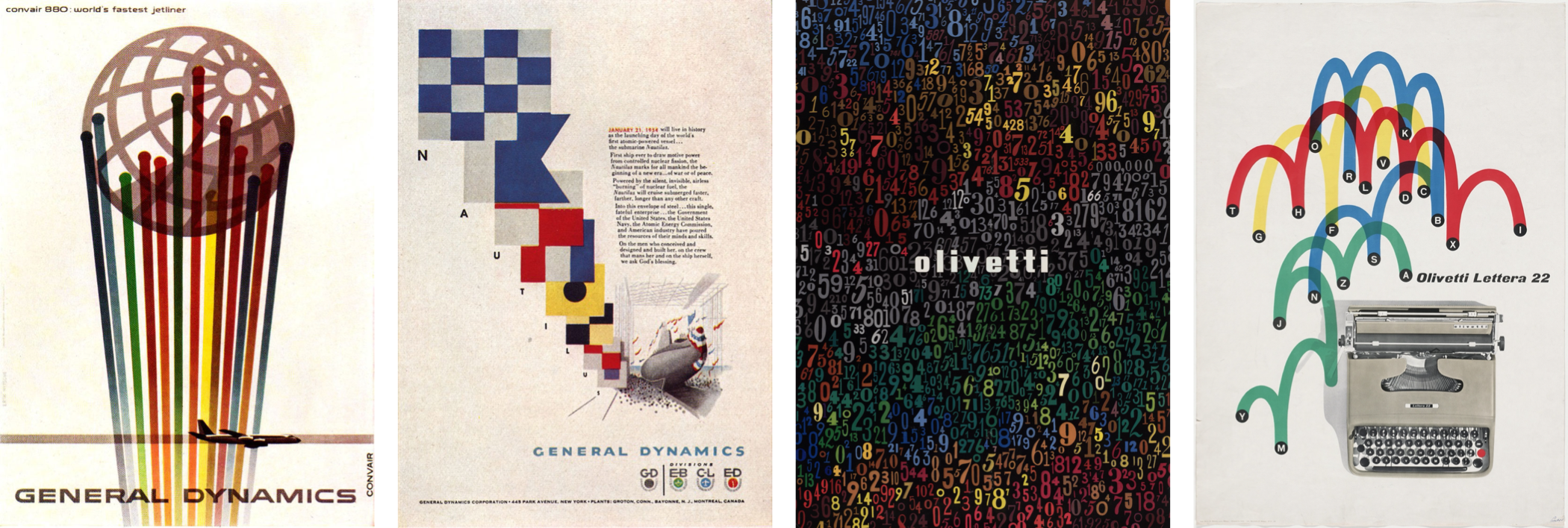
Even the most celebrated design figures spent significant portions of their careers tackling everyday subject matter. Erik Nitsche, after relocating from Switzerland to the United States, worked for magazines including Harper’s Bazaar, Life, and Vanity Fair. Yet his most recognized work emerged during his five years as art director at aerospace and defence company General Dynamics.
At General Dynamics, Nitsche developed a comprehensive information design system that shaped annual reports, posters, and technical documentation. The system culminated in Dynamic America, a 420-page book chronicling the company’s history. This work transformed a defence contractor’s communications into a landmark of corporate design.
Italian designer Giovanni Pintori took a similar path at Olivetti. Over 31 years, his simple style and geometric shapes applied to advertisements, calendars, and posters became the visual vocabulary for the business products manufacturer. His approach gave machines and office equipment a compelling, human voice.
Lessons From Max Huber
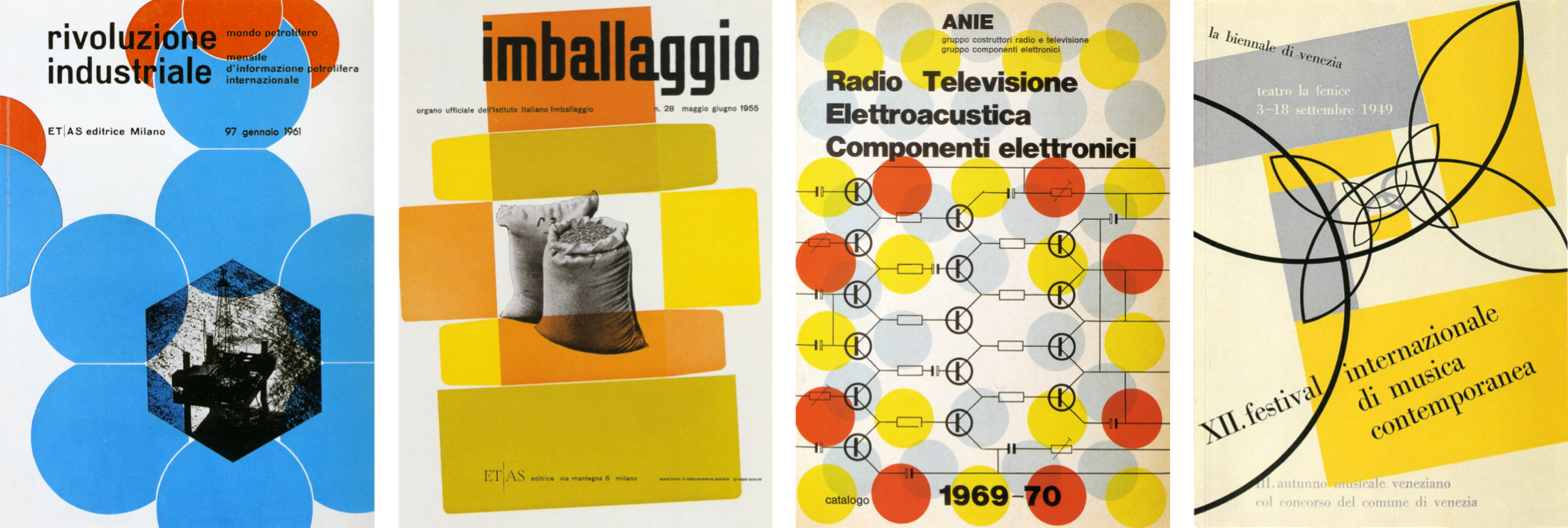
Swiss-born Max Huber, who spent most of his career in Italy, followed the same trajectory. While his portfolio includes work for many leading Italian brands, his food labels and wrapping paper designs for La Rinascente supermarkets remain particularly fascinating. Here was a designer applying sophisticated visual thinking to grocery packaging—hardly the stuff of glamorous creative briefs.
What these three designers demonstrate is that a subject’s apparent ordinariness does not limit its creative potential. The most unexpected projects can yield the most satisfying work when approached with curiosity and craft. That principle holds true whether the client is a multinational manufacturer or a local supermarket chain, and it remains a valuable reminder for any designer seeking meaningful work in an industry that often prioritises the polished over the provocative.
Max Huber’s Lasting Influence on Swiss Design
Max Huber stands among Switzerland’s most notable designers, though his name may not be as widely recognized as his contemporaries. Born in Baar in 1919, Huber worked across Switzerland and Italy until the end of the Second World War.
His time in Milan, where he worked at Antonio Boggeri’s studio, shaped his distinctive approach: a willingness to blend illustration, photography, and typography. Between 1950 and 1954, Huber designed for La Rinascente, a high-end department store chain, earning the first of his Golden Compass awards in 1954. Milan’s status as the center of Italy’s avant-garde in the 1940s exposed Huber to artists, designers, and intellectuals whose ideas he absorbed—not at face value, but through his own experimentation.
Huber manipulated photographs, cutting subjects from backgrounds and mixing them with blocks of color and shapes. His poster designs for Monza Autodromo demonstrate this energy through colorful strips that suggest movement and speed. He frequently combined flat geometric shapes—arrows, circles, swirling patterns—with monochrome and duotone photographs, as seen in his record covers and jazz collection cases.
Typography was a less celebrated but equally inventive part of Huber’s work. He moved comfortably between modern serifs and contemporary sans-serifs, defying the strictly typographic Swiss style’s association with Neo-grotesque typefaces. Huber structured grids to highlight text alignment, keeping a clear hierarchy with large headlines, yet he was willing to set type at odd angles and play with perspective.
From the 1960s until his death in 1992, Huber worked on various commissions, including a brand redesign and the wallpaper design “Rhythm,” featuring Louis Armstrong. His client Oscar Braendli commissioned exhibition designs, and Huber approached every project, including work for Adriano Olivetti, with the same enthusiasm for experimentation. These long-term relationships with discerning clients show how trust and collaboration can yield designs that last for decades.
Huber’s signature elements—bold color blocks, iconic shapes, manipulated photographs, and strong typography—may have remained consistent, yet his portfolio represents remarkable variety. In his later years, he taught graphic design in Lugano and Mendrisio, where he died in 1992; a museum in Chiasso is dedicated to his work. The book Max Huber (2006), by Stanislaus von Moos, Mara Campana, and Giampiero Bosoni, is the sole comprehensive catalogue of his career and those who knew him personally.
The Evolution of Classic Typeface Classifications
The evolution of type design often tracks technological progress, much as we follow the effect of new CSS capabilities on web design today. The earliest printed letterforms were modeled on handwriting—these are known as Humanist typefaces. With the refinement of steel punchcutting in the fifteenth century, type became more precise, allowing designers to create what are now called Old style typefaces.
While Humanist typefaces often have a lowercase “e” with a slanted crossbar, Old style faces use a horizontal one. The stress of a typeface—the angle between the thinnest parts of a letter—remains diagonal in both, though Old style adds more contrast between thick and thin strokes. Bracketed serifs, with curves smoothly joining them to stems, are common. Baskerville, designed in the 1750s, and Garamond-style faces, including Monotype Garamond, remain popular in print and have spawned modern interpretations.
An Age of Reason and Transitional Type
The 17th-century Age of Enlightenment prompted a rejection of traditional forms, and by 1692, Louis XIV requested a typeface designed on scientific principles rather than calligraphy. Romain du Roi, based on a grid of 2,304 squares, featured higher contrast between strokes. This precision from subsequently refined steel engraving approached what became Transitional type, as exemplified by John Baskerville, Giambattista Bodoni, and William Caslon—designers whose work distanced itself from calligraphy. Transitional faces generally have vertical stress with more horizontal serifs on ascenders and ball terminals at stroke ends, though differing levels of contrast exist. Cambria, by Jelle Bosma, came in 2004 from Microsoft’s ClearType Collection, and Georgia was released a decade earlier. Mrs Eaves, named for Baskerville’s wife, is a modern interpretation from 1996.
Modern Type and Its Highs and Lows
The classification labeled “Modern” first appeared in 1784 at the hands of Firmin Didot, culminating a progression from earlier heightened-contrast designs. Giambattista Bodoni built his brand on abrupt, high-contrast strokes with sharp, unbracketed serifs and vertical axes. These Didone faces often also feature small apertures in forms like the lowercase “a.” While frequently used for fashion mastheads due to their elegance, the same characteristics—extreme contrast, condensed apertures, and vertical stress—can convey personalities as varied as contemporary identity designs.
Slab Serifs for Maximum Impact
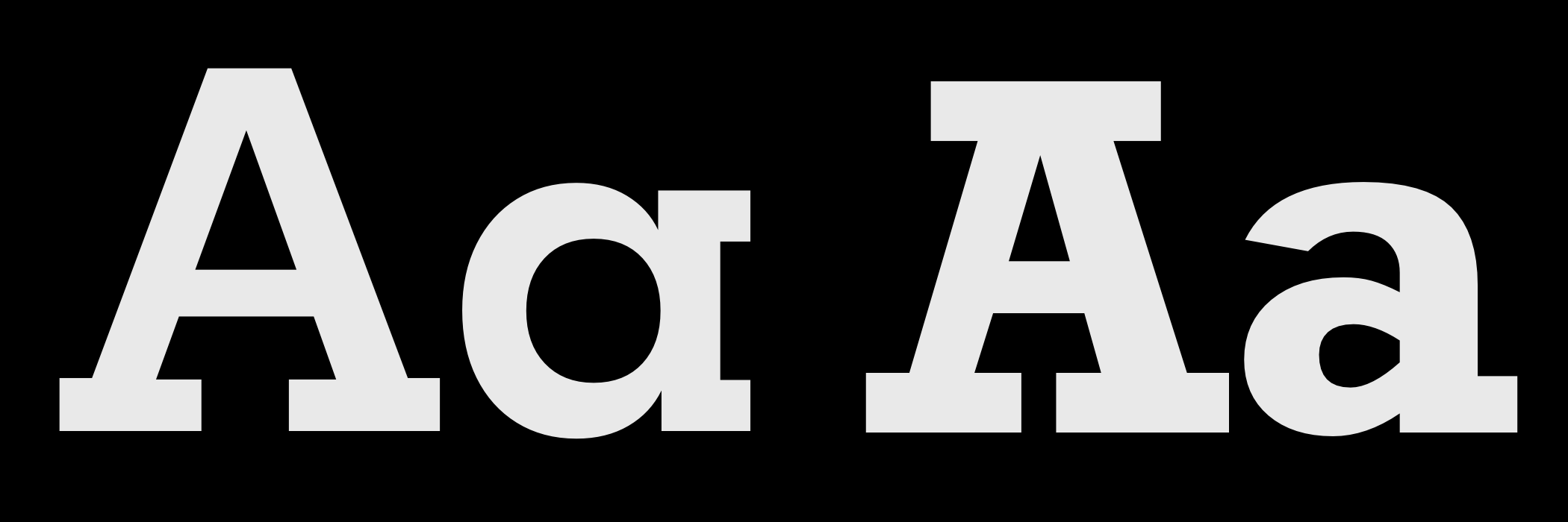
Early in the 19th century, the first Slab serif typefaces appeared in advertising posters, designed to break through visual noise with their blocky shapes. An uneased, 90-degree joint between a serif and stem distinguishes this frequently unbracketed category.
Clarendon defines a style within Slabs, blending squared corners with curved brackets and a more obvious thick-thin contrast than other family members. Archer’s ball terminals make it distinctive for both print and screen. Sentinel, also from Hoefler & Co., gained prominence through Barack Obama’s 2012 reelection use, and Berlinale participant Bernie Sanders selected Jubilat for his 2016 campaign. Erik Spiekermann has contributed numerous interpretations; among them, ITC Officina Serif was chosen for Transcending CSS and later FF Unit Slab in several weights and italics. Dalton Maag’s Lexia, prized for its loud Advertising weight, and Mokoko, used across this series, originate from the foundry behind many favored choices.
These later designers show how the character of a typeface—for better or worse—can change perception of the content set in it, a principle Huber applied with every color and shape he arranged.



